
 Mia Hartley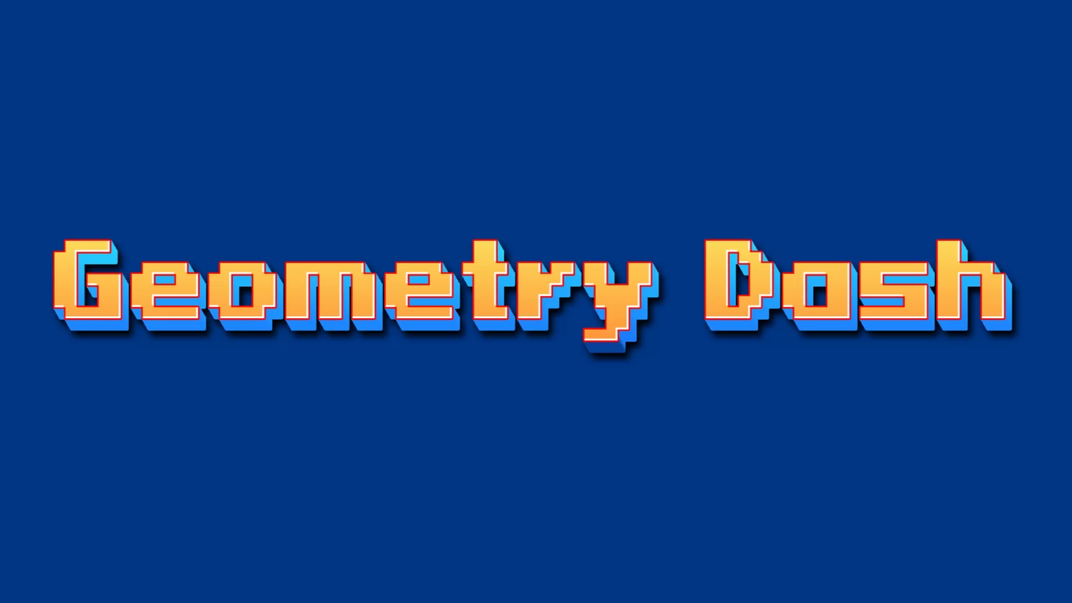
Type a word, pick a style, download a PNG. That is the whole thing, and it takes about ten seconds.
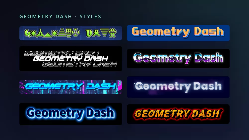
All of them come from the same Geometry Dash font generator, with a different style picked from the list. Nothing to install, no account.
About the Geometry Dash font
Geometry Dash is a rhythm-based platformer released in 2013 on iOS and Android, then on Steam, developed by the Swedish developer Robert Topala and published by his company RobTop Games. You tap to jump a cube through spikes in time with the music, one hit and you restart, and the level editor turned it into a game with millions of player-made levels and a YouTube scene built around them.
Two fonts do the work, and "the Geometry Dash font" can mean either. The logo is set in Oxygene 1, a pixel font by Jakob Fischer, the designer behind Pizzadude. The text inside the game, the level names, the menus, the RobTop logo, is very close to Pusab, a chunky rounded face from the Flat-it foundry. Players who say "GD font" usually mean the second one, because it is the one they see on every level.
How to make Geometry Dash text
Step 1. Type the word
Open the generator and replace the sample text with yours: a level name, a channel name, a video title, your player name. The letters redraw as you type.
Step 2. Pick a style
The style on the target page builds each letter out of level icons on the blue grid of the editor. It is the most Geometry Dash thing on the list, and it is the hardest to read at small sizes, so for a name or a thumbnail switch to the pixel style that matches the logo. The Styles tab lets you change the fill, the outline and the shadow separately in either.
Step 3. Pick the shape
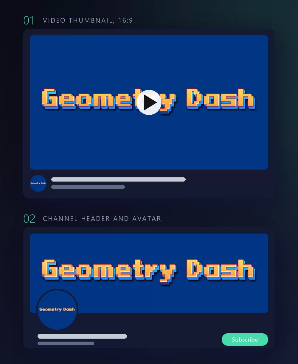
Set the shape before you export and nothing gets cropped afterwards. A 16:9 for a video thumbnail, a square for an avatar or a Discord icon, a wide strip for a channel header. The two mock-ups above are what those three shapes become once they are in place.
Step 4. Download
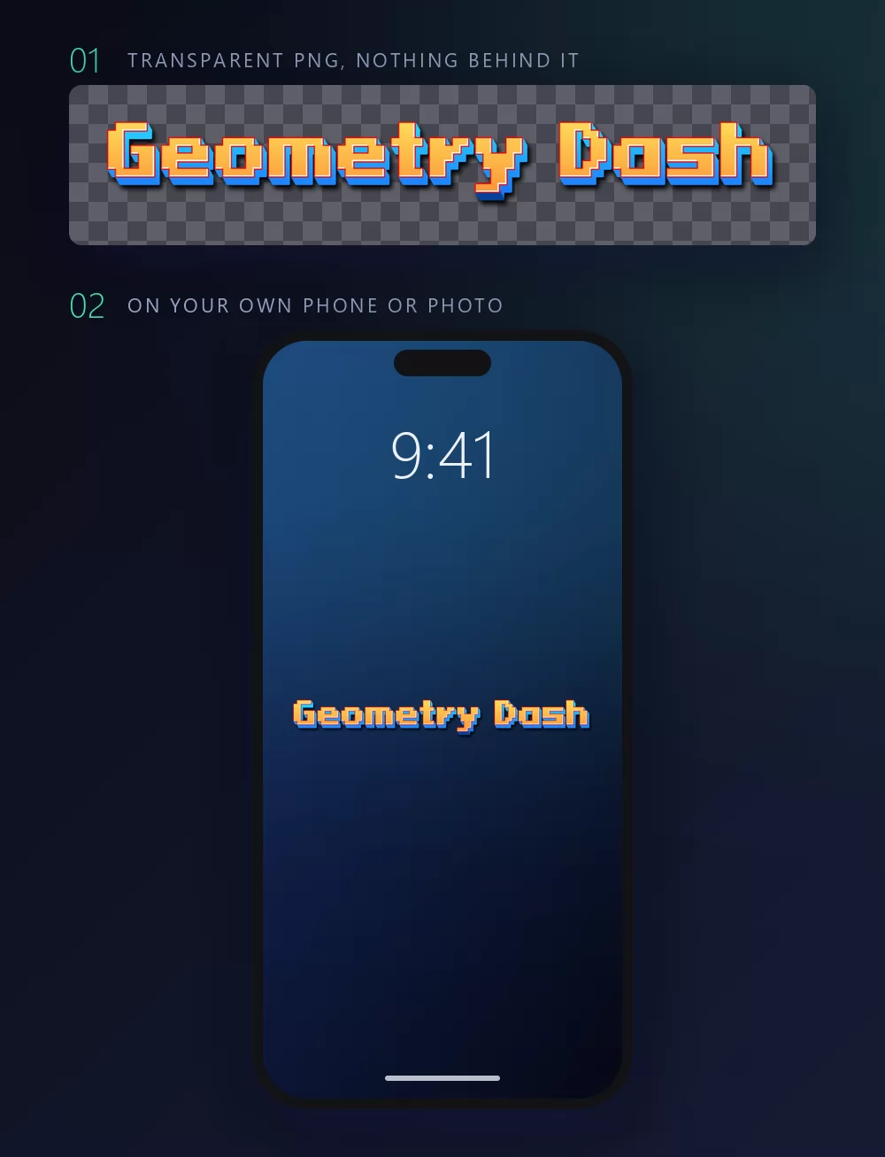
In the Download tab, take the transparent PNG if you plan to put the title onto your own screenshot. This is the option most people miss, and it is the one that matters for a level thumbnail: your own capture of the level behind, the title on top, no blue box around it.
Long names fill the width fast
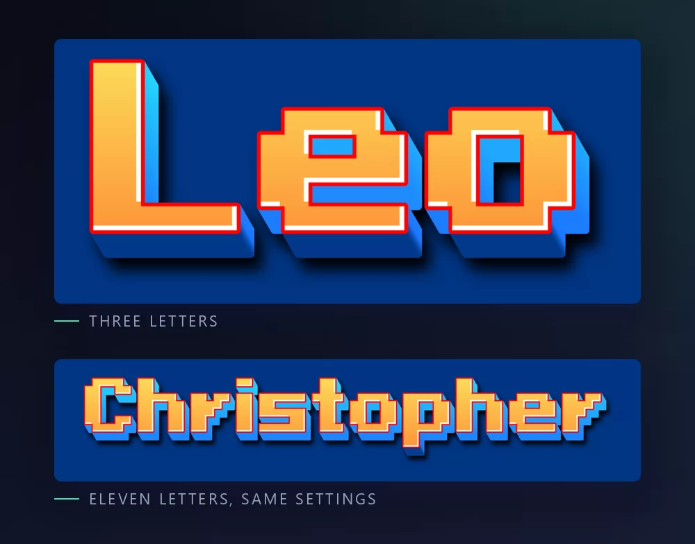
The more letters there are, the tighter they sit. Character spacing is a slider in the Text tab: open it up a little and a long name stops looking cramped. The same tab holds zoom, line height, curve and rotation.
The logo look, or the level look
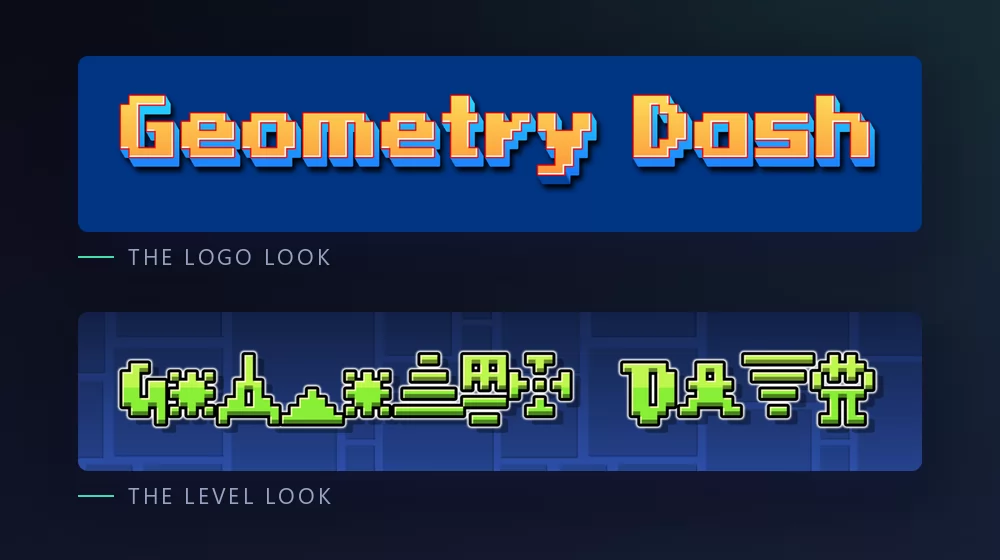
The logo look is pixel lettering, the Oxygene 1 of the title screen: square letters with a dark outline, orange on blue. It reads at any size, which is why it is the one to use for a name.
The level look is the Geometry Dash text effect itself: each letter assembled from cubes, spikes and portals on the grid of the editor. It says the game at a glance and it belongs on a thumbnail, not on a profile picture that will be shrunk to a circle.
Which font, if you want to install one
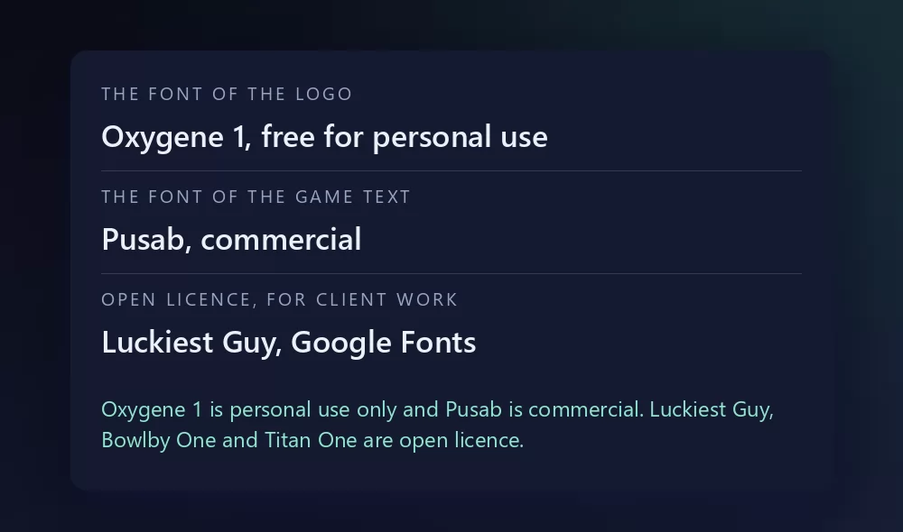
Oxygene 1 is the logo font, and it is the easy one. Jakob Fischer released it through Pizzadude in 2003, and it is listed on the font sites as free for personal use. A level thumbnail for your own video is personal use. A shirt you sell is not.
Pusab is the in-game font, and it is the one people go looking for and cannot find for free. It is a commercial face from Flat-it, the foundry of Ryoichi Tsunekawa, and it is bought from the foundry or its resellers. The copies that circulate on GD forums and Discord servers are unlicensed.
For the Pusab look with a clean licence, the honest options are the chunky rounded fonts on Google Fonts: Luckiest Guy, the closest in weight and bounce, Bowlby One by Vernon Adams, heavier, and Titan One by Rodrigo Fuenzalida, a touch narrower. All three are open licence, all three are available inside Canva, and none of them is Pusab. They give you the silhouette, which at thumbnail size is most of what the eye reads.
What people actually make with it
Level thumbnails for YouTube, first of all: the level name in the game's lettering over a screenshot of the hardest part. Then channel banners, Discord and YouTube avatars, profile cards for the community sites, phone wallpapers, and the occasional printed shirt for a meetup. Almost all of it works better with the transparent PNG than with an installed font, because the look is the outline and the shadow as much as the letters, and a font file gives you the outlines and nothing else.
How to make Geometry Dash text in Canva
Canva does not carry Pusab or Oxygene 1. It does carry Luckiest Guy, Bowlby One and Titan One, so you can get the chunky look without leaving it. For the pixel logo look or the level look, make the lettering as a transparent PNG and upload it: it drops straight into a Canva thumbnail and stays sharp.
If you work in Canva often, you can also use TextStudio effects inside Canva and skip the upload.
How to make Geometry Dash text in Photoshop
Install Oxygene 1 for the logo look, or Luckiest Guy for the in-game look, type your text, then build the treatment with layer styles:
- Colour overlay in orange or yellow for the logo, or any bright colour for a level name.
- Stroke, set to Outside, in a very dark blue or black, thick. This is the part that makes it read as the game.
- Drop shadow, hard, no blur, offset down and right: the pixel look has no soft edges.
Keep anti-aliasing off on the pixel font, or the squares turn to mush.
How to make Geometry Dash text in Word
Install the font, type your text, and use the text effects for the outline and the shadow. Word can do a thick outline, and for a pixel font that is most of the look. For a thumbnail, an exported PNG on your own screenshot will still look better.
On your phone
You cannot install a font and use it in most apps, on iOS or Android. The generator runs in the phone browser, which is where most of Geometry Dash is played anyway: make the PNG on the phone, save it to the gallery, and add it in whatever app you were using.
Is the Geometry Dash font free?
Oxygene 1, the logo font, is free for personal use. Pusab, the in-game font, is commercial and is not legitimately free anywhere. Luckiest Guy, Bowlby One and Titan One are open licence on Google Fonts, and they are the honest way to get the chunky look without paying.
And there is a second question underneath, which gets conflated with the first constantly: a font licence is not a trademark licence. Even a font you may use commercially says nothing about Geometry Dash, which belongs to RobTop Games. A thumbnail for your own level video is the sort of use nobody has ever objected to. Selling merchandise that trades on the game is a different matter, and no font licence will cover you there.
Open TextStudio and type a word to see it in the style straight away.
More fonts and styles to try
If you came here for a game font, these cover the same ground:
- Minecraft font generator : blocky letters, and the same transparent PNG workflow
- Fortnite font generator : heavy condensed capitals, and the same thumbnail workflow
- Pokemon font generator : the same solid and hollow lettering, in a different palette
- Spiderman font generator : jagged capitals with a thick outline, plus a webbing texture
- Death Note font generator : the scratched title lettering and L's blackletter, plus the same thumbnail workflow
- SpongeBob font generator : the same bold cartoon capitals, softer
- Toy Story font generator : a yellow fill with a heavy outline, over a tilted block
- Disney font generator : the signature script and the Mickey lettering, plus a style for most Disney films
- Bluey font generator : chunky rounded capitals on sky blue, and the same invitation and cake topper workflow
- Hello Kitty font generator : the red script under Kitty's face, and the same invitation and wallpaper workflow
- logo fonts : why a film or game logo is almost never a font you can install
Frequently asked questions
What font does Geometry Dash use? Two. The logo is Oxygene 1, a pixel font by Jakob Fischer. The in-game text and the RobTop logo are very close to Pusab, by Flat-it.
What is the GD font? When players say GD font they usually mean Pusab, the chunky rounded font of the level names and menus.
Is Pusab free? No. It is a commercial font from Flat-it. The copies passed around on forums are unlicensed. Luckiest Guy, Bowlby One and Titan One are the open licence lookalikes.
Is Oxygene 1 free? Free for personal use, listed as such on the font sites. Not for commercial work.
How do I make a Geometry Dash level thumbnail? Pick the 16:9 shape, download the transparent PNG, and place the level name over your own screenshot of the level.
Can I use the Geometry Dash style on things I sell? The font licence and the trademark are separate questions. Geometry Dash belongs to RobTop Games, so a permissive font licence would still not cover merchandise trading on the game.
Why does my pixel text look blurry? Anti-aliasing, or a scale that is not a whole multiple. Turn smoothing off, keep the font at a size that is a multiple of its pixel grid, and export at the final size rather than resizing afterwards.