
 Mia Hartley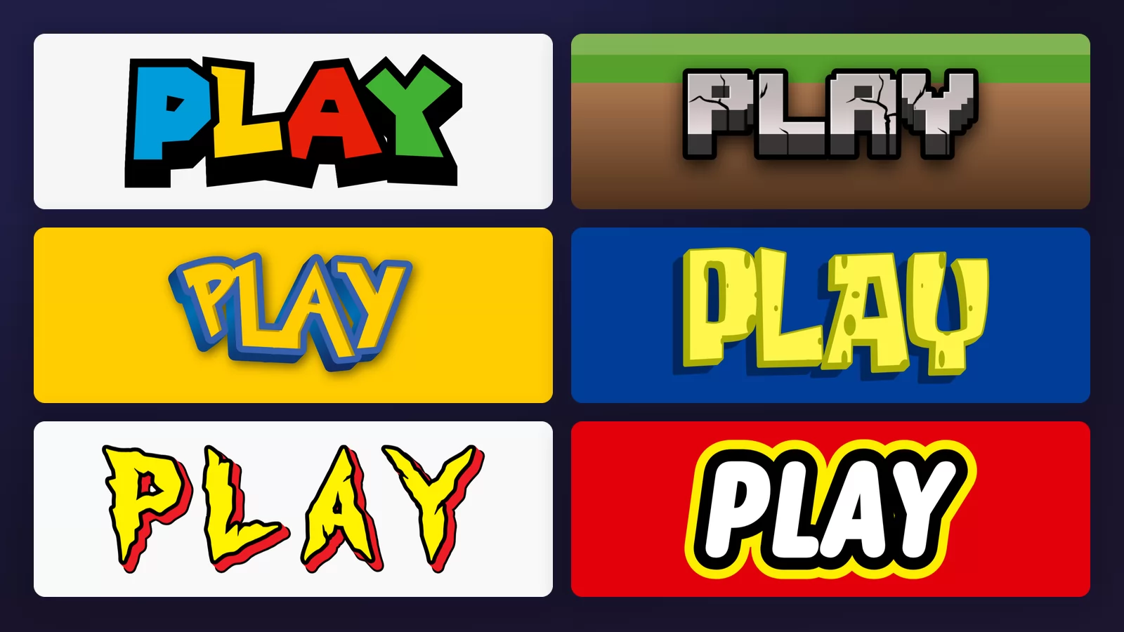
Type "Pokémon font" into a search box and a dozen sites will hand you a file. None of them will tell you the thing that actually matters: there is no Pokémon font. The logo was drawn by hand, letter by letter, and no typeface was ever involved.
That is true of almost every logo you would want to copy. What you can get is a lookalike: someone redrew those shapes and filled in the rest of the alphabet themselves. That is a perfectly good thing to use, as long as you know what it is. Every sample below was made with the logo text generator of TextStudio, on a neutral word, so you can see the lettering rather than the brand.
A logo is drawn once. A font has to cover every letter.
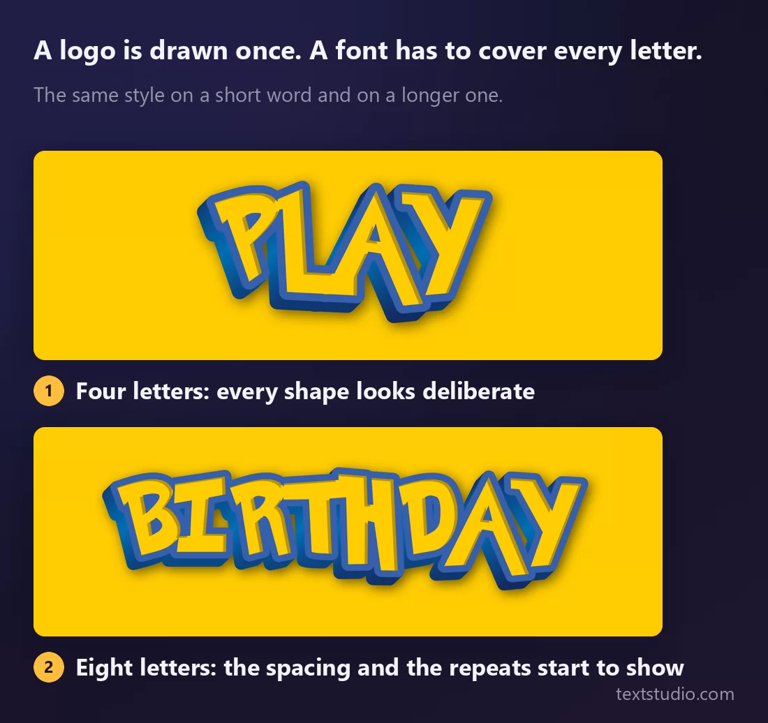
Look at the two rows. On the short word, every shape looks intentional, because a logo is intentional: a designer sits with four or five letters and makes them work together. On the longer word the same style has to produce letters the original logo never contained, and the seams show. The spacing tightens, the repeats look identical in a way hand lettering never is.
That gap is the whole subject. A logo is a drawing. A font is a system that has to handle any word you throw at it, including the ones nobody planned for.
Where the confusion comes from
Take the most searched example. The Pokémon logo was created in 1998 by designer Chris Maple, who sketched dozens of letterform variations by hand before settling on the bouncy shapes everyone recognises. It is completely custom: no existing typeface was used, and each letter was drawn to work in that one word.
What circulates online as "the Pokémon font" is a fan-made recreation, distributed in a couple of weights. It is a good imitation. It is not what the designer made, it has no connection to the company, and the letters that never appeared in the original had to be invented by whoever drew it.
Every site in this category serves you that file. Almost none of them say any of the above, and it is the part you need to make a sensible decision.
1. Blocky arcade
Fat, slightly irregular capitals in flat primary colours, each one wrapped in a heavy black outline. The letters lean and overlap a little, which is what stops them looking mechanical.
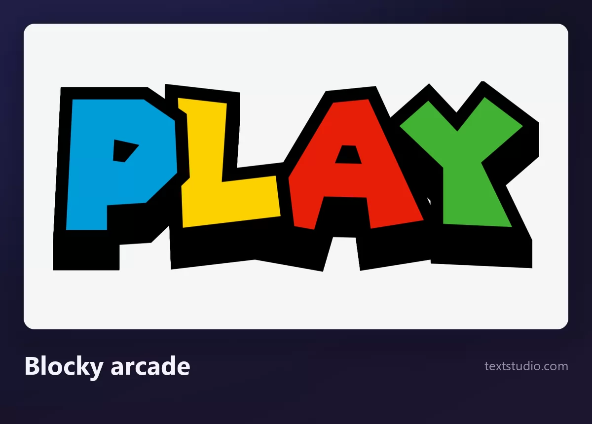
Good for: anything aimed at children, party invitations, retro gaming content. It is the most legible style here by a wide margin, because the shapes are simple and the outline separates them from any background.
2. Pixel and stone
Letters built out of visible squares, textured like stone, over a strip of grass and earth. This one is not really lettering at all: it is a material, and the material is the whole reference.
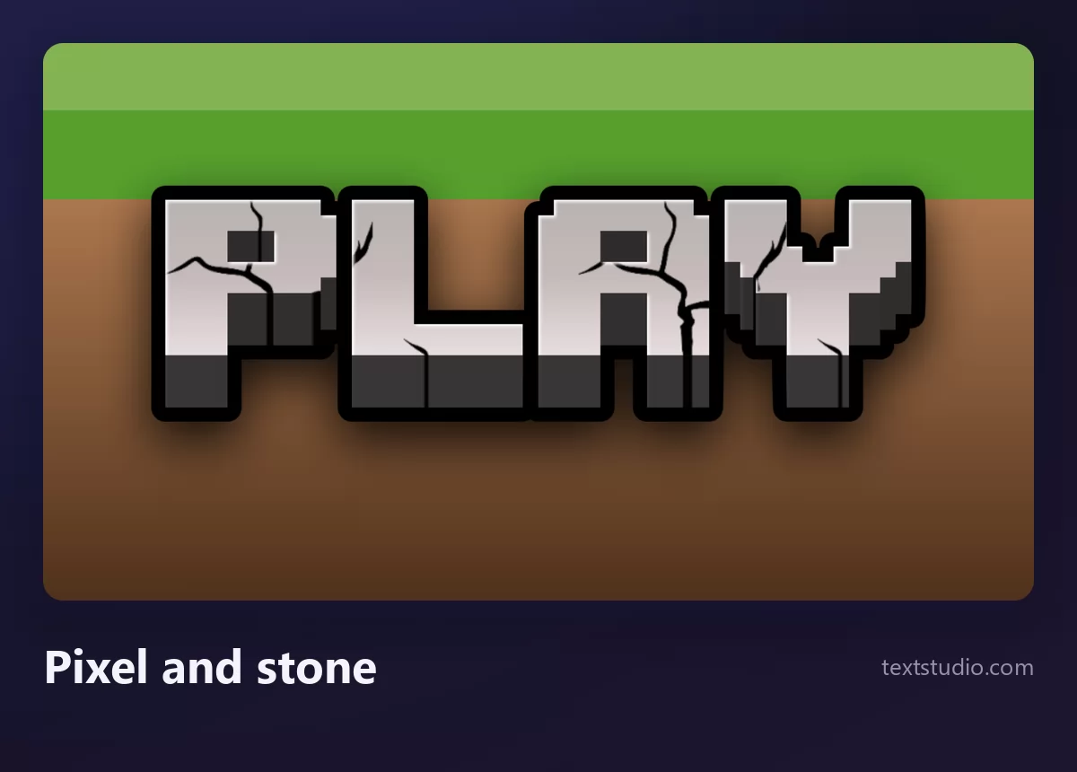
Good for: server banners, video thumbnails, anything for players who will recognise the texture instantly. Keep it large: the pixel edges turn to mush at small sizes.
3. Bevelled cartoon
Yellow letters, a thick blue outline, and a bevel that lifts them off the page. The italic slant and the slightly uneven baseline are doing the work, not the colour.
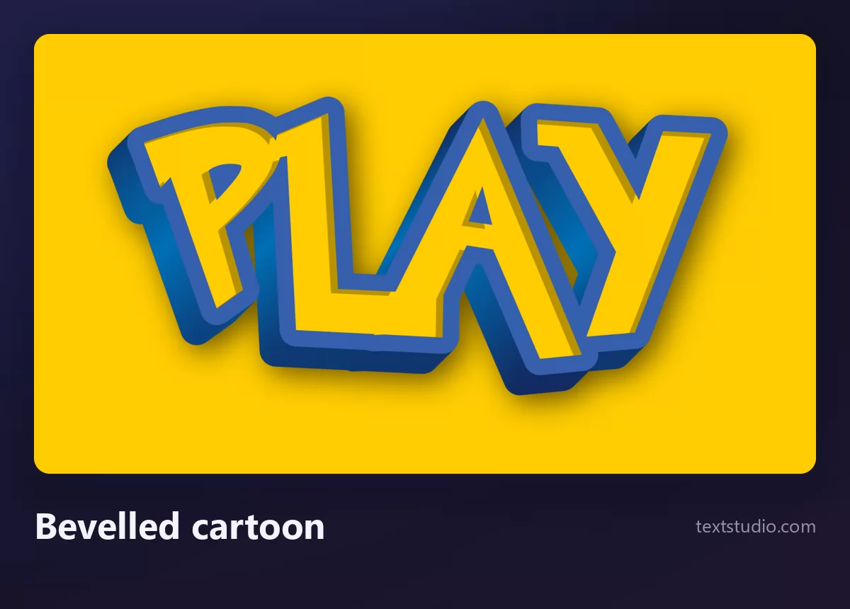
Good for: kids' events, gaming channels, anything that should feel like an adventure rather than a product. This is the style people are actually after when they search for a famous cartoon font.
4. Signature script
A thin, looping script that reads as a signature rather than as type. This is the clearest example on the page of the thing the whole article is about: a signature is handwriting. There is no typeface underneath it, there never was.
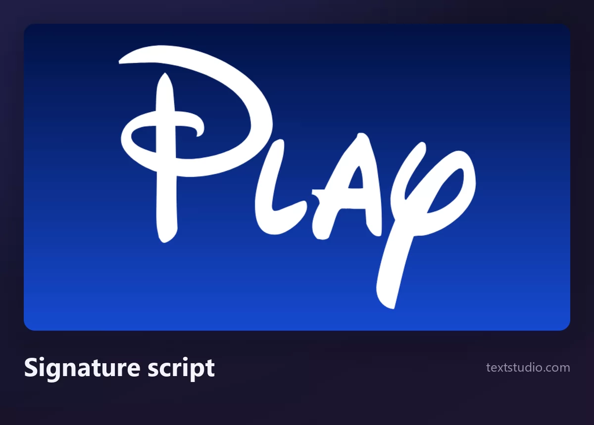
Good for: nothing commercial, and that is not a legal footnote, it is the point. Use it to understand what custom lettering means, and use something else on your poster.
5. Bubbly script
Fat rounded script with a white cut around the whole word and a soft shadow. The letters swell in the middle and taper at the ends, the way a brush would.
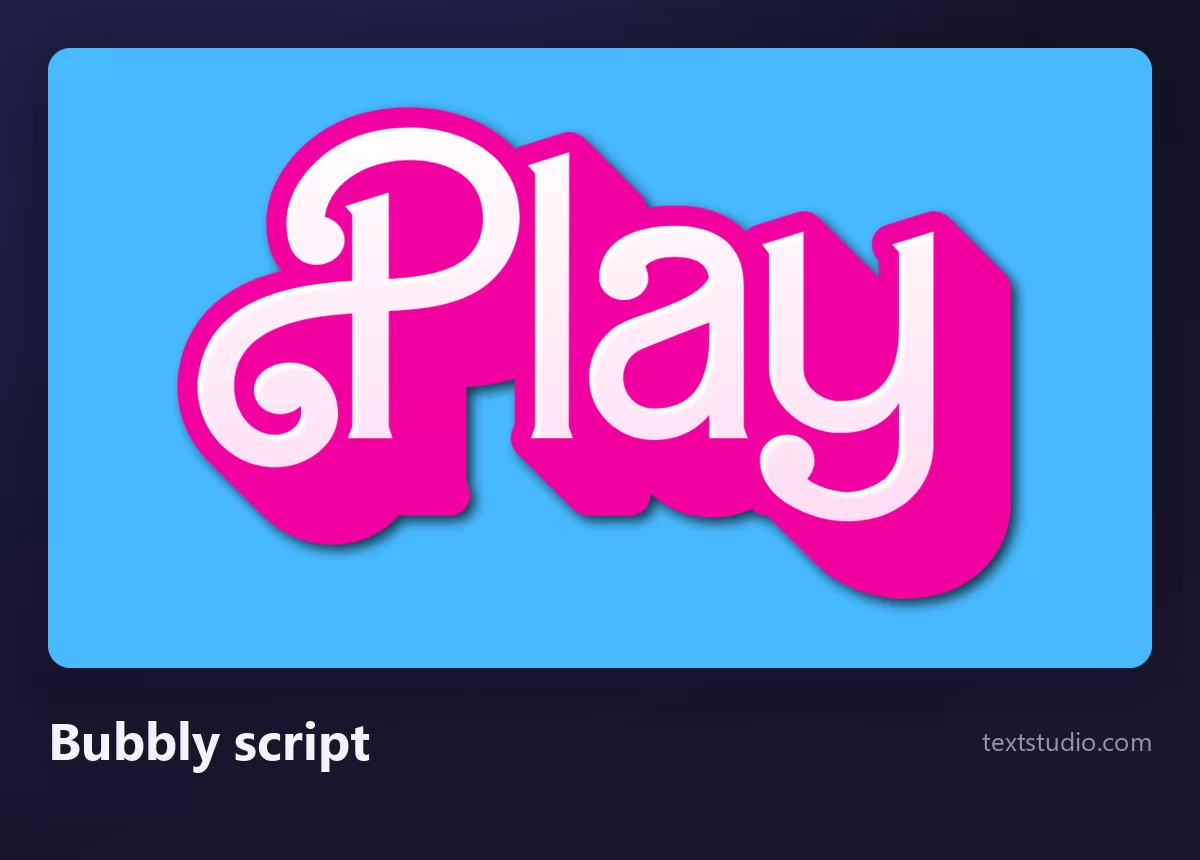
Good for: birthday parties, toy and craft content, anything aimed at younger children. It photographs well on printed invitations, which most of the styles here do not.
6. Porous sponge
Yellow letters with holes punched through them and a soft green edge, so the word looks like it was cut out of something absorbent. Another case where the texture is the reference, not the letterforms.
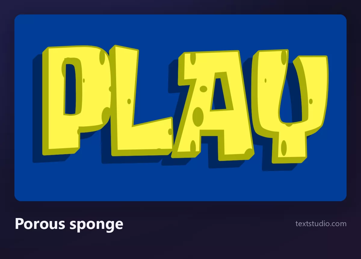
Good for: children's parties, silly video titles, anything that should read as funny before it is read at all.
7. Torn comic
Yellow letters with a ragged red outline that looks torn rather than drawn, with sharp points where a normal letter would have a corner. Comic-book energy in its purest form.
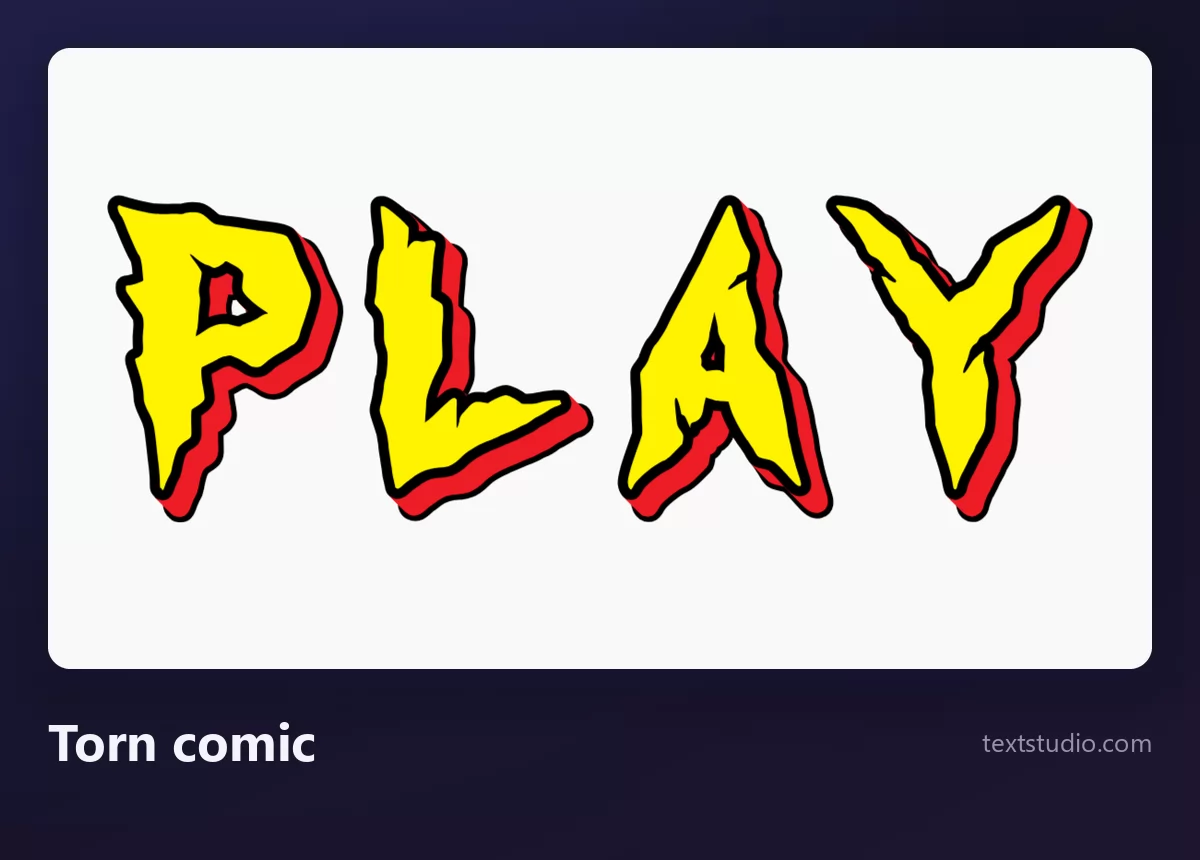
Good for: action content, sports, anything that needs to feel fast. The torn edge is the first thing to disappear when you shrink it, so treat it as a title and never as a caption.
8. Ultra bold slab
White letters, very heavy, with a yellow halo and a red field behind. Almost no detail: just weight, contrast, and confidence.
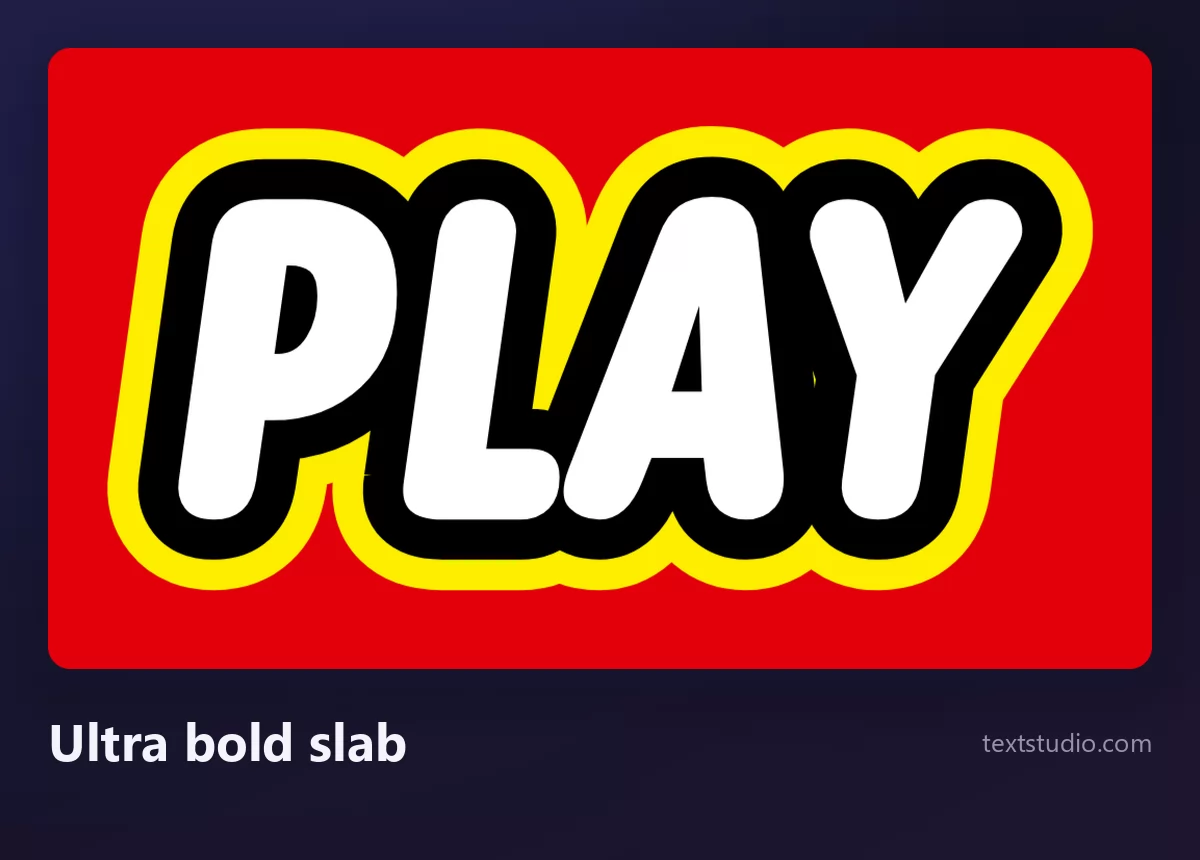
Good for: anything that has to be read from far away or very small. This is the only style on the page that survives being shrunk to a favicon, because the shape carries it and nothing depends on fine detail.
All eight, on the same word
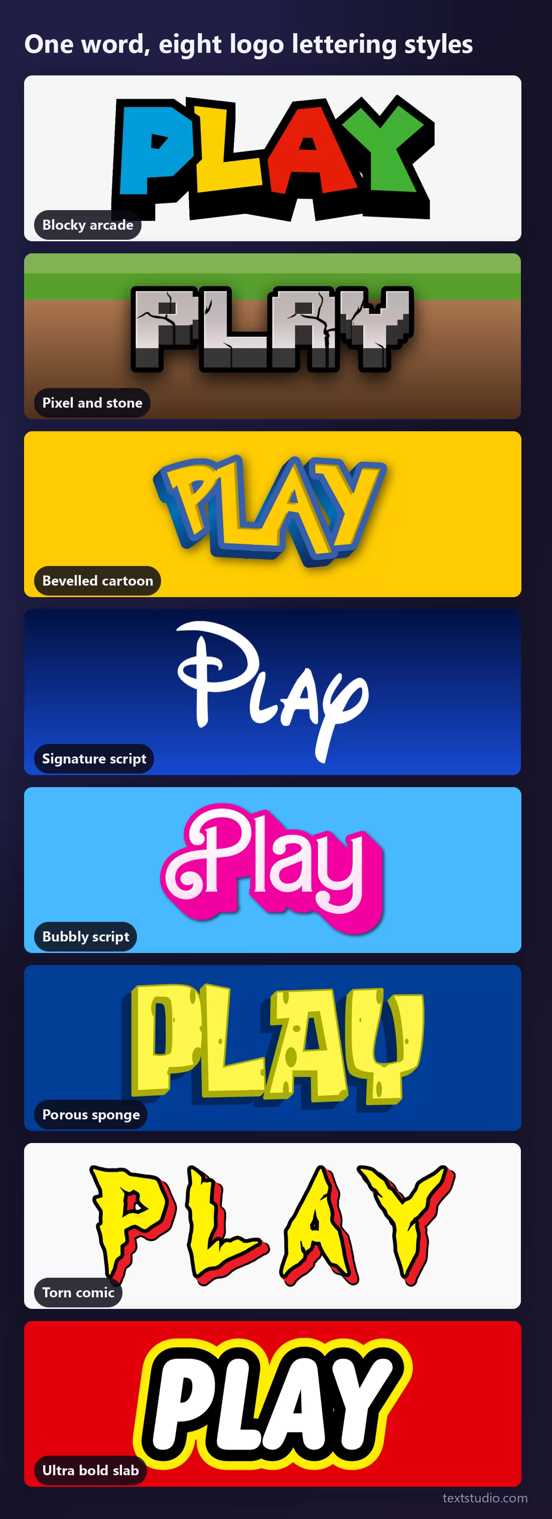
Nothing changes from row to row except the lettering. Seen together, it is obvious that these are not eight fonts but eight drawings, each one built to say one thing about one world.
What each style makes people think of
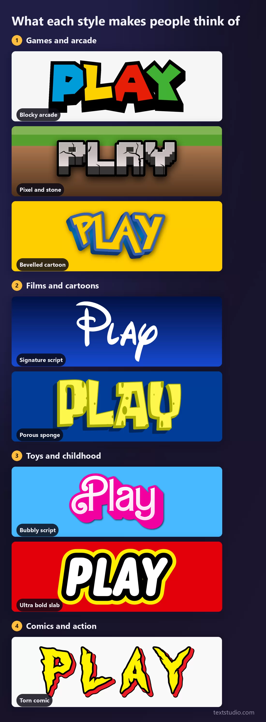
This is the only sorting that matters when you choose. Nobody looks at a poster and thinks "bevelled italic with a blue outline"; they think "that is a game" or "that is for kids". Pick the world first, then the style inside it.
The reference is doing a lot of work for you here, which is a strength and a trap. It carries a whole set of associations for free, and it also means your design is borrowing someone else's identity. That is fine for a party and a problem for a business, which is the next section.
Fine for a party. Not for a business.
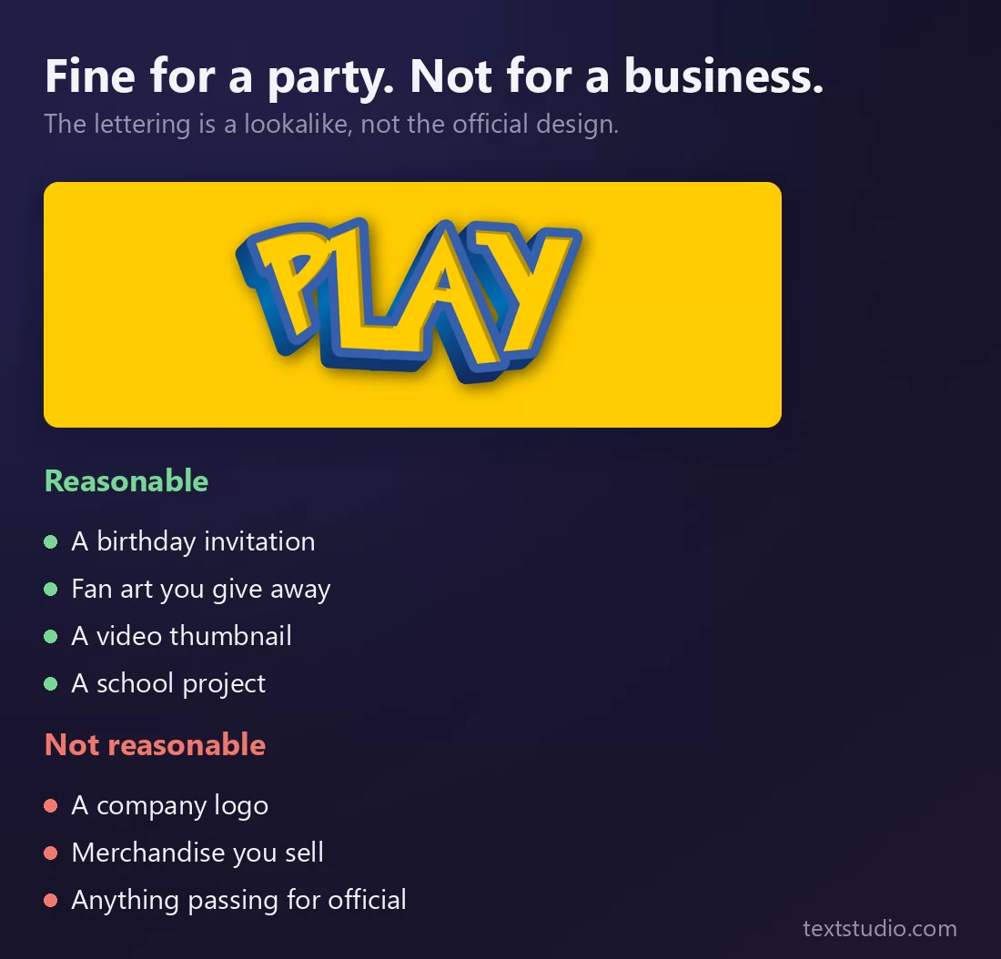
The lettering is a lookalike, and the thing it looks like belongs to someone. That distinction has nothing to do with which style you pick, which is why the picture above shows one style and two lists.
Personal and non-commercial use is where this belongs: an invitation, fan art you give away, a thumbnail, a school project. What you should not do is build a business on it, sell things carrying it, or let anyone think your thing is officially connected to theirs. That last one is the real line, and it is a line about confusion, not about drawing.
If you want the same energy without borrowing anyone's identity, the answer is usually a heavy face plus a strong outline. The guide to adding a stroke to text covers the mechanics, and comic fonts and cartoon text effects has a family of styles that carry the fun without the reference.
Making one, in three steps
- Pick the world, not the logo. Decide whether you want games, cartoons, toys or comics. That single choice narrows eight styles to two and stops you copying a specific brand by accident.
- Keep the word short. These styles were drawn for logos, and logos are one or two words. Put a sentence through them and you will see exactly the seams the first picture showed.
- Look at it where it will be seen. On a phone, at thumbnail width, on a printed card. Texture and torn edges vanish first; weight and silhouette survive.
Every style here is free and needs no account. Open TextStudio to put your own words into any of them.
Questions people ask
What font does the Pokémon logo use? None. It was drawn by hand in 1998 by Chris Maple, who sketched the letterforms individually. Files circulating as "the Pokémon font" are fan-made recreations, not the original design.
Are these the real fonts from the games and films? No, and no site can give you those. They are lookalikes: someone redrew the recognisable letters and invented the rest of the alphabet.
Can I use them? For personal, non-commercial things, in practice yes: invitations, fan art, thumbnails, school work. Not for a company logo, not on merchandise you sell, and never in a way that suggests an official connection.
Why does my text look wrong in these styles? Probably because it is too long. The original logo only ever had to spell one word, so the letters outside it were reconstructed. Short words look right; sentences reveal the reconstruction.
What should I use for my own brand instead? A real typeface you have a licence for, given a distinctive treatment: heavy weight, a strong outline, one memorable colour. You get an identity that is yours, which is the one thing a lookalike can never give you.
About the brands mentioned. The names, logos and trademarks cited on this page belong to their respective owners, and are used here for identification only. The lettering styles shown are original creations inspired by recognisable visual styles: they are neither official nor affiliated, and they are intended for personal and non-commercial use.