
 Mia Hartley
Type a word, pick a style, download a PNG. That is the whole thing, and it takes about ten seconds.
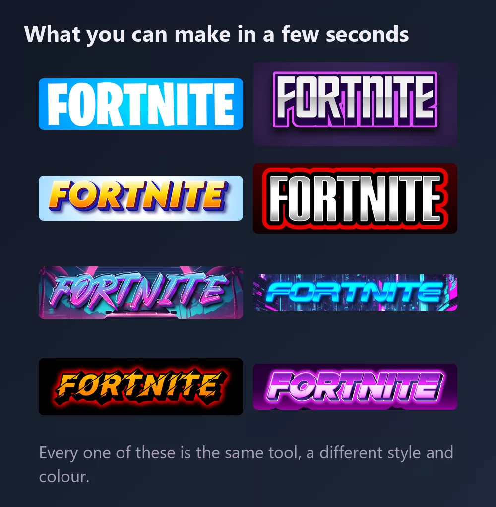
All of them come from the same Fortnite font generator, with a different style picked from the list. Nothing to install, no account.
About the Fortnite font
Fortnite is a sandbox survival game developed by Epic Games and People Can Fly. It was released on 25 July 2017 through paid early access, and the free battle royale mode that followed is what turned it into a phenomenon.
The font in the logo is Burbank Big Condensed, designed by Tal Leming, used in a modified form. Burbank is a display family built for exactly this kind of job: it runs to about twenty styles. Burbank Big comes in three widths, each with four weights, and a companion, Burbank Small, is drawn for smaller sizes in four widths, each with an italic.
It is a commercial family. You buy a licence and download it from the foundry, which is the honest answer to "where do I get the Fortnite font".
How to make Fortnite text
Step 1. Type the word
Open the generator and replace the sample text with yours: a name, a squad tag, a channel name, a video title. The letters redraw as you type.
Step 2. Pick a style
The classic is heavy white condensed capitals over a blue gradient. The Styles tab lets you change the fill, the outline and the shadow separately, so you can keep the letterforms and take the colours somewhere else.
Step 3. Pick the shape
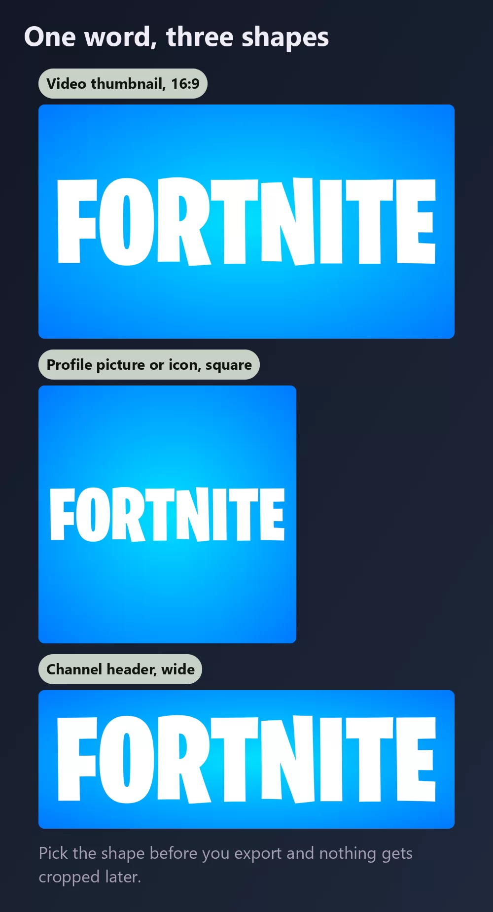
Set the shape before you export and nothing gets cropped afterwards. A 16:9 for a video thumbnail, a square for a profile picture or an icon, a wide strip for a channel header.
Step 4. Download
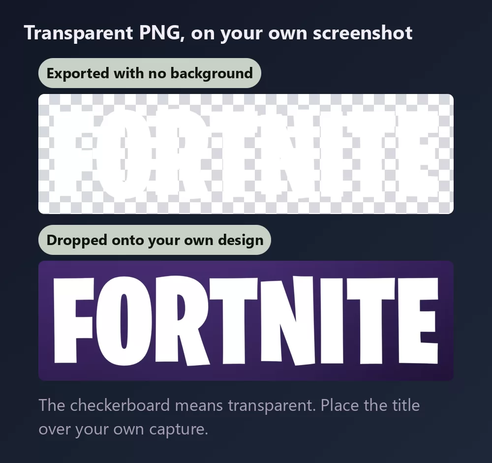
In the Download tab, take the transparent PNG if you plan to put the title onto your own screenshot. This is the option most people miss, and it is the one that matters for a thumbnail: your own capture behind, the title on top, no white box around it.
Long names fill the width fast
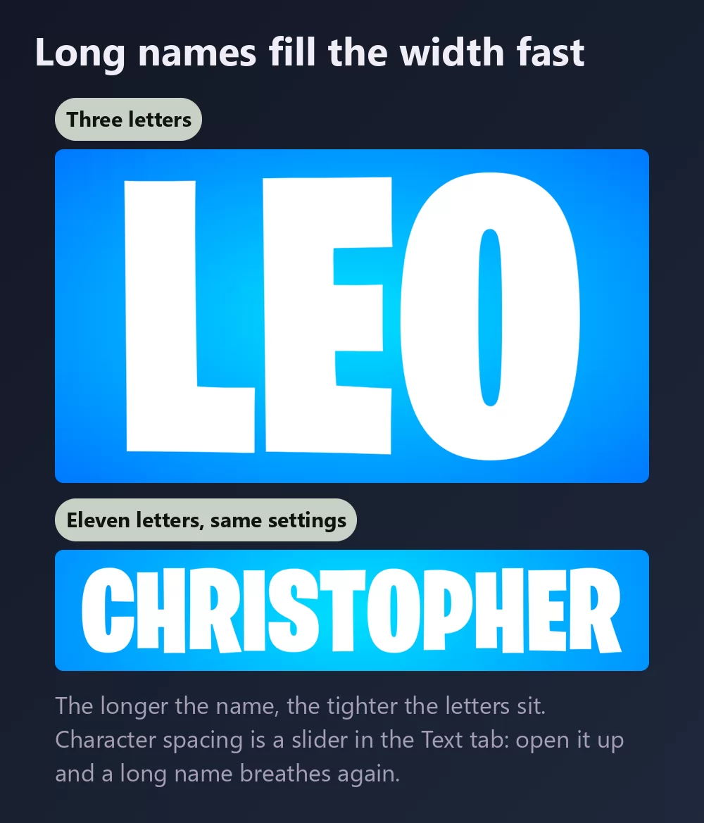
The more letters there are, the tighter they sit. Character spacing is a slider in the Text tab: open it up a little and a long name stops looking cramped. The same tab holds zoom, line height, curve and rotation.
The logo look, or the esports look
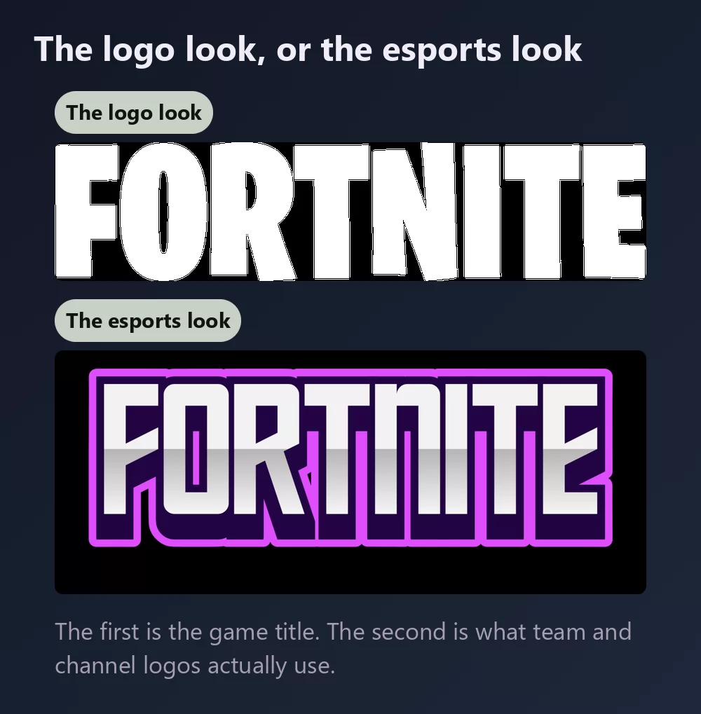
The logo look is the game title itself: heavy condensed capitals, white, tilted a degree or two.
The esports look keeps the same weight and adds a coloured outline and a glow. That is what team logos, channel banners and tournament graphics actually use, and it survives being shrunk to an avatar far better than a plain white wordmark does.
Which font, if you want to install one
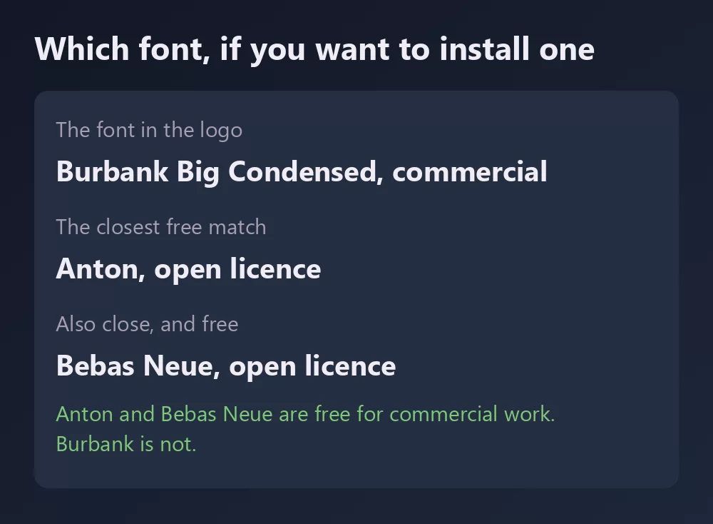
Burbank Big Condensed is the real answer, and it is commercial. Sites offering it as a free download are sharing unlicensed copies, which is worth knowing before you install something for a client job.
The free options that genuinely look close are all open licence faces from Google Fonts:
- Anton is the closest single match: one weight, very heavy, very condensed, and free for commercial use. It is also available inside Canva.
- Bebas Neue is a touch lighter and slightly narrower, and a long-standing favourite for gaming thumbnails.
- Oswald is the one to reach for when you need several weights rather than a single display cut.
None of them is a clone. They give you the same silhouette, which is most of what the eye reads at thumbnail size.
How to make Fortnite text in Canva
Canva does not carry Burbank, but it does carry Anton, so you can get close without leaving it. For the outline, the glow and the tilt, make the lettering as a transparent PNG and upload it: it drops straight into a Canva design and stays sharp.
If you work in Canva often, you can also use TextStudio effects inside Canva and skip the upload.
How to make Fortnite text in Photoshop
Install Anton or Bebas Neue, type your text in capitals, then build the treatment with layer styles:
- Gradient overlay, a light blue to a deeper blue, top to bottom.
- Stroke, set to Outside, in white or a bright colour, thick.
- Outer glow in the same colour as the stroke, low opacity, wide.
- Drop shadow, tight and dark.
Then rotate the whole text layer by one or two degrees. That last touch is small and it is the difference between a wordmark and a game logo.
How to make Fortnite text in Word
Install the font, type your text, and use the text effects for the outline and the shadow. Word cannot do a real outer glow or a gradient fill with any precision, so the result stays flat. For a thumbnail or anything you will publish, an exported PNG will look better.
On your phone
You cannot install a font and use it in most apps, on iOS or Android. The generator runs in the phone browser: make the PNG on the phone, save it to the gallery, and add it in whatever app you were using.
Is the Fortnite font free?
The font in the logo is not. Burbank is a commercial family, and it is licensed rather than downloaded for nothing. Anton, Bebas Neue and Oswald are free, including for commercial work, and they are the honest way to get the look without paying.
There is a second question underneath, which gets conflated with the first constantly: a font licence is not a trademark licence. Even a font you may use commercially says nothing about Fortnite, which belongs to Epic Games. Making a thumbnail for your own gameplay video is the sort of use nobody has ever objected to. Selling merchandise that trades on the game is a different matter, and no font licence will cover you there.
Open TextStudio and type a word to see it in the style straight away.
More fonts and styles to try
If you came here for a character font, these cover the same ground:
- Pokemon font generator : the same solid and hollow lettering, in a different palette
- Minecraft font generator : blocky letters, and the same transparent PNG workflow
- Toy Story font generator : a yellow fill with a heavy outline, over a tilted block
- SpongeBob font generator : the same bold cartoon capitals, softer
- Spiderman font generator : jagged capitals with a thick outline, plus a webbing texture
- Disney font generator : the signature script and the Mickey lettering, plus a style for most Disney films
- logo fonts : why a game or film logo is almost never a font you can install
Frequently asked questions
What font does Fortnite use? Burbank Big Condensed, designed by Tal Leming, in a modified form. It is a commercial family.
What is the closest free Fortnite font? Anton, from Google Fonts. Bebas Neue is close too, and Oswald if you need several weights.
Can I download Burbank for free? Not legitimately. Sites offering it free are distributing unlicensed copies.
How many styles does Burbank have? About twenty. Burbank Big has three widths with four weights each, and Burbank Small adds four widths with italics for smaller sizes.
How do I get a transparent background? Choose the transparent PNG in the Download tab, then place the title over your own screenshot.
Can I use the Fortnite style on things I sell? The font licence and the trademark are separate questions. Fortnite belongs to Epic Games, so even a permissive font licence would not cover merchandise trading on the game.
Why does my text look flat next to the real logo? Usually the outline, the glow and the slight tilt, not the font. Those three do more work than the letterforms.