
 Mia Hartley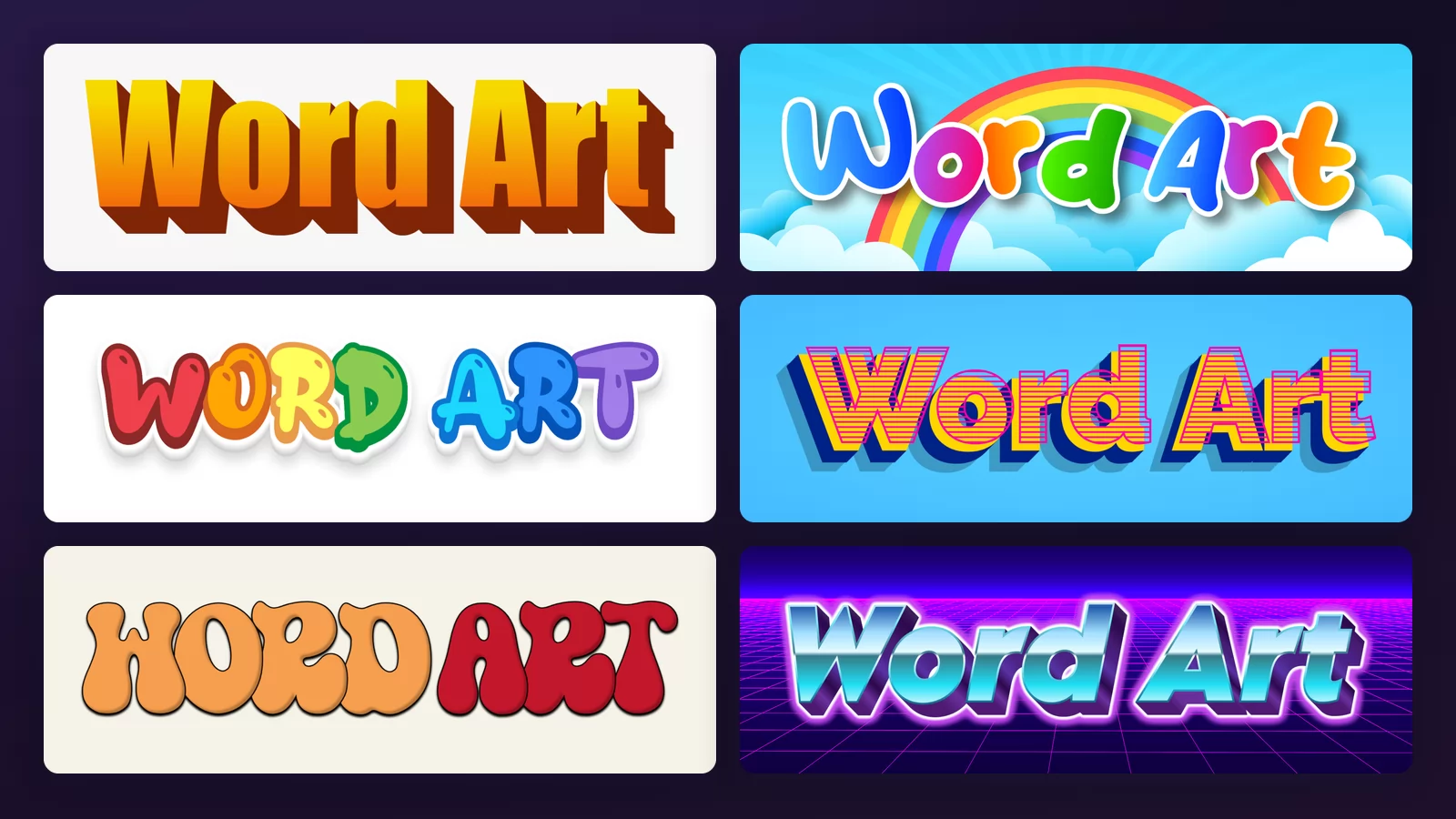
Search for word art and you get two completely different things back, mixed together on the same page. Half the results arrange a hundred words into the shape of a heart. The other half take one short phrase and decorate it. Both are called word art, neither page tells you which one it is, and that is why the search feels broken.
This guide is about the second kind: one phrase, made into a picture. Every sample below was rendered on the same two words with the word art generator of TextStudio, so the only thing that changes from image to image is the style itself. Click any of them to open that exact style and put your own words in it.
Word cloud or word art?
Settle this first, because it decides which tool you need.
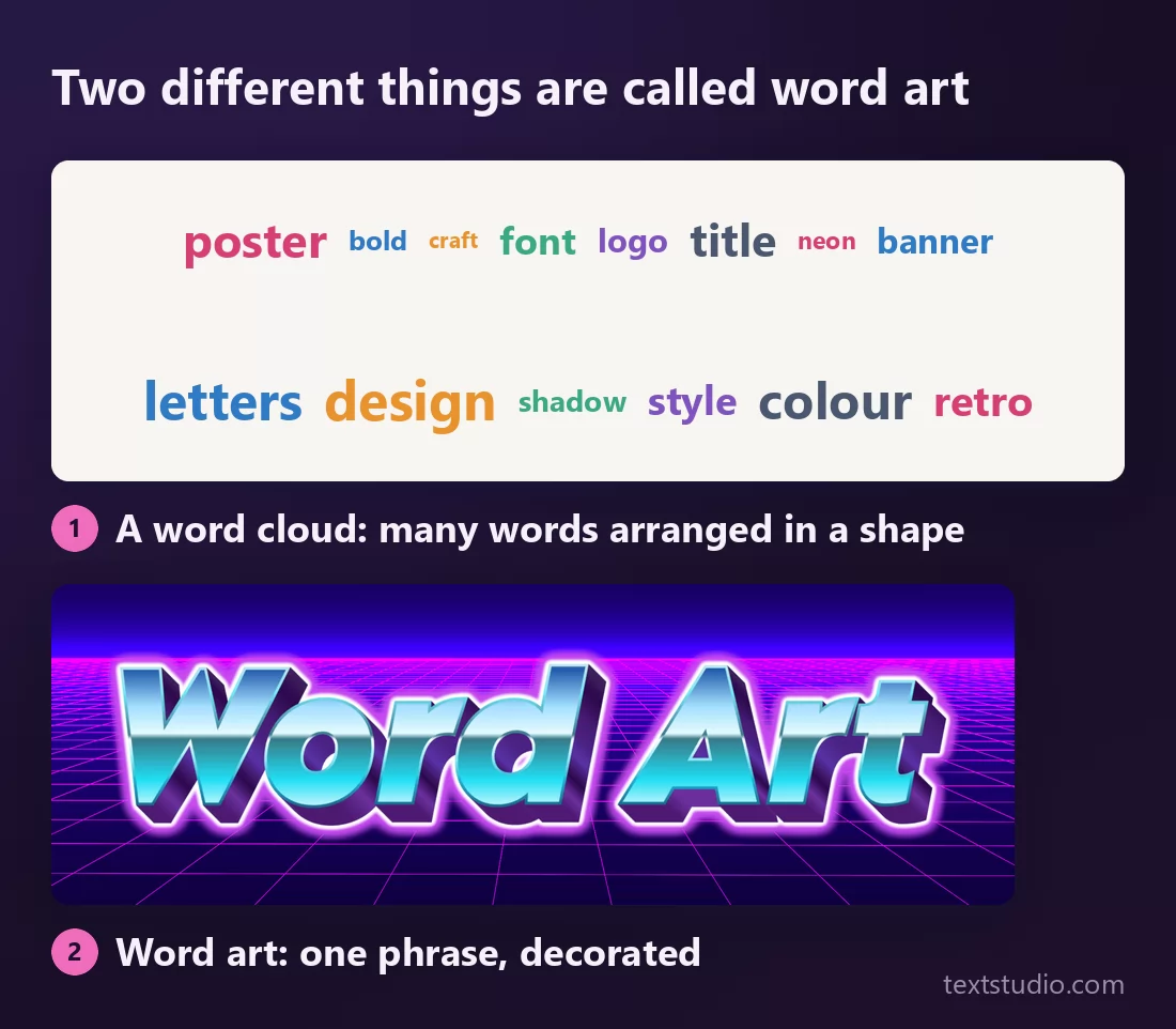
- A word cloud takes a list, sizes each word by how often it appears, and pours the lot into a shape. It is a way of summarising text. You feed it a paragraph, a survey, a set of tags.
- Word art, in the sense everyone means when they say "make me some word art", takes one short phrase and turns it into a graphic. A title, a name, a logo, a thumbnail.
If you want a leaving card in the shape of a heart, you want a word cloud. If you want your channel name to look like something, you want the rest of this page.
The one everybody remembers
Word art is not really a design category. It is a memory of a menu: the WordArt gallery that shipped in Microsoft Word, a grid of thirty preset shapes, most of them a gradient with a heavy shadow attached.
Two things made it unforgettable. It was the first time most people could make text look like something without owning a design program, and everybody was given exactly the same thirty options, so the whole world's school reports and church newsletters ended up wearing the same six styles. Microsoft quietly redesigned the gallery in Office 2007 and the original look was gone, which is precisely why it now reads as a specific year rather than as a default.
That is the useful part of the history. What follows is what the same idea looks like across eight registers.
1. The Word 97 original
A gradient fill, capitals, and a solid block shadow thrown down and to the right at a fixed angle. No blur, no perspective, no light source that makes any physical sense. The shadow is not trying to look real, and that flatness is the signature.
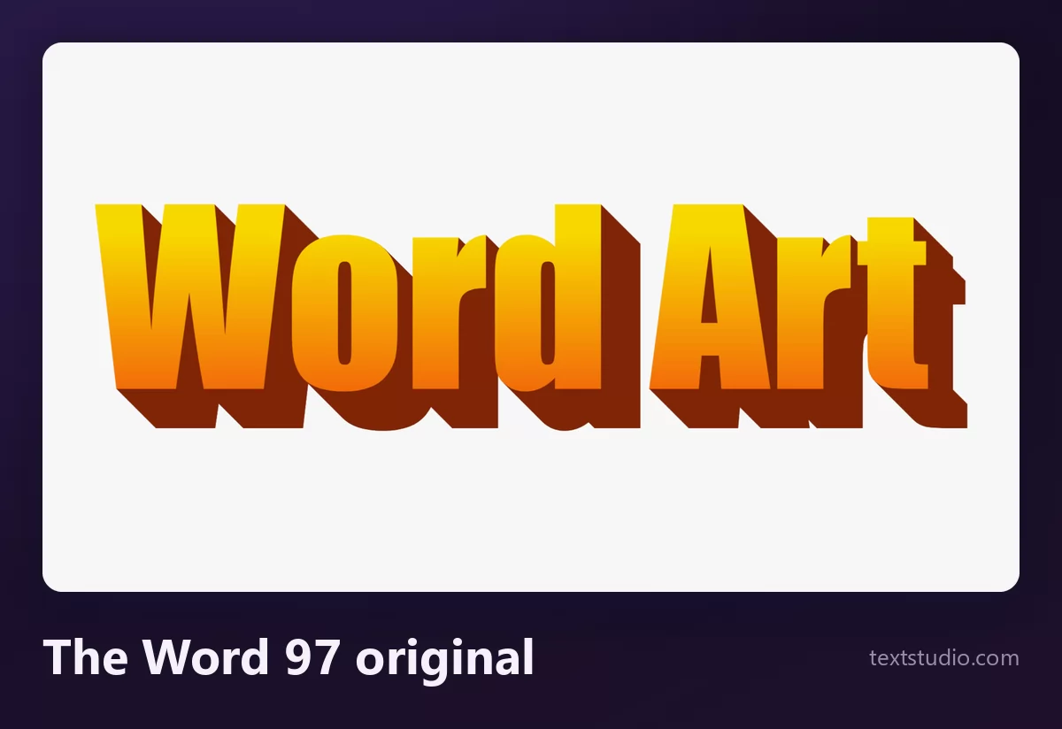
Good for: anything deliberately nineties, parody posters, a slide that needs a laugh. Use it when you want people to recognise the reference. Use anything else when you do not.
2. Rainbow arch
The other half of the memory: letters bent into an arc, each one a different colour, usually over a sky. The arch was WordArt's real party trick, because bending text was genuinely hard to do by hand in 1997 and trivial from that menu.
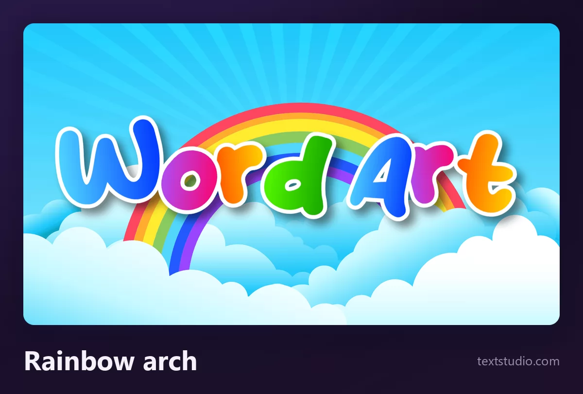
The arch is still worth using, and it survived the nineties better than the gradients did. If you want to bend your own text rather than take a preset arc, that is a separate tool: see the guide to curving text into arches and circles.
3. Bubble letters
Fat rounded shapes with a thick outline and a highlight on top, each letter in its own colour. This is the register children draw by hand on notebooks, and it has never really gone away.
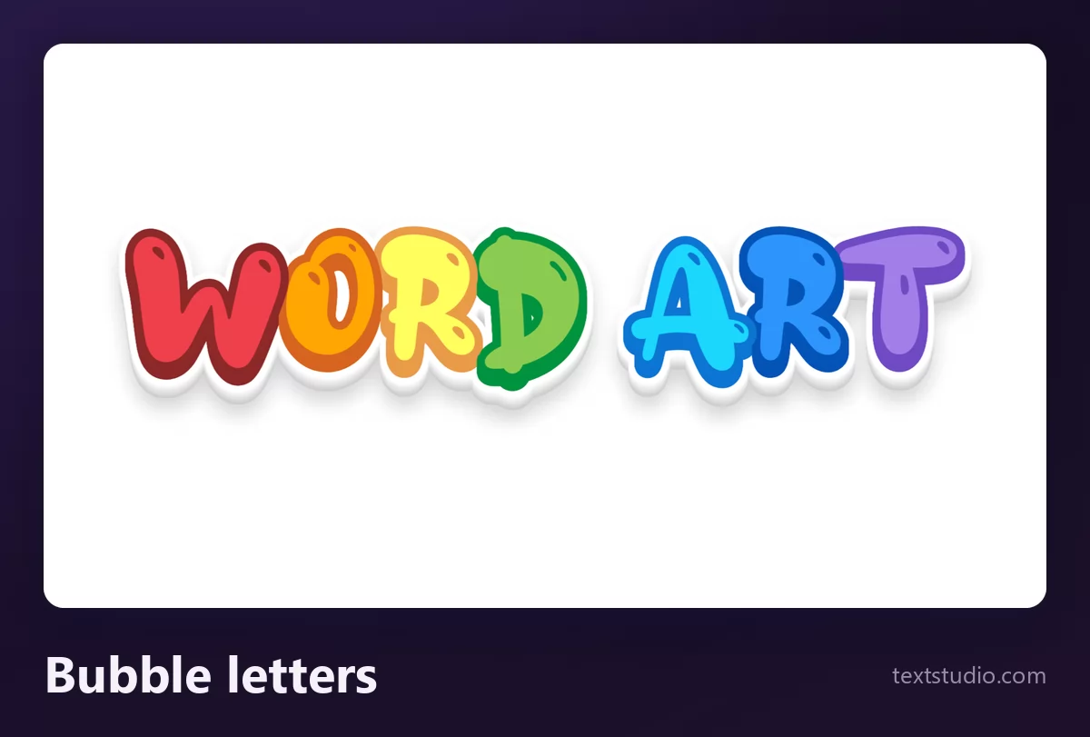
Good for: birthday cards, kids' events, anything cheerful. It is also the most forgiving style here, because the shapes are simple and the outline keeps them separated on any background.
4. Chrome bevel
Silver, bevelled, with a hard highlight running across the middle of each letter. The certificate classic: sports awards, tournament banners, "employee of the month".
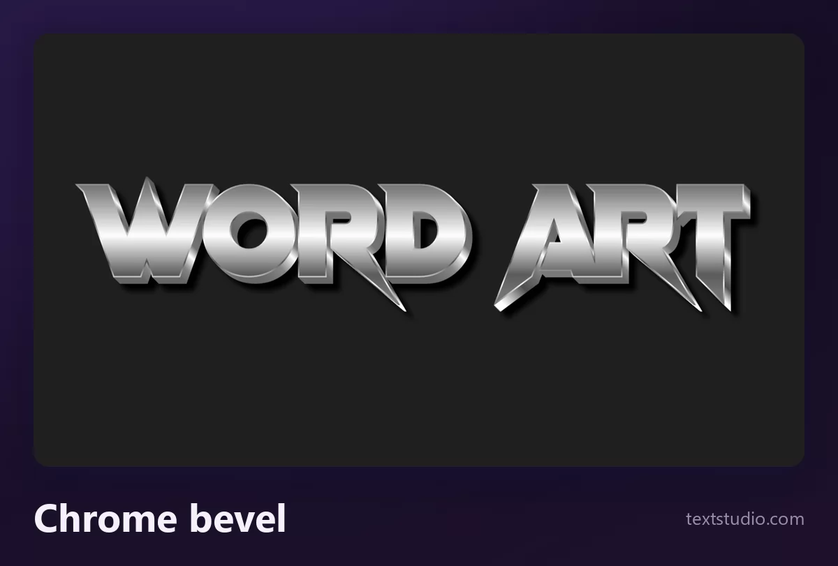
Chrome needs a dark ground to read as metal; on white it turns into grey mush. If this is the register you want, there is a whole family of it in the guide to metal and chrome text effects.
5. Pop-art stripes
Capitals filled with horizontal stripes, sitting on a flat offset shadow in a contrasting colour. Comic-book lettering, and one of the few styles here that still looks deliberate rather than nostalgic.
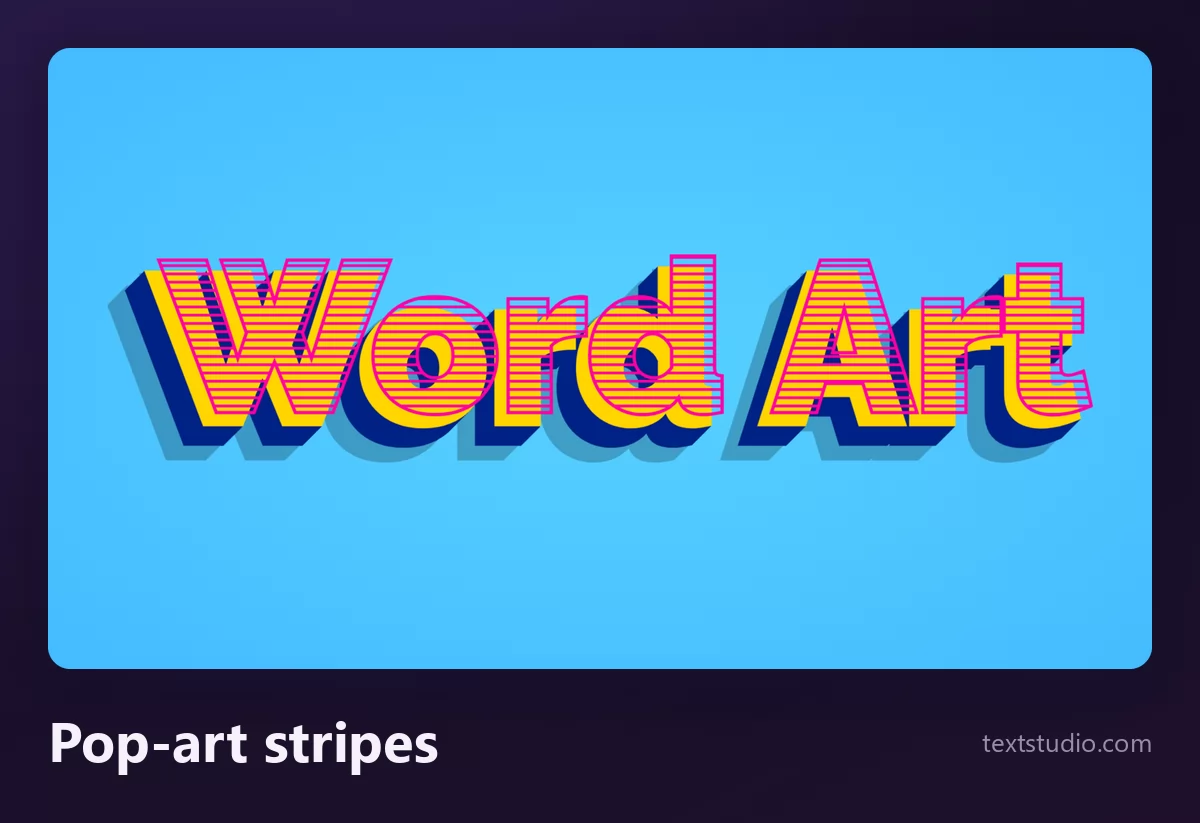
Good for: sale banners, event flyers, anything that needs to shout. The stripes are the first detail to disappear when you shrink it, so keep it big.
6. Groovy revival
Fat, soft, slightly wobbly letters with tight spacing, in warm oranges and reds. Seventies lettering, redrawn by people who were not alive in the seventies, and currently everywhere.
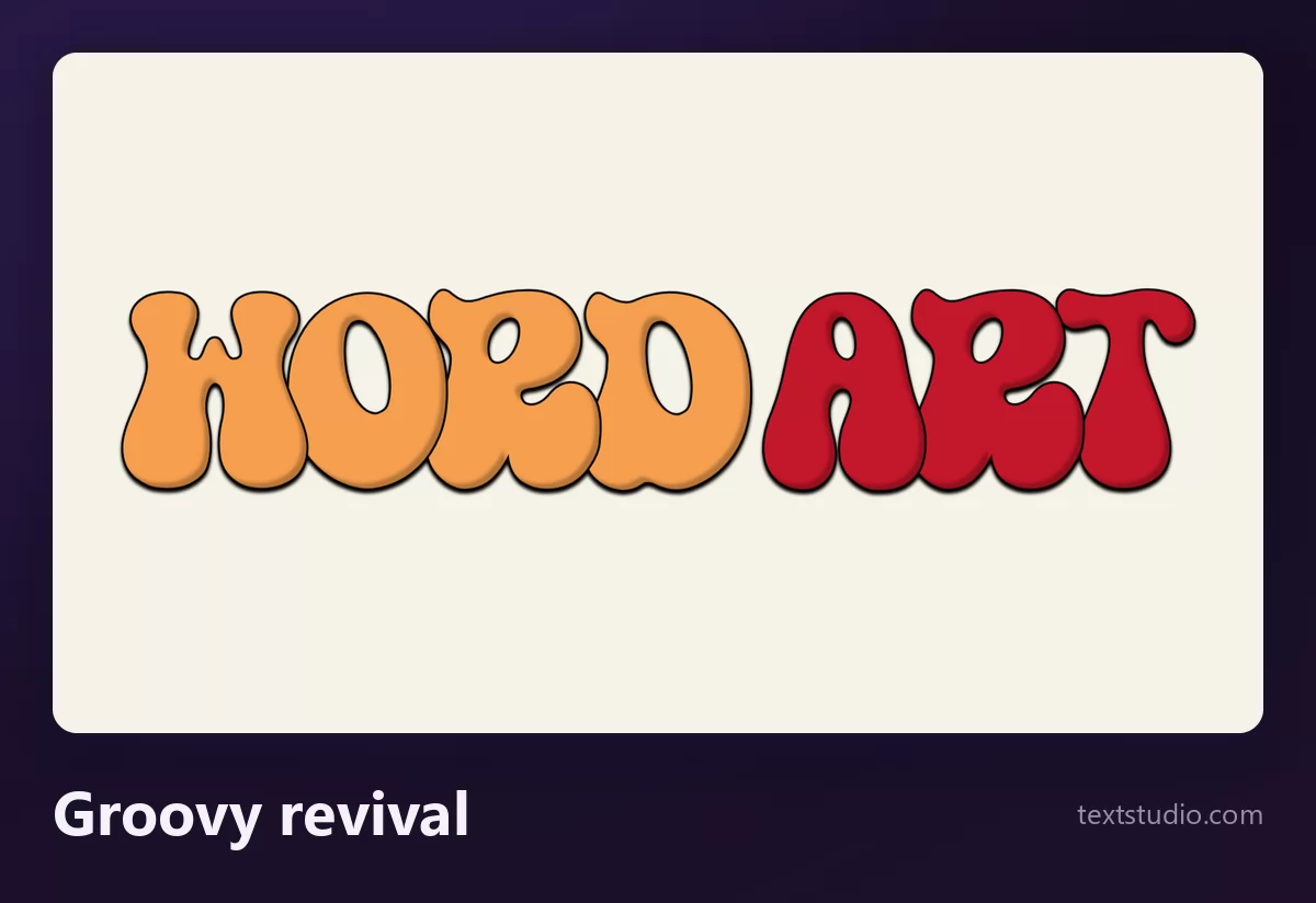
This is the closest thing on this page to a current trend rather than a memory. If you want the wider family, the guide to retro fonts and vintage text effects covers the decades either side of it.
7. Y2K desktop
Bright pink lettering with a hard glow, dropped on top of old operating system windows and error dialogs. Not a font so much as a whole scene, and the visual language of a generation that grew up with a beige computer in the corner of the living room.
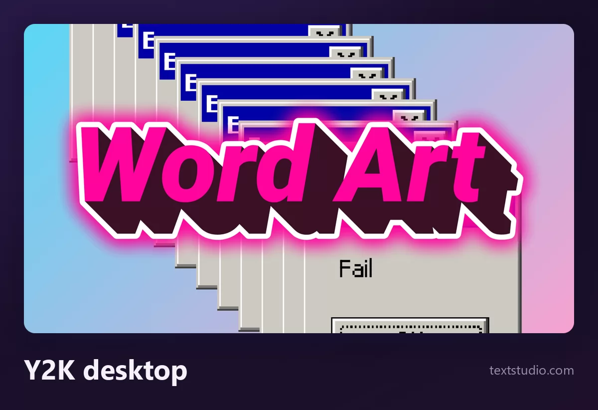
Good for: music covers, playlist art, anything aimed at people under thirty. It dates fast and that is fine, because it is meant to.
8. Neon grid
Chrome-blue letters with a magenta glow, standing on a perspective grid that runs to a horizon. The eighties as remembered by the nineties, and the single most reliable "this looks designed" style on this list.
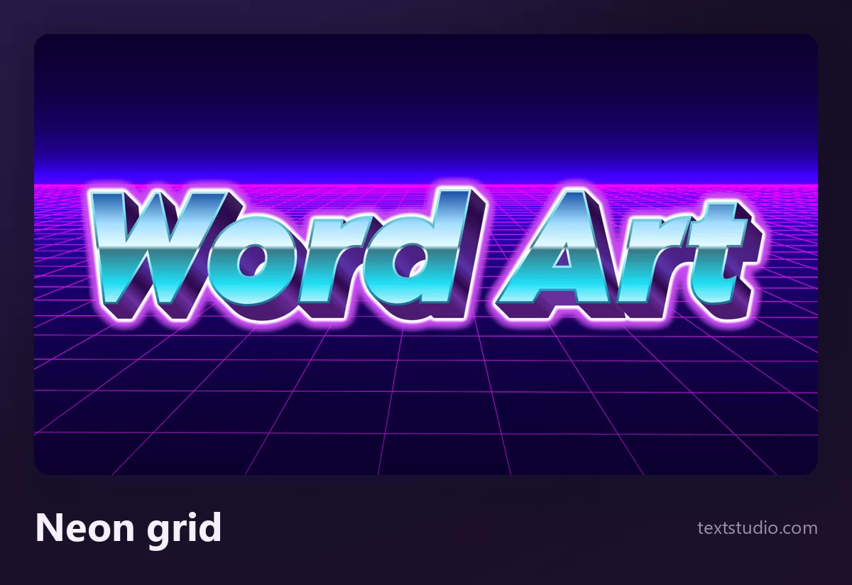
Good for: thumbnails, game overlays, synth and electronic music. The glow does a lot of work at large sizes and almost none at small ones, which brings us to the two things that actually decide whether word art works.
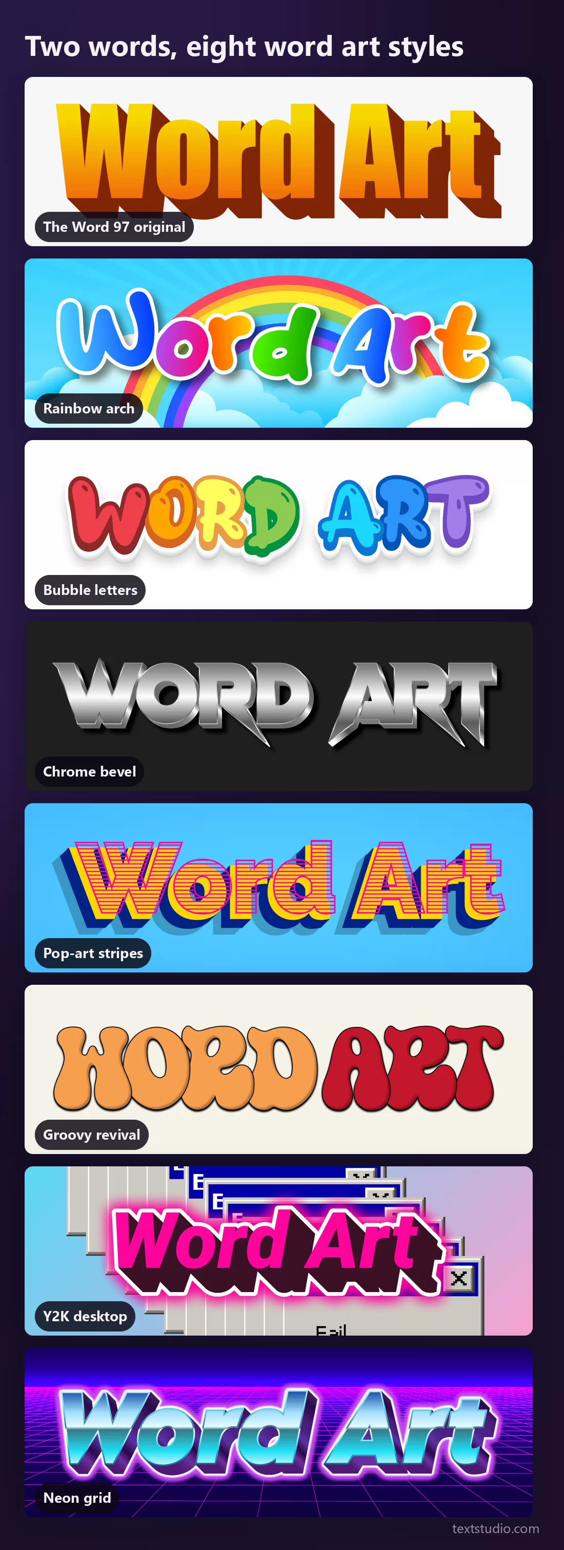
All eight, on the same two words
Same phrase, same size, nothing changed but the style. Seen together, the eight are not variations on a theme; they are eight different decades talking.
Retro on purpose, or just dated?
This is the only genuinely hard question in the whole subject, and no amount of style choice saves you from it.
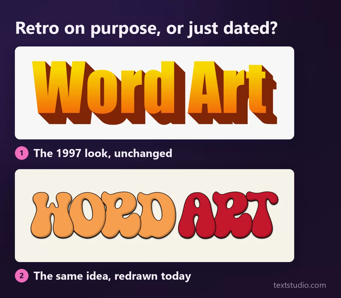
Both of those are retro. Only one of them reads as a choice. The difference is not the decade being referenced, it is whether the drawing is any good by today's standards: the spacing, the outline weight, the colours sitting next to each other. The top one is a faithful reproduction of a preset from 1997, and a faithful reproduction of something mediocre is still mediocre. The bottom one references the seventies and was drawn last year.
The practical rule: reference a period, do not reproduce a default. If your word art looks exactly like a menu everyone had, people read it as "made by someone who did not choose". If it looks like that period redrawn, they read it as taste. The exception is parody, where looking exactly like the default is the entire joke, and then style 1 is the right answer and nothing else will do.
Poster, thumbnail, favicon
The second thing that decides it: word art is decoration, and decoration is the first thing to disappear when the picture gets smaller.
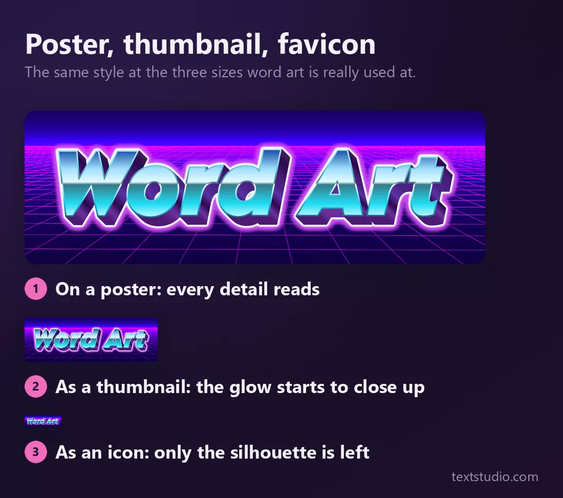
Nothing was zoomed to make that point; each row is the picture at its real size. The glow, the bevel and the stripes all live in a band of a few pixels, so they go first. What is left at the bottom is the silhouette, which is the only part a logo or a favicon can rely on.
So: match the style to the size before you match it to the mood. On a poster, use everything. On a video thumbnail, keep the outline and drop the fine detail. For a profile picture or an icon, use a style whose shape is distinctive, like bubble letters, and not one whose interest is entirely in its surface, like chrome.
Making one, in three steps
- Pick the register, not the font. Decide first whether you are being nostalgic, loud, playful or slick. That single decision rules out six of the eight styles above and the choice becomes easy.
- Type your phrase and keep it short. Word art is for three or four words at most. A whole sentence in a decorated face stops being a picture and becomes something people have to work to read.
- Export at the size you will actually use, then look at it there. Not at full width in a browser tab. Put it on the thumbnail, on the slide, on the shirt, and check that the thing you liked about it survived.
Every style on this page is free to use and needs no account. Open TextStudio to put your own words into any of them.
Questions people ask
Is word art free? Every style shown here is, yes. You type your phrase, pick a style and download the image.
Whatever happened to WordArt in Word? It is still in Microsoft Word, under Insert, but the gallery was redesigned in Office 2007 and the original thirty presets were replaced. The look people remember belongs to Word 97 to 2003, which is why reproducing it now reads as a deliberate reference.
What is the difference between word art and a word cloud? A word cloud arranges many words by frequency into a shape and summarises a text. Word art decorates one short phrase. Different tools, different jobs, unfortunately the same name.
Can I use word art for a logo? For a wordmark, sometimes. Test it at icon size first: if only a coloured smear survives, it is a title, not a logo. Styles with distinctive letter shapes survive that test; styles built on surface detail do not.
What size should I export? Bigger than you need, then scale down. Detail that is not in the file cannot be recovered, and every style here has detail that only exists above a certain size.