
 Mia Hartley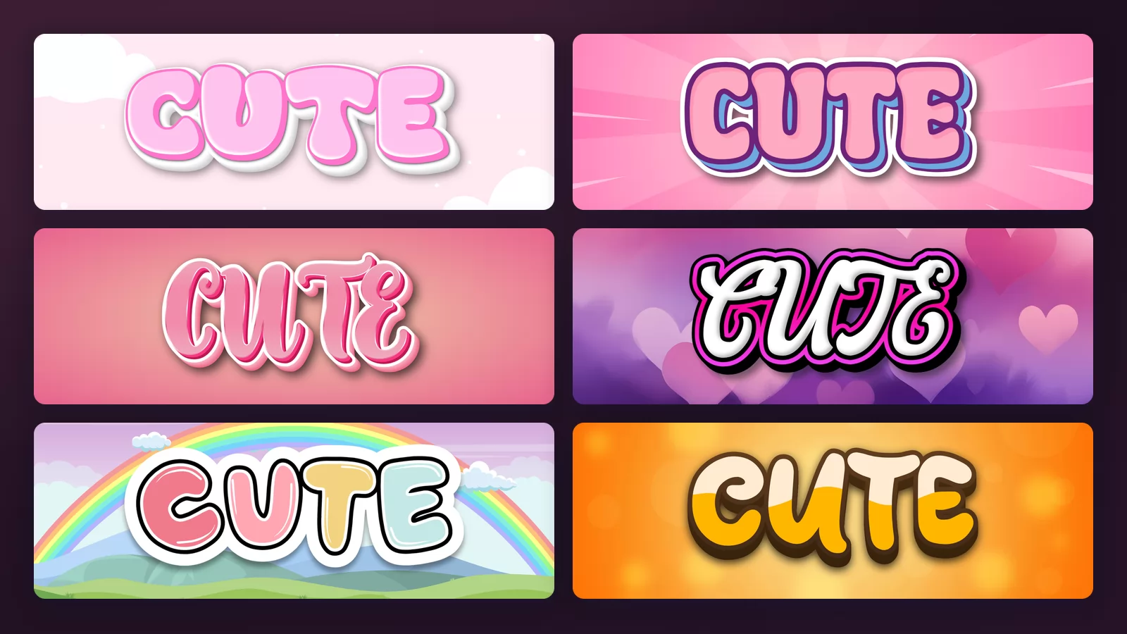
Search for a cute font and you land on two completely different kinds of tool without anyone telling you they are different. One gives you characters you can paste into a bio. The other gives you an image. They solve different problems, and picking the wrong one is why people end up frustrated.
This guide sorts that out first, then answers the question underneath it: what actually makes lettering look cute, rather than merely pink. Every image below is the same word rendered with the cute font generator of TextStudio, so nothing changes between pictures except the style.
Two different things are called a "cute font"
Paste-able text. Tools that swap your letters for unusual Unicode characters, so cute becomes something ornate you can paste into an Instagram bio, a Discord name or a message. It stays selectable text, which is exactly what you want for a username.
The catch: those are not fonts, they are substitute characters. They can show up as empty boxes on other people's devices, screen readers read them as gibberish, and some platforms filter them. We go into when that matters in the guide to cursive fonts and pasted text.
Rendered lettering. Tools that draw your word as an actual designed image, with real letterforms, shadows, outlines and backgrounds. You cannot paste it into a bio field, but you can put it on a thumbnail, a sticker, a poster or a story.
Neither is better. If your text has to live inside a text field, you need the first. If it has to look designed, you need the second, and that is everything on this page.
Kawaii and Western cute are not the same thing
The two words get used interchangeably in English, and they describe genuinely different aesthetics. Kawaii is a specific Japanese visual language; "cute" in the Western sense is broader and louder.
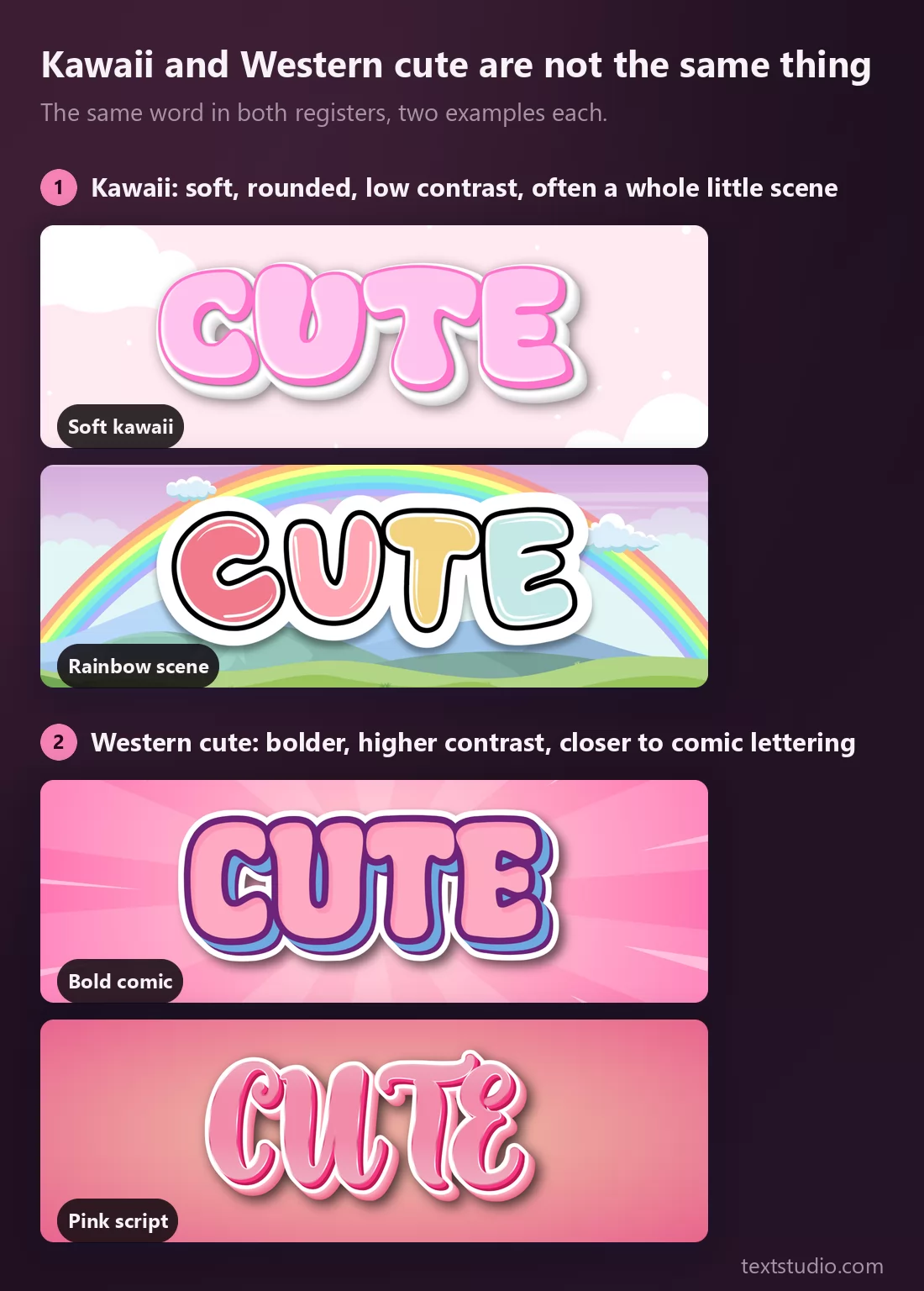
- Kawaii keeps contrast low. Soft pinks and creams, very rounded shapes, thin or absent outlines, and often a whole little world around the word: clouds, a rainbow, a pastel sky. Nothing is sharp and nothing shouts.
- Western cute is closer to comic lettering. Thicker outlines, stronger colour contrast, a shadow or a burst behind the word. It reads as playful and energetic rather than gentle.
Pick the register before the style. A kawaii treatment on a loud, high-energy layout looks weak, and a bold comic word on a soft pastel design looks like it wandered in from somewhere else.
What actually makes lettering look cute
Most people assume it is the colour. It is not. Pastel is the easiest half of the job and it is not the half that does the work.
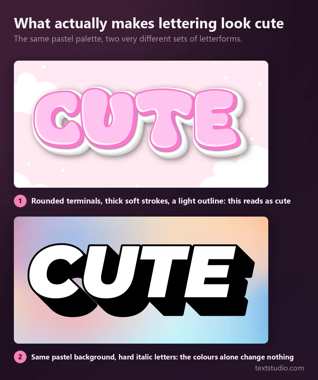
The second sample uses the same pastel range and reads as a sports logo. What changes is the drawing of the letters themselves:
- Rounded terminals. Every stroke ends in a curve, never a point or a sharp cut.
- Thick, soft strokes with little contrast between thick and thin, so nothing feels tense.
- Wide, open shapes. Cute letterforms are short and broad rather than tall and narrow.
- A light outline that separates the word from its background without hardening it.
- No slant. Italic reads as speed, and speed is not cute.
If a style has those five and you make it grey, it will still read as cute. If it lacks them, no amount of pink will save it.
1. Soft kawaii
Pale pink letters, very round, a soft white outline and a cloud background. This is the canonical kawaii treatment and the one most people picture when they use the word.
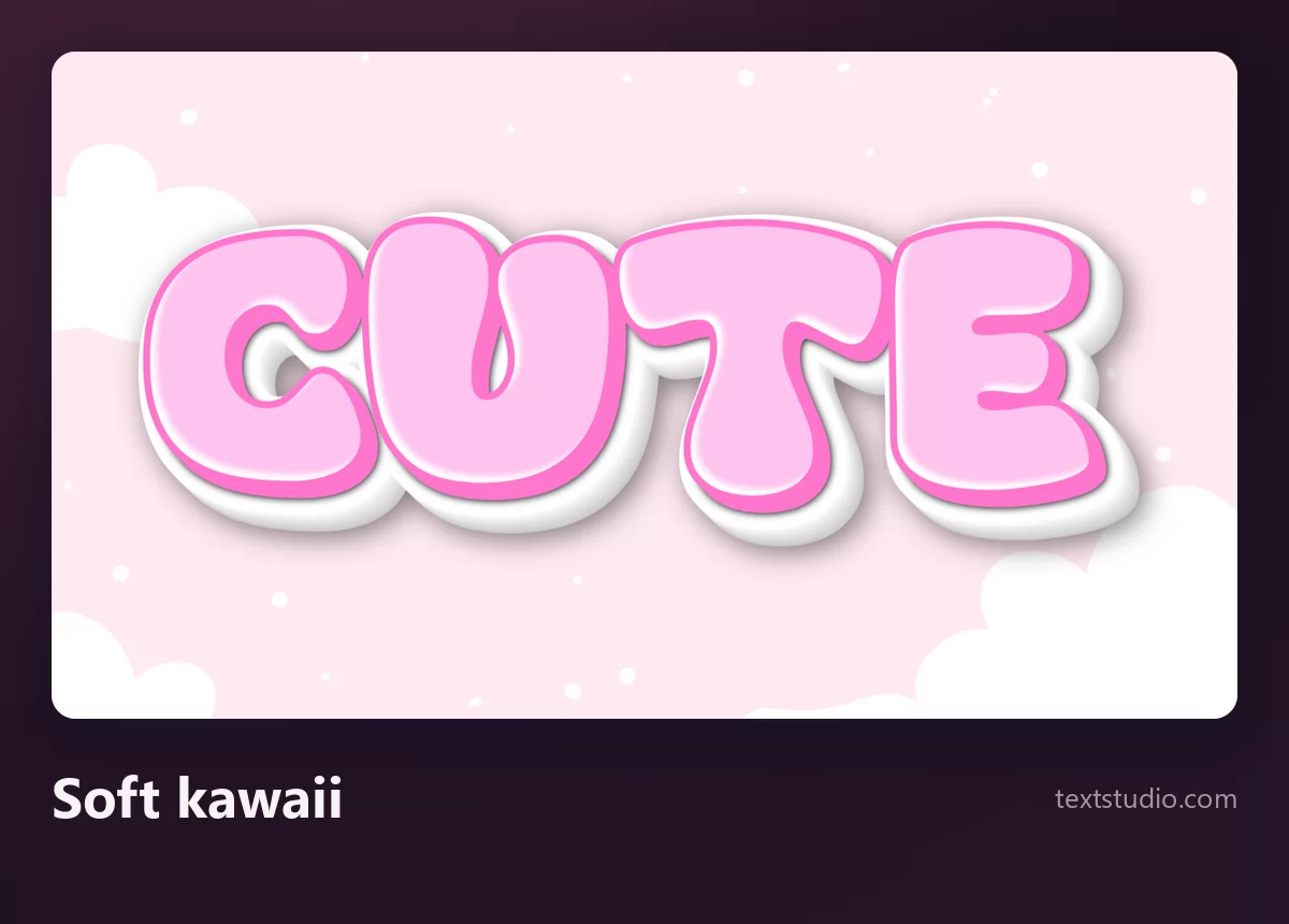
Good for: stationery, plush and craft shops, soft-aesthetic social accounts, anything aimed at a gentle mood.
2. Bold comic
Pink letters with a heavy purple and white outline over a radial burst. Same colour family as the kawaii style, completely different energy: this one is built to be seen at a distance.
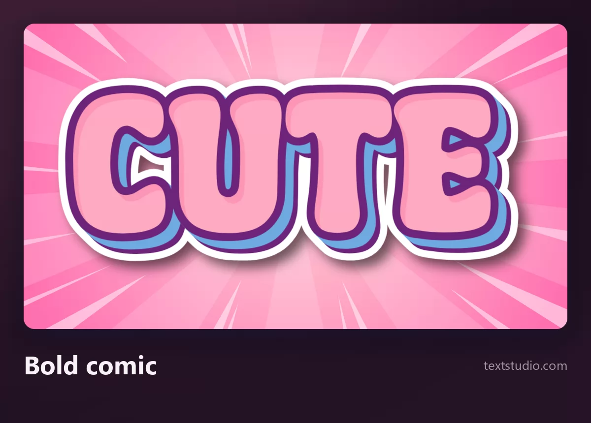
Good for: thumbnails, sale banners, kids' products, anything that needs to survive being small in a busy feed. It is the most legible style on this page.
3. Pink script
A connected script with a three-dimensional pink extrusion. The joins do the softening, so it stays sweet without needing rounded terminals.
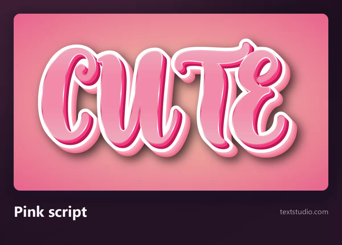
Watch out for length: joined script loses readability faster than separated letters, so keep it to a word or two.
4. Hearts and outline
White script letters with a dark outline over a background of soft hearts. The decoration carries the meaning here, which makes it the most literal style in the list.
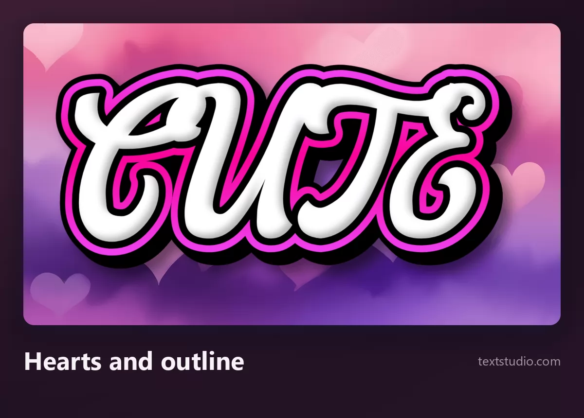
Good for: Valentine's material, wedding and shower graphics, anything romantic rather than childlike.
5. Princess curls
Thin outlined letters that spiral into curls, topped with a small crown. It is the most decorative style here and the least readable, which is a fair trade for a single short word.
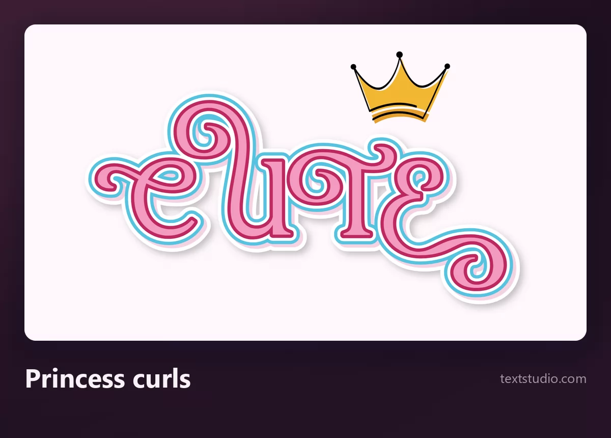
Watch out for size: those curls are hairlines. Keep it large, on a card or a header, never in a line of small text.
6. Warm and rounded
Cream and orange rounded letters with a thick brown outline. It breaks out of the pink default entirely, which is exactly why it is worth having: cute does not have to be pink.
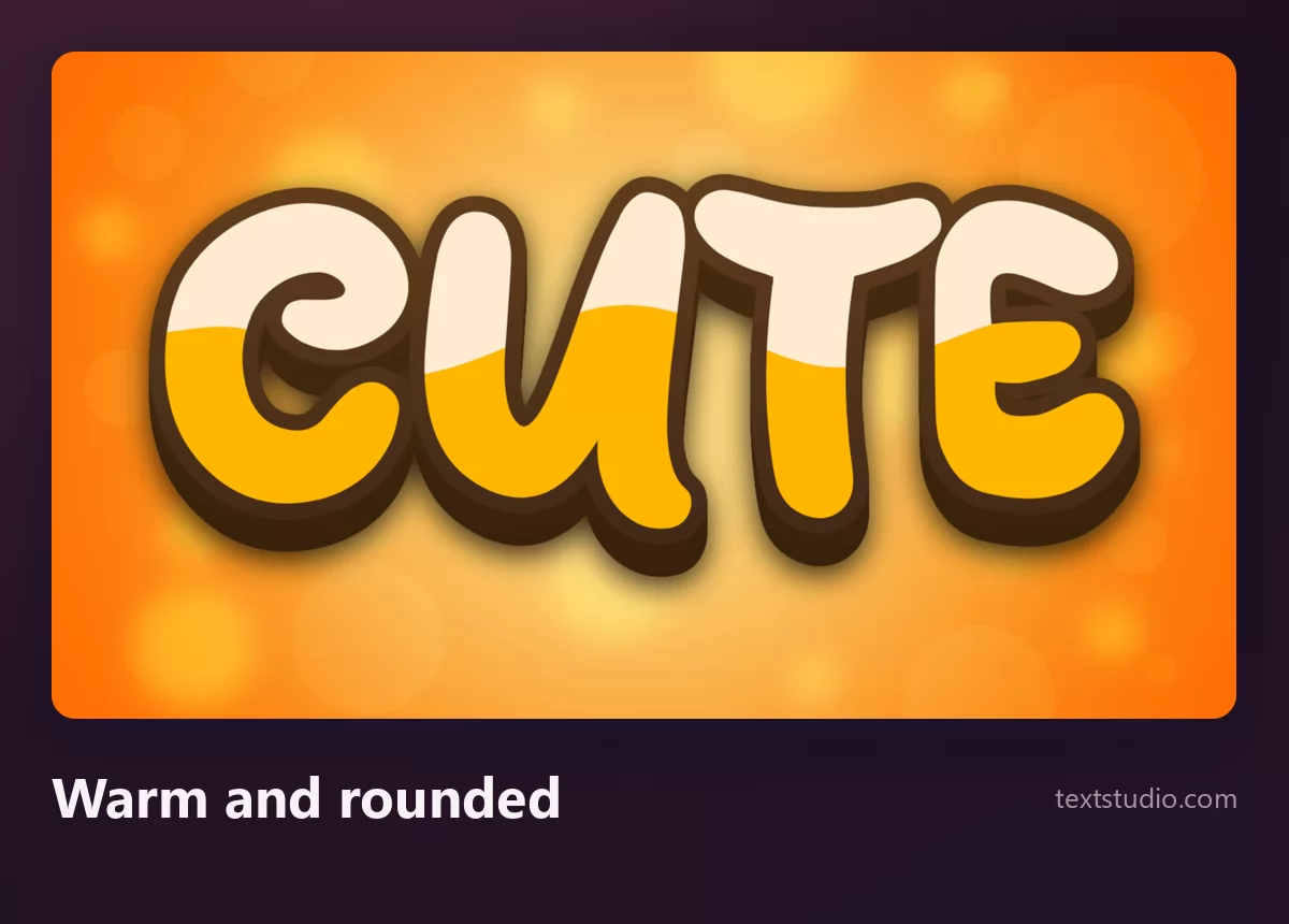
Good for: food and drink, cafés, packaging, children's menus. The heavy outline also means it survives on a photograph.
7. Rainbow scene
Rounded letters, each in a different pastel, with a black outline and a white sticker edge, set on an illustrated rainbow landscape. The background is half the design.
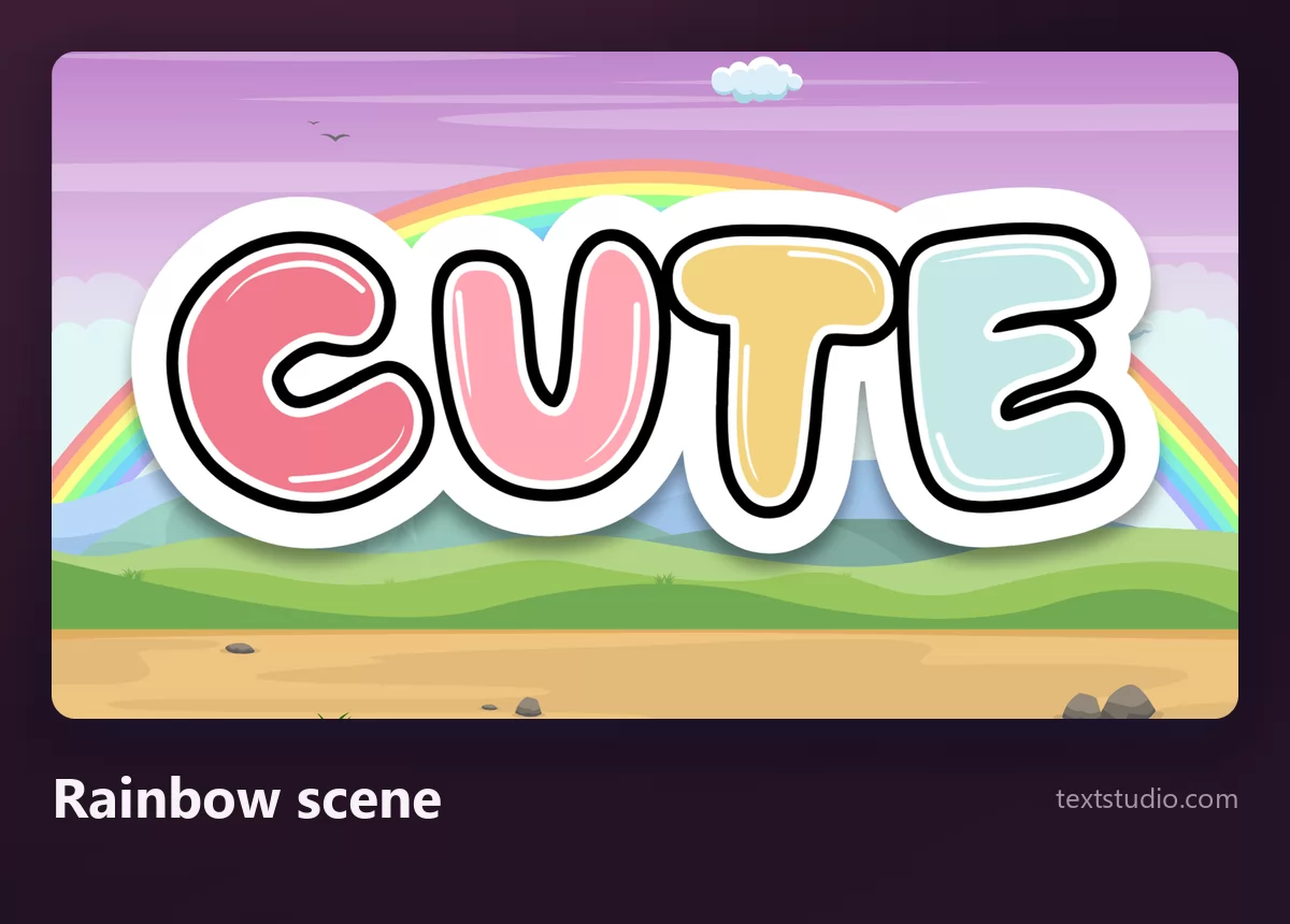
Good for: children's material, classroom displays, party graphics. Because the scene does the work, the word itself stays simple and readable.
8. Delicate handwriting
A thin pink monoline script on cream, barely there. It is the quietest style in this list and the one with the narrowest use.
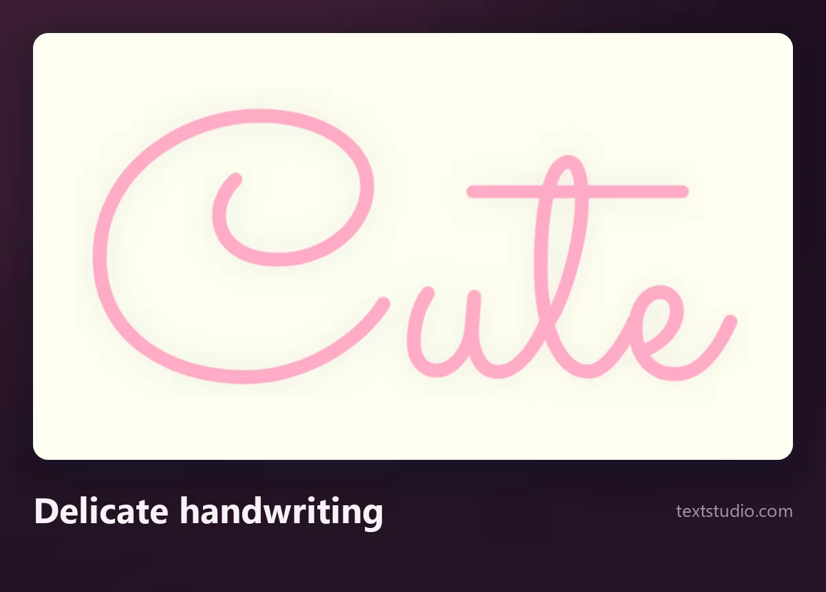
Watch out: hairlines disappear first. This one needs a large size and a plain background, as the size test below shows.
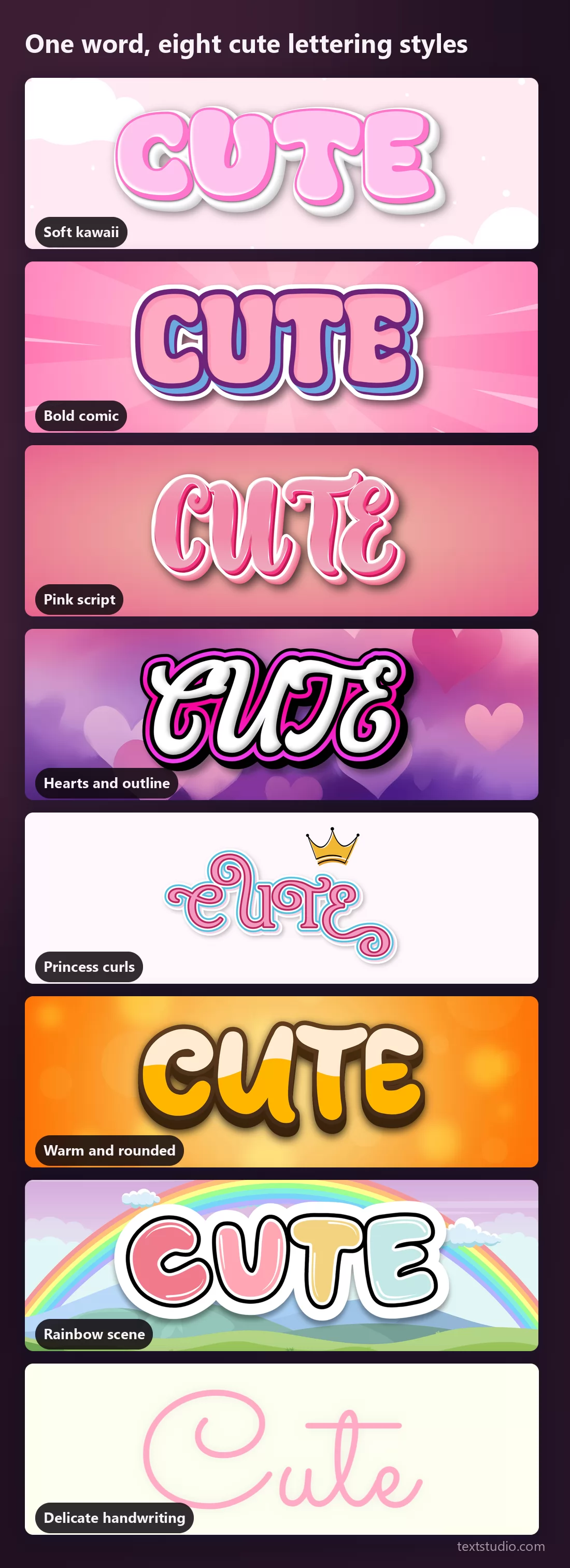
One word, eight styles side by side
Seen together the range is wider than the colour suggests: two styles are scripts, two lean on an illustrated background, and only one leaves the pink family.
What survives at bio size
Cute lettering usually ends up small: a profile picture, a username graphic, a highlight cover, a sticker. Here are two of these styles at roughly that size.
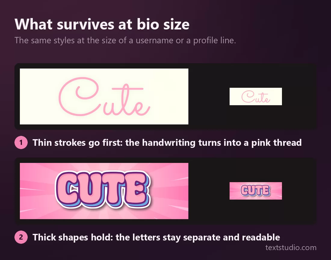
The rule is the same one that decides everything else on this page: shape survives, hairlines do not. Thick rounded letters with an outline stay readable at any size. Thin scripts and fine decoration turn into a smudge.
If your word is going to be small, take it from the bold end of this list and check it at final size before you commit.
How to pick a cute font
- Decide first whether you need text or an image. If it goes in a bio or a username field, you need paste-able characters. If it goes on a graphic, you need lettering. That single question saves the most time.
- Choose the register, kawaii or Western. Soft and low contrast, or bold and outlined. Mixing them in one design is what makes it look unresolved.
- Judge the letterforms, not the palette. Rounded, thick, wide, unslanted. Pastel on the wrong shapes reads as sporty, not sweet.
- Check it at final size. Hairlines and fine decoration go first.
- Cute is not only pink. Cream, mint, butter yellow and warm orange all read as cute, and they stand out in a feed where everything else is pink.
- One decorative element per design. Curls plus hearts plus a rainbow is not three times as cute.
FAQ
What is a cute font?
Any lettering whose shapes read as gentle and friendly: rounded stroke ends, thick soft strokes, wide open letterforms, usually with a light outline. The colour helps but does not do the work, as the comparison above shows.
What is the difference between a cute font and a kawaii font?
Kawaii is a specific Japanese aesthetic: low contrast, very rounded, soft pastels, often a whole illustrated scene around the word. Western cute is bolder, more contrasted and closer to comic lettering. Both are cute; they are not interchangeable.
How do I get cute fonts in my Instagram bio?
You need paste-able characters rather than lettering, because a bio field only accepts text. Those tools swap your letters for Unicode look-alikes, which can appear as empty boxes for some readers. The trade-off is explained in our guide to cursive fonts and pasted text.
What is the best cute font for a logo?
A bold, rounded, outlined one rather than a thin script. A logo has to work small, in one colour and on backgrounds you do not control, and only the thick shape-based styles manage all three. The same reasoning applies across logo lettering styles.
Can cute fonts be used for something other than children's designs?
Yes, and that is mostly a matter of restraint. A single rounded lettering style with a muted palette and no decoration reads as warm and approachable rather than childish. It is the accumulation of curls, hearts and rainbows that pushes it towards the nursery.
What colours work for cute lettering?
Pastel pink is the default and therefore the most crowded. Cream, mint, butter yellow, lilac and warm orange all read as cute while standing out. There is more on picking those in the coloured text effects guide.
Make your own
Type your word, pick the register first, then check it at the size you will actually use. If you want the rounded shapes without the pastel, the bubble lettering guide covers the same letterforms in louder colours. Open the TextStudio cute font generator and see your word in it.