
 Mia Hartley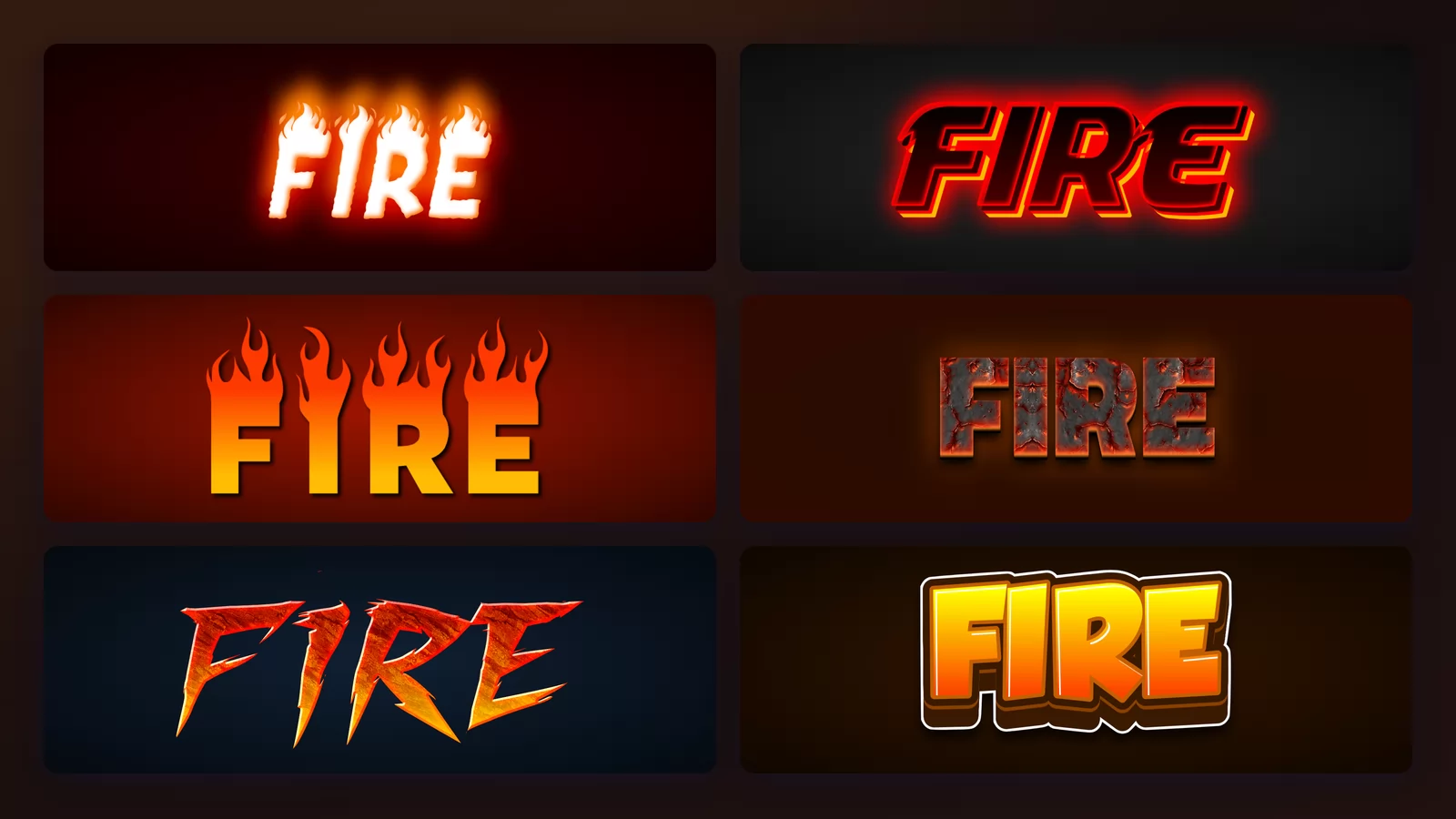
Look up any fire font and you will find the same picture: glowing orange letters on a black square. Every gallery, every generator preview, every Pinterest board. It looks like a style choice.
It is not. It is a constraint that nobody mentions, and the moment you put that lettering on your own page, on a white slide or a light-coloured poster, half of these effects fall apart. This guide starts there, because it is the thing that decides whether a fire font will work for you, and then walks through eight styles on the same word with the fire font generator of TextStudio, so nothing changes between images except the style.
The rule: it is the letters, not the fire
The obvious explanation is that fire is light, so it needs darkness. That turns out to be wrong. Cut the background away from eight fire effects and drop each one onto black and then onto white, and seven of the eight survive.
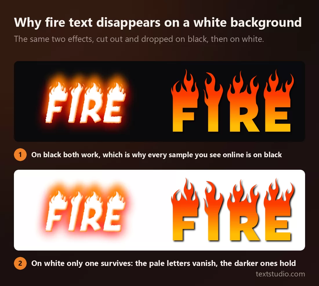
The one that failed did so for a plain reason: its letters are white. The flames are still there on the white background, but the letterforms they sit on have nothing left to contrast against, and the word survives only as an orange fringe.
So the rule is not "fire needs a dark background". It is this: the letters have to be darker than the page. Fire effects come in two kinds, and only one of them cares.
- Pale letters lit by fire. White or cream letterforms, glow doing the work. Spectacular on black, unusable on white.
- Saturated letters made of fire. Orange, red or gradient-filled letterforms, often with their own outline. These work anywhere, and they are the ones to pick when you do not control the background.
Check which kind you have before you commit to it, not after you have placed it on a light page.
1. Real flames
White letterforms with actual flame shapes licking up over the top and a warm halo around everything. It is the most convincing fire on this list, and the one that behaves exactly as described above.
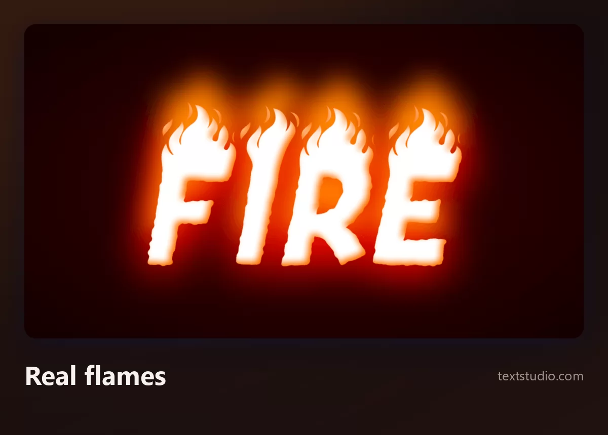
Good for: dark posters, gaming thumbnails, video intros, anything where you own the background and it is dark. Do not put it on a light page.
2. Burning glow
Dark letters with a hard red-orange rim and a glow bleeding outward, closer to hot metal than to open flame. Because the letterforms themselves are dark, this one keeps working on a pale background, where the glow simply reads as a halo.
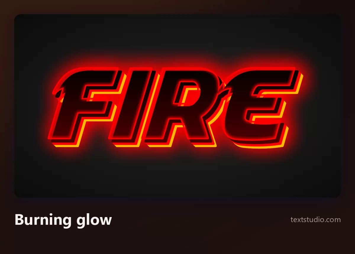
Good for: titles, logos, anything that needs to look hot without looking like a bonfire. It is also the most legible style here, since the letters keep their full shape.
3. Outlined heat
Solid orange letters with a bright yellow outline and a soft glow behind. There are no flames at all: the heat is carried entirely by colour and by the rim light.
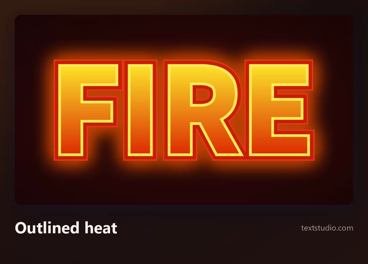
Good for: headings, sports and esports graphics, sale banners. The outline is what makes it survive being placed on a photograph.
4. Flame tips
Solid gradient letters with flame shapes drawn rising from the top of each one. The flames are graphic shapes rather than light, which is why this style is completely indifferent to its background.
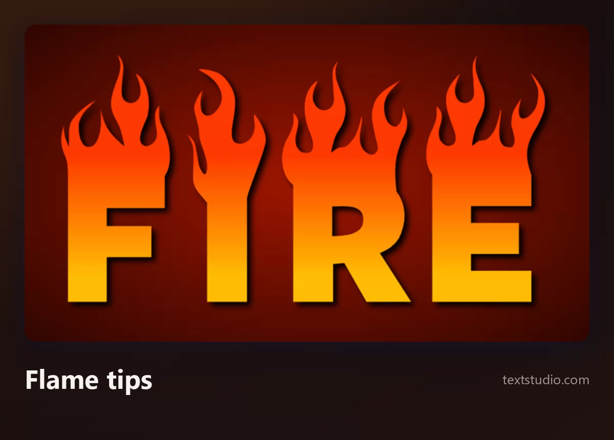
Good for: t-shirts, stickers, print, anything going onto a surface whose colour you do not control. It is the safest choice on this page.
5. Ember texture
Letters filled with a photographic burning texture: embers, sparks and dark charring inside the letterform itself, with a heavy shadow underneath.
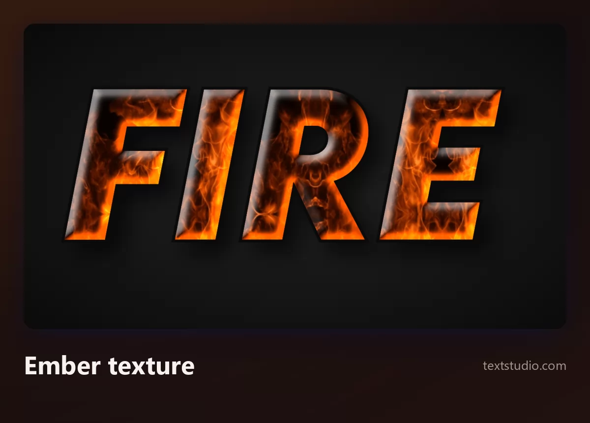
Watch out for size: the texture is the whole effect, and texture is the first thing to disappear when a word gets small. Keep this one large.
6. Cracked lava
Charred grey-black letters split by fissures with molten orange glowing out of them. It reads as heat rather than as flame, and it is the darkest style here.
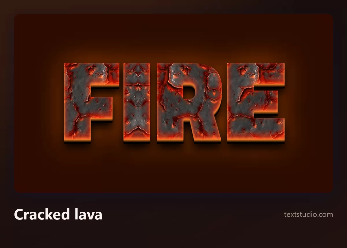
Good for: game titles, metal and rock artwork, anything volcanic. The dark letterforms mean it holds up on light backgrounds too, which is unusual for something this dramatic.
7. Slashed and jagged
Letters torn into sharp shards with fire showing through the gaps, leaning forward. This is the heroic fantasy register: dungeon crawlers, boss fights, tournament posters.
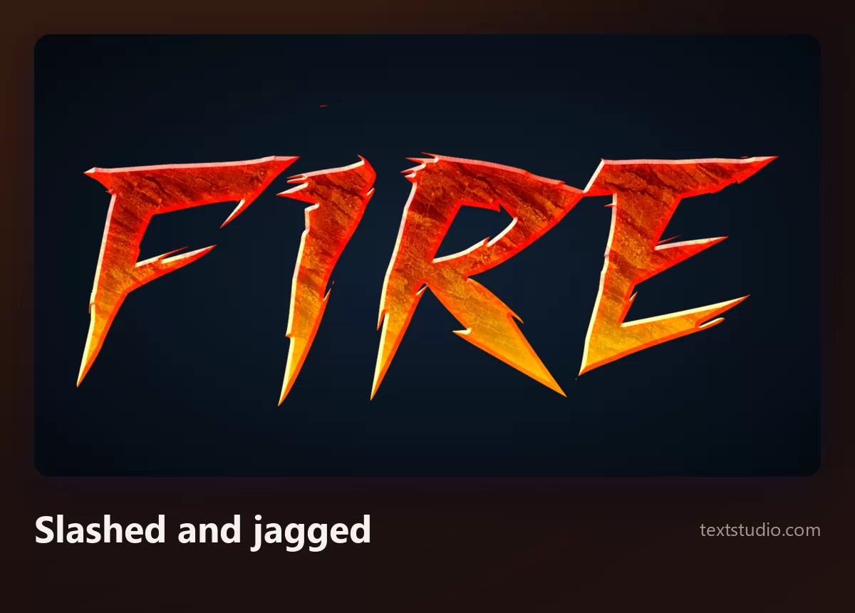
Watch out for readability: the shards eat into the letter shapes, so give it one word and plenty of room. If you like this level of aggression, the same question comes up across graffiti lettering styles.
8. Friendly cartoon
A warm orange gradient inside a thick brown and white outline, with a chunky 3D base. There is no fire in it at all, and that is the point: it is the style you use when you want heat without menace.
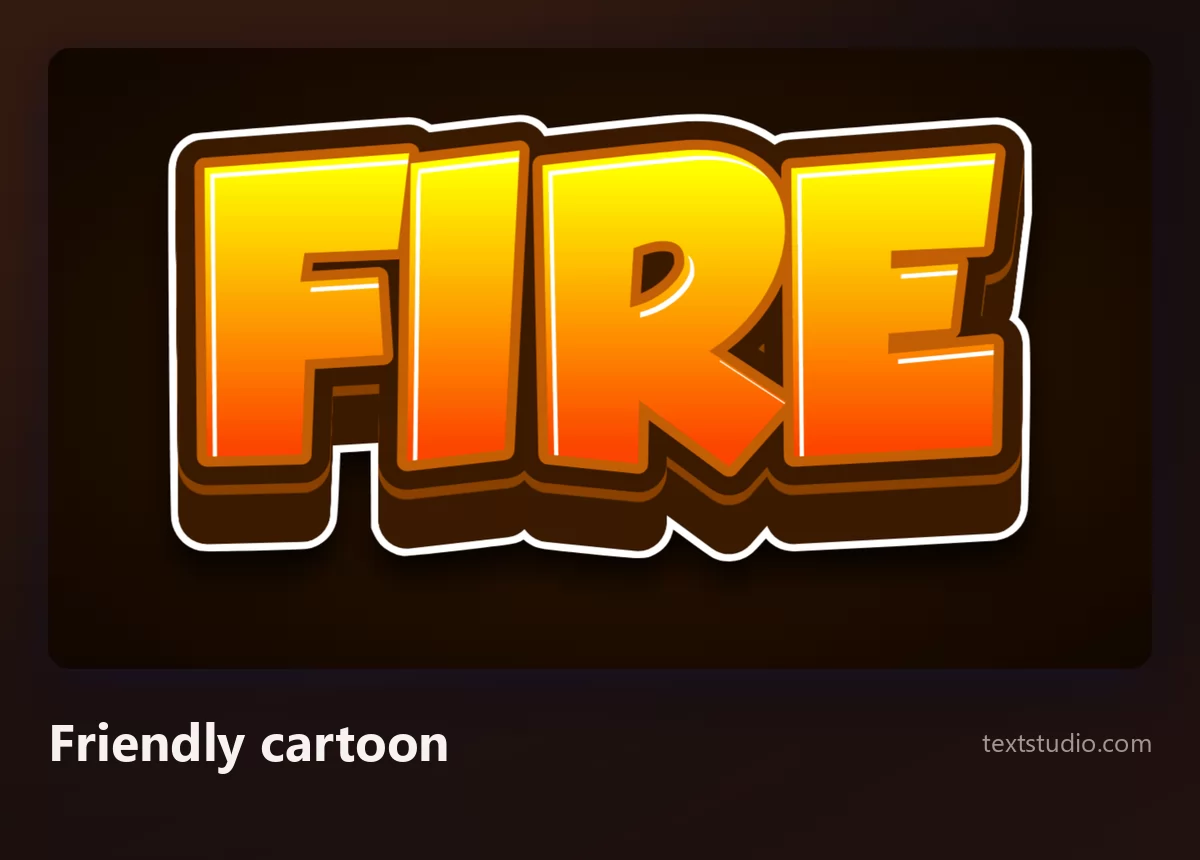
Good for: children's material, mobile games, food and spice packaging, anything aimed at an audience that should not feel threatened.
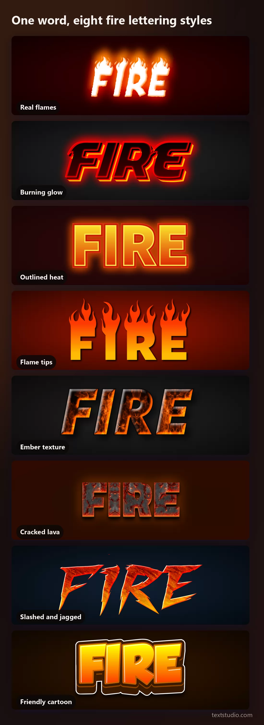
One word, eight styles side by side
Together the split becomes visible: two styles are built from light, four from saturated colour, and two from texture. The texture ones are the most spectacular and the least robust.
What is left at small size
The second thing nobody checks. A fire font is chosen from a large preview and then used as an avatar, a favicon, a badge in the corner of a video. Here is the same lettering at both sizes.
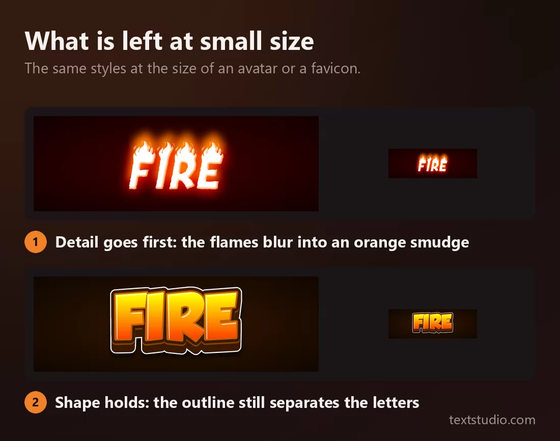
The pattern matches the background rule. Styles whose character lives in shape survive; styles whose character lives in light or texture do not. Flames become a haze, embers become a smear, and an outlined letterform stays a letterform.
If your word is going to end up small, pick from the outlined and gradient styles and check it at final size before you commit.
Fire, neon and fireworks are not the same effect
These three get used interchangeably and they are not remotely the same thing. The difference is a matter of where the light is, and once you have seen it you cannot unsee it.
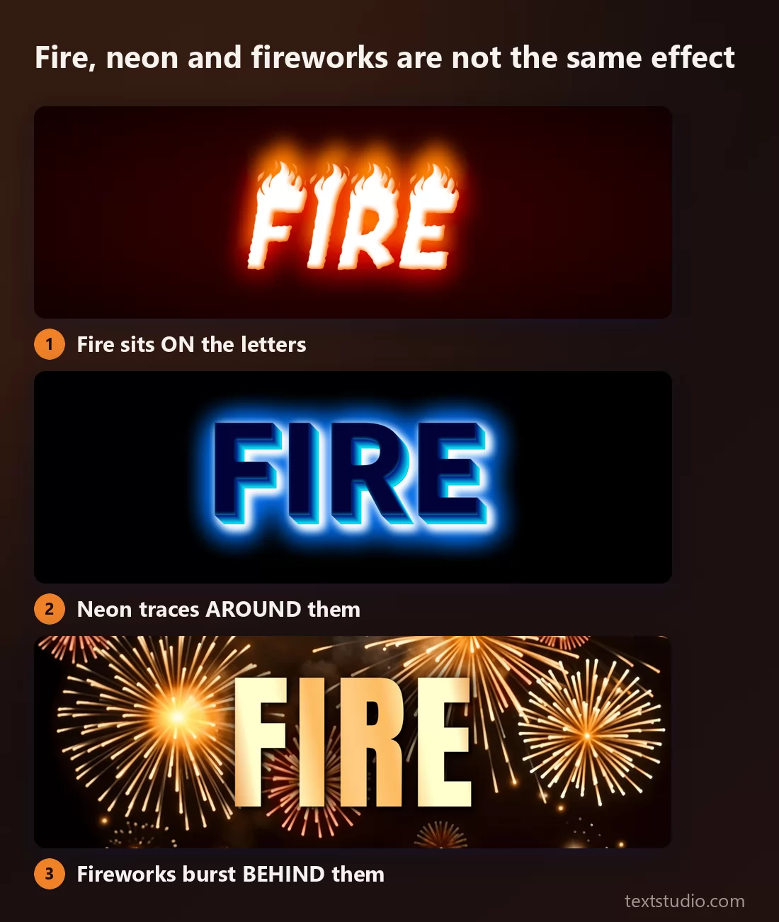
- Fire sits on the letters. It is warm, irregular, and it moves upward. The letterform gets partly eaten by it.
- Neon traces around them. It is even, cool and continuous, following the outline like a tube. Nothing is consumed. The full range is in the neon lettering guide.
- Fireworks burst behind them. The letters stay completely plain and the drama is all background. That is covered in the fireworks text guide.
If someone asks you for "fire text" and shows you a neon reference, this is the conversation to have before you start.
How to pick a fire font
- Decide your background first. If it will not always be dark, rule out every style with pale letterforms. This single question eliminates half the options.
- Count your words. Fire eats into letter shapes, so a single word takes anything while a phrase needs the outlined or cartoon styles.
- Check it at final size, not preview size. Texture and flames go first; outlines survive.
- One hot element per design. Fire lettering plus a fire background plus a glow on the details is how a poster becomes unreadable.
- Orange and red is not compulsory. Blue fire reads as heat just as fast and stands out in a feed where everything else is orange.
- Leave room above the line. Flames rise, so they need vertical space that a normal font does not, and two lines of flaming text will collide.
FAQ
What is a fire font?
A typeface or text effect that makes letters look like they are burning. Some are fonts whose letterforms are shaped like flames; most are effects layered onto an ordinary typeface, adding glow, flame shapes or a burning texture.
Why does my fire text look bad on a white background?
Almost always because the effect uses pale letterforms and relies on a dark background for contrast. Switch to a style whose letters are saturated orange or red with their own outline, and it will work on any colour.
What is the best fire font for a logo?
An outlined or gradient style rather than a flame or texture one. A logo has to survive being small, being printed in one colour, and sitting on backgrounds you do not control, and only the shape-based styles do all three.
Is a fire font the same as a neon font?
No. Fire sits on top of the letters and consumes their shape; neon traces an even tube around the outline and leaves the letterform intact. They read completely differently, as the comparison above shows.
Can I paste fire text into Instagram or a message?
Not as a font. The copy-paste tools that claim to do this swap your letters for unusual Unicode characters, which look nothing like fire and can show up as empty boxes on other people's devices. A fire effect is an image, so you export it and post it as one.
What colour should fire text be?
Orange to yellow is the default because it reads as fire instantly. Red alone reads as heat rather than flame, and blue or green fire reads as supernatural, which is useful precisely because it is unexpected. More on choosing here in the coloured text effects guide.
Make your own
Type your word, pick a style, then do the two checks that this article is about: put it on the background you will actually use, and shrink it to the size you will actually use. If it survives both, you have the right one. Open the TextStudio fire generator and set your word alight.