
 Mia Hartley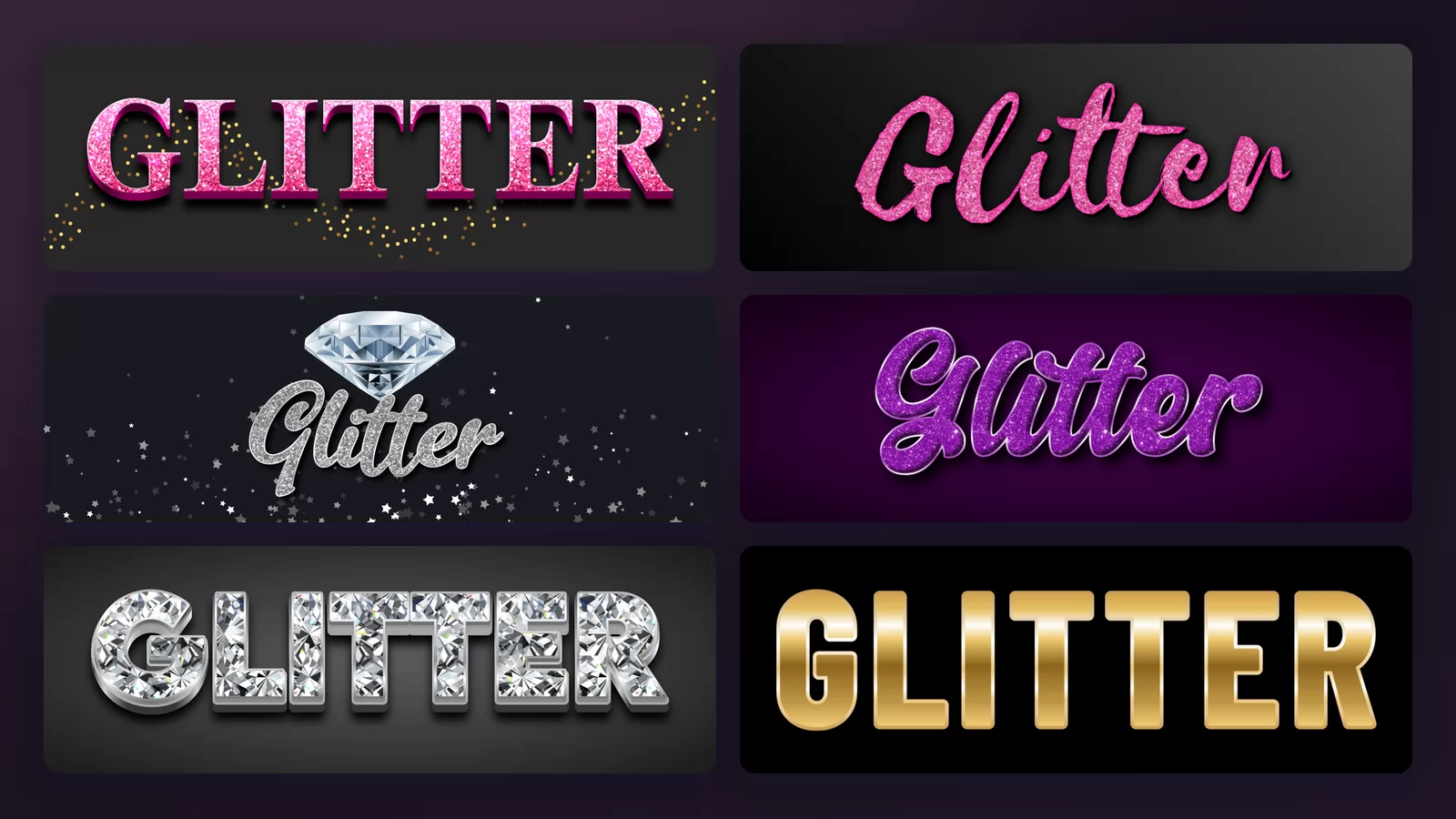
Pick a glitter effect from a gallery and you are looking at a photograph: letters, a background, and a lot of sparkle. What you cannot tell from that picture is which part of it you are actually getting.
A good half of what gets sold as a glitter font puts the sparkle behind the letters rather than in them. In the preview it looks spectacular. On your own layout, where the backdrop is your photo or your brand colour, the letters turn out to be flat. This guide starts with how to spot that in two seconds, then goes through eight styles on the same word with the glitter font generator of TextStudio.
Look at where the glitter actually is
Here are two samples that both read as "glitter" at a glance. Underneath each one is the same effect with its background removed and dropped on a plain colour.
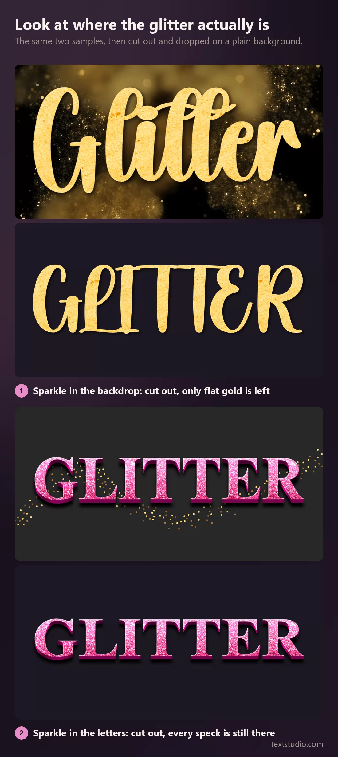
The gold one was a gold cloud with plain letters on top. Take the cloud away and there is nothing sparkling left. The pink one carries its glitter inside the letterforms, so it survives being moved anywhere.
How to check before you commit: look at the letters alone, not the picture. Zoom in on a single stroke. If you can see individual grains inside it, the glitter is in the type. If the stroke is a smooth gradient and all the sparkle sits around the word, you are buying a background.
Neither is wrong. A sparkling backdrop is a fine thing to use when you control the whole image, on a New Year post or a party invitation. It is the wrong thing to buy when you need lettering to drop onto something else.
Glitter, shine and gemstone are not the same material
The second confusion, and it explains why people end up disappointed with a "glitter" font that has no glitter in it at all.
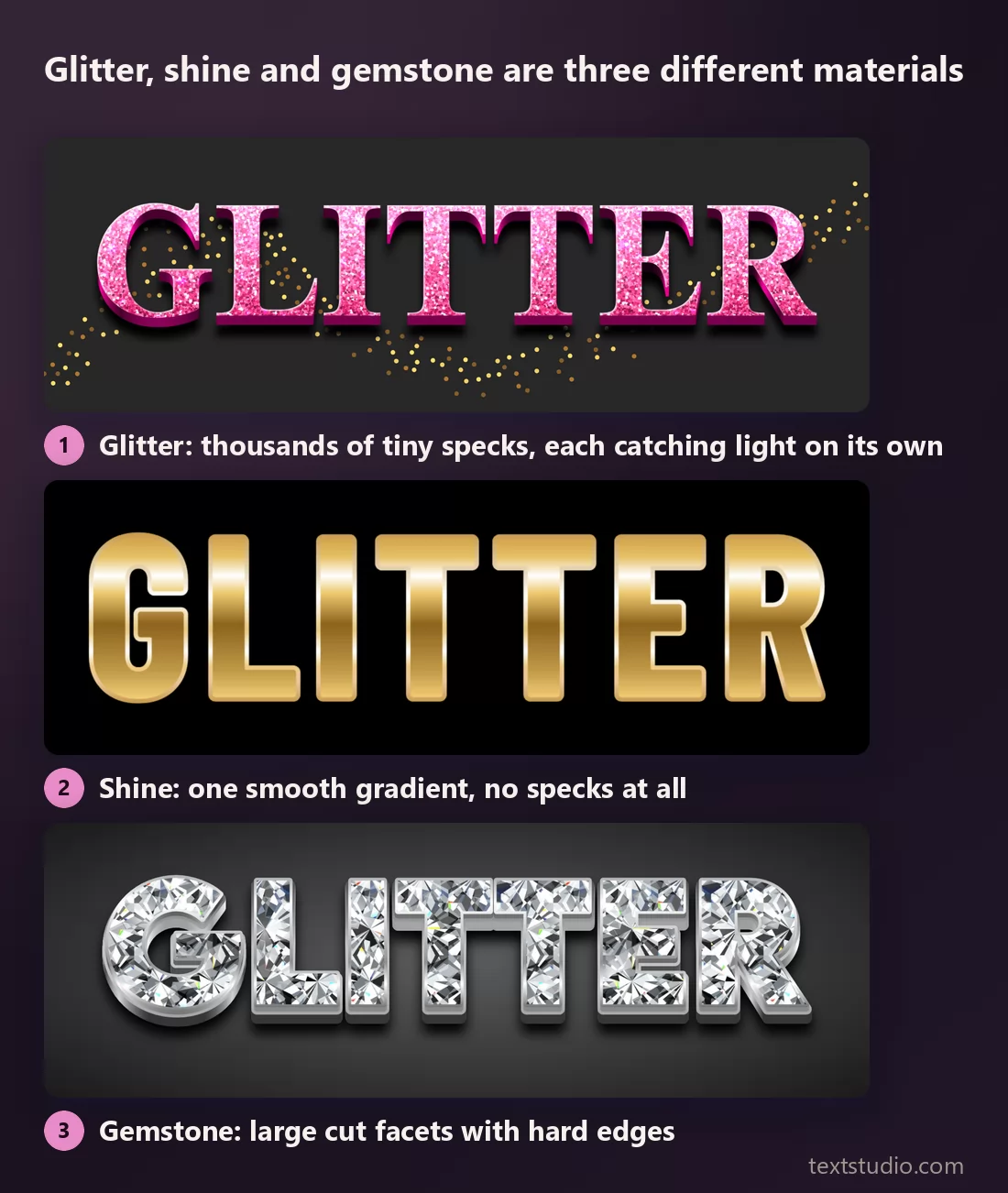
- Glitter is thousands of tiny specks, each one catching light at its own angle. It has a visible grain. Up close it is almost noisy.
- Shine is one smooth gradient running across the letter, usually gold. No grain at all. It reads as metal, not as sparkle.
- Gemstone is a small number of large, hard-edged facets. It reads as jewellery, and it needs thick letters to have room for the facets.
Most searches for "glitter" are looking for the first. Most of what turns up first is the second, because a smooth gradient is far easier to make and survives small sizes better. If a sample looks glittery but you cannot see any grain, it is shine.
Glitter is a fill, not a typeface
This is the part that makes choosing much easier. Glitter is a material applied to a shape. The shape is a separate decision, and it is the one that decides how the word feels.
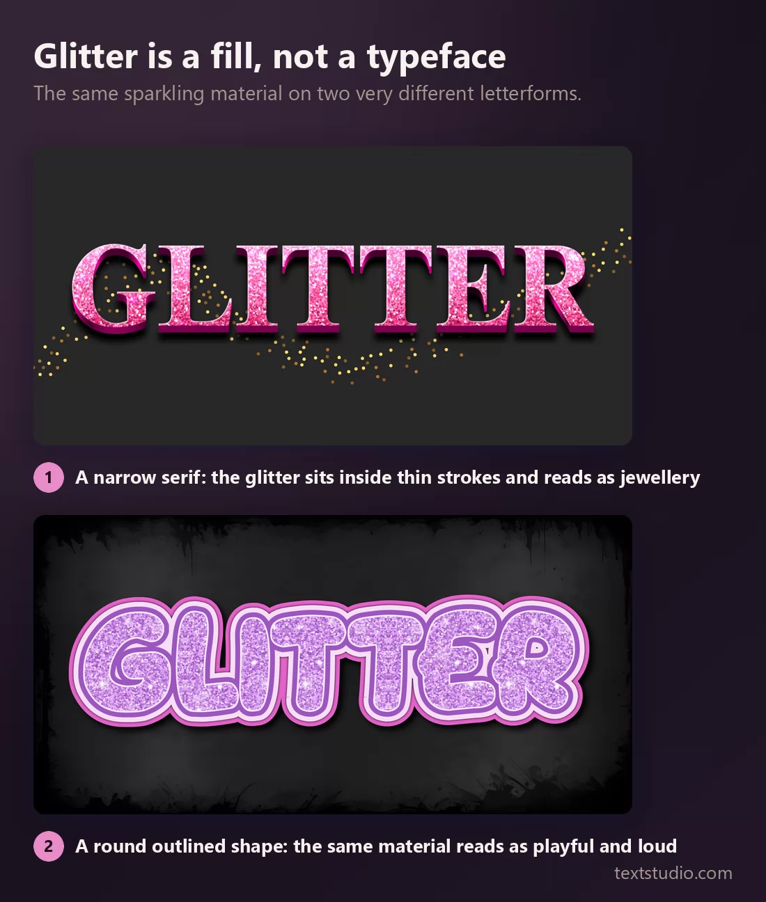
Same speckles, completely different registers. So pick the letterform first, the way you would for any other job, and treat the sparkle as the finish. It also tells you what will not work: a hairline script has no room for grains, so glitter inside it turns into a grey smear.
Still or animated? They are two different products
Search for "glitter font" and you get images. Search for "glitter text" and half the results are animations, because for twenty years glitter text meant a sparkling graphic that moves, the kind that went in forum signatures and profile pages. It is still what a lot of people want.
Both exist and they are not interchangeable:
- A still image is what you need for a print job, a thumbnail, a logo, anything that will be flattened. Everything on this page is a still.
- An animation is what you need for a story, a video intro, a profile banner on a platform that plays them. TextStudio's most downloaded glitter effect is in fact an animated one: the animated gold glitter text effect has more downloads than any still glitter style on the site.
Decide which one before you start, because an animation exported as a still loses the only thing that made it interesting.
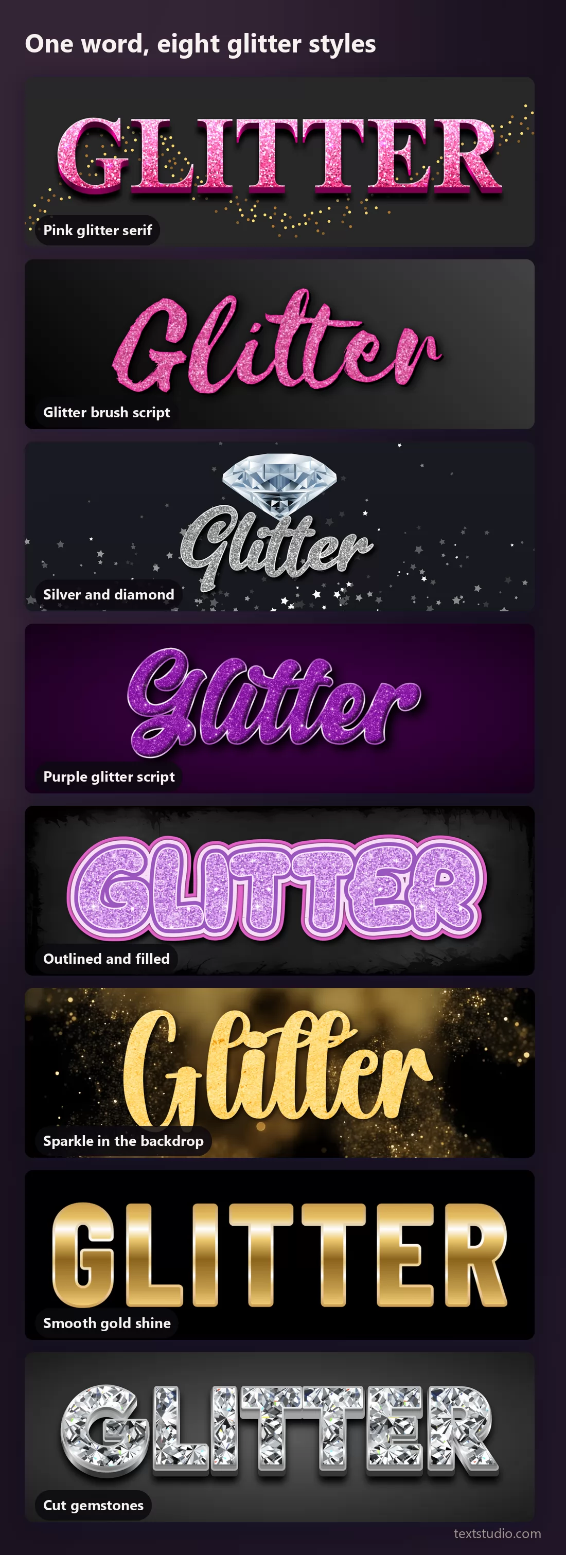
1. Pink glitter serif
A narrow serif filled with dense pink grain, with a scatter of gold specks thrown around the word. This is the reference glitter treatment: the sparkle is entirely inside the letters.
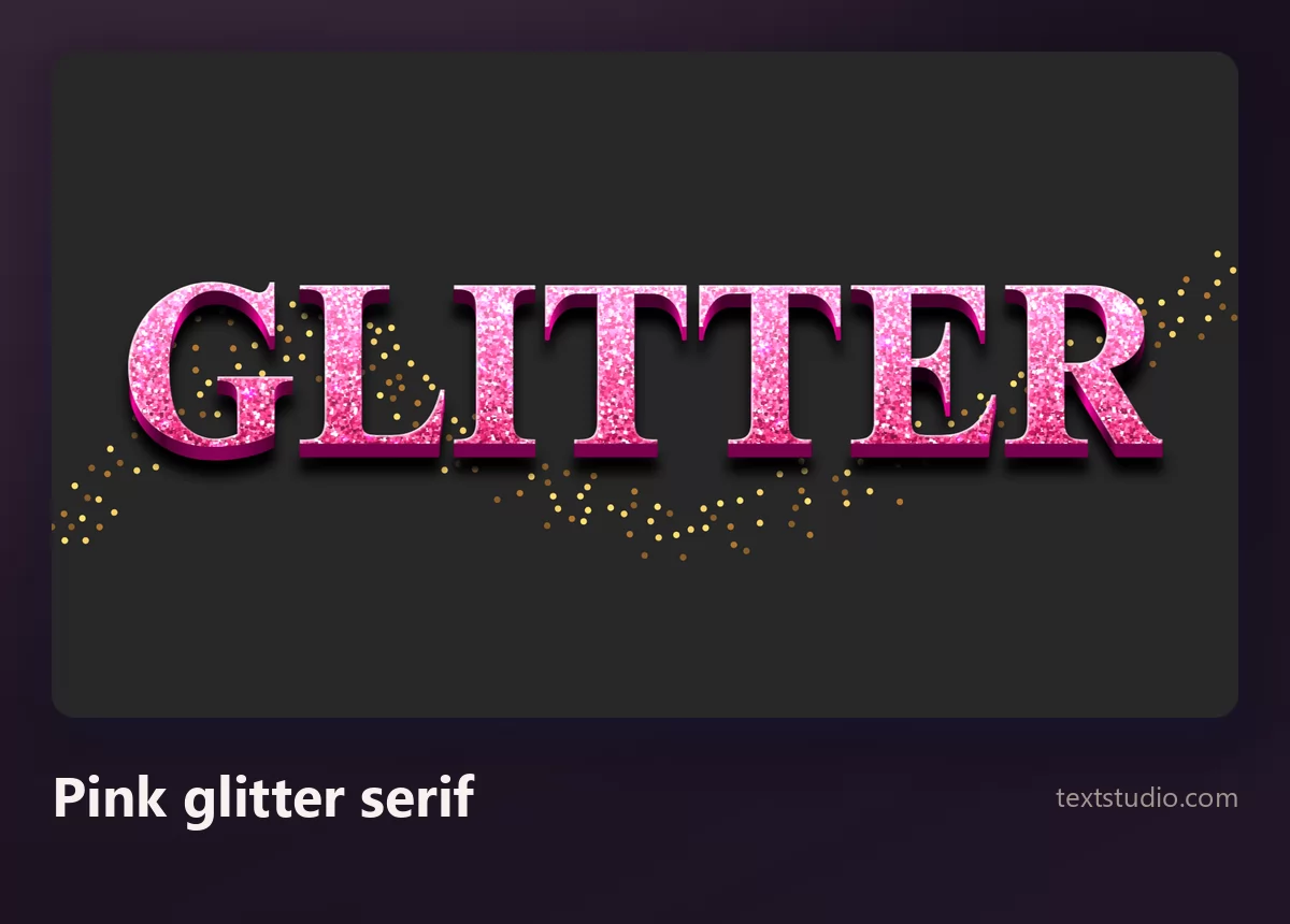
Good for: birthday and party graphics, beauty and nail-salon material, anything aimed at a young audience. The serif shape keeps it from looking childish.
2. Glitter brush script
The same kind of pink grain on a fast brush script. The strokes are thicker and more irregular, so the grain has more room and reads more clearly than in a formal script.
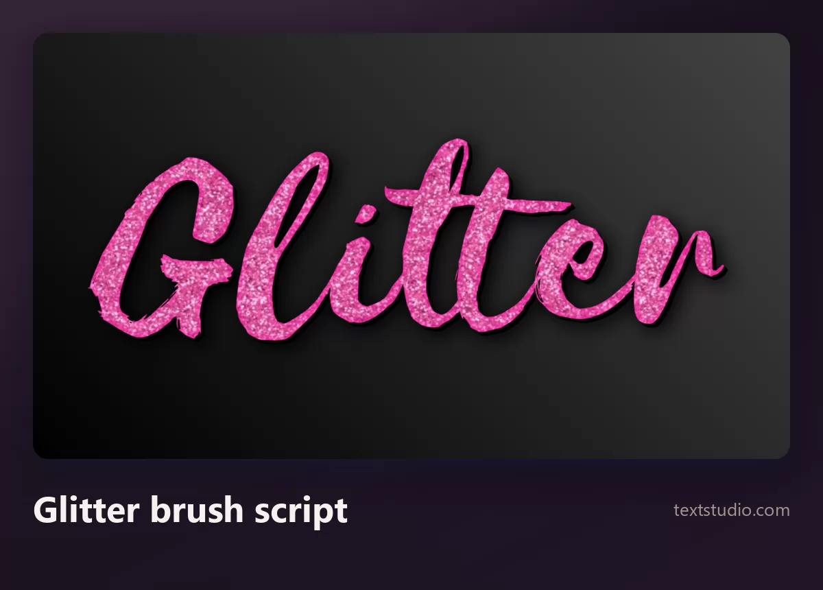
Watch out for length: a brush script joins its letters, so it loses readability faster than separated ones. Keep it to a word or two.
3. Silver and diamond
Silver grain with a cut diamond sitting above the word and small stars scattered behind. Cooler and more formal than the pink versions.
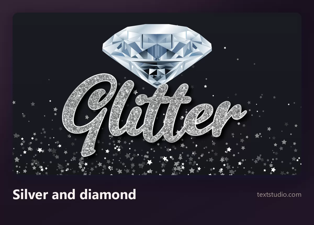
Good for: engagement and wedding material, winter and New Year graphics, jewellery. Silver glitter also sits better next to a photograph than gold, which tends to fight with skin tones.
4. Purple glitter script
A flowing script in purple grain with a lighter outline. Purple is the least crowded of the glitter colours, which is a real advantage in a feed where everything else is pink or gold.
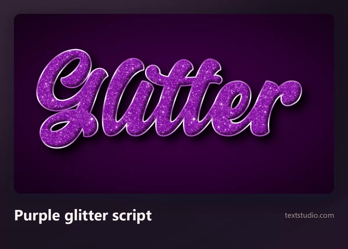
Good for: music and nightlife, beauty, anything that wants to look glittery without looking like a children's party.
5. Outlined and filled
Round bubble letterforms with a heavy outline and glitter poured inside. The outline does the readability work, which frees the fill to be as busy as it likes.
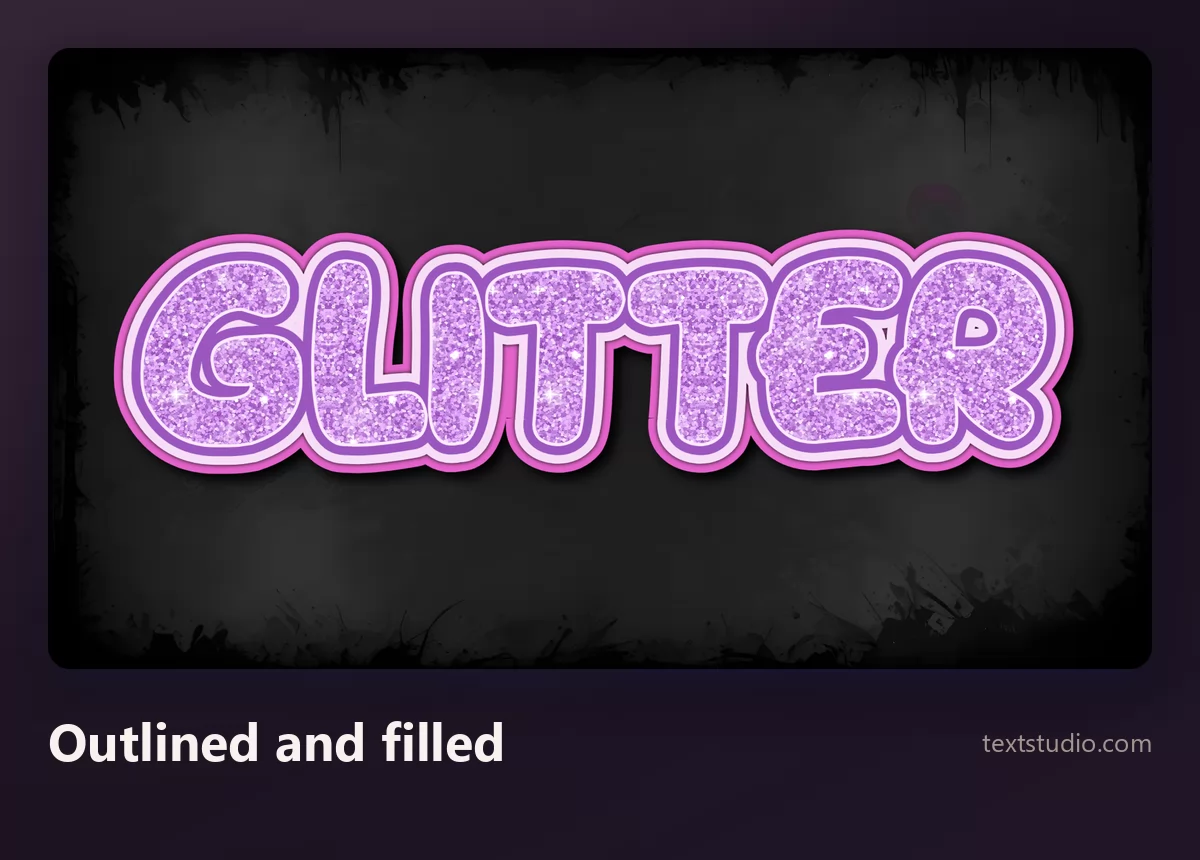
Good for: thumbnails, stickers, anything that has to survive being small or sitting on a busy background. It is the most robust style on this page.
6. Sparkle in the backdrop
Smooth gold letters on a cloud of golden dust. This is the style from the comparison at the top: gorgeous as a finished image, and empty once you cut the letters out.
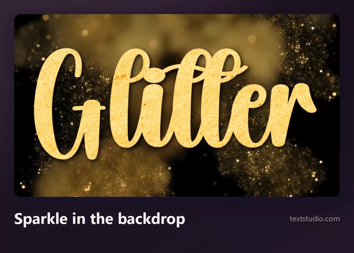
Use it as a whole image and it is excellent. Just do not choose it expecting glittery letters.
7. Smooth gold shine
A bold sans with a polished gold gradient, no grain anywhere. This is the look most people actually get when they search for glitter, and for a lot of jobs it is the better choice.
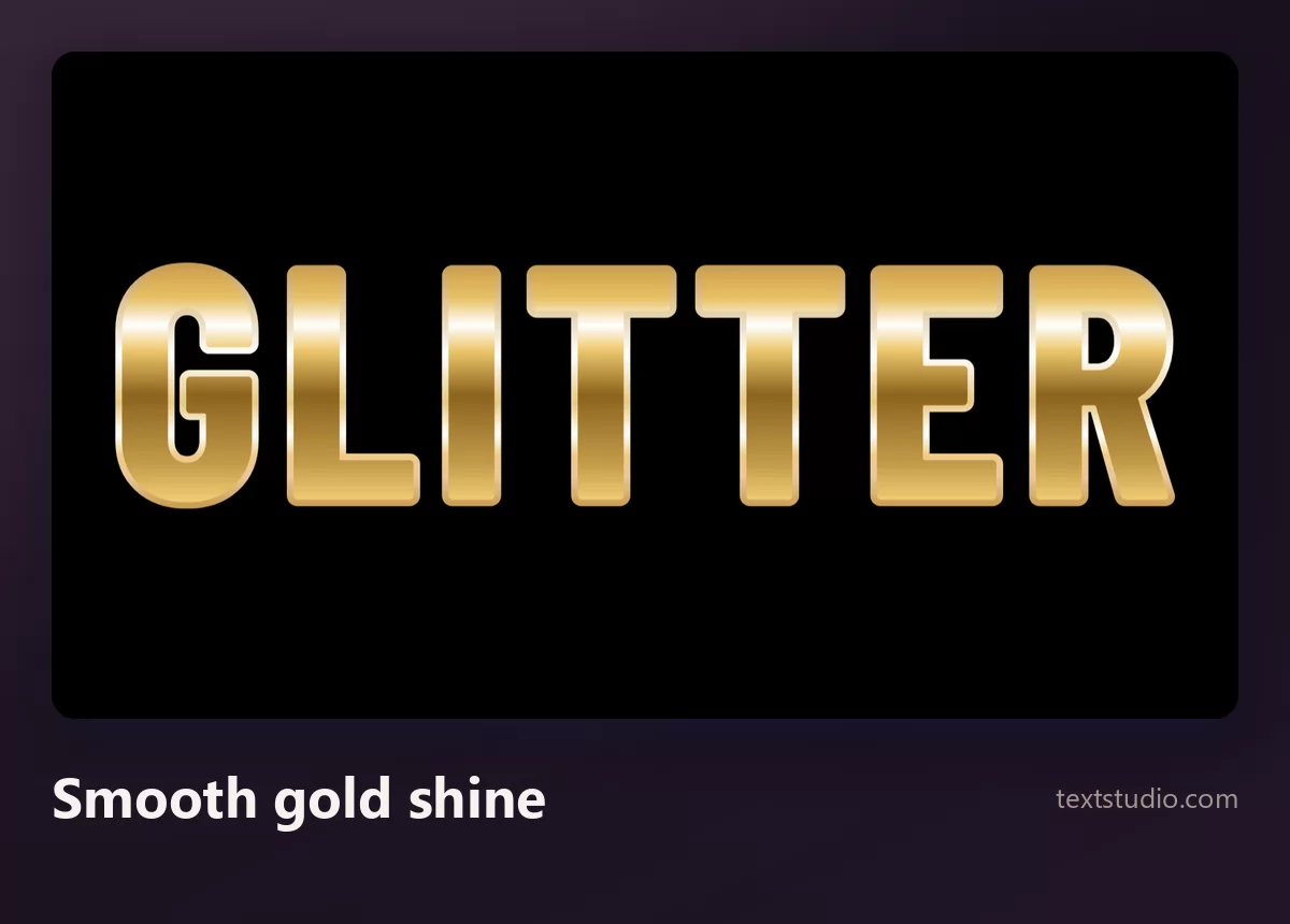
Good for: luxury and sale banners, certificates, anything that has to stay clean at small size. Shine survives shrinking, glitter does not.
8. Cut gemstones
Letters built out of faceted stones with hard edges and bright highlights. It is the most literal jewellery treatment here, and the one that needs the most room.
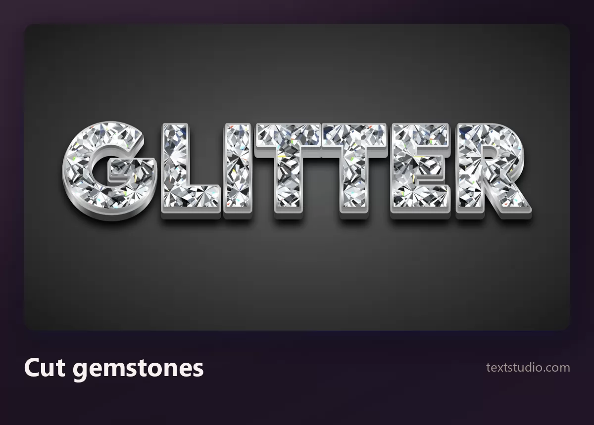
Watch out for size: facets are large features, so the letters have to be thick and big enough to hold several of them. Shrink it and the stones turn into grey blocks.
One word, eight styles side by side
Together the split is easy to see: four styles carry their sparkle in the letters, two put it behind them, and two are not sparkle at all.
How to pick a glitter font
- Check where the sparkle lives. Look at one stroke on its own. Grain inside it means glitter; a smooth gradient means shine with a decorated background.
- Pick the letterform first. Glitter is a finish, not a typeface. Choose the shape the way you would for any other job, then apply the material.
- Decide still or animated before you start. They are different products and one does not convert into the other.
- Avoid hairlines. Thin strokes have no room for grain, and glitter in them becomes a smudge.
- Check it at final size. Glitter is texture, and texture is the first thing to go. If it has to work small, use shine or an outlined style.
- One sparkling element per design. Glitter lettering on a glitter background with a glitter border reads as noise, not as luxury. The rest of the layout should be plain.
FAQ
What is a glitter font?
Strictly, a font is a set of letterforms and glitter is a fill applied to them, so a "glitter font" is a text effect rather than a typeface. The practical consequence is that you choose the letter shape and the sparkling material separately.
Why does my glitter text look flat?
Almost always because the effect you picked keeps its sparkle in the background rather than in the letters. Cut out, it becomes a plain gradient. The comparison at the top of this page shows exactly that.
What is the difference between glitter and gold foil or shine?
Glitter has a visible grain made of many small specks. Shine and foil are a single smooth gradient with no grain. They read differently: glitter as sparkle, shine as polished metal.
Can I get animated glitter text?
Yes, and it is a separate kind of effect rather than a setting. Animated glitter is what "glitter text" traditionally meant, and it remains the most downloaded glitter style on TextStudio.
Does glitter work at small sizes?
Poorly. The grain is what makes it read as glitter, and grain is the first thing lost when an image shrinks. For favicons, small logos and body-size text, a shine or an outlined style holds up far better.
What colour glitter should I use?
Gold and pink are the defaults and therefore the most crowded. Silver sits better beside photographs, and purple is the least used of the common glitter colours. There is more on choosing in the coloured text effects guide.
Make your own
Type your word, then do the one check this article is about: look at a single stroke and see whether the grain is inside it. If you want the same sparkle on softer shapes, the bubble lettering guide covers those letterforms, and cute lettering styles covers the register they belong to. Open the TextStudio glitter generator and see your word sparkle.