
 Mia Hartley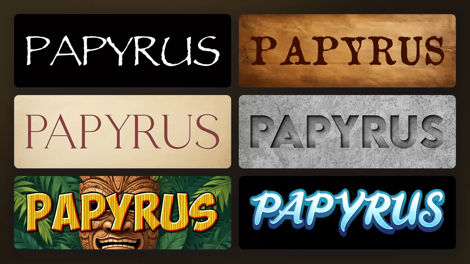
Papyrus was drawn by Chris Costello in 1982, when he was 23, on paper, with a brush. It is a decent piece of lettering with an unusual story. It is also the font people put on spa brochures, yoga flyers, Thai restaurant menus and, famously, the poster for a very expensive science fiction film.
None of that is Costello's fault. Papyrus is everywhere for one boring reason: it has been installed on essentially every Windows and Mac computer for decades, so it is one of the few interesting-looking faces that anyone can reach for without downloading anything.
This guide does three things: it shows what the letterforms actually do, it says when Papyrus is genuinely the right call, and then, for each job it usually gets handed, it shows something that does that job better. Every image is the same word rendered with the Papyrus font generator of TextStudio.
Do you already have it, and is it free?
Two questions worth clearing up before anything else, because they are what most people came for.
You probably already have it. macOS has shipped Papyrus since 2003, and Microsoft Office installs it on both Windows and Mac. Open your font list and type "Pap" before downloading anything: if it is there, you have the real thing rather than a copy of unknown origin.
It is not free to redistribute. Papyrus was drawn by Chris Costello and released by Letraset in 1983; the rights sit with Monotype today. Your macOS or Office licence covers using it in your own work. It does not cover putting the font file on a website, embedding it in an app, or shipping it inside a product. The sites offering a free .ttf are generally distributing a file they have no right to distribute.
The free lookalikes need checking. Unlike Times New Roman, Papyrus has no free drop-in equivalent with matching widths. There are plenty of similar hand-drawn faces, but many are free for personal use only, with a separate commercial licence. Read the terms before you put one on a client's poster.
And if you want it in Instagram Stories, that is one of the most common reasons people go looking for the file. Instagram does not offer Papyrus in its text tool. What works is making the lettering as an image and adding it to your story, which takes about ten seconds and needs nothing installed.
What the letterforms actually do
Before deciding anything, it helps to look closely. Papyrus is not a bad drawing. It is a very loud one.
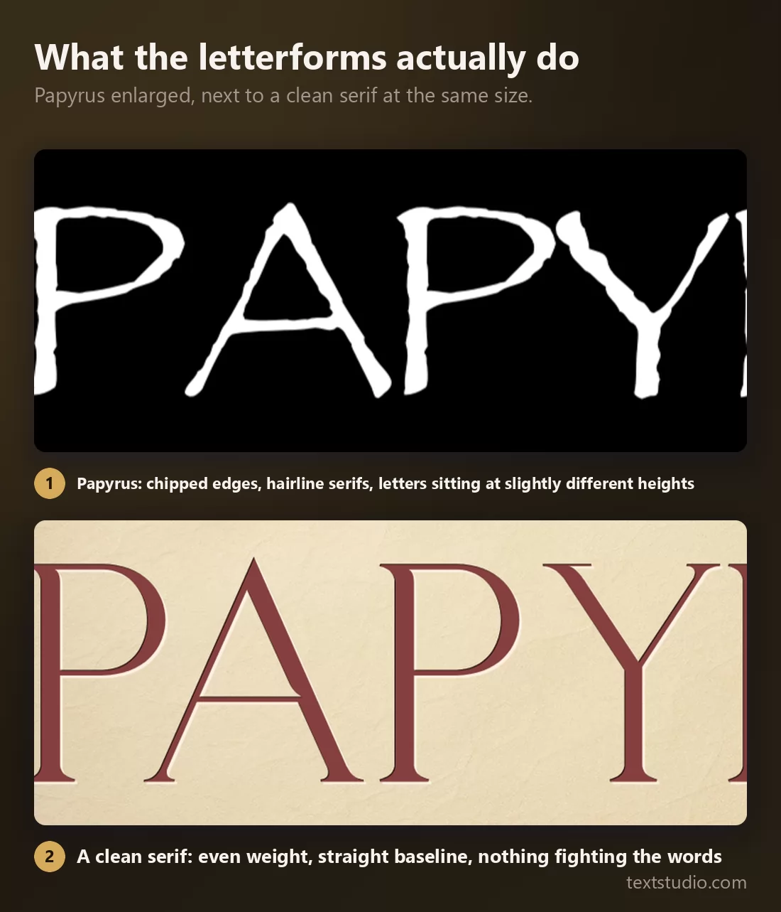
Three things are happening, and all three are deliberate:
- The edges are chipped. Every stroke has a rough, eroded outline, as if the letter had been printed on something old.
- The serifs are hairlines. They are much finer than the stems, which is what gives the face its spindly, hand-cut feel.
- The letters sit at slightly different heights. The baseline wobbles on purpose.
That is a lot of personality for a typeface, and personality is a fixed cost: you pay it on every single word. A clean serif has none of it, which is exactly why it disappears behind what you are actually saying.
Papyrus is a headline font, and only that
The most common mistake is not choosing Papyrus. It is choosing Papyrus and then using it for a paragraph.
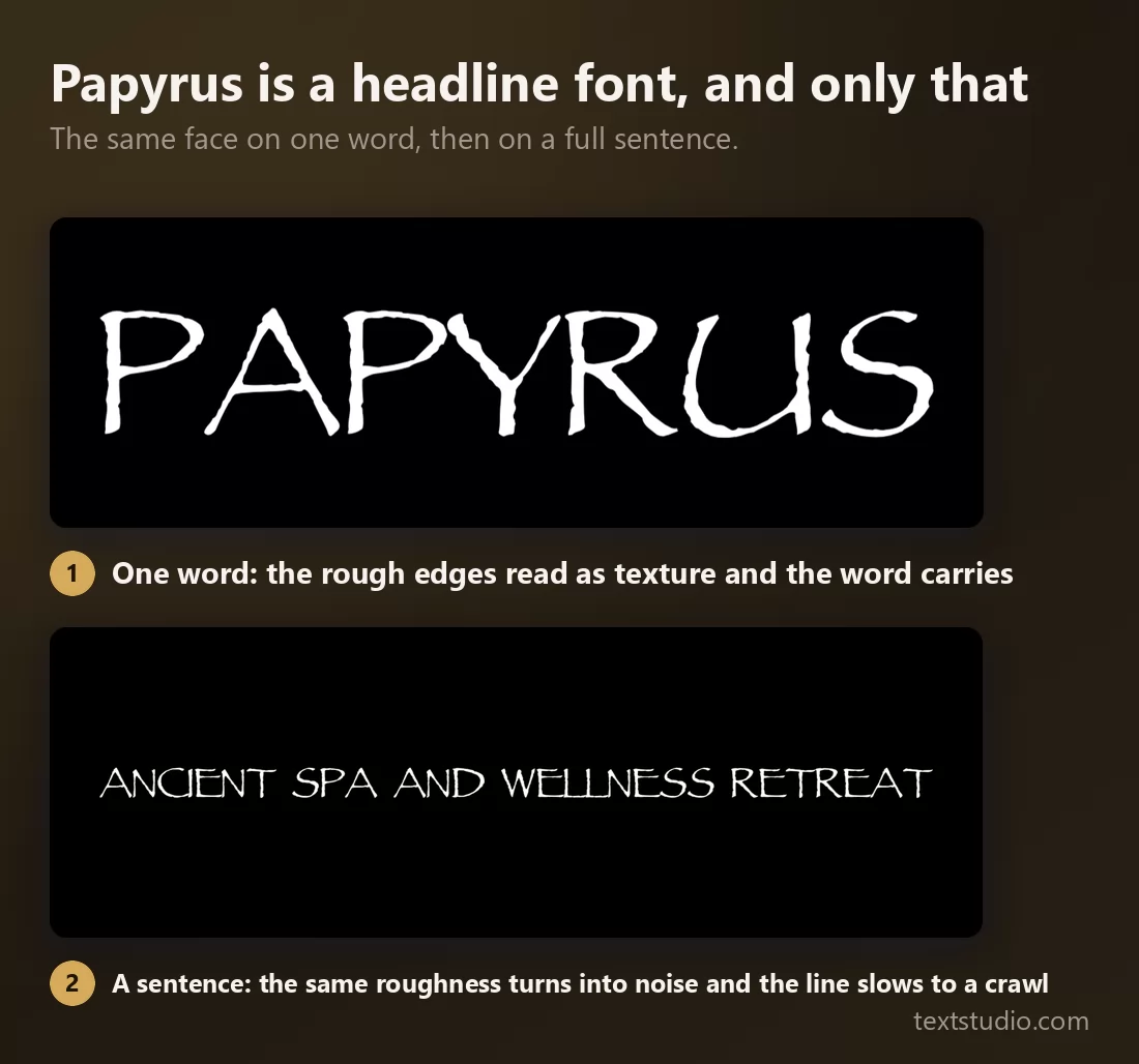
At one word the erosion reads as material: it looks like something old, which is the intended effect. At sentence length the same erosion becomes noise. Every letter is fighting its neighbours, the wobbling baseline stops the eye tracking along the line, and reading slows to a crawl.
If you take one thing from this page: never set body text in Papyrus. A title, a logo, a single line on a menu. Nothing longer.
When Papyrus is genuinely the right call
The pile-on is mostly deserved, but not always, and it is worth being honest about it.
Papyrus works when you want a handmade, slightly archaic feel with no budget and no download, and when the word count is tiny. A one-off village fete poster. A homemade wedding invitation. A prop that is supposed to look amateur. In those cases the alternative is not a better font, it is no font at all, and Papyrus does the job.
It also works when the association is the point. If your subject is genuinely ancient Egypt, the reference lands rather than embarrassing you.
What it does not survive is professional context and repetition. A brand uses its lettering thousands of times. Papyrus is far too loud to be seen that often, and far too available to feel like anyone's property.
What to use instead, job by job
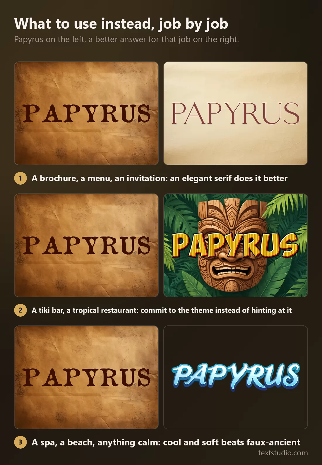
Most "fonts similar to Papyrus" lists offer you lookalikes. That is solving the wrong problem: if Papyrus is too loud and too common, so is a font drawn to resemble it. The useful question is what each job actually needs.
1. Papyrus itself
The face on its own, white on black, so the letterforms are visible without a background doing the work.
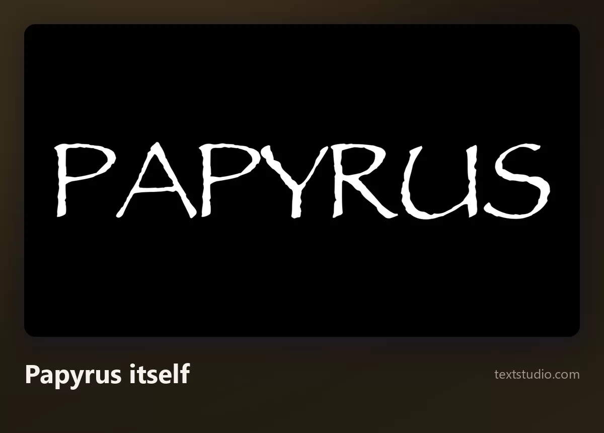
Worth looking at once without the parchment, because most of the time you meet Papyrus it comes with a background that is doing half the persuading.
2. Papyrus on parchment
Its natural habitat, and the version most people actually produce: aged paper, brown ink, deliberate creases.
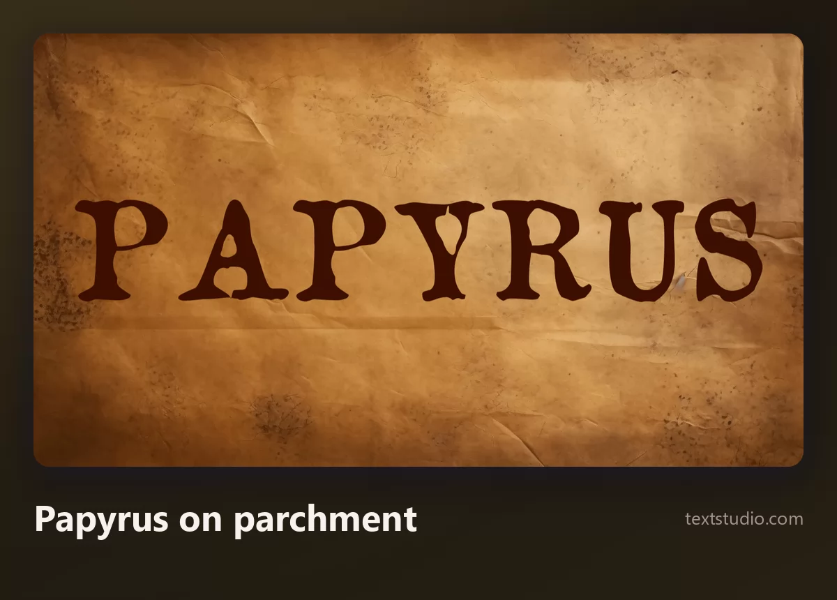
Notice how much of the effect is the paper rather than the type. That is a useful thing to spot, because the paper is the part you can keep.
3. An elegant serif
The best general answer, and the least exciting to hear. For a brochure, a menu, an invitation, a refined serif gives you the same sense of care without the costume.
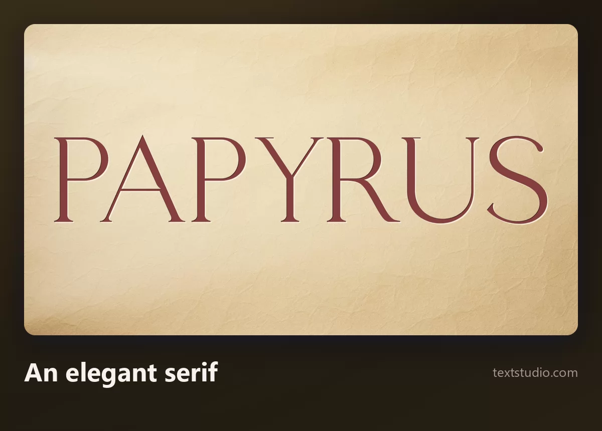
It reads as considered rather than themed. And because it carries no strong association, it still works on page two, page three and the business card.
4. Carved in stone
If what you wanted from Papyrus was ancient, go and get ancient properly. Letters cut into stone say it directly rather than hinting at it.
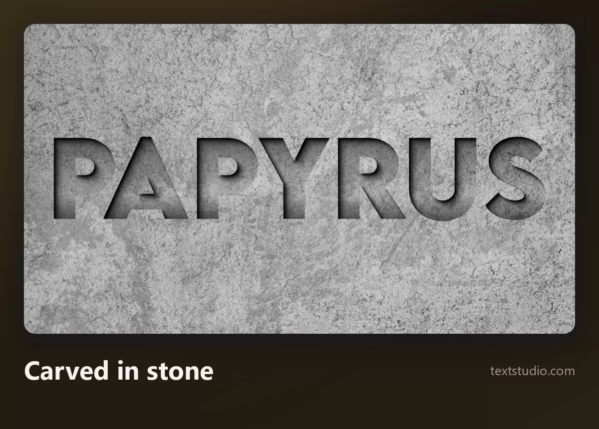
Good for: museum and heritage material, history content, anything mythological. It is also far more legible than Papyrus, because the letterform underneath is clean and the age is in the surface.
5. Tiki and tropical
Papyrus ends up on a lot of tropical restaurant signage. This is what committing to that theme looks like instead of gesturing at it.
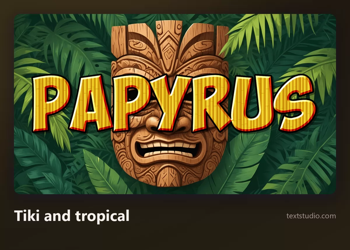
Good for: tiki bars, poke and Hawaiian places, summer events. The rule underneath: a theme done fully beats a theme suggested by a typeface alone.
6. Coastal and calm
The spa, the beach club, the wellness studio. Papyrus gets used here because it feels natural and unhurried. Cool colours and a soft script do that better, and without the archaeology.
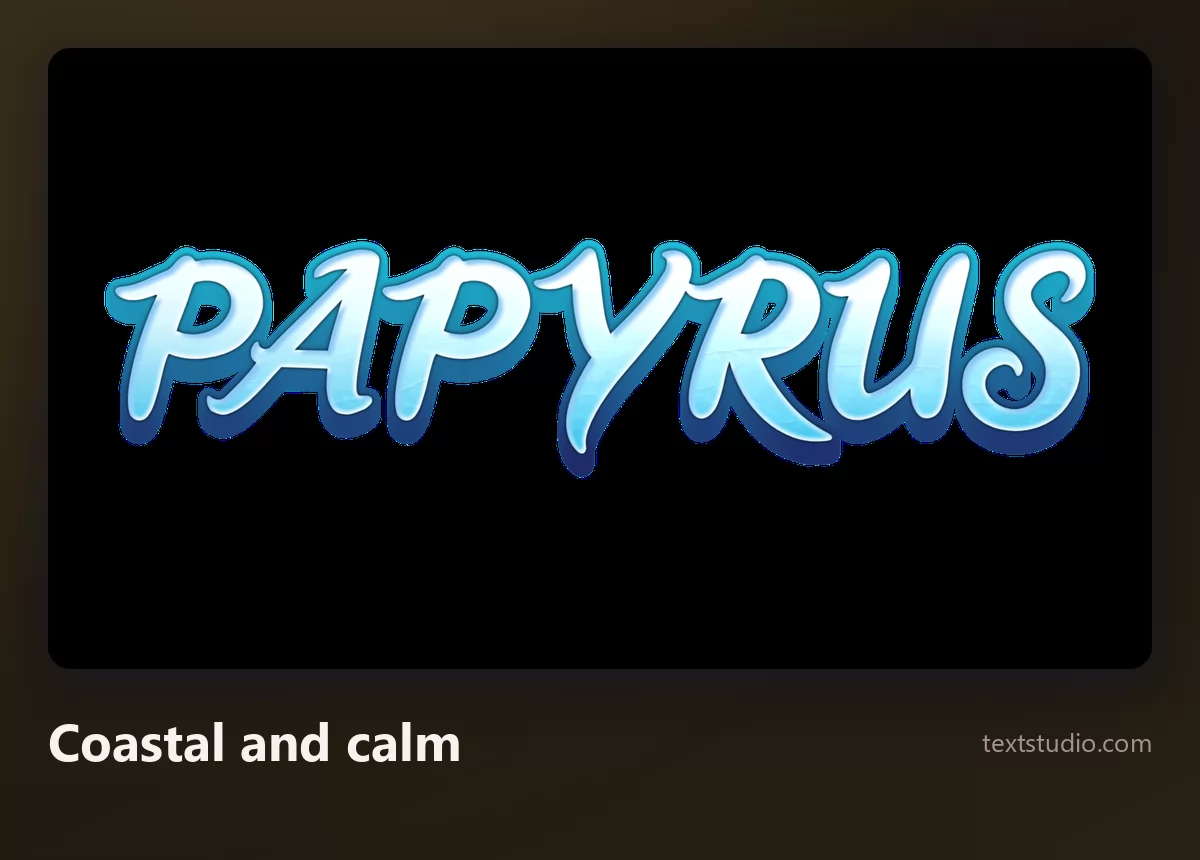
Good for: spas, swimming and surf, coastal hotels, anything that should feel like exhaling.
7. Jungle adventure
For fantasy, adventure and children's material, where Papyrus is standing in for "somewhere far away and long ago".

Good for: kids' events, games, exhibitions, anything with an expedition in it.
8. Desert and western
The other half of the ancient-and-far-away brief: sand, heat, distance. A western treatment carries it without pretending to be an artefact.
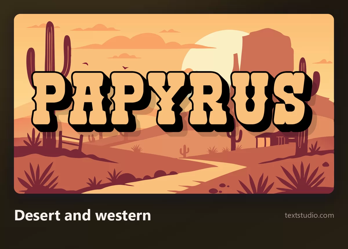
Good for: western and desert themes, escape rooms, adventure branding, anything set somewhere dry.
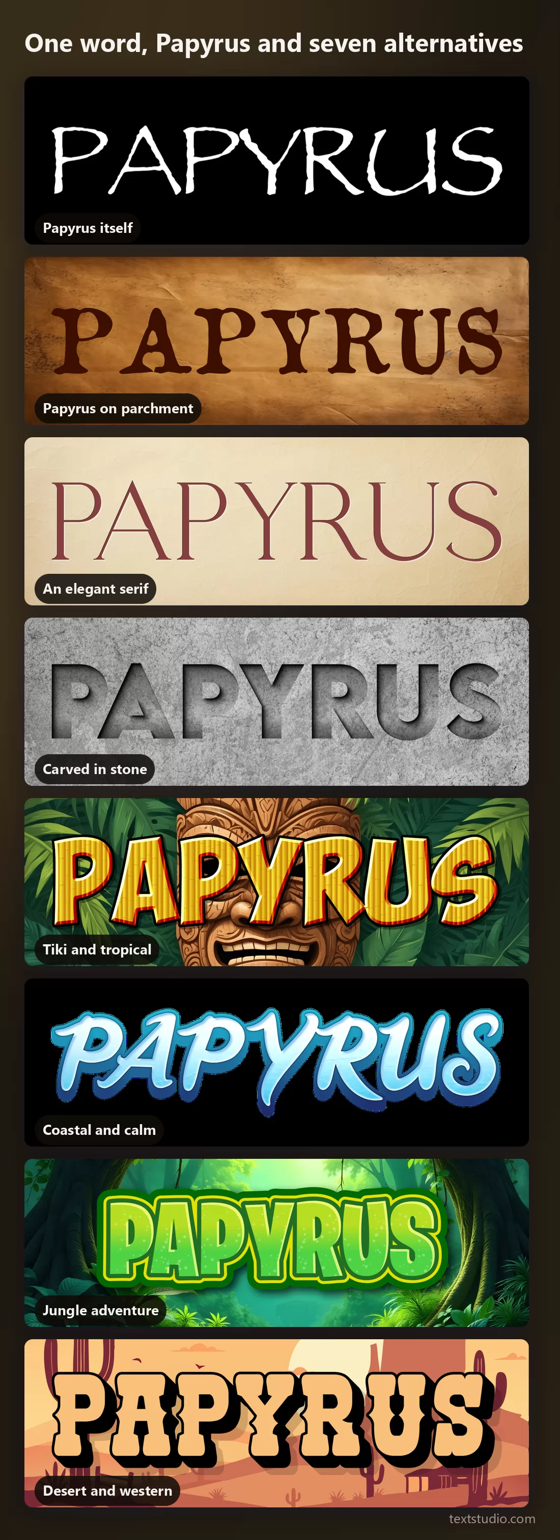
One word, Papyrus and seven alternatives
Seen together, the point is not that Papyrus is ugly. It is that it is a single answer being asked to cover seven different questions.
How to decide
- Name the job first. Ancient, tropical, calm, adventurous, elegant. Papyrus is used for all five, and it is the best answer to none of them.
- Count the words. Anything past a short line rules Papyrus out on legibility alone.
- Ask how often it will be seen. A one-off can carry a loud face. A brand cannot.
- Do not shop for lookalikes. If the problem is that Papyrus is too loud and too common, a font drawn to resemble it inherits both.
- Let the background carry the age. Parchment, stone and weathered texture do the historical work far better than letterforms, and they leave the type free to stay readable.
- If it genuinely is about ancient Egypt, keep Papyrus and use it once, large.
FAQ
Who designed the Papyrus font?
Chris Costello, in 1982. He drew it by hand with a brush while thinking about the ancient Middle East, and sold it before it became ubiquitous.
Why do designers hate Papyrus?
Less for how it is drawn than for how it is used: it ships free on every computer, so it turns up constantly, often set too long, in contexts that have nothing to do with its associations. Familiarity plus misuse, rather than bad lettering.
Is Papyrus free?
Free to use, not free to redistribute. It ships with macOS and with Microsoft Office, so most people already have it, and that licence covers your own documents. Putting the font file on a website or inside an app needs a licence from Monotype.
How do I get the Papyrus font on Instagram?
Instagram's own text tool does not include it. The way round it is to make the lettering as an image and add that to your story or post, which is what the generator on this page is for.
What font is used in the Avatar logo?
Papyrus, with modifications. That is what turned a widely disliked font into a running joke, including a Saturday Night Live sketch about the poster.
What is the best alternative to Papyrus?
There is no single one, because Papyrus gets used for several unrelated jobs. For a brochure or a menu, a refined serif. For something genuinely ancient, carved stone. For tropical, a themed treatment. The comparison above pairs each job with an answer.
Can I still use Papyrus?
Yes, on a short piece of text, once, when a handmade and slightly archaic feel is what you want and nobody is paying for a designer. The trouble starts when it becomes a brand's permanent voice.
Make your own
Type your word, look at it in Papyrus, then look at it in the alternative for your actual job and pick honestly. If you want the aged feel without the typeface, the retro lettering guide covers that, and cursive lettering covers the handmade end. Open the TextStudio Papyrus generator and see your word both ways.