
 Mia Hartley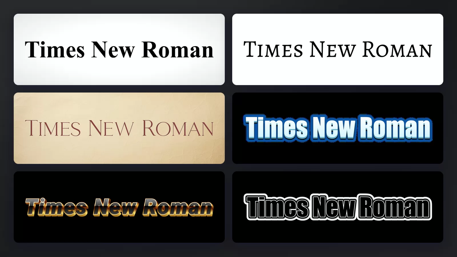
Times New Roman is the serif typeface that comes preinstalled on almost every computer, and the one most style guides, universities and courts ask for by name. Most people looking for it want one of three things: to check they have it, to get it legally without paying, or to see what their own text looks like in it.
This page answers those three, then covers the free fonts that match it exactly, what to use when nobody is requiring it, and where it came from.
Do you already have it?
Almost certainly yes.
- Windows ships with it, and has since Windows 3.1.
- macOS ships with it too.
- Microsoft Office installs it on any platform, including the Mac version.
- Google Docs does not have it by default, but the drop-down offers Tinos, which is designed to be an exact match. More on that below.
- LibreOffice substitutes Liberation Serif automatically, which is also an exact match.
So before downloading anything, open your font list and type "Times". If it is there, you are done, and you have the real Monotype font rather than a copy of unknown origin.
Is Times New Roman free?
Not exactly, and this is where most download pages are misleading.
The typeface is owned by Monotype. You did not buy it separately, but you did license it when you bought Windows, macOS or Office, and that licence covers using it in your own documents. What it does not cover is redistributing the font file, embedding it in an app, or shipping it inside a product.
The "free download" sites that offer a .ttf are distributing a file they generally do not have the right to distribute. For a homework assignment nobody is going to chase you. For anything commercial, a website or an app, use one of the free substitutes below instead. They are properly licensed, they cost nothing, and they were built for exactly this.
Two free fonts that match it exactly
This is the part worth knowing. Two fonts are metrically compatible with Times New Roman, which means every character is the same width as its Times counterpart. Swap one in and your line breaks, page count and layout stay identical. Nothing reflows.
- Liberation Serif, released by Red Hat in 2007, is the substitute LibreOffice uses automatically. It is free for any use, including commercial.
- Tinos, drawn by Steve Matteson and available on Google Fonts, grew out of the same project. It is the one Google Docs offers, and the one to use on a website.
Because the metrics match, a document set in Times New Roman opened on a machine that only has Tinos looks the same length and breaks in the same places. That is the whole point of them, and it is why they are a better answer than a font that merely looks similar.
If you need a serif that is free and does not have to match the metrics, you have far more choice, and several are better designed for screens. Georgia and Cambria both ship with Windows and were drawn later with displays in mind.
See your own text in it, without installing anything
If you only need the look for a title, a cover, a thumbnail or an image, you do not need the font file at all.
Type your words into the Times New Roman font generator, and you get a finished image you can drop straight into a slide, a video or a page. That covers most of the reasons people go looking for the file in the first place.
Does it make a document longer or shorter?
A common question, usually asked by someone facing a page limit, and the answer is measurable: Times New Roman is the narrowest of the common serifs.
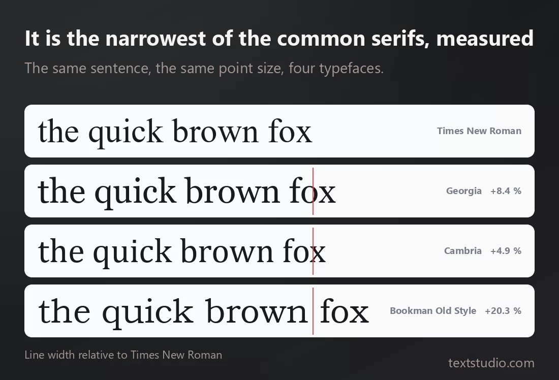
The red line marks where Times New Roman finishes; everything to the right is the extra room the other faces need for the same words. The exact figure is printed beside each line, and it shifts a little depending on which letters your text happens to use. The direction does not: a few percent for the closest faces, around a fifth for the widest.
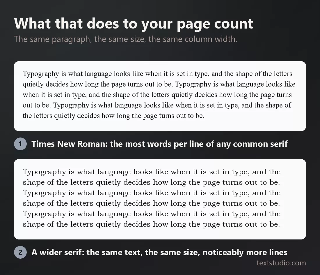
Same words, same size, same column, and the wider face needs more lines to hold them. Over twenty pages that is the difference between meeting a limit and going over it.
Two practical consequences. If you are short of space, Times New Roman is the most economical serif you already have. If you are padding, switching to Bookman Old Style adds roughly a fifth. And if you need the layout to stay put, use Liberation Serif or Tinos, whose metrics match exactly.
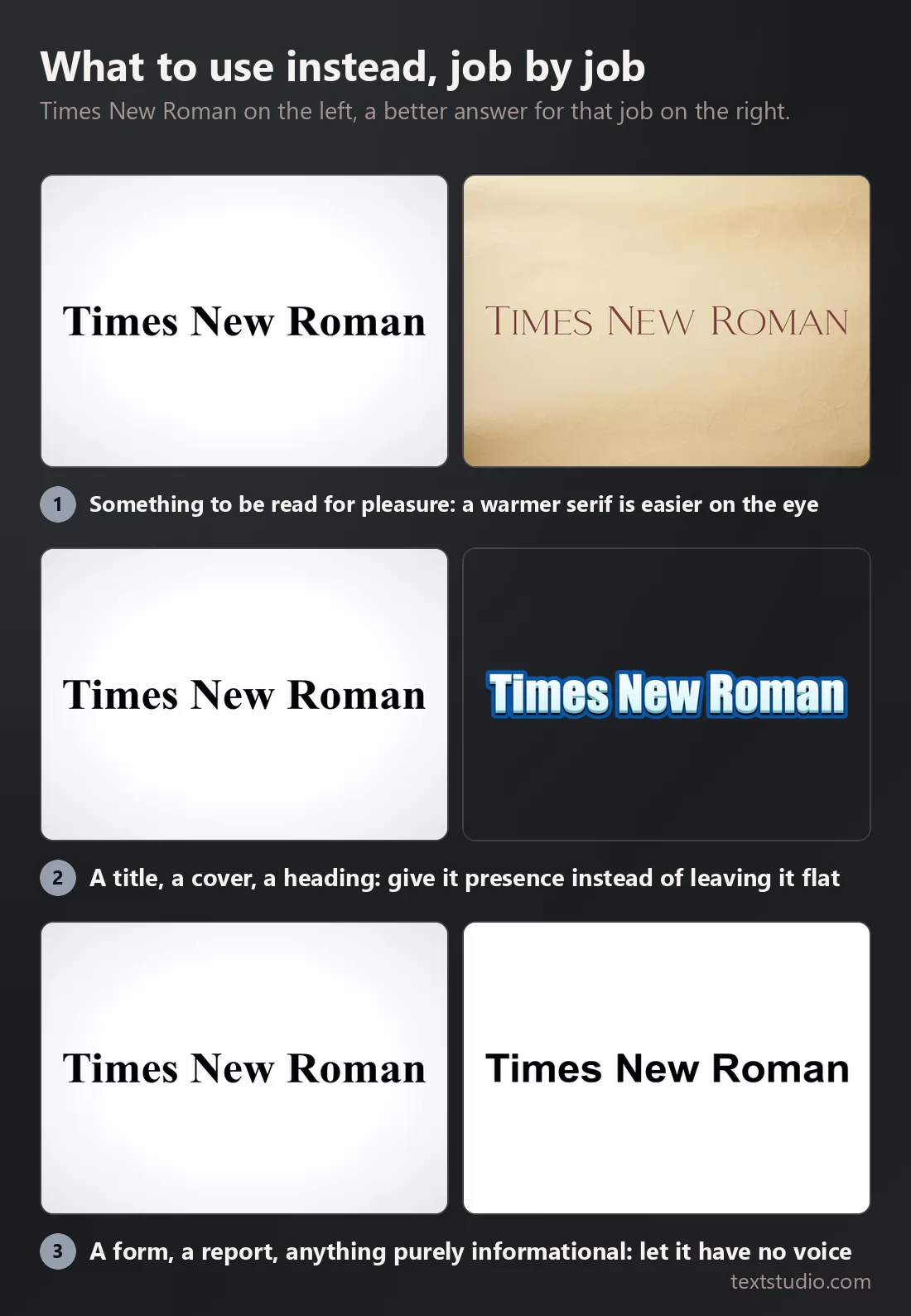
What to use instead, job by job
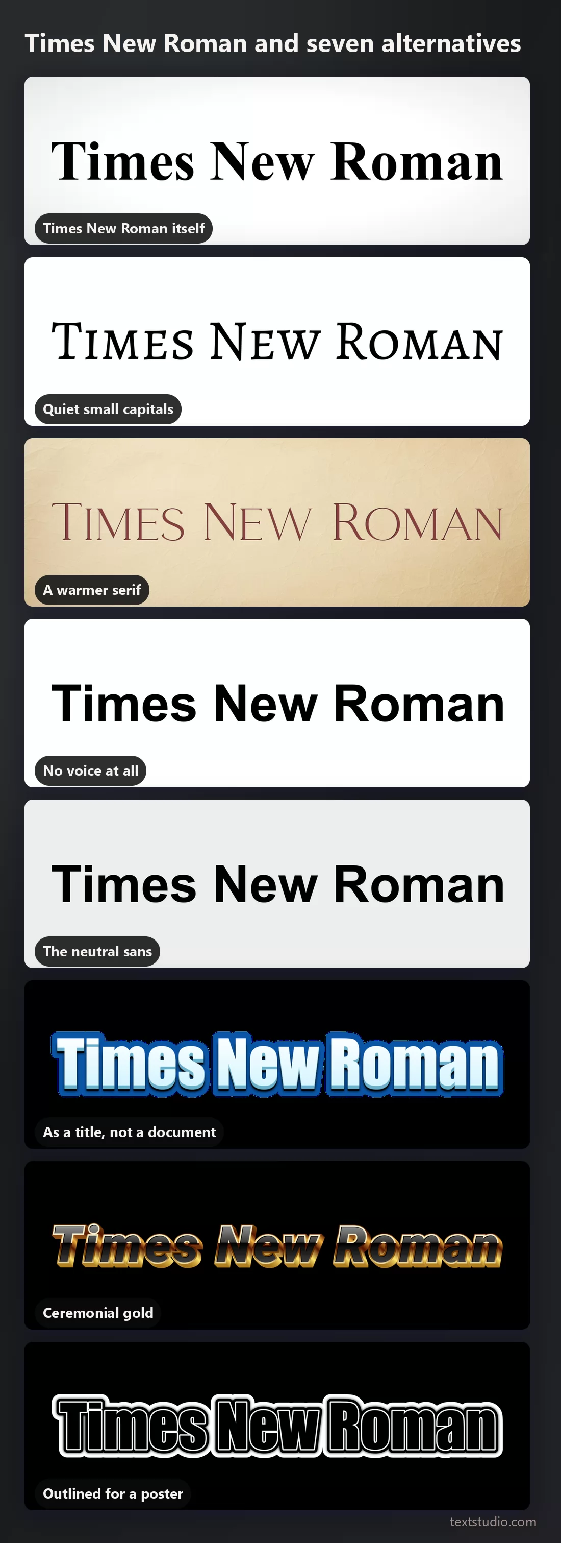
1. Quiet small capitals
The same seriousness, set in small capitals with generous spacing. It reads as considered rather than as a default.
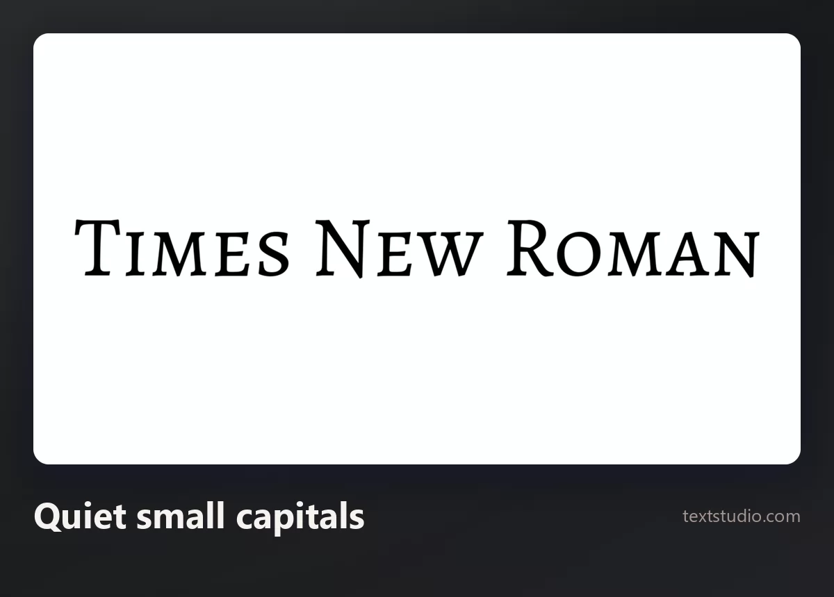
Good for: title pages, section openers, anything that should look edited rather than typed.
2. A warmer serif
For text somebody will read for pleasure rather than compliance: softer, wider, easier over several pages.
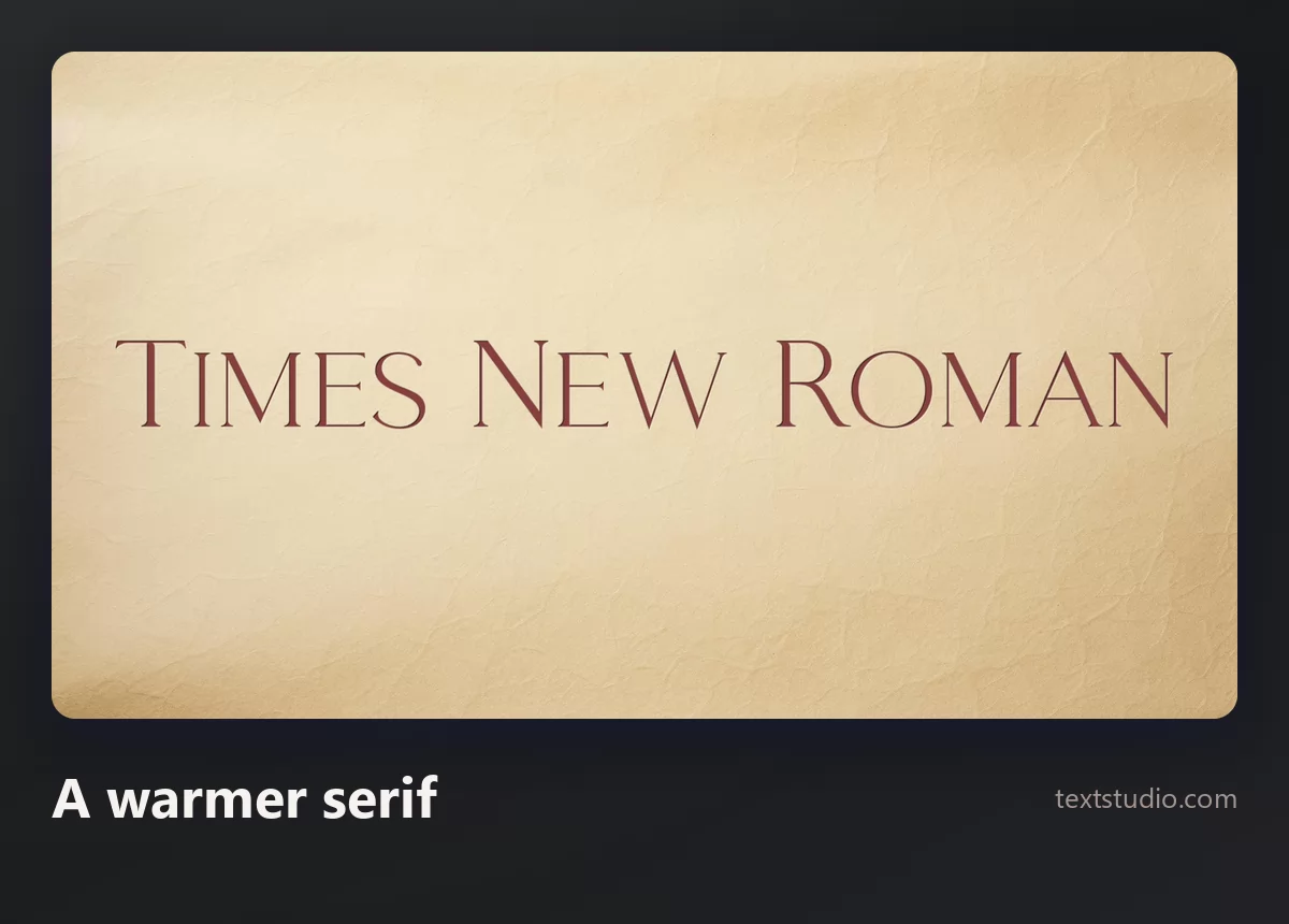
Good for: essays, books, long-form articles, menus. It costs you page count, and that is usually a fair trade.
3. No voice at all
Sometimes the text should carry no tone whatsoever, and a plain bold sans does that better than a serif with three centuries of association behind it.
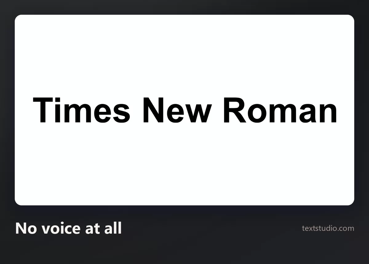
Good for: forms, labels, interfaces, anything purely functional.
4. The neutral sans
The other default, and the one to reach for when the text will be read on a screen rather than on paper.
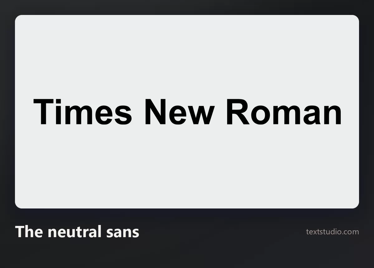
Good for: slides, web copy, anything at small sizes on a display. Note that it is wider than Times New Roman, so it costs you room.
5. As a title, not a document
If Times New Roman is going on a cover or a heading rather than into a paragraph, it can carry an effect.
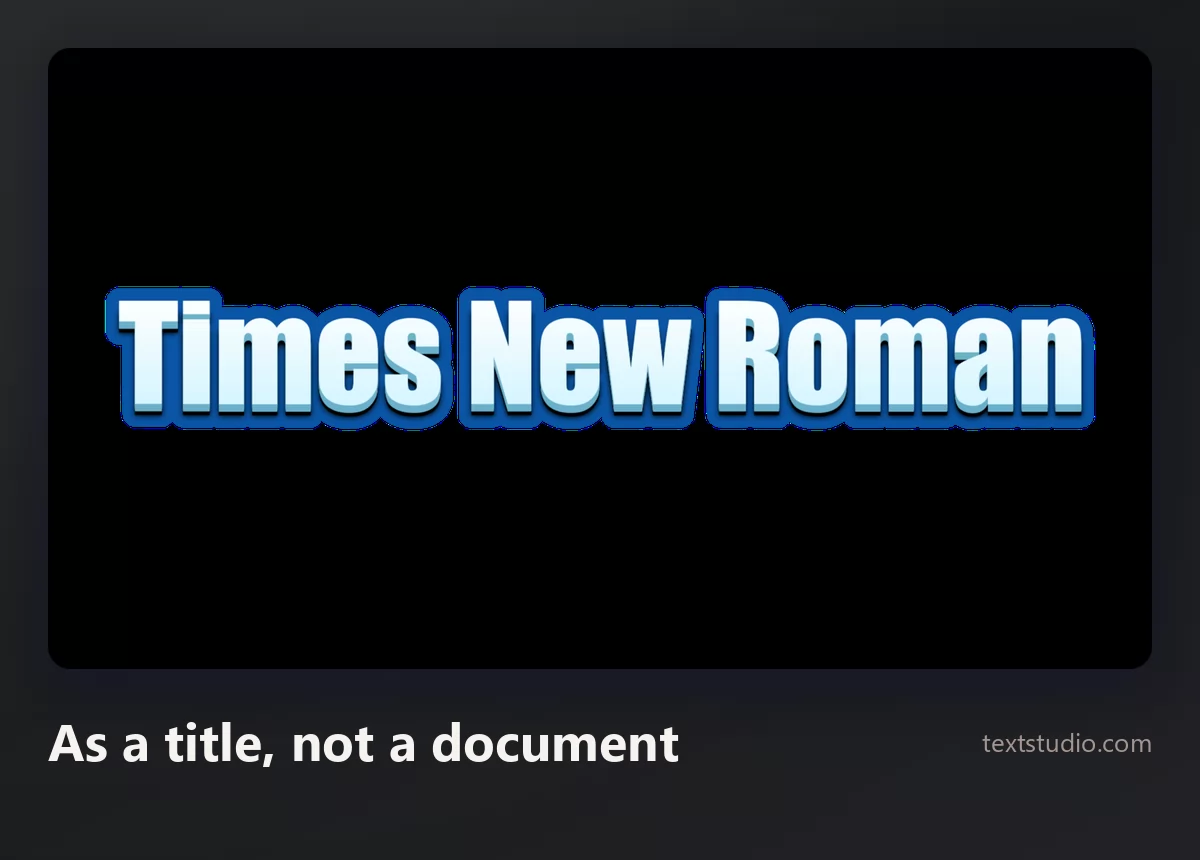
Good for: covers, headings, thumbnails.
6. Ceremonial gold
For diplomas, certificates and invitations, where the seriousness of a serif is the point and a bit of ceremony is expected.
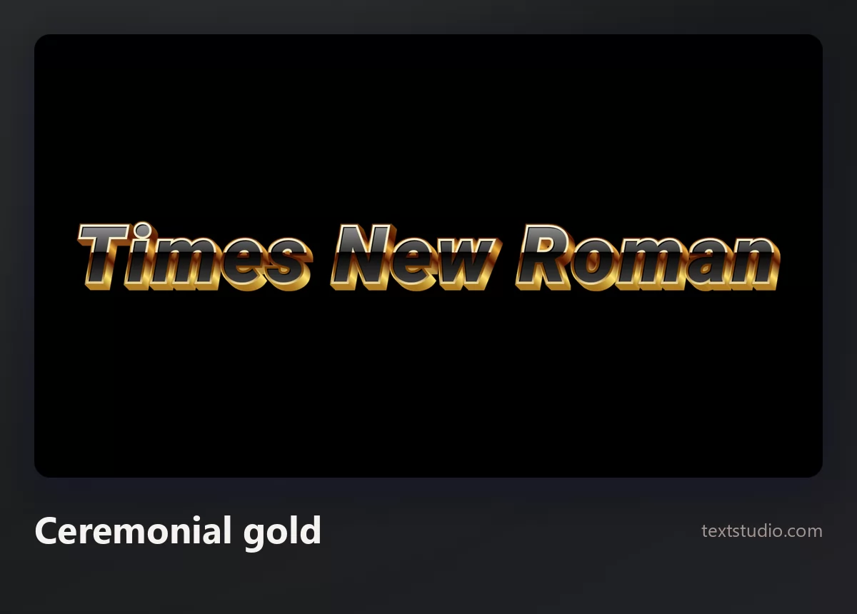
Good for: awards, certificates, formal invitations. Use it once, large, and keep everything else plain.
7. Outlined for a poster
Heavy letters with a clean outline, meant to be read across a room.
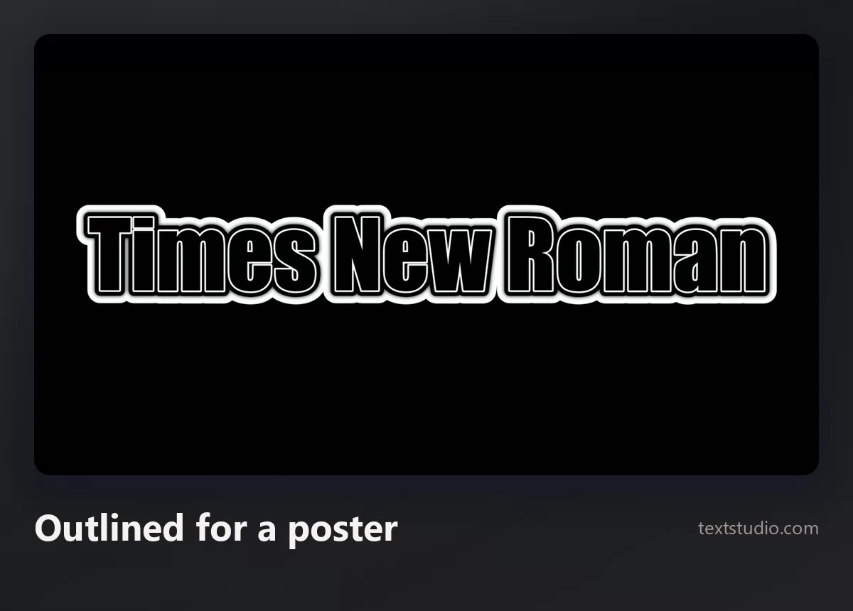
Good for: posters, event signage, anything that has to work at a distance.
All of them side by side
Where it came from
Briefly, because the story explains why it is shaped the way it is.
The Times of London commissioned it in 1931 after Stanley Morison, who advised Monotype, complained in print that the paper was badly set. Morison worked with Victor Lardent, a lettering artist in the paper's advertising department, and started from an older face called Plantin. It first appeared on 3 October 1932.
The brief was narrow columns, small sizes and cheap paper, which is exactly why it is compact: the space saving you can measure today was the point of the design. The Times itself moved on in 1972 and has changed its text face several times since, so the typeface has not been the newspaper's for over fifty years. It made its career in offices instead.
FAQ
Is Times New Roman free to download?
Not to redistribute. Monotype owns it, and your Windows, macOS or Office licence covers using it in your own documents. If you need a font you can legally ship or embed, use Liberation Serif or Tinos, which are free for any use and match its widths exactly.
What is the free version of Times New Roman?
Liberation Serif and Tinos. Both are metrically compatible, meaning every character is the same width, so swapping one in leaves your line breaks and page count unchanged.
How do I get Times New Roman in Google Docs?
It is not in the default list, but Tinos is, and it is designed as an exact match. Choose it from the font menu and your document will lay out identically to one set in Times New Roman.
Who designed Times New Roman?
Stanley Morison, who advised Monotype, working with Victor Lardent at The Times. Commissioned in 1931, first published on 3 October 1932, based on an older face called Plantin.
What font makes a document longer?
Almost any common serif other than Times New Roman. Bookman Old Style adds roughly a fifth to the line length at the same point size, and Georgia and Arial about a tenth. The precise figure depends on the letters your text uses; the comparison above measures it on one sentence.
Is Times New Roman good on a screen?
Less than the fonts drawn for one. Its thin strokes were made for ink on paper. Georgia and Cambria were designed later with displays in mind and hold up better at small sizes.
Make your own
If you need Times New Roman as an image rather than as a document font, that is the fastest route: no download, no licence question, no install. The two other over-familiar typefaces get the same treatment in the Papyrus guide and the Comic Sans guide. Open the TextStudio Times New Roman generator and see your own words in it.