
 Mia Hartley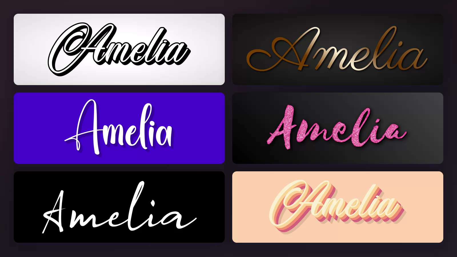
Search for a cursive font and you land on two completely different kinds of tool without anyone telling you. Some give you characters to paste into a bio. Others give you a picture of your word. They look interchangeable in the results page. They are not, and picking the wrong one is why a name that looked perfect in the box turns into a row of empty squares on someone else's phone.
This guide sorts that out first, then shows eight cursive styles on the same name, Amelia, all rendered with the cursive font generator of TextStudio so the only thing changing between images is the style.
Pasted text, or a rendered image?
Paste-and-copy tools do not change your font. They swap each letter for a different Unicode character that happens to look cursive, borrowed from a block meant for mathematical notation. Your phone then draws whatever it has for that character, which is fine when the glyph exists and blank when it does not.
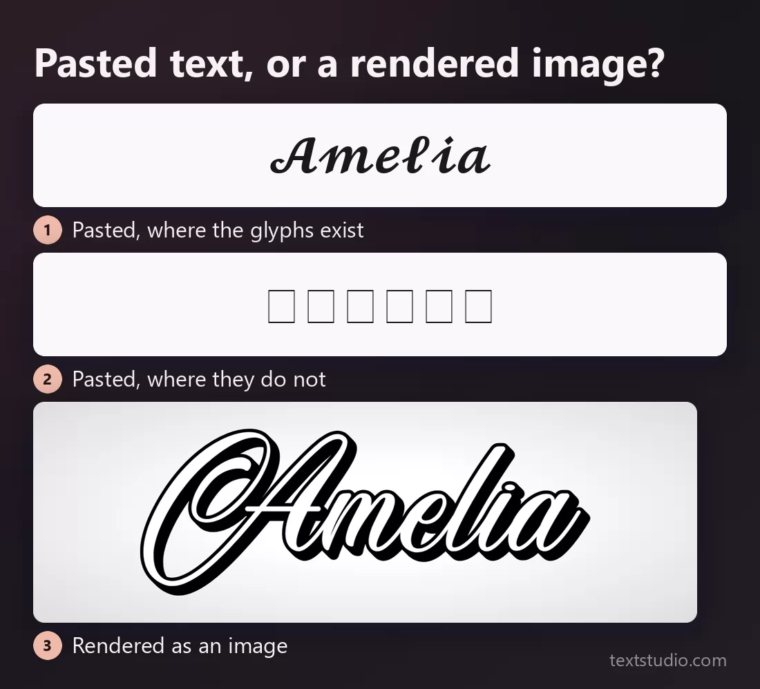
The middle row is not a mock-up. It is the same pasted string drawn in a font that has no glyphs for those characters, which is what a reader on an older phone, a different browser or a plain email client actually sees. Three other things follow from the same cause: a screen reader announces those characters oddly or skips them, a search for your name will not match them, and some platforms strip them out of certain fields.
None of that makes the paste route bad. For a bio, a chat message or a comment, it is instant and free, and a fancy text generator is exactly the right tool. But for anything that has to survive being seen by strangers on unknown devices, a logo, an invitation, a thumbnail, a print, you want a rendered image: a picture of the word, with no font to be missing.
Everything below is the rendered kind.
1. Signature (monoline)
A monoline script keeps the same stroke width from start to finish, the way a ballpoint does. No thick and thin, no flourishes beyond the odd long tail. It reads as a real person's signature, which is why it ended up on half the small brands on the internet.
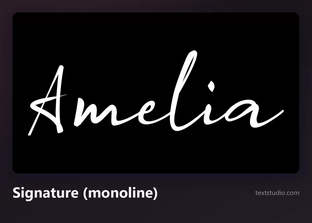
Good for: logos, watermarks, a personal brand, the end of a video. Watch out for size, because a single thin stroke is the first thing to disappear against a busy photo. If a signature is the whole point, our guide to making a signature online goes further than this one section.
2. Formal calligraphy
The formal script descends from pointed-nib penmanship: strong contrast between the downstrokes and the hairlines, a steady slant, capitals built out of loops. It is the lettering of wedding stationery, diplomas and perfume bottles, and it carries a lot of ceremony with it.
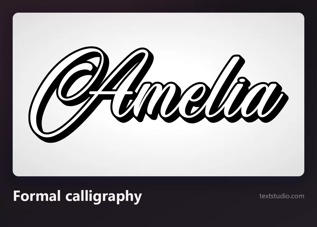
Good for: invitations, certificates, packaging that wants to feel expensive. The hairlines are the risk: they thin out on screen at small sizes and can vanish entirely in low-quality printing.
3. Modern brush calligraphy
The brush script of the last decade: a bouncing baseline, letters that lean into each other, a stroke that swells where the brush pressed. It looks handmade because it more or less is, and it is the reason so much packaging suddenly looked like a coffee shop menu.
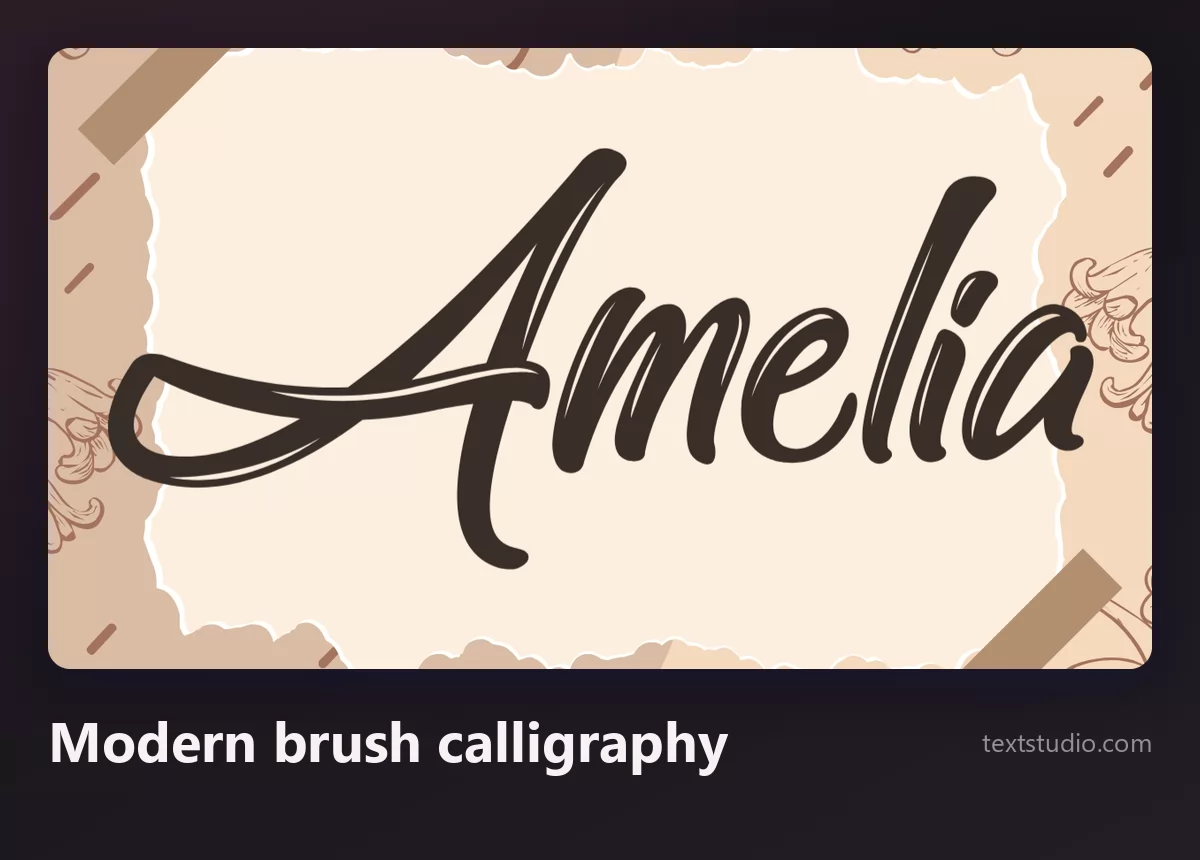
Good for: greeting cards, small-batch packaging, social posts, anything that should feel personal. Watch out for the bounce: letters that swing above and below the line need vertical room, and they fight against a tight layout.
4. Bold brush script
Same brush, much more ink. Thick, fast, slightly rough at the edges, usually set in one solid colour. Where the delicate scripts whisper, this one is built to be shouted across a shop window or a sports shirt.
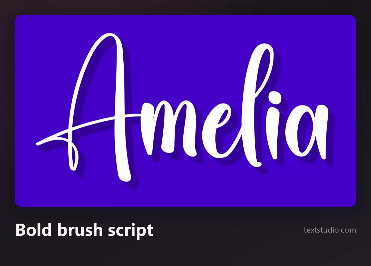
Good for: sportswear, drinks, YouTube thumbnails, sale banners. It is also the safest cursive when the design has to work small, because there is no hairline to lose.
5. Retro sign script
Mid-century sign painting, rebuilt: a fat connected script with an outline, a hard shadow and often a 3D extrusion behind it. Diners, barbershops, record sleeves. It is the most three-dimensional cursive in this list and the one that reads best from a distance.
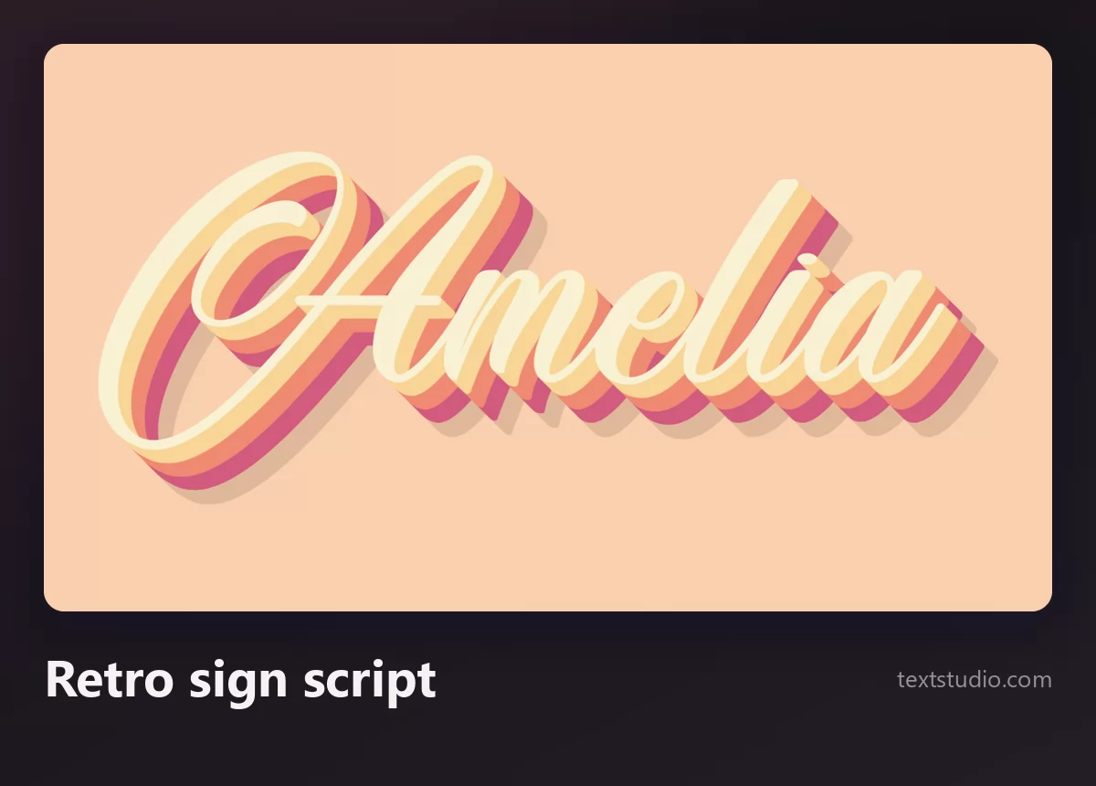
Good for: posters, shopfronts, album art, anything nostalgic. Give it space: the shadow adds real width, and two of these next to each other turn into noise.
6. Gold script
Not a letterform but a finish, and one that suits cursive better than almost any other style, because the reflections have long curved strokes to travel along. Gold reads as luxury, celebration and anniversary at a glance.
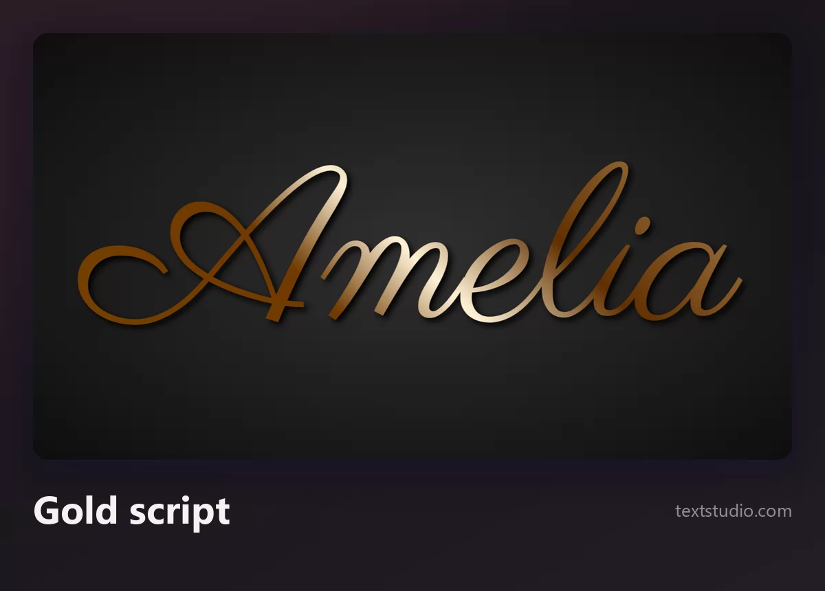
Good for: wedding and anniversary designs, invitations, premium packaging. One rule: gold needs a dark or coloured background. On white, the light parts of the gradient turn into the page and the word breaks into pieces.
7. Glitter script
Party lettering. A brush script filled with sparkle, usually pink, gold or silver. It is unapologetically festive, and it does a job no clean script can do: it says celebration before anyone reads the word.
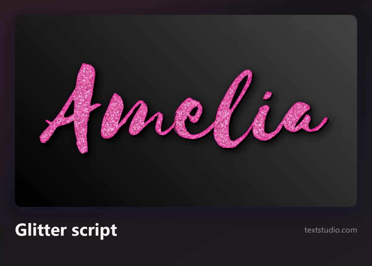
Good for: birthday cards, invitations, sweet sixteen and baby shower designs. The texture is the catch: shrink it and the sparkle turns into flat noise, so keep glitter lettering big.
8. Pastel outlined script
A soft gradient fill with a clean outline around the whole word, which makes it read like a sticker. It is the cursive of stories, planners and soft-branded thumbnails, and the outline means it survives on top of a photograph.
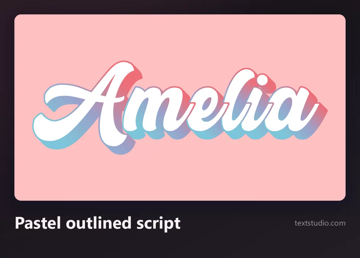
Good for: social stories, planner covers, anything placed over a busy background. The outline is doing the work, so keep it thick enough to survive when the design is scaled down.
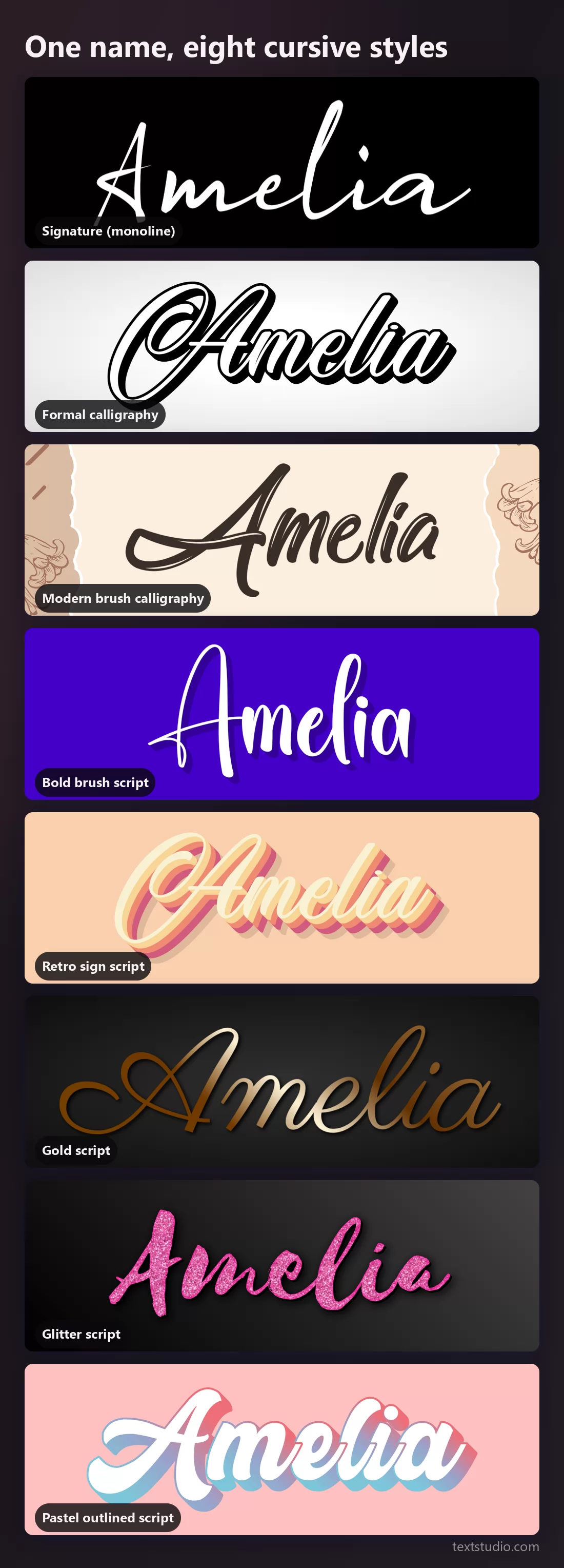
One name, eight styles side by side
Put them together and the family resemblances break apart. The monoline and the formal script are the two thinnest and the two most fragile. The brush and retro scripts are the widest. The gold and glitter are finishes that could be applied to several of the others.
The small-size test
Cursive suffers more than any other category when it shrinks, because what makes it beautiful is exactly what disappears: the hairlines, the connections between letters, the fine tail on the last letter. Here are the same renders at roughly the size of an app icon or a favicon.
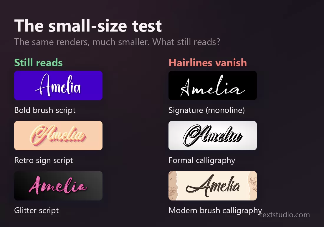
The rule that comes out of it is simple: the smaller the use, the thicker the script. A monoline signature that looks elegant across a business card is a grey smudge as a profile picture.
The capitals trap
This one costs nothing to avoid and ruins more designs than any other cursive mistake. Cursive letterforms are drawn to connect on the left and the right. Capitals are not: they are designed as opening letters, with entry flourishes and no exit stroke. Set a whole word in capitals and every connection breaks at once.
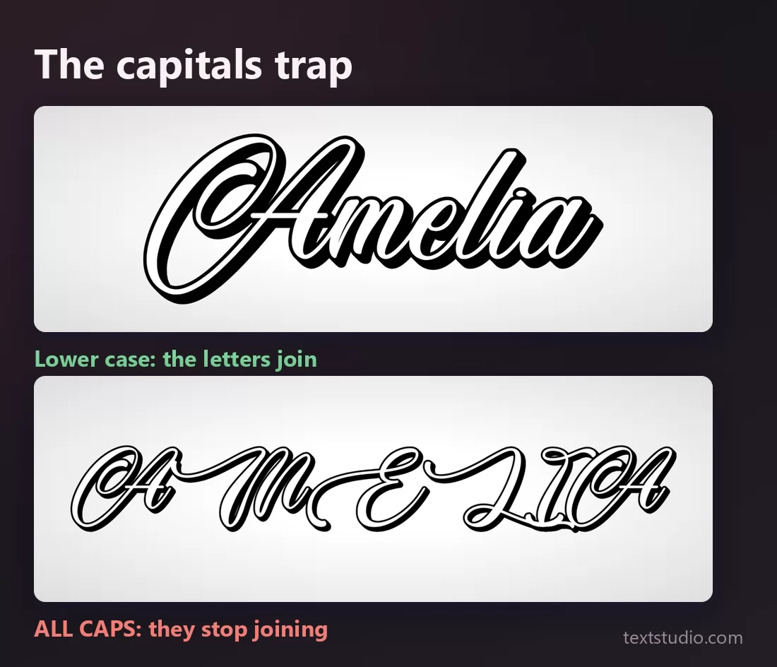
Look at the second row: the letters are still beautiful individually and the word has become hard to read. Use capitals for the first letter, and only the first letter.
Cursive, script, calligraphy, handwriting
Four words used as if they meant the same thing. They do not, and knowing which one you actually want makes searching for it far easier.
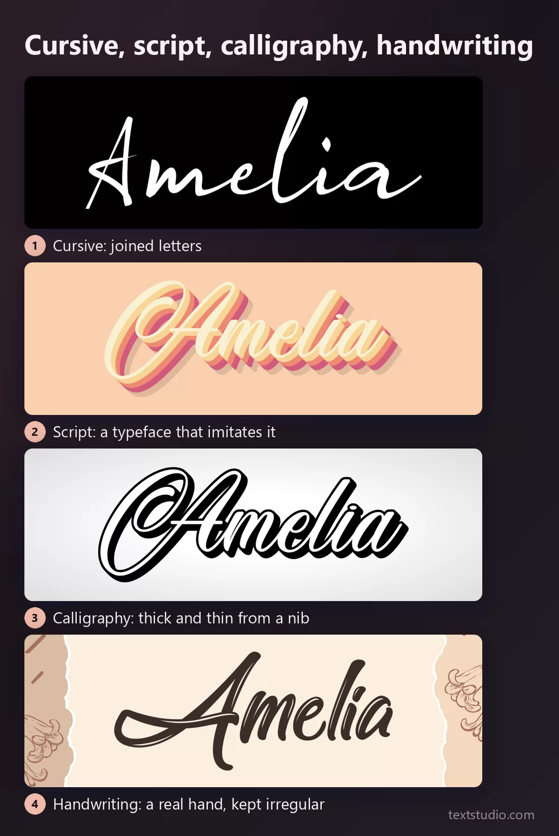
- Cursive is a way of writing: the letters are joined. It describes the handwriting taught in school, not a particular font.
- Script is a category of typeface that imitates cursive. Every font in this article is a script.
- Calligraphy is a technique: a tool with a flexible or angled tip that produces thick downstrokes and thin upstrokes. A script font can imitate calligraphy without any pen being involved.
- Handwriting fonts imitate an ordinary person writing rather than a trained hand, and keep the irregularity on purpose. Letters often do not join at all, which makes them not cursive.
How to choose a cursive font
- Decide where it will be read first. A bio wants pasted characters. A logo, an invitation or a thumbnail wants a rendered image.
- Let the size pick the weight. Big and printed can carry hairlines. Small and on screen needs a brush or a retro script.
- Never set it in capitals. One capital, the first, and the rest in lower case.
- One cursive per design. Two different scripts in the same layout read as a mistake, even when both are beautiful.
- Check the first letter on its own. Capital swashes in formal scripts are easy to misread, and a capital L, S or T can look like something else entirely to someone who does not know the word.
- Watch the collisions. A descender from one line running into the ascender of the next is the most common flaw in cursive layouts. Add line spacing before you add anything else.
FAQ
What is the difference between cursive and script?
Cursive is a manner of writing with joined letters. Script is the name given to typefaces that imitate it. In practice people use both words for the same thing, and searching for either brings up the same fonts.
Why does my pasted cursive text show up as empty boxes?
Because it is not a font. Copy-paste tools swap your letters for Unicode characters borrowed from a mathematical block, and a device that has no glyph for those characters draws a box instead. Rendering the word as an image removes the problem entirely.
Can I use cursive fonts on Instagram?
For a bio or a caption, paste-able characters work, with the caveats above. For a story, a highlight cover or a post image, a rendered image gives you full control of colour, size and background, and it cannot break on someone else's phone.
Which cursive font is the easiest to read?
A bold brush script or a retro sign script. Both have thick even strokes and clear letter shapes. Formal calligraphy is the hardest, especially in capitals.
Can I use these cursive fonts commercially?
Check the licence of the particular style you download, as you would for any font. The rendered image is yours to use, but a name that will carry a brand deserves a licence you have actually read.
Set your own name
Pick a style, type a name, compare two versions side by side and shrink one to check it still reads. If you like comparing lettering this way, the same treatment applies to tattoo lettering styles, where size and legibility matter even more. Open the TextStudio cursive generator and see your name in script.