
 Mia Hartley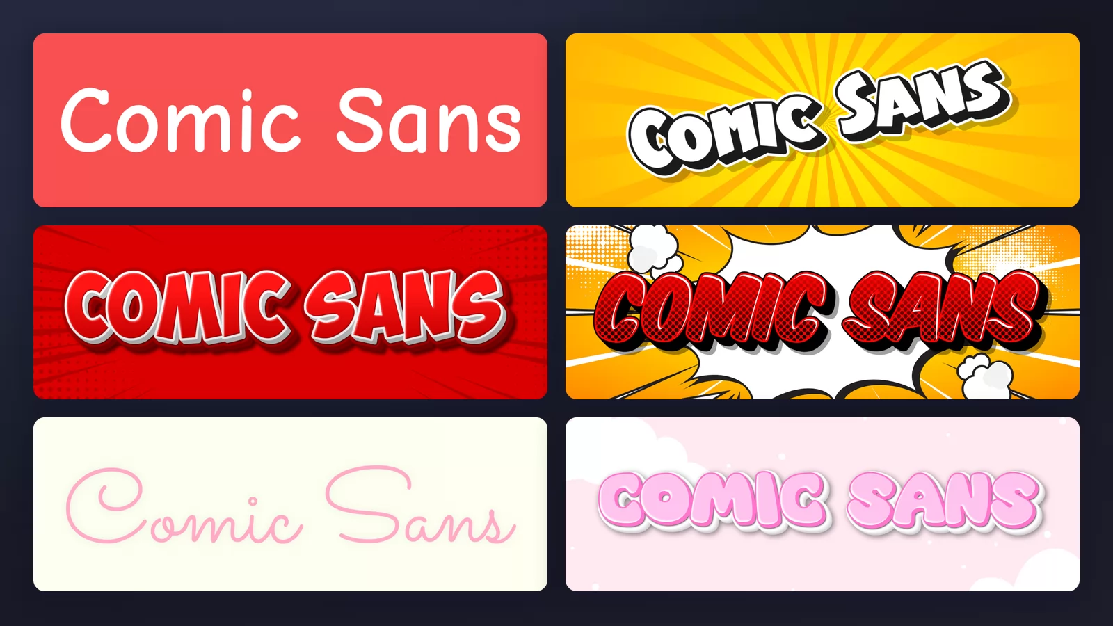
Comic Sans is the most mocked typeface in the world. There are websites campaigning to ban it, and telling someone their design looks like Comic Sans is an insult with no explanation required.
Almost none of that mockery is about the drawing. Vincent Connare made it at Microsoft in 1994 for a specific job, and by the standards of that job it is competent work. What happened next is that it shipped on every computer on earth, which is a different thing entirely.
This guide looks at what the letters actually do, which turns out to be measurable, then at where the font genuinely belongs, and finally at what to reach for instead in each situation where people default to it. All the samples are rendered with the Comic Sans font generator of TextStudio.
Do you already have it, and is it free?
The two questions most people arrive with, answered before anything else.
You already have it. Windows and macOS both ship Comic Sans, and Microsoft Office installs it everywhere. Type "Comic" into your font list before downloading anything.
It is not free to redistribute. Microsoft owns it. Using it in your own documents is covered by the licence you already hold; putting the font file on a website, embedding it in an app or shipping it inside a product is not. The download sites offering a free .ttf are handing out a file they have no right to hand out.
If you need a free one, use Comic Neue. It is on Google Fonts, it is open-licensed for any use including commercial, and it is a cleaner drawing of the same friendly idea: the same informal register with tidier curves and better spacing. If you want the Comic Sans feeling on a website or in a product, that is the answer, and it is a better-behaved typeface besides.
Its letters are not mirror images, and that is measurable
Start with the thing nobody mentions. In most sans-serif typefaces, the lowercase b, d, p and q are the same shape reused: draw one bowl and one stem, then flip and rotate. It is efficient and it looks tidy.
Comic Sans does not do that. Each of those letters is drawn separately, and you can prove it: take the b, flip it horizontally, and lay it over the d at the same size.
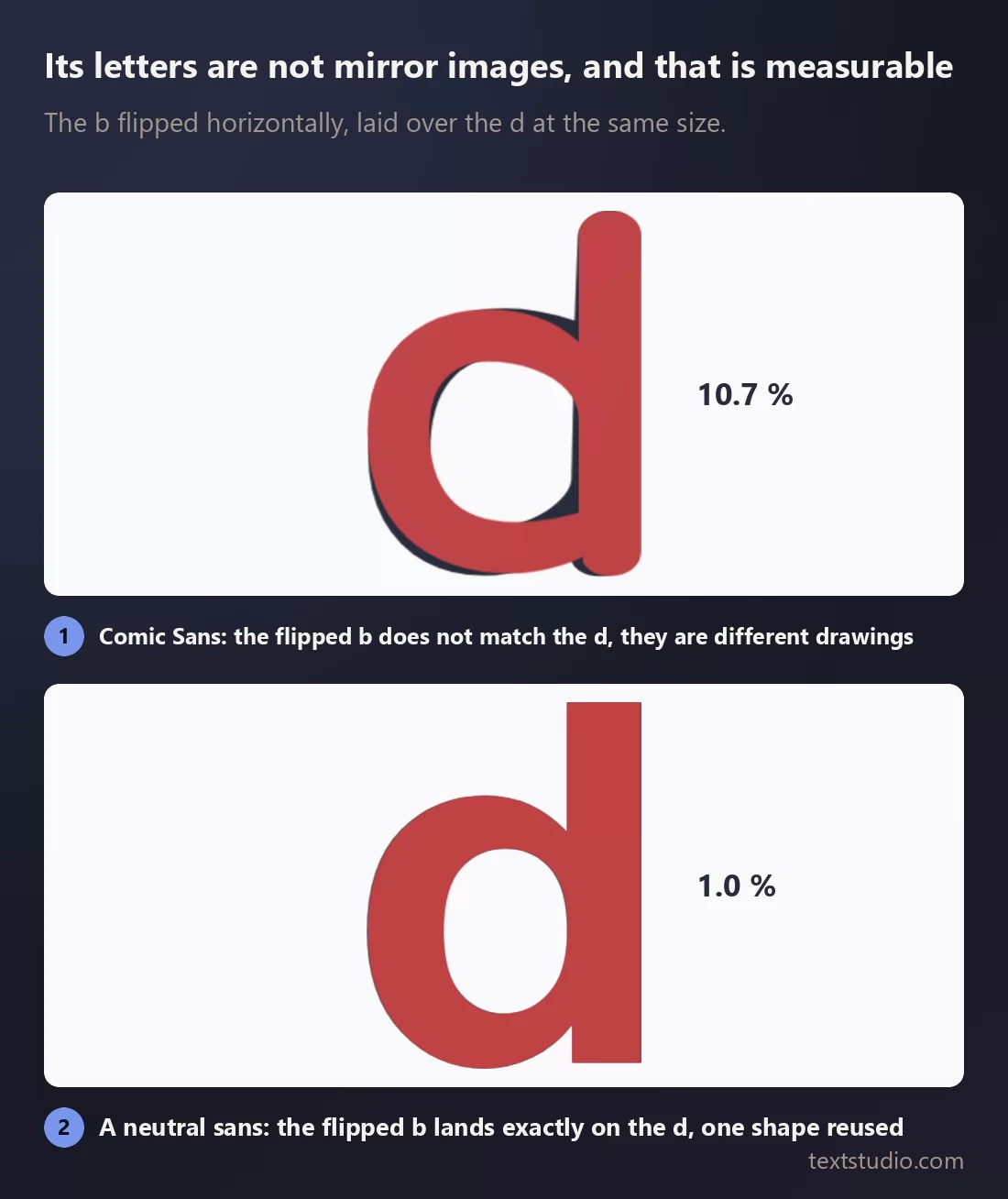
In a neutral sans the flipped b lands on the d almost perfectly: about one percent of the pixels differ, which is just the edge softening. In Comic Sans roughly eleven percent differ. The bowls attach at different heights, the stems are different lengths, and the strokes vary in width the way a hand varies.
This matters because b/d and p/q confusion is one of the documented difficulties in dyslexic reading, and letters that are not interchangeable are harder to confuse. It is one of the reasons the British Dyslexia Association lists Comic Sans among the typefaces it recommends.
Be careful with that argument though, because it gets overstated. The same association also recommends Arial and Verdana, whose b and d are mirror images, so letter differentiation is clearly not the only thing that matters. And a well-known eye-tracking study from Universitat Pompeu Fabra in Barcelona tested a set of fonts for dyslexic readers and did not include Comic Sans at all. What is safe to say: its letterforms have properties that help, it is not a magic solution, and the people who use it in a classroom are not being stupid.
Comic Sans is not comic book lettering
The second thing worth clearing up, and the source of a lot of confusion, is the name. Connare was looking at the lettering in The Dark Knight Returns and Watchmen when he drew it. But looking at something is not the same as reproducing it.
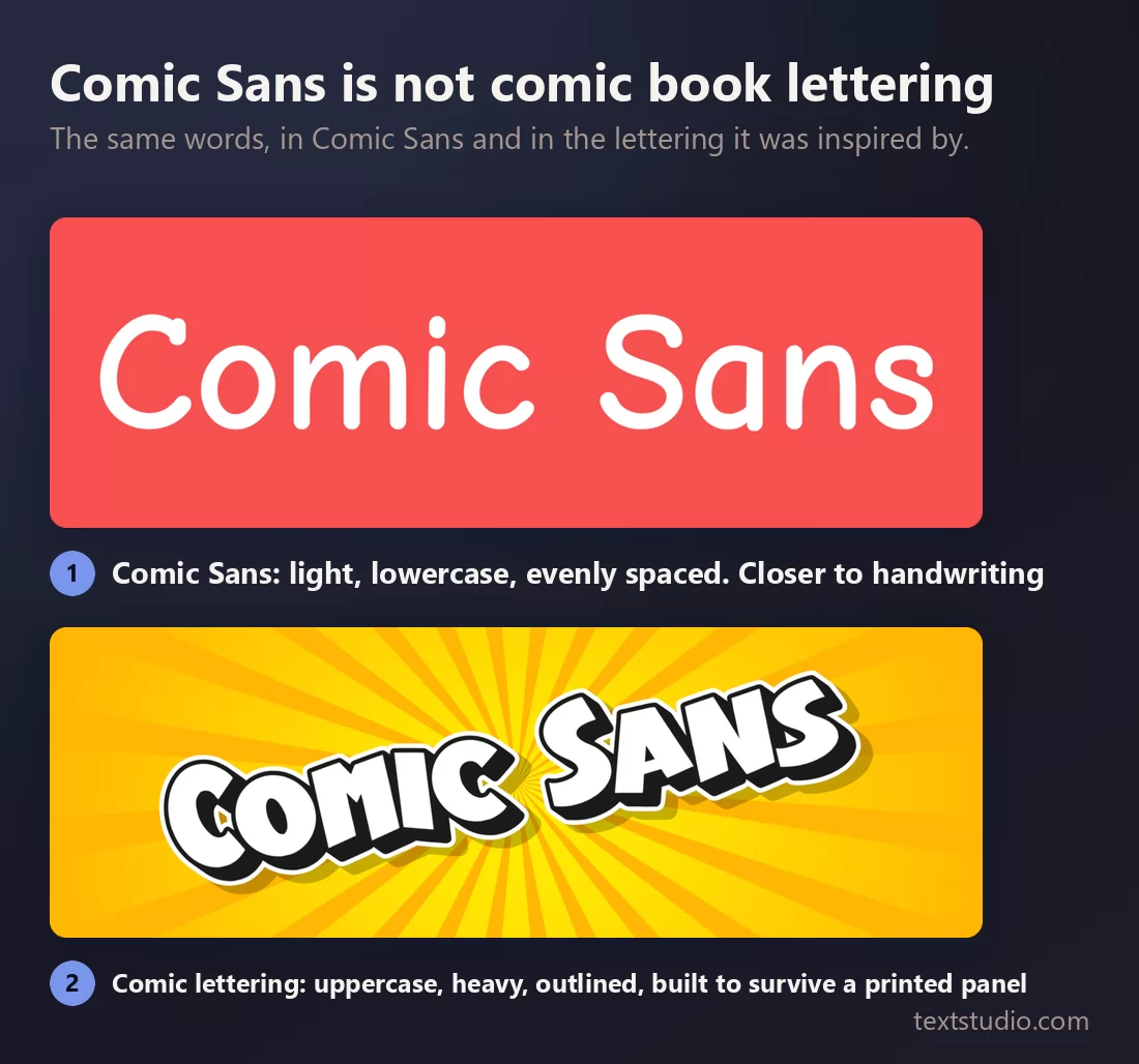
Real comic lettering is uppercase, heavy, tightly outlined and built to hold up when a panel is printed small on cheap paper. Comic Sans is light, lowercase and evenly spaced. It is much closer to handwriting than to anything in a comic.
So if you picked Comic Sans because you wanted a comic feel, you picked the wrong tool, and the fix is easy: use actual comic lettering.
Why it is everywhere
Connare drew it in 1994 for Microsoft Bob, a piece of software meant to make computers friendly for beginners, in which a cartoon dog gave you advice. The dog's speech bubbles were set in Times New Roman, which is a genuinely absurd thing for a cartoon dog to speak in, and that is the problem Comic Sans was drawn to fix.
It then missed the deadline for Bob and shipped elsewhere in Windows instead. That is the whole story: a typeface designed for cartoon speech bubbles ended up preinstalled on every machine on the planet, where it became the only informal-looking option most people had, and it was used for restaurant menus, funeral notices, hospital signs and corporate presentations.
Connare has never apologised for it. His line, in a 2014 interview, was that people who do not like it do not know anything about design, because in design you work to a brief. He has a point about the brief. He also, quietly, did not have to look at it on a bank's letterhead.
When it is genuinely the right call
Being fair about this matters, because "never use Comic Sans" is bad advice given as a rule.
It works for children's material, which is the register it was drawn in. A classroom sign, a school worksheet, a party invitation for a six-year-old. It works where letter differentiation is useful, for the reasons measured above. And it works in a genuinely informal one-off, a note pinned to a door, where the alternative is not a better typeface but no thought at all.
What kills it is professional context and repetition. A brand uses its lettering thousands of times, and Comic Sans is far too loaded to be seen that often. It is not that the drawing is bad. It is that everyone has already decided what it means.
What to use instead, job by job
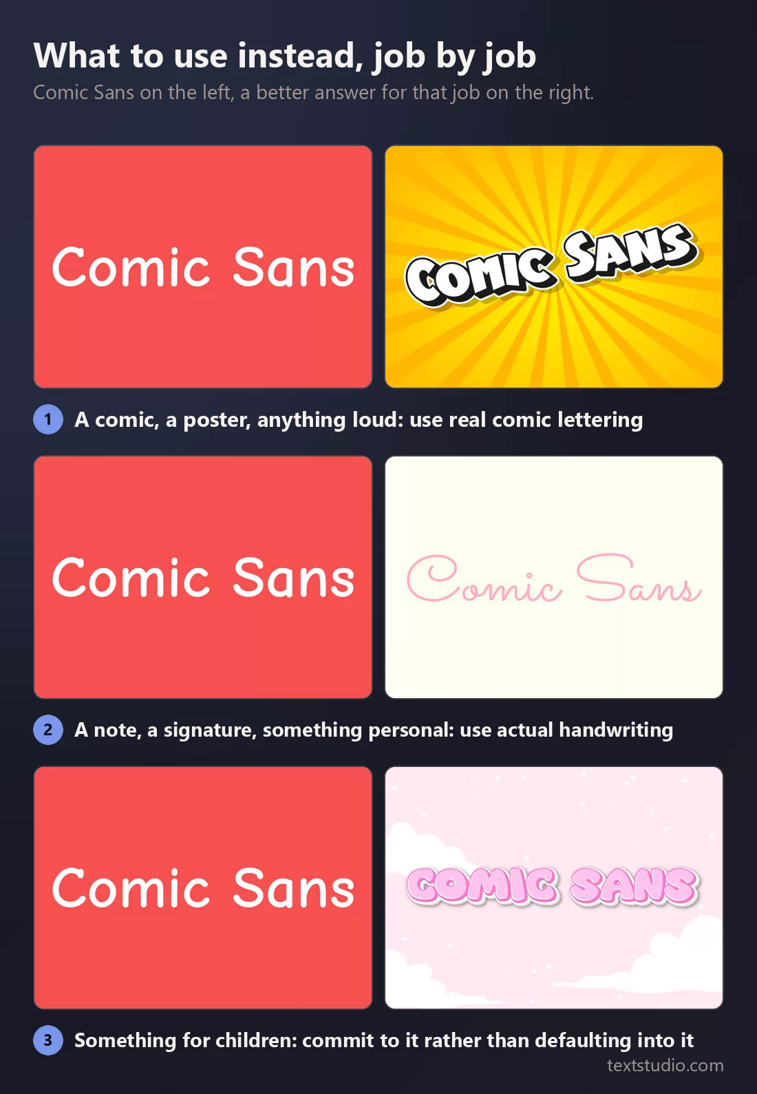
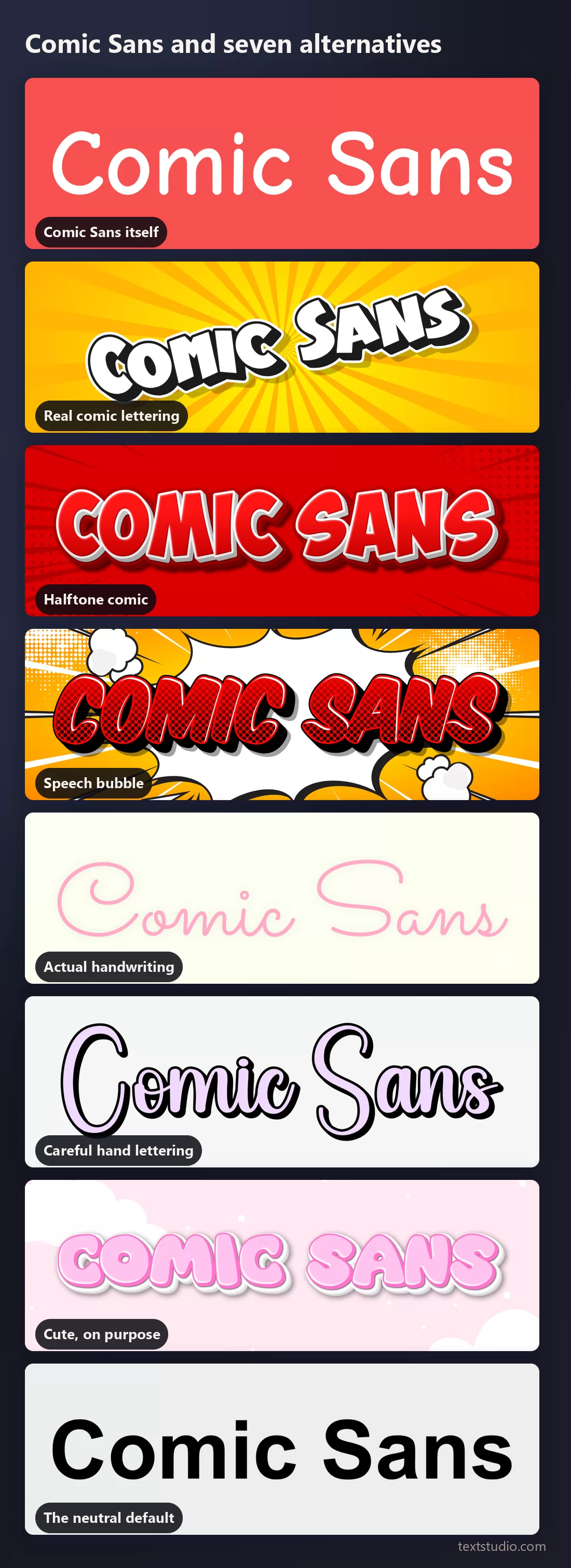
1. Comic Sans itself
The typeface on its own, so the letterforms are visible without a background doing any persuading.
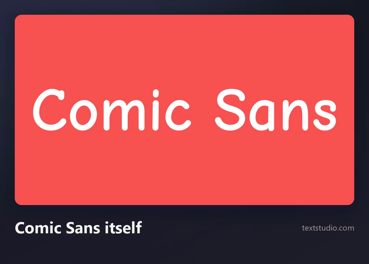
Round, light, slightly uneven. Nothing about it is badly made. It simply has one register and no way to hide.
2. Real comic lettering
What most people actually wanted. Heavy capitals with a thick outline and a drop shadow, on a burst background.
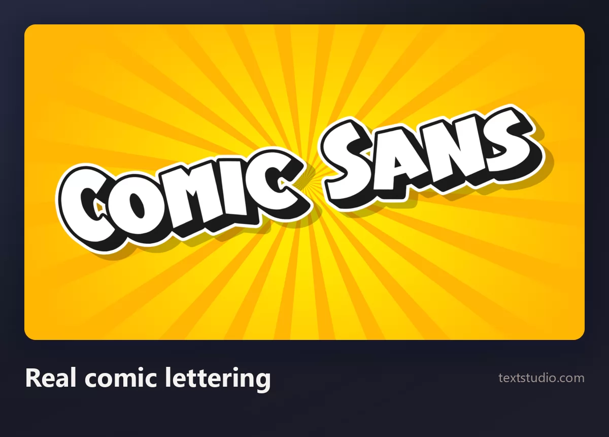
Good for: posters, thumbnails, anything meant to shout. This is the register Comic Sans is named after and does not occupy. If you like it, the comic lettering guide covers the rest of the family.
3. Halftone comic
The same energy with printed comic texture behind it: red, dotted, slightly retro.
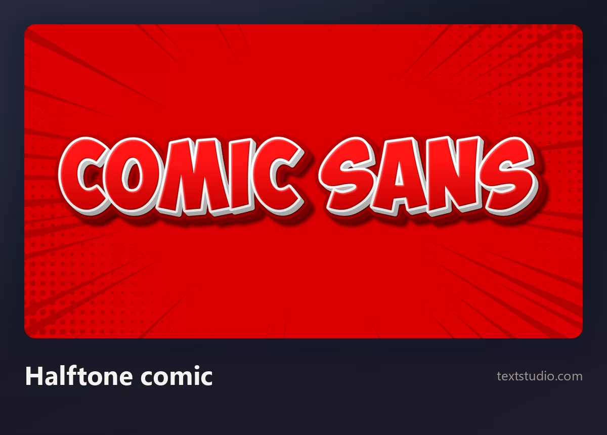
Good for: retro comic material, event posters, merchandise. The halftone does the period work so the letters can stay simple.
4. Speech bubble
Lettering set inside an onomatopoeia burst, which is the closest thing to what Comic Sans was originally briefed to do.
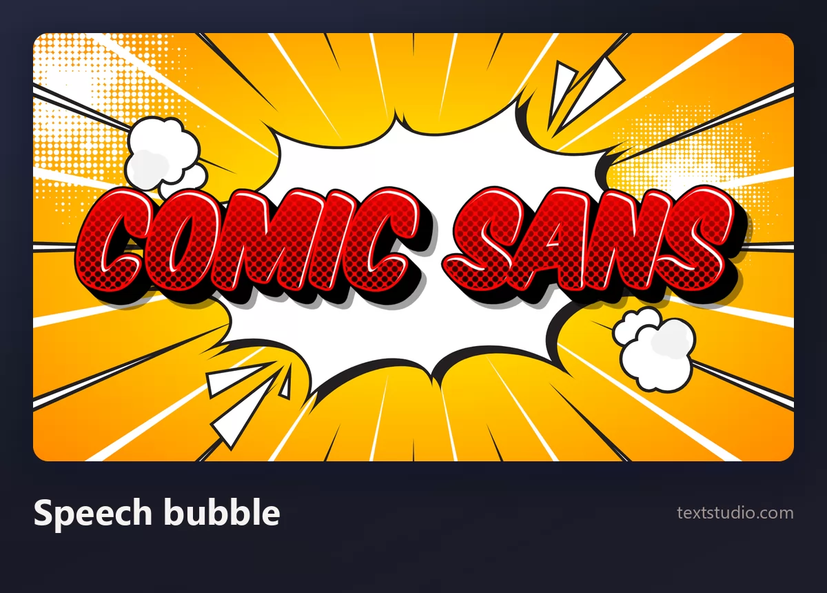
Good for: reaction images, memes, anything with dialogue in it. If your text is something a character says, put it in a bubble and the whole problem goes away.
5. Actual handwriting
If what you wanted was the human touch, get a real one. A thin monoline script reads as a person rather than as a default.
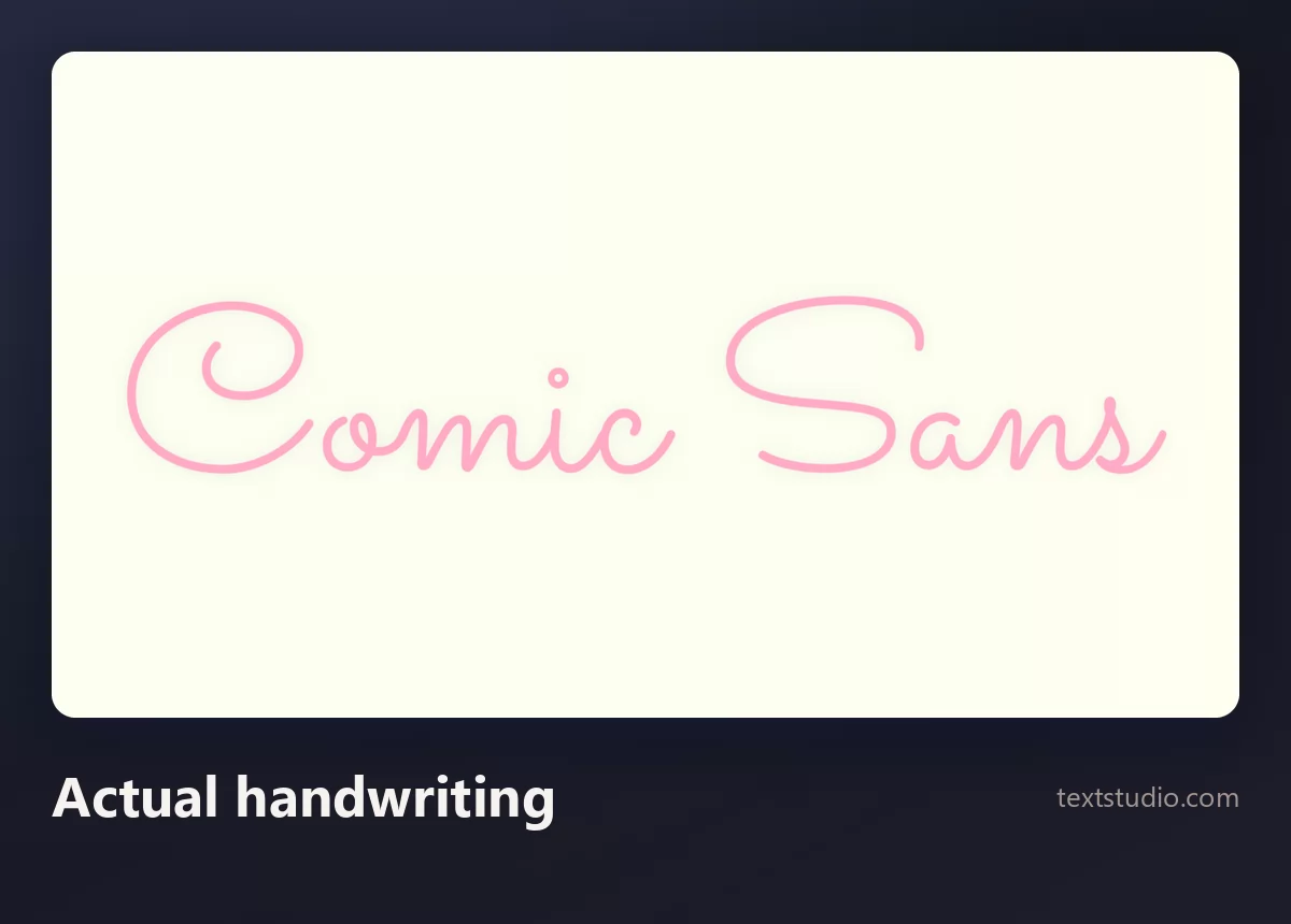
Good for: notes, signatures, personal messages, anything that should feel written rather than typed. More options in the cursive lettering guide.
6. Careful hand lettering
The grown-up version: a drawn script with contrast and an outline, still handmade but clearly deliberate.
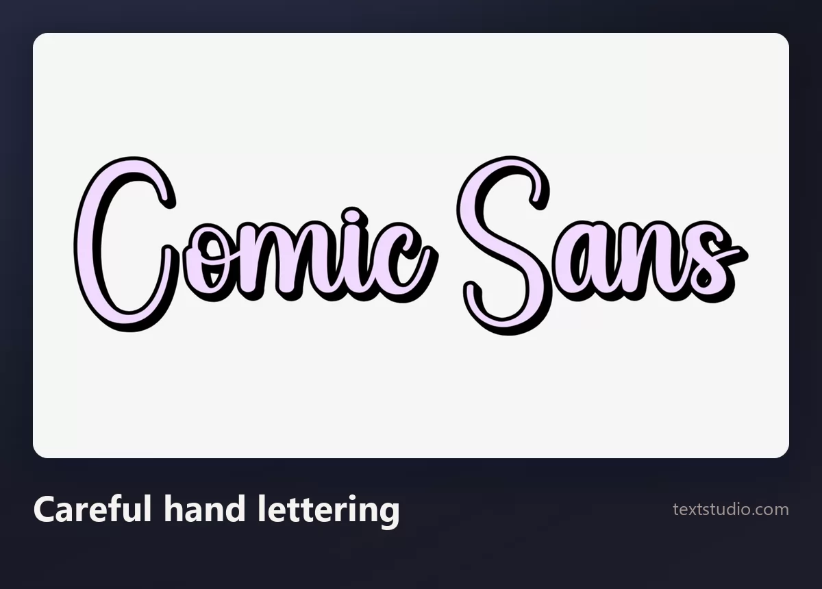
Good for: invitations, packaging, small brands. It gives you the warmth without the schoolroom.
7. Cute, on purpose
If the audience really is children, choose that on purpose rather than arriving at it by default.
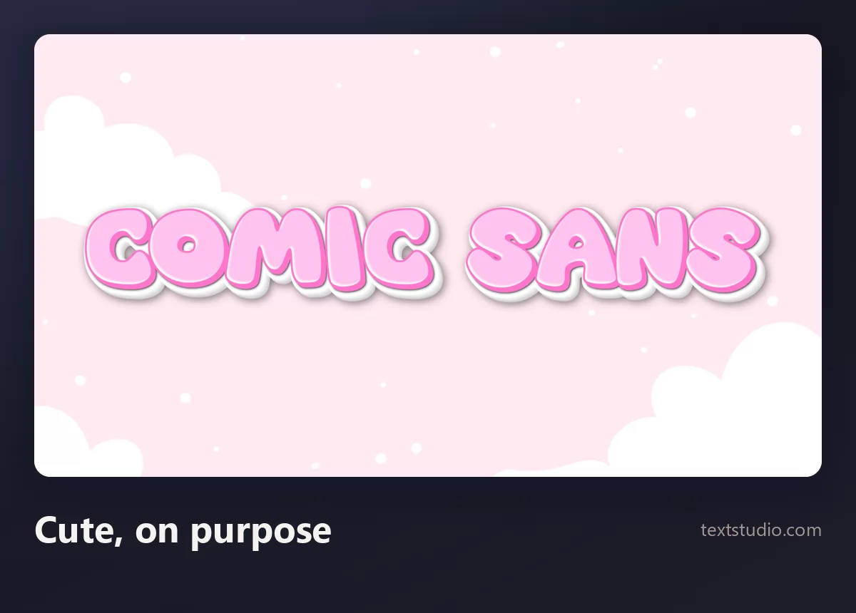
Good for: nurseries, children's events, toys. There is a whole range here, covered in the cute lettering guide.
8. The neutral default
Sometimes the right answer is that the text should not have a voice at all.
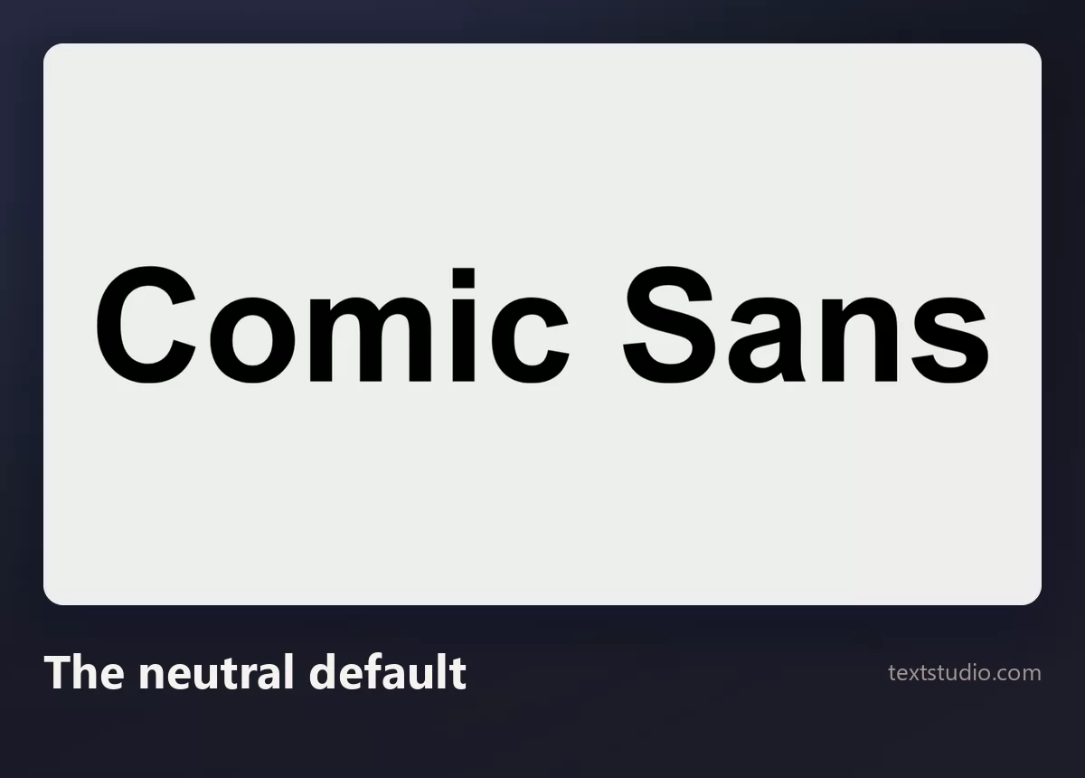
Good for: anything informational. If the reason you reached for Comic Sans was "the default looked boring", boring is often correct, and the interest should come from the layout instead.
Comic Sans and seven alternatives
Together, the point becomes clear: Comic Sans is a single register being asked to cover comics, handwriting, children and informality all at once.
How to decide
- Name the register you want. Comic, handwritten, childlike, informal. Comic Sans is used for all four and is only really at home in one.
- If you want comics, use comic lettering. Uppercase, heavy, outlined. It is not the same thing and the difference is obvious once you see it.
- Ask how often it will be seen. A one-off tolerates a loaded typeface. A brand does not.
- Keep it for children's material and short informal notes, where its reputation costs you nothing.
- Do not use it to look friendly in a professional document. The reader will notice the font before the message, which is the opposite of what you wanted.
- If accessibility is the reason, say so and pick deliberately. Comic Sans is one reasonable option among several, not the only one.
FAQ
Who created Comic Sans and when?
Vincent Connare, at Microsoft, in 1994. He drew it for Microsoft Bob, where a cartoon dog spoke in Times New Roman, and it missed that deadline and shipped elsewhere in Windows instead.
Why do designers hate Comic Sans?
Mostly because of where it turns up rather than how it is drawn. It is preinstalled everywhere, so it became the default informal typeface for people with no other options, and it ended up on hospital signs, funeral notices and corporate slides where its register is completely wrong.
Is Comic Sans good for dyslexia?
It has properties that help: its letters are drawn individually, so b and d are not mirror images of each other, and the British Dyslexia Association lists it among recommended fonts. But that association also recommends Arial and Verdana, and the best-known eye-tracking study on the subject did not test Comic Sans. It is a reasonable choice, not a cure.
Is Comic Sans the same as comic book lettering?
No. Real comic lettering is uppercase, heavy and outlined, built for a printed panel. Comic Sans is light, lowercase and much closer to handwriting. The comparison above shows the two side by side.
What should I use instead of Comic Sans?
It depends on the job: real comic lettering for anything loud, actual handwriting for anything personal, a deliberate cute style for children, and a plain neutral sans when the text should simply be read. The section above pairs each job with an answer.
Is Comic Sans free?
Free to use, not free to redistribute. It ships with Windows, macOS and Office, and that licence covers your own documents. Putting the file on a website or inside an app needs permission from Microsoft.
What is the free version of Comic Sans?
Comic Neue, on Google Fonts. It is open-licensed for any use, including commercial, and it is a tidier drawing of the same idea, so it is the one to use on a website or in a product.
Make your own
Type your words, look at them in Comic Sans, then look at them in the alternative for your actual job. If the answer is still Comic Sans, use it without apologising. If you want the other famous over-familiar typeface, the Papyrus guide does the same exercise. Open the TextStudio Comic Sans generator and see your words both ways.