
 Mia Hartley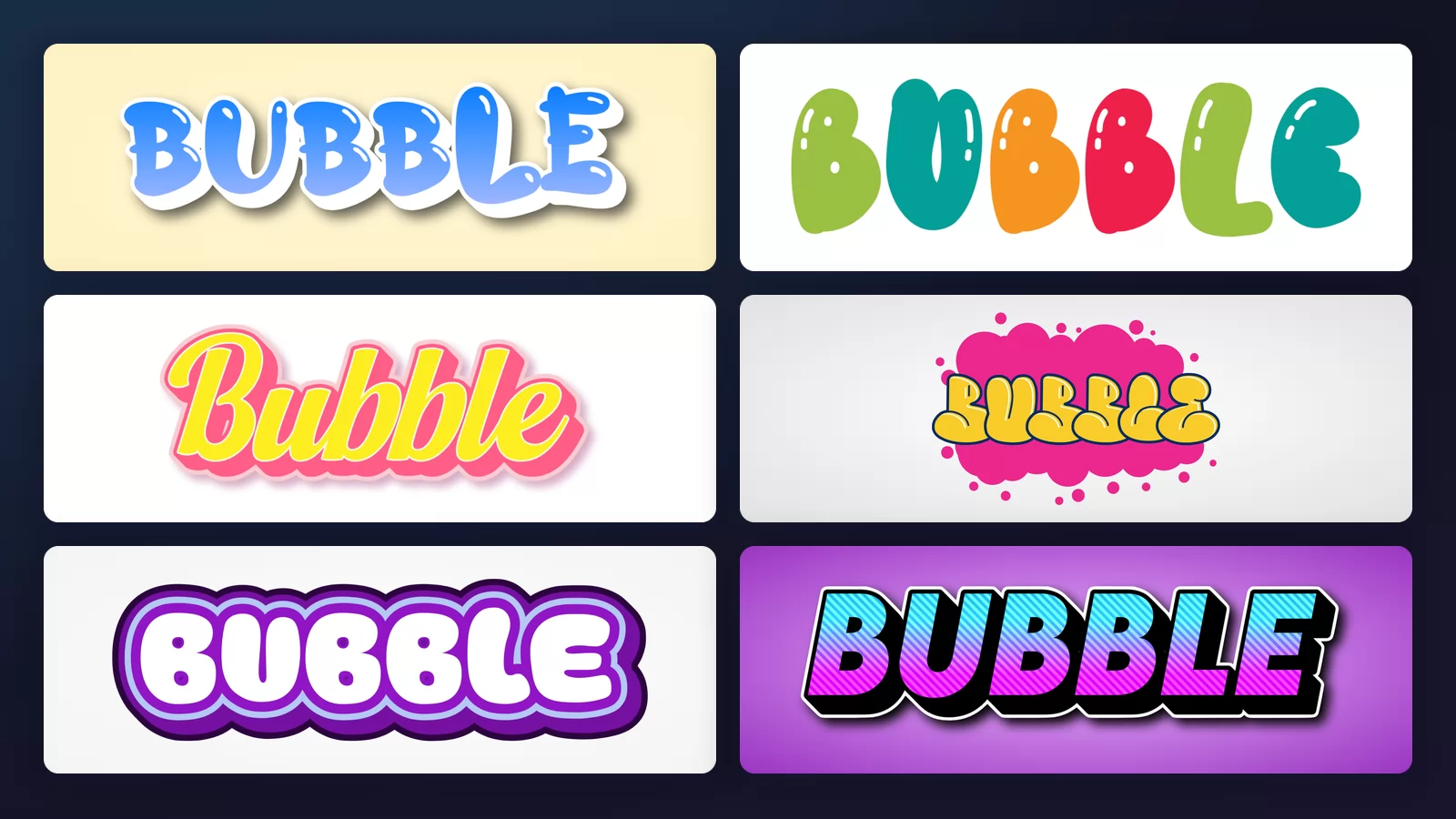
Almost everyone has drawn bubble letters. You write a word, you trace a fat outline around each letter, you round off every corner, and the whole thing puffs up like it has been inflated. It is the first lettering most people ever invent for themselves, usually in the margin of a school notebook.
What almost nobody does is stop and ask why some sets of bubble letters look right and others look like deflated balloons. There is a single rule behind it, and once you can see it, both drawing them and picking a ready-made one get much easier.
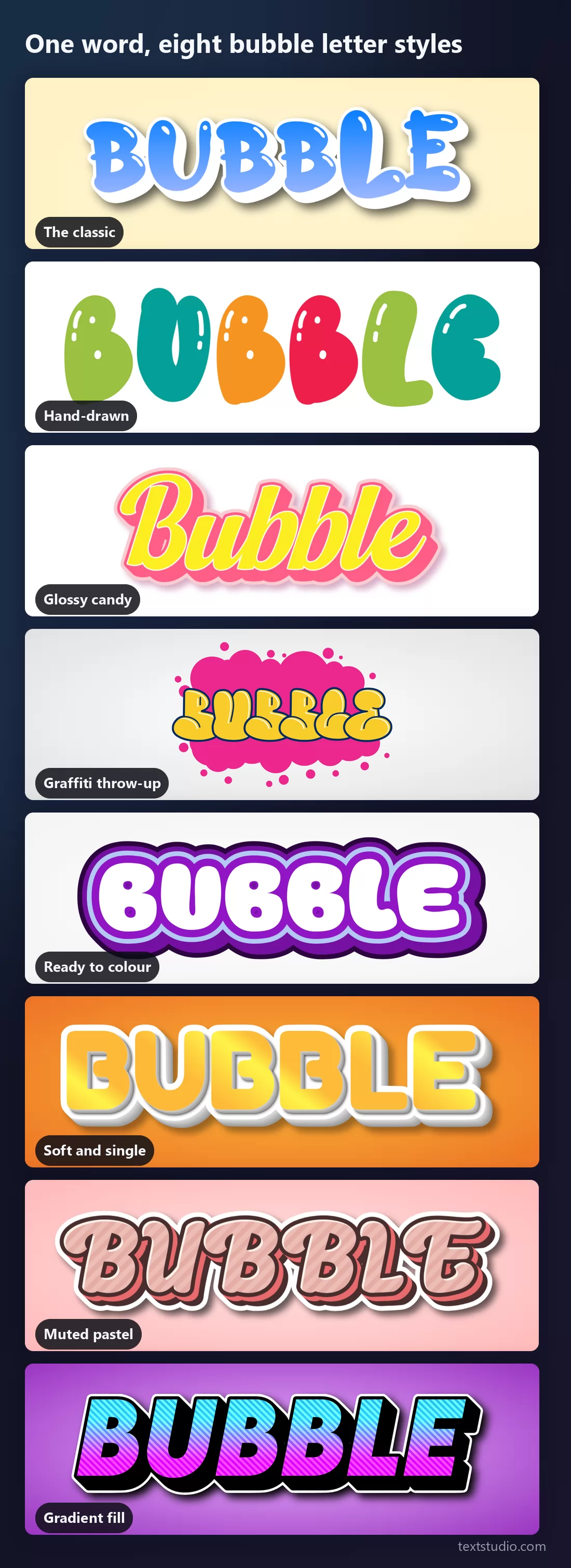
Every image below is the same word rendered with the bubble letter generator of TextStudio, so nothing changes from one picture to the next except the style itself.
The rule: puff the outside, and the inside gives way
A bubble letter is a normal letter that has been inflated from the outside in. The stroke thickens outward, but the letter still has to fit in the same space, so everything else has to shrink. What shrinks first is the hole inside the letter, the part typographers call the counter: the middle of an A, B, D, O, P, Q or R.
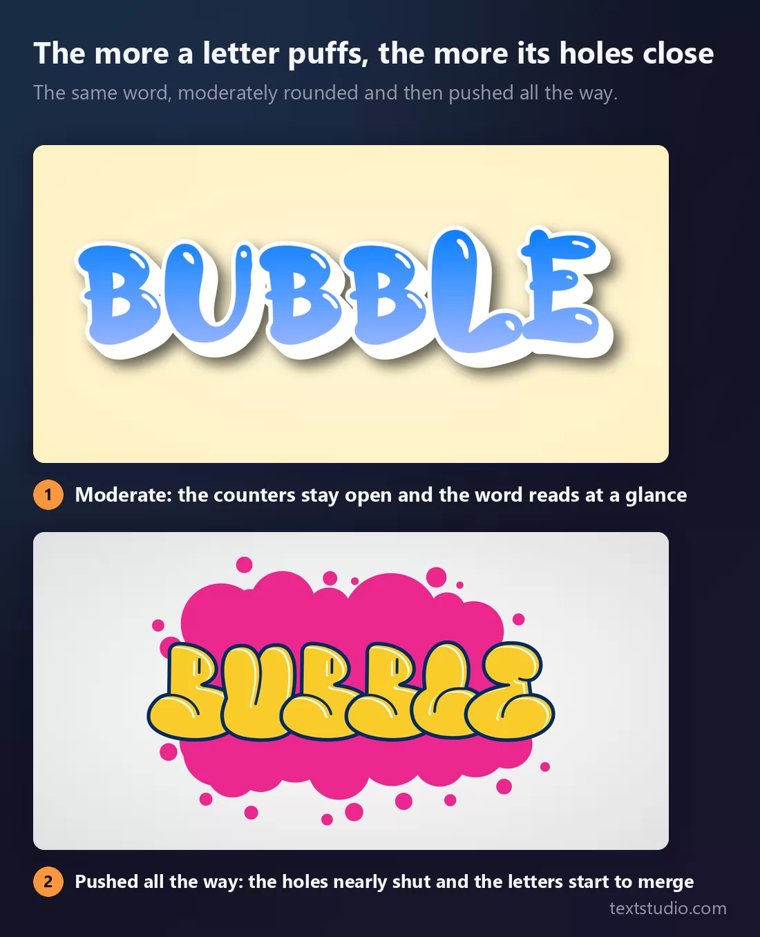
That is the whole trade-off. Puff a little and you get friendly, readable letters. Puff a lot and you get the graffiti look, where the counters close to slits and neighbouring letters press into each other. Both are legitimate; they are just for different jobs.
It also explains the mistake beginners make. They thicken the outline evenly all the way round, including inward, which strangles the counter before the letter has had a chance to look inflated. The fix is to grow the shape outward and let the inside close only as much as it must.
1. The classic
A soft blue gradient inside a white outline, with a highlight along the top of each letter. This is the shape most people picture when they hear "bubble letters", and it is the safest one on this list: the counters stay open, so the word survives at any size.
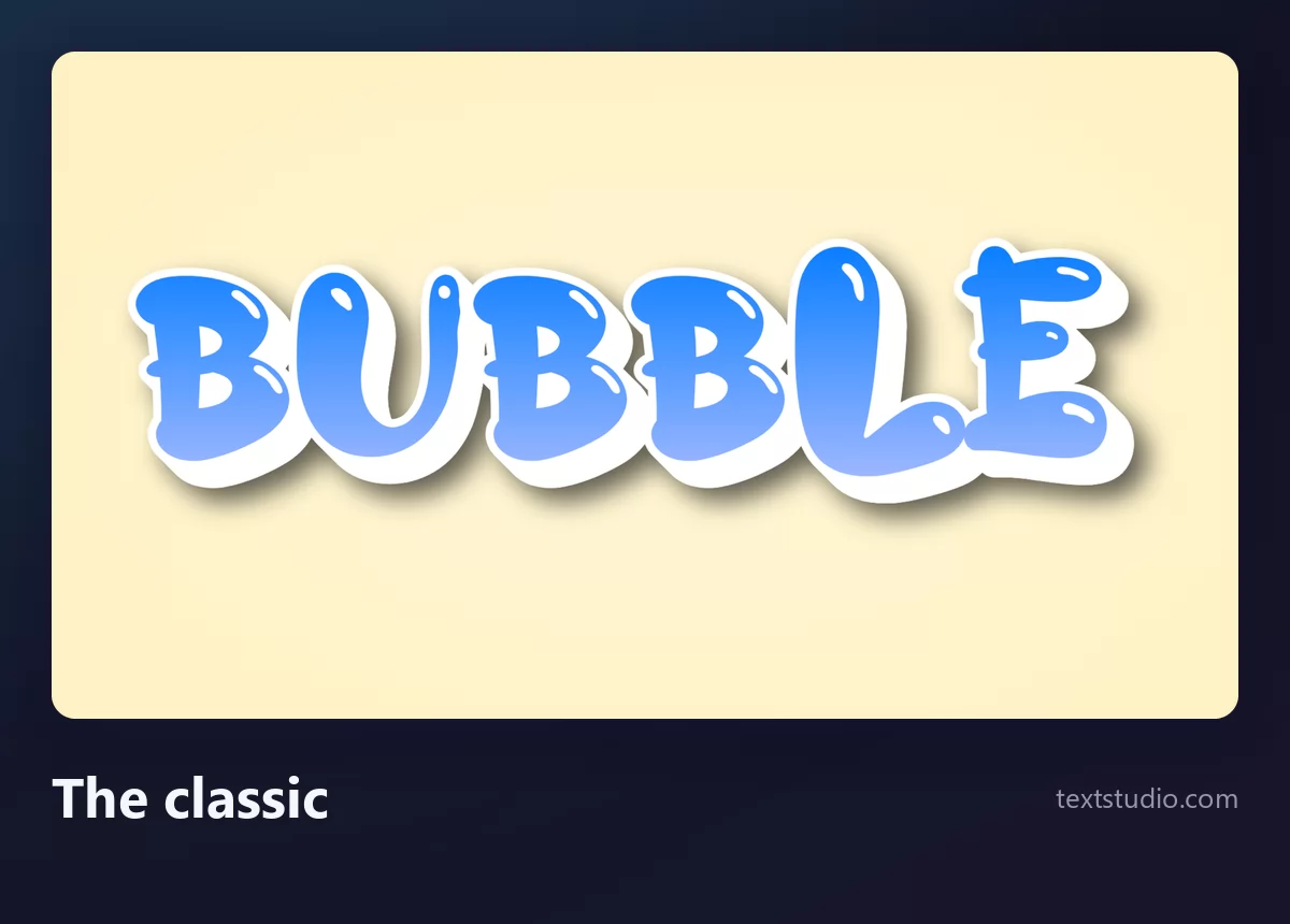
Good for: headers, thumbnails, birthday cards, anything that needs to read instantly and feel friendly.
2. Hand-drawn
Fat, uneven, each letter in a different colour with a small white glint. No outline at all, just the filled shape. It is the closest a generator gets to the version you would draw yourself, wobble included.
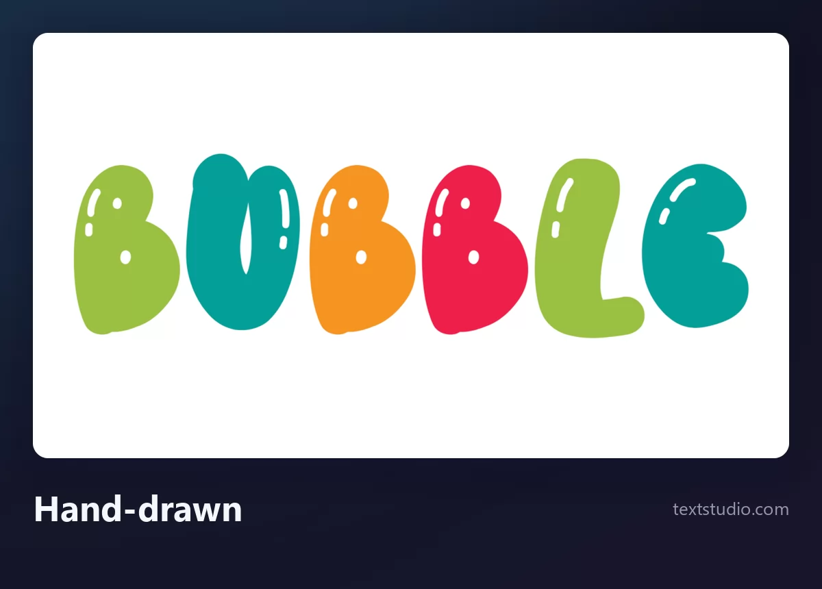
Good for: classroom displays, children's projects, craft posters. The irregularity is the point, so do not pair it with a rigid grid layout.
3. Glossy candy
A bubble script: the letters are joined and slanted rather than standing separately. Yellow over pink with a hard gloss, the lettering of sweet packaging and ice cream vans.
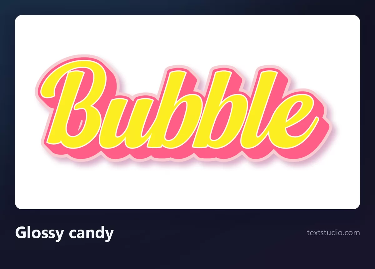
Watch out for length: joined slanted letters lose readability faster than separated ones, so keep this to a word or two.
4. Graffiti throw-up
The extreme end of the rule above. Letters inflated until they lean on each other, counters reduced to slits, set on a cloud shape. In graffiti this is called a throw-up, and it is meant to be painted fast and read from across a street.
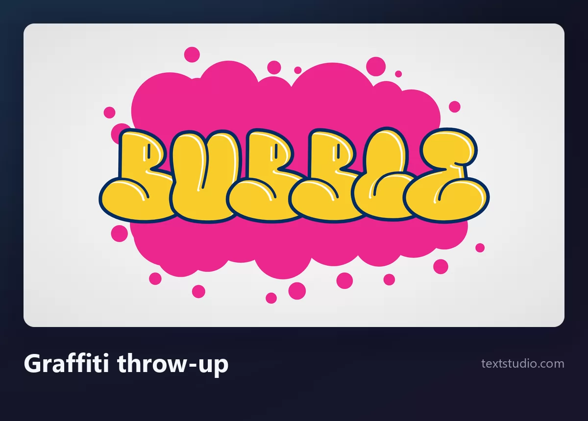
Good for: street-art posters, skate and music artwork, anything that wants attitude. If you like this register, the graffiti lettering styles guide covers the rest of the family, from tags to full pieces.
5. Ready to colour
White inside, with several outlines stacked around the word in purple. Because the interiors are empty, this is the version you print and hand to someone with a box of pencils, which is what a large share of bubble letter searches are actually looking for.
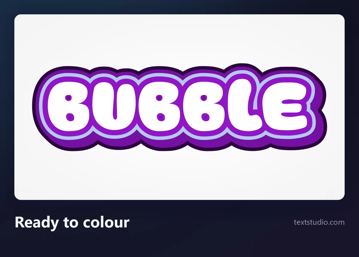
Good for: colouring sheets, name banners, worksheets, party decorations that the children finish themselves.
6. Soft and single
One warm colour, gentle rounding, a soft shadow instead of an outline. It is the quietest bubble style here, which makes it the one that survives next to a body of text without shouting over it.

Good for: app screens, packaging, presentation titles. It is also the easiest to recolour to match a brand.
7. Muted pastel
The same rounded shapes in a desaturated pink, built from stacked layers so the word looks like a sticker lifted off the page. Softer and more grown-up than the rest of this list.
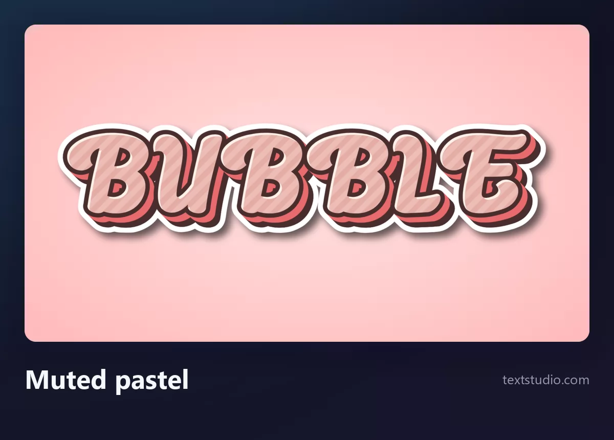
Good for: stationery, wedding and baby-shower material, anything where the usual primary colours would feel too loud.
8. Gradient fill
Rounded letters with a heavy black outline and a two-colour gradient running through the fill. The outline does the readability work, which frees the fill to be as bright as you like.
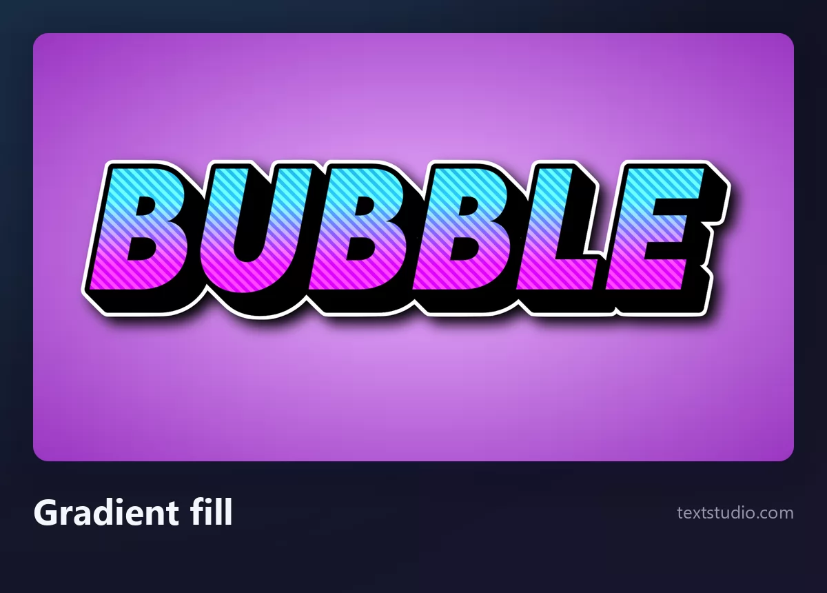
Good for: thumbnails, stream overlays, sale banners. A strong outline is also what lets bubble letters sit on a photograph without disappearing into it.
One word, eight styles side by side
Seen together the family splits cleanly: two of them have no outline at all, three lean on a heavy one, and the two most inflated are the two hardest to read.
What bubble letters are actually for
They are not interchangeable. The distance between a classroom banner and a skate poster is much wider than the distance between two styles inside the same group.
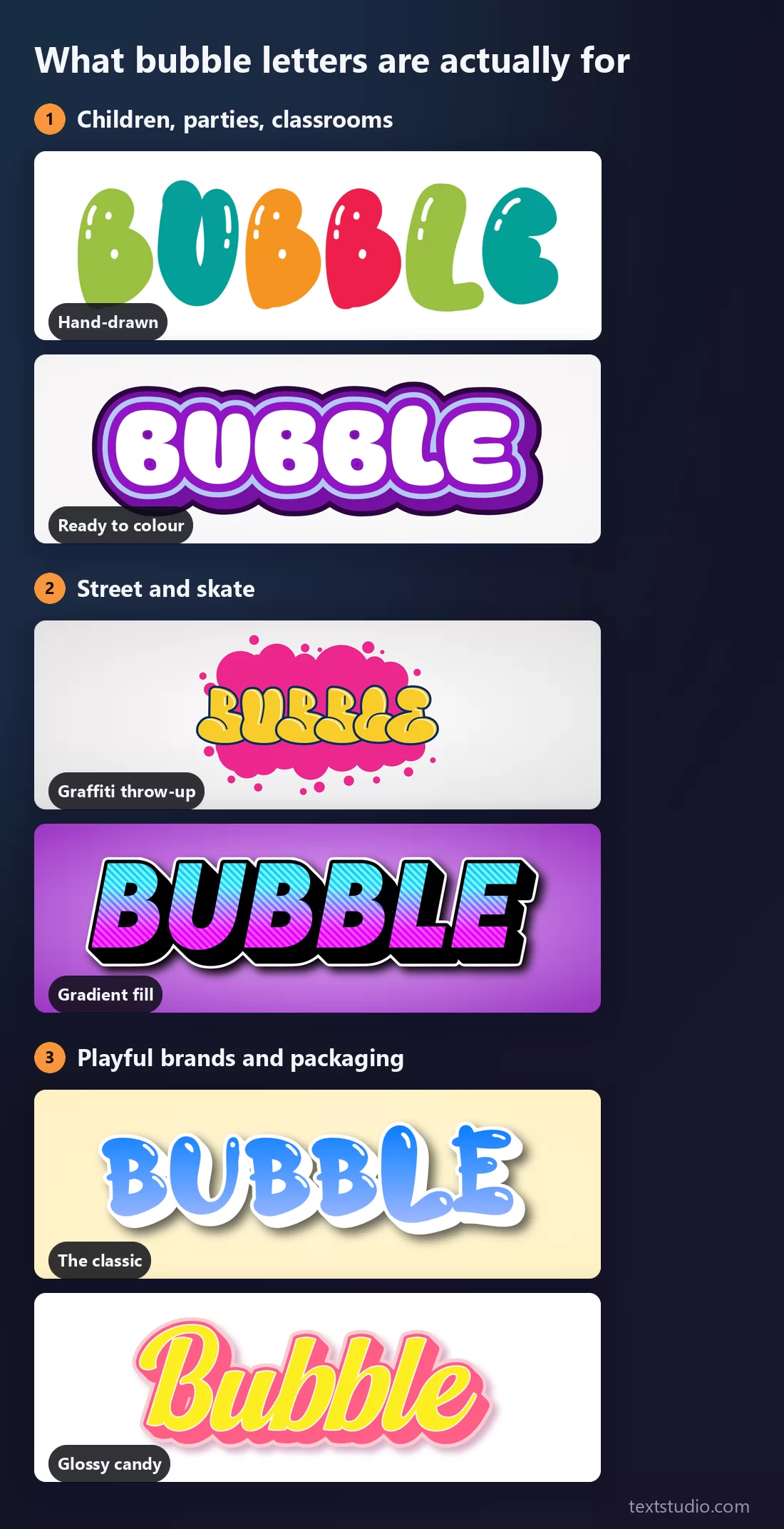
- Children, parties, classrooms. Rounded, open counters, bright flat colour. Readability matters more than style here, because these words usually carry a name, a date or a room number.
- Street and skate. Inflated to the limit, heavy outlines, one or two words maximum. This is where the throw-up belongs.
- Playful brands and packaging. Consistent shapes, one gradient or one gloss, nothing hand-wobbled. The letters have to survive being printed small on a box.
An outline to colour, or already filled
Two different jobs hide behind the same search. Some people want a finished word to drop into a design; others want an empty shape to print and colour, which is the classroom version of bubble letters and the reason they have survived for fifty years.
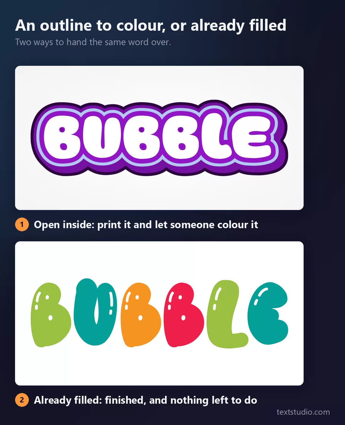
If you need the printable version, pick a style whose interior is white and whose outline is dark, then print it at the largest size the page allows. Thin outlines vanish under a felt-tip pen.
How to draw bubble letters by hand
Five steps, and the third is the one people skip.
- Write the word normally, in pencil, with wide gaps between the letters. Those gaps become the thickness of the bubbles, so leave more room than feels right.
- Trace an outline around each letter, roughly the width of the original stroke, staying outside the pencil line the whole way round.
- Round every corner and every end. No point should survive. This is the step that separates bubble letters from a simple outline, and it is the one that gets rushed.
- Let the counters shrink. Where the outline of an A, B, D, O, P, Q or R closes in on itself, keep the hole small but keep it open. If it closes completely, the letter turns into a blob and stops being readable.
- Erase the pencil, then add one highlight in the top left of each letter, always on the same side. A single consistent glint is what makes the shape read as inflated rather than merely fat.
Where letters touch, decide which one is in front and draw the other one behind it. Overlap is normal in bubble lettering, and pretending it does not happen is what produces cramped, squashed words.
How to pick a bubble style
- Count your words first. One word can take any style on this page. A phrase needs open counters and separated letters, which rules out the throw-up and the script.
- Decide whether it will be coloured. If someone is going to fill it in, you need an empty interior and a thick dark outline, not a finished gradient.
- Check it small. Bubble letters lose their highlight before they lose their shape, so a style that relies on gloss will look flat at thumbnail size.
- One decorative font per design. Bubble letters are already loud. Set the details, the date and the address in something plain.
- Match the outline to the background. On a photo or a busy pattern, only the heavy-outlined styles survive. On plain paper, an outline-free style looks softer and more hand-made.
FAQ
What are bubble letters?
Letters drawn with a thick, rounded outline so they look inflated. Every corner is rounded off, the strokes are much fatter than in a normal typeface, and the holes inside letters like A, B and O are smaller than usual because the shape has grown outward into them.
How do you draw bubble letters step by step?
Write the word in pencil with wide spacing, trace a fat outline around each letter, round off every corner and terminal, keep the inside holes small but open, then erase the pencil and add a highlight in the same corner of every letter. The full version is in the section above.
Are bubble letters and graffiti letters the same thing?
Not quite. A graffiti throw-up is a bubble letter pushed to its limit, but graffiti also covers tags, wildstyle and block letters, which are built on completely different shapes. The overlap is real but partial.
What is the best bubble font for kids?
An outline style with white interiors if they are going to colour it in, or a hand-drawn multicoloured style if they are not. Both keep their counters open, so a name or a date still reads.
Can I use bubble letters in Instagram captions or messages?
The copy-paste tools that offer this swap your letters for unusual Unicode characters rather than changing the font, which can show up as empty boxes on other people's devices. We explain when that matters in the guide to cursive fonts and pasted text.
How do I make bubble letters without drawing them?
Type your word into a generator and pick a style. That is what every image on this page is: the same word, one style each, exported straight from the editor.
Make your own
Type a word, try the classic first, then push it towards the throw-up and watch the counters close. If you want to keep the rounded shapes but change what fills them, the coloured text effects guide covers that side. Open the TextStudio bubble letter generator and inflate your own.