
 Mia Hartley
Type a word, pick a style, download a PNG. That is the whole thing, and it takes about ten seconds.
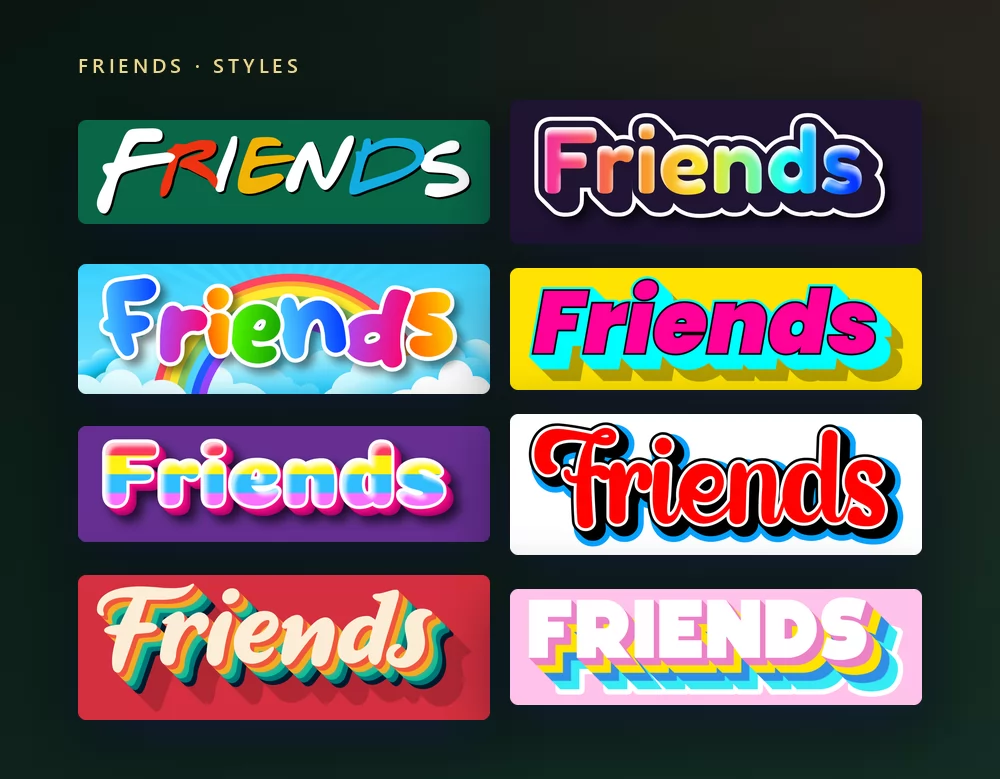
They all come from the same Friends font generator, with a different style picked from the list. Nothing to install, no account, and every style above is free.
About the Friends font
Friends ran on NBC from 1994 to 2004, ten seasons about six friends in their twenties and thirties living in Manhattan. Its title card is one of the most copied pieces of television lettering ever made: irregular hand-drawn capitals, some white, some red, yellow or blue, with coloured dots between them, on a plain field.
That lettering was drawn, not typed, so there is no official Friends font. What exists are fan versions, and the closest free ones are Gabriel Weiss' Friends and Minus Cre by Fred Cre.
Two other fonts belong to the show and get confused with it constantly. The DVD sleeves are set in Berliner Grotesk Light, by Erik Spiekermann. The end credits on screen use Lydian, by Warren Chappell. Neither of them is the title lettering, and both are commercial faces.
One more trap worth naming: there is also a modern sans serif family literally called Friends, by W Type Foundry. It has nothing to do with the show. If you buy a licence for it expecting the sitcom look, you will be disappointed.
How to make Friends text
Step 1. Type the word
Open the generator and replace the sample text with yours: a name, a group chat title, a caption, a couple of words for a poster. The letters redraw as you type, and the colours distribute themselves.
Step 2. Pick a style
The style on the target page is the show one. Worth knowing before you compare it to the title card: the original puts coloured dots between white letters, while this preset puts the colour on the letters themselves. That is a deliberate difference, not a miss. Dots between every letter of a long name turn into visual noise, whereas coloured letters keep working at any length.
Step 3. Pick the shape
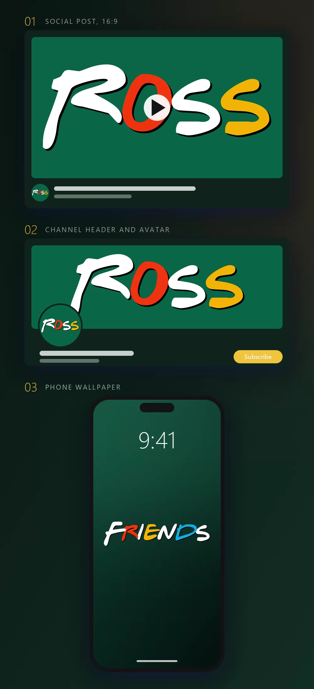
Set the shape before you export and nothing gets cropped afterwards. A 16:9 for a post or a story frame, a square for an avatar, a wide strip for a channel header, a tall one for a wallpaper. The three mock-ups above are what those shapes become once they are in place.
Step 4. Download
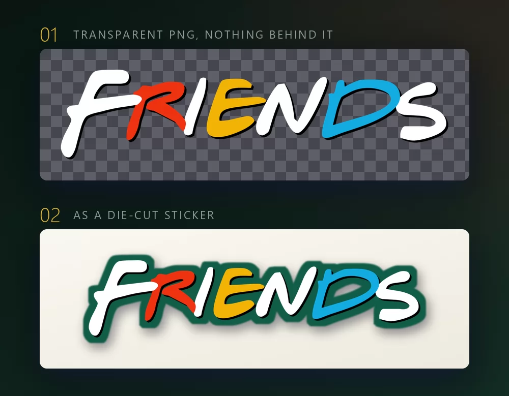
In the Download tab, take the transparent PNG if the words are going onto something else: your own photo, a coloured background, a slide, a cutting machine for a laptop sticker. This is the option most people miss, and it is the one that matters, because the lettering keeps its shape instead of arriving inside a green rectangle.
Long words fill the width fast
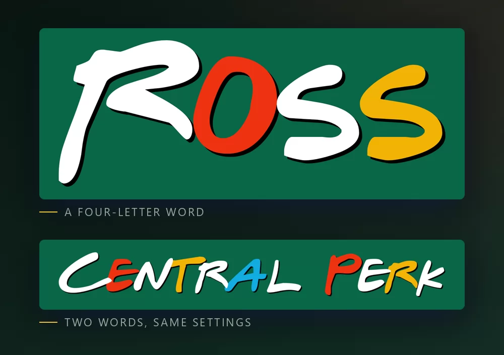
The more letters there are, the tighter they sit. Character spacing is a slider in the Text tab: open it up a little and a long phrase stops looking cramped. The same tab holds zoom, line height, curve and rotation.
If you want characters to paste, not a picture
This is worth saying plainly, because a good share of people searching for the Friends font are not after an image at all. They want characters they can paste into a bio, a username or a group chat name, so the style travels with the text.
That is a different tool and a different technology: it uses Unicode variants of the alphabet rather than a drawn image. Our fancy text generator does that job. Be aware of the trade-off: pasted characters keep their look anywhere, but you get none of the colour, and some apps and screen readers handle them badly.
If you want the actual show look, with its colours, it has to be an image.
The show look, or the friendship look
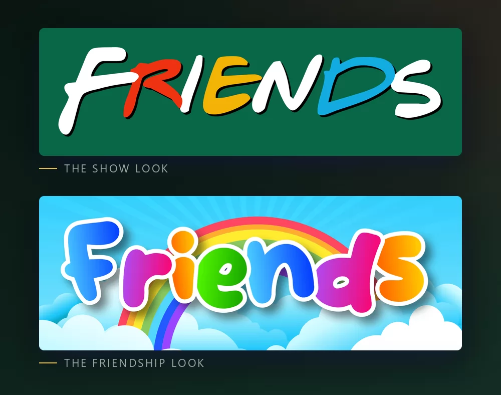
The show look is the one people picture: the irregular hand-drawn capitals with the colour scheme of the title card. It says the sitcom immediately, which is what you want for a fan post or a rewatch story.
The friendship look is the other half of what gets searched for, and it is not the same thing. Rainbow letters, soft outlines, a bright background: it says friendship in general rather than one television series. For a card to an actual friend, it often lands better.
Both are in the same list, so you can try a word in one, then in the other, without leaving the page.
Which font to install, if you want one
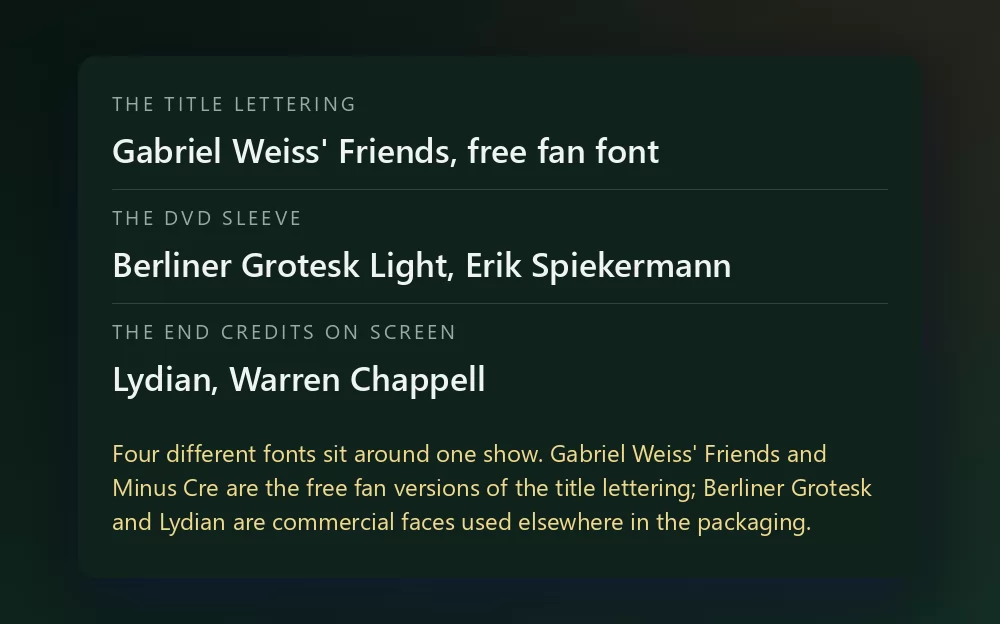
Gabriel Weiss' Friends is the fan font that recreates the title lettering, and it is the one every download page points to. It is free, and it lives on the usual font aggregators rather than on an official page, so read the label where you find it. Minus Cre, by Fred Cre, is the other free approximation.
Berliner Grotesk Light and Lydian are real commercial typefaces with real histories, used on the sleeves and in the credits. Buy them if you want them, but do not expect the title card.
None of these gives you the colours. The lettering is only half the look here; the palette is the other half, which is why the generator hands you both at once.
What people actually make with it
Rewatch posts and stories first: a favourite quote, an episode title, a screenshot with a caption. Then phone wallpapers, group chat and party names, laptop and water bottle stickers, birthday cards for a friend, and printed T-shirts for a reunion. Almost all of that goes better with a transparent PNG than with an installed font, because the colour is doing half the work and a font file gives you letter shapes and nothing else.
How to make Friends text in Canva
Canva does not have Gabriel Weiss' Friends. It has plenty of hand-drawn brush faces that get you near the shape, but not the palette, and it is the palette that people recognise. The reliable route is to make it here as a transparent PNG and upload it: it drops straight into a Canva post and stays sharp.
The text effects app for Canva carries thousands of styles, but not the brand ones: Canva does not accept third-party logos inside its apps, so uploading the PNG is the way in for this one.
How to make Friends text in Photoshop
Install Gabriel Weiss' Friends, type in capitals, then do the part the font does not do:
- Colour the letters individually. Split the word across several text layers, or use character-level colour, and set most letters white with one red, one yellow and one blue among them.
- Add the dots as small circles between the letters if you want the exact title card, cycling through the same three colours.
- A thin dark outline on the letters, and a flat coloured background behind everything.
The irregularity is the point. If every letter sits on the same baseline at the same size, it stops looking like the show.
How to make Friends text in Word
Install the font, type your text, and use text effects for the outline. Word can colour letters individually, which is most of what this look needs. For a post or a wallpaper you are still better off dropping an exported PNG onto your page.
On a phone
On iOS and Android, most apps cannot install and use a font. The generator runs in a mobile browser, which is where most stories get made anyway: make the PNG on the phone, save it to the photos, and add it in whatever app you were using.
Is the Friends font free
The generator is, and every style shown above is free. Gabriel Weiss' Friends and Minus Cre are free fan fonts; their licence labels vary by host, so treat them as personal use unless the page you download from says otherwise. Berliner Grotesk and Lydian are commercial.
There is a second question underneath, and it gets mixed up with the first one constantly: a font licence is not a trademark licence. Friends belongs to Warner Bros., and the title lettering is part of that identity. A wallpaper or a birthday card for a friend is the kind of use nobody has ever objected to. Selling merchandise that trades on the show is another matter, and no font licence covers that for you.
Open TextStudio, type a word, and see the style straight away.
More fonts and styles to try
If you came for a film or television font, these cover the same ground:
- Cars font generator : the chrome crest badge with your own name inside
- Disney font generator : the signature script and the Mickey lettering, plus a style for almost every Disney film
- Toy Story font generator : yellow fill with a thick outline, on a slanted band
- Death Note font generator : scratchy title lettering and the blackletter L
- Lego font generator : the white rounded logo letters or the studded brick look
- Bluey font generator : chunky rounded capitals on sky blue
- Hello Kitty font generator : the red script under Kitty's face, and the same wallpaper workflow
- Pokemon font generator : the same solid and hollow lettering, in another colour scheme
- SpongeBob font generator : the same thick cartoon capitals, softer
- Minecraft font generator : blocky letters, and the same transparent PNG workflow
- Spiderman font generator : jagged capitals with a heavy outline, plus a web texture
- Marvel font generator : the red logo block with your own name, and the same transparent PNG workflow
- logo fonts : why a film or show logo is almost never a font you can install
Questions people ask
What font does Friends use? None, officially: the title card is hand-drawn lettering. The closest free fan versions are Gabriel Weiss' Friends and Minus Cre. The DVD sleeves use Berliner Grotesk Light and the end credits use Lydian, and neither is the title lettering.
Is there a free Friends font? Gabriel Weiss' Friends, and Minus Cre. Both are free fan fonts hosted on the usual aggregators, so check the licence label on the page you download from.
How do I get the coloured dots? The title card puts dots between white letters. This generator colours the letters themselves instead, which reads better on a long word. For the dots exactly, you have to add them yourself in an editor.
How do I copy and paste Friends style text? That is a different tool: a fancy text generator swaps your letters for Unicode variants you can paste anywhere. You keep the shape but lose the colour, and the real show look cannot be pasted as text.
What is the Friends font on Canva? There is no exact one. Canva has hand-drawn brush faces that get near the shape, but not the palette. Making a transparent PNG here and uploading it is the reliable route.
Can I use the Friends style on something I sell? Font licences and trademarks are two different things. Friends belongs to Warner Bros., so even a permissive font licence does not cover merchandise that trades on the show.
Why does my long phrase look cramped? Because the letters tighten as you add more. Open the character spacing slider in the Text tab, or split the phrase over two lines.