
 Mia Hartley
Type a name, pick a style, download a PNG. That is the whole thing, and it takes about ten seconds.
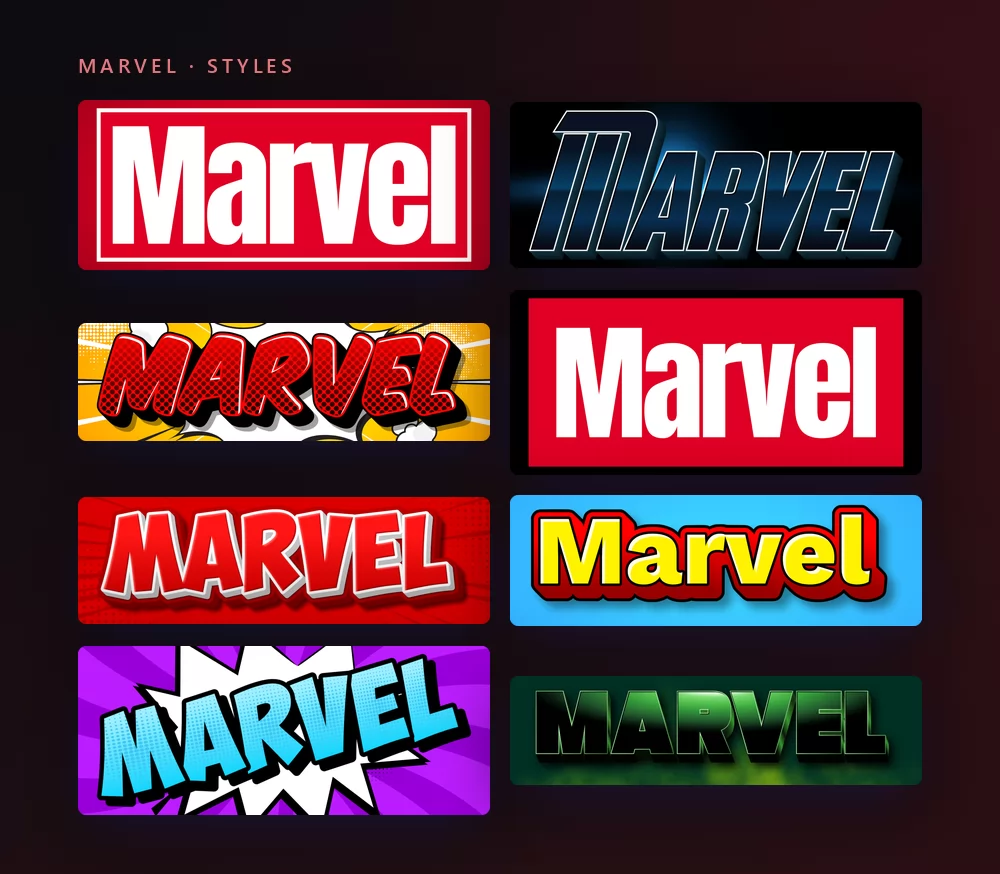
They all come from the same Marvel font generator, with a different style picked from the list. Nothing to install, no account, and every style above is free.
About the Marvel font
Marvel Comics is the American publisher behind Spider-Man, the X-Men, Iron Man, the Fantastic Four and the Avengers. Its logo is one of the plainest in entertainment: the word set in white, inside a red rectangle, and nothing else. No bevel, no chrome, no drop shadow. The whole effect comes from weight and confinement.
The lettering is very close to Benton Sans Extra Comp Black, drawn by Cyrus Highsmith and Tobias Frere-Jones for Font Bureau. It is a compressed grotesque: the letters are squeezed narrow and pushed to a heavy weight, so a short word fills a wide band without a single decorative stroke.
The same typeface turns up elsewhere once you know its shape: the Dressbarn wordmark and the title card of the series Longmire are both set in Benton Sans.
Two details are worth knowing before you try to reproduce it. The first is that the logo version is modified, not typed straight out of the font: the individual letterforms, the stroke weights and the spacing were all adjusted. The second is anatomical. Look closely at the wordmark and every letter except the E and the L touches its neighbour, at the top or at the bottom. That overlap is tight kerning applied by hand, not something the font does on its own, which is why an installed copy of Benton Sans still does not give you the logo.
The red rectangle is younger than the company. Marvel went through eight decades of wordmarks before the block arrived in the 2002 redesign, and it has been tidied rather than replaced ever since. It is the reason the logo survives being printed at the size of a postage stamp on a comic cover and at the size of a building on a cinema wall.
How to make Marvel text
Step 1. Type the name
Open the generator and replace the sample text with yours. The red block is built around the word, so it redraws itself as you type. A first name, a channel name and a team name all work.
Step 2. Pick a style
The style on the target page is the logo itself: white capitals in the red block. The list around it holds the comic side of the same world, halftone dots, speech-balloon bursts, heavy outlines, chrome and rim light. You can also browse the whole set of Marvel text effects and come back with one you like. The Style tab lets you change the fill, the outline and the shadow in any of them.
Step 3. Pick the shape
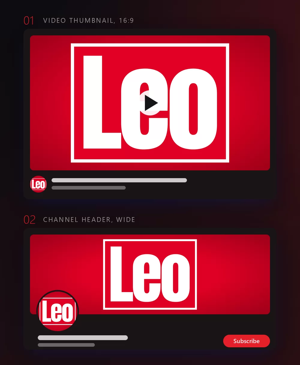
Set the shape before you export and nothing gets cropped afterwards. A wide format for a video thumbnail, a square for a profile picture, a very wide strip for a channel header or a banner. The two mock-ups above are what those shapes become once they are in place.
Step 4. Download
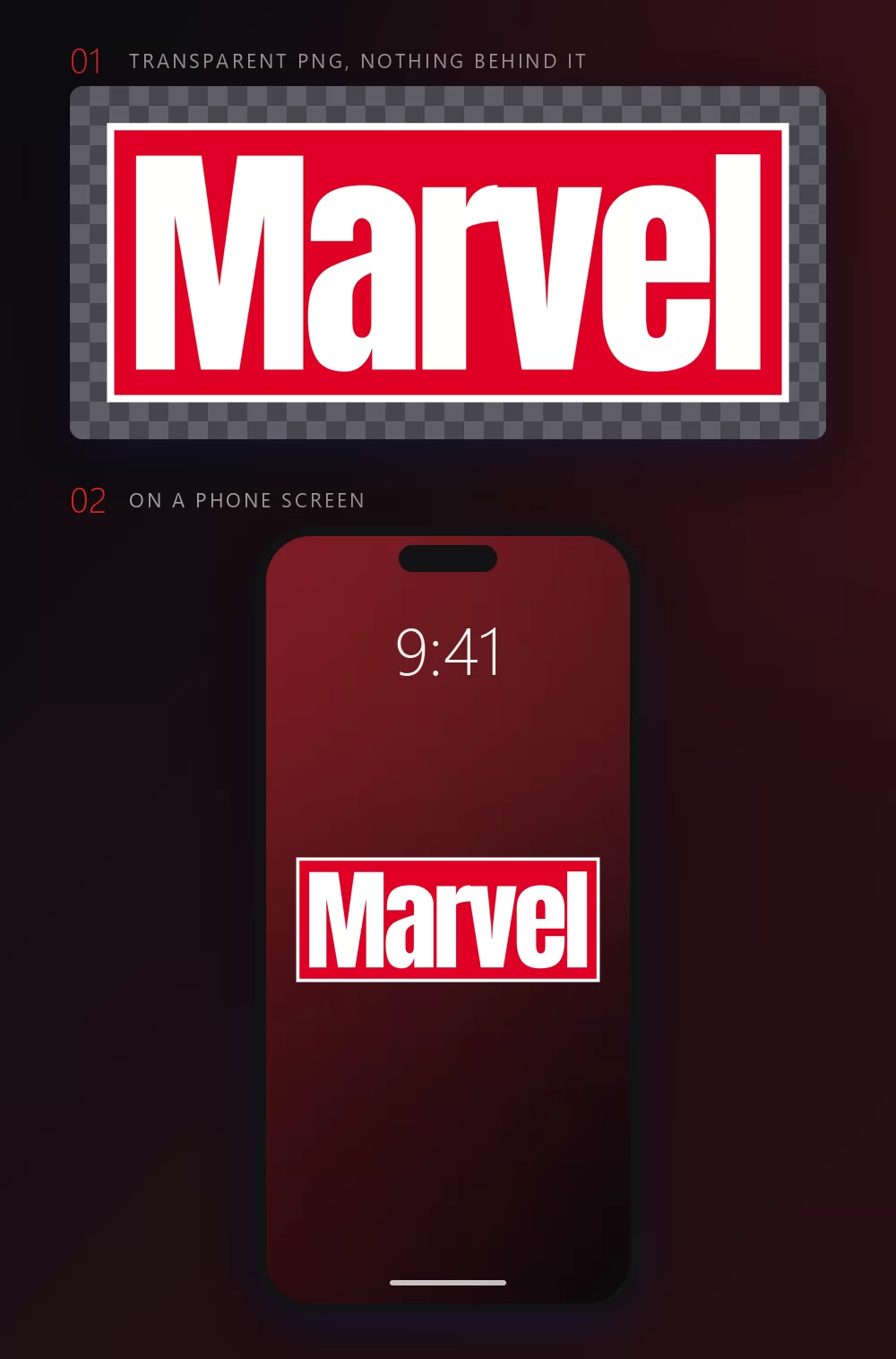
The background is a control of its own, sitting next to the text: leave the red field as it is, put another colour behind the block, or load an image of your own. Set it here rather than repairing it afterwards in another app.
In the Download tab, take the transparent PNG if the block is going onto something else: a photo, a slide, a coloured background, a cutting machine. It is the option most people miss. It matters here more than usual, because the logo is a red rectangle on a page: exported flat, it arrives with a second rectangle of white around it, and the whole point is lost.
If you only need the word as characters you can paste into a chat or a profile, the copy and paste styles are a different tool from this one. The generator makes an image, which is what you want the moment the red block is involved.
What happens when the name gets longer
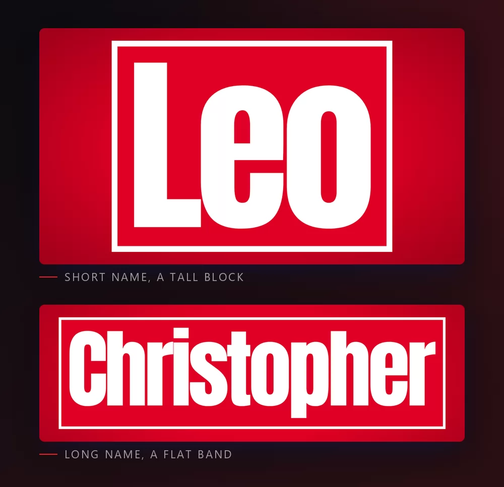
We measured this one, because it decides which name you should use where. The red block never overflows. Type more letters and nothing runs past the frame: the block grows wider up to a fixed maximum, and after that it stays that width and gets flatter while the letters shrink to fit.
So the shape you get is decided by the word, not by any setting. A short name gives a tall, nearly square block. A long name gives a wide, flat band. What drives it is the width of the word rather than the number of letters, which is why two names of the same length can come out differently if one has wider letters than the other.
Use it deliberately. A long name is already the right shape for a channel header or a banner. A short name, or an initial, is what fills a square profile picture. Picking the word for the slot is easier than fighting the slot afterwards.
Marvel Comics or Marvel Studios
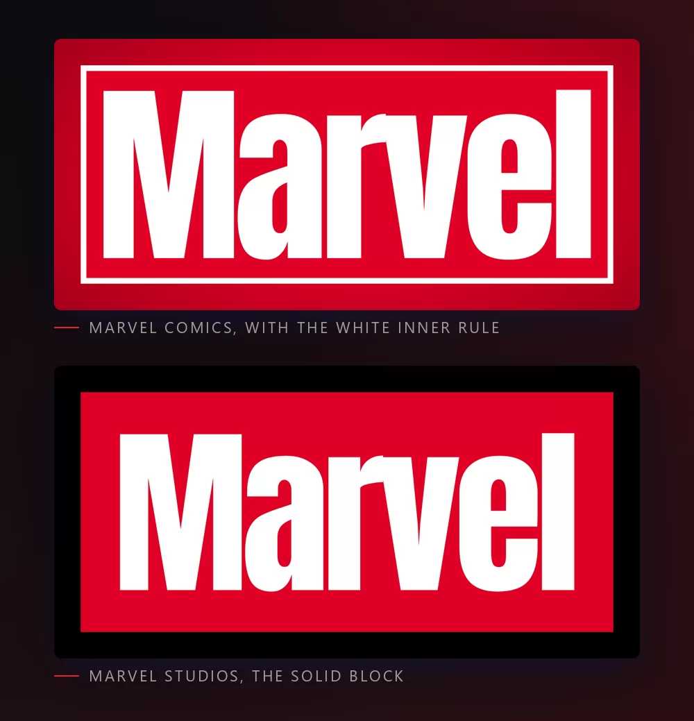
People type "Marvel logo" meaning one of two things, and the difference is a single line.
The comics block carries a thin white rule set just inside the red field, so the wordmark sits in a framed panel. That is the version printed on comic covers, and it is the one on the target page.
The solid block drops the inner rule: red field, white letters, nothing else. It is the plainer, more cinematic version, closer to the card that opens a Marvel Studios film.
Both are in the same list and both are free, so you can try a name in one, then in the other, without leaving the page. If you are making a title card, the solid block usually reads better at a distance. If you are making something that should look printed, keep the rule.
Which font to install, if you want one
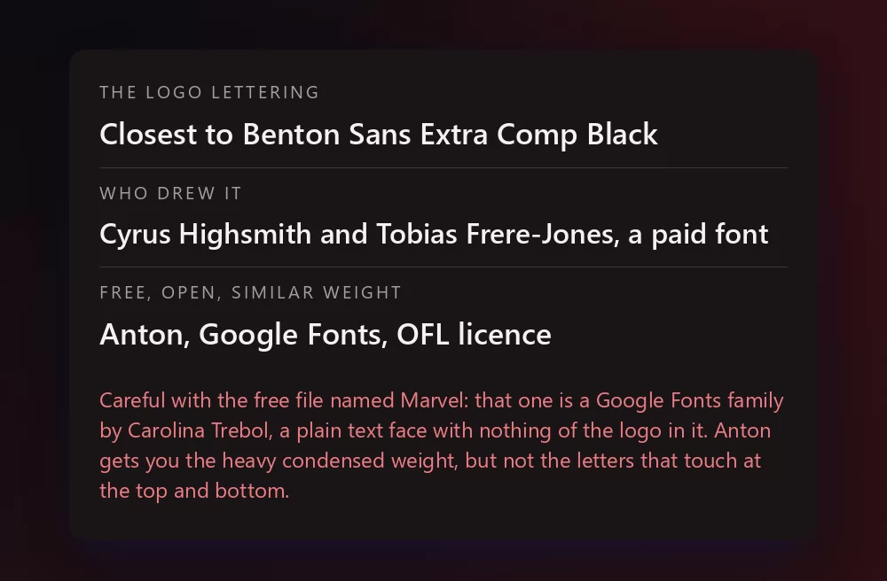
Benton Sans Extra Comp Black is the identified match. It is a commercial font, sold by Font Bureau and available through Adobe Fonts, and there is no legitimate free copy of it. If you have an Adobe subscription, check there before you buy anything.
Now the trap, and it catches a lot of people. Several download pages offer a free file called Marvel, and the file is real: it is a font family named Marvel, drawn by Carolina Trebol in 2011, published on Google Fonts under the SIL Open Font License, in regular, italic, bold and bold italic. It is also a perfectly ordinary text face with nothing of the logo in it. Same name, different font, no relation to the comics at all. Install it and you will wonder what went wrong.
For an open licence that actually looks the part, the honest pick is Anton, drawn by Vernon Adams and published on Google Fonts under the same open licence. Be clear about what it does and does not give you: it is a single heavy condensed weight, so it matches the compression and the blackness, but the letters sit apart instead of touching at the tops and bottoms, and there is no red block. It gets you most of the way for free, and it is licensed for commercial work.
About the free lookalike fonts. Font archives list dozens of Marvel-style faces, and the best known of them, Avengeance, American Captain, Star Shield, are marked personal use only. Free to download is not the same as free to use: if the work is going anywhere near money, read the licence file that came with the font, not the button you clicked.
None of these gives you the block. The red field is a shape, not a font, which is why the generator draws it around your text instead of asking you to find it.
What people actually make with it
Video thumbnails and channel art first, by a wide margin, because the block is legible at any size and survives being scaled down in a feed. Then profile pictures, Discord and gaming tags, a name for a fan edit, a title card for a school presentation, birthday invitations for a superhero party, and printed name badges. Players of Marvel Rivals come looking for the same thing for their squad name and end up in the same list. Almost all of that goes better with a transparent PNG than with an installed font, because what people recognise is the red block, and a font file gives you the letter shapes and nothing else.
How to make Marvel text in Canva
Canva does not have Benton Sans and it does not have the block. It does have Anton, so you can get a heavy condensed title without leaving Canva: set the text in Anton, put a red rectangle behind it, and pull the letter spacing down until the letters nearly touch. That gets you close.
For the block itself, make it here as a transparent PNG and upload it: it drops straight into a Canva design and keeps its shape. The text effects app for Canva carries thousands of styles, but not the brand ones: Canva does not accept third-party logos inside its apps, which is why the upload is the way in here.
How to make Marvel text in Photoshop
With Anton or any heavy condensed face installed, the logo is four steps and no layer styles at all, which is unusual:
- Type the word in capitals, white, in the heaviest condensed font you have.
- Tighten the tracking until the letters almost touch. This is the step that does the work. Then nudge individual pairs by hand, since the real wordmark has letters overlapping at the top or the bottom.
- Draw a red rectangle behind, and give the text a generous margin left and right so the block reads as a panel rather than a highlight.
- For the comics version, add a thin white stroke on a slightly smaller rectangle inside the red one.
There is no bevel, no gradient and no glow anywhere in this logo. Adding any of them is what makes a homemade version look wrong.
How to make Marvel text in Word
Word will not give you the block, but it will give you the lettering if you install Anton first. Type the name in capitals, set the font, then use the character spacing setting to condense it. For anything you are actually going to show people, dropping an exported PNG onto the page is faster and looks right.
On a phone
On iOS and Android, most apps cannot install and use a font. The generator runs in a mobile browser, which is where most thumbnails and profile pictures get made anyway: make the PNG on the phone, save it to the photos, and add it in whatever app you were using.
Is the Marvel font free
The generator is, and so is every style shown above. Benton Sans Extra Comp Black is a commercial font. Anton is free under an open licence for personal and commercial work. The lookalike fonts on font archives are mostly personal use only, whatever the download button says.
There is a second question underneath, and it gets mixed up with the first one constantly: a font licence is not a trademark licence. Marvel and its characters belong to Marvel and Disney, and the red block is part of that identity. A name on a profile picture, a school project or a birthday banner is the kind of use nobody has ever objected to. Selling merchandise that trades on the brand is another matter, and no font licence covers that for you.
Open TextStudio, type a name, and watch the block build itself around it.
More fonts and styles to try
If you came for a comic, film or game font, these cover the same ground:
- Spiderman font generator : jagged capitals with a heavy outline and a web texture, for the character rather than the publisher
- comic fonts : speech balloons, halftone dots and sound effects, the rest of the comic page
- Fortnite font generator : heavy condensed capitals, and the same thumbnail workflow
- logo fonts : why a film or game logo is almost never a font you can install
- Minecraft font generator : blocky letters, and the same transparent PNG workflow
- Geometry Dash font generator : pixel logo letters or level-style letters, and the same thumbnail workflow
- Death Note font generator : the gothic title lettering, and the same wallpaper workflow
- Cars font generator : the chrome crest with your own name, and the same invitation workflow
- Lego font generator : the white rounded logo letters or the studded brick look
- Friends font generator : the hand-drawn lettering of the sitcom in its colours
- Pokemon font generator : the same solid and hollow lettering, in another colour scheme
- graffiti font generator : the same heavy letters, hand drawn instead of engineered
- metal font generator : chrome and steel letters, for the harder side of a title card
Questions people ask
What font is used in the Marvel logo? The lettering is very close to Benton Sans Extra Comp Black, drawn by Cyrus Highsmith and Tobias Frere-Jones for Font Bureau. The logo version is modified, and the red block around it is a drawn shape, not part of any font.
Is the Marvel font free? Benton Sans is commercial. Anton on Google Fonts is free and open licensed and gets you the heavy condensed weight. The generator on this page is free for every style shown.
I downloaded a free font called Marvel and it looks nothing like the logo. Why? Because it is a different font that happens to share the name: a text face by Carolina Trebol, published on Google Fonts. It is a real font under a real open licence, just not the one you were looking for.
What is the difference between the Marvel Comics and Marvel Studios logo? The comics version has a thin white rule set inside the red field. The studios version is a plain solid block. Both are in the list, and both are free.
Why do the letters in the logo touch each other? That is hand kerning, not the font. Every letter except the E and the L overlaps its neighbour at the top or the bottom, which is what makes the wordmark read as a single solid mass.
Does my name fit in the red block? Always. The block does not overflow: it grows to a maximum width, then flattens while the letters shrink. A short name gives a tall block, a long name gives a wide band.
How do I get the Marvel logo with a transparent background? Type your text, then choose the transparent PNG in the Download tab. That is the version to use if the block is going on top of anything else.
Can I use the Marvel style on something I sell? Font licences and trademarks are two different things. Marvel belongs to Marvel and Disney, so even a permissive font licence does not cover merchandise that trades on the brand.