
 Mia Hartley
Type a word, pick a style, download a PNG. That is the whole thing, and it takes about ten seconds.
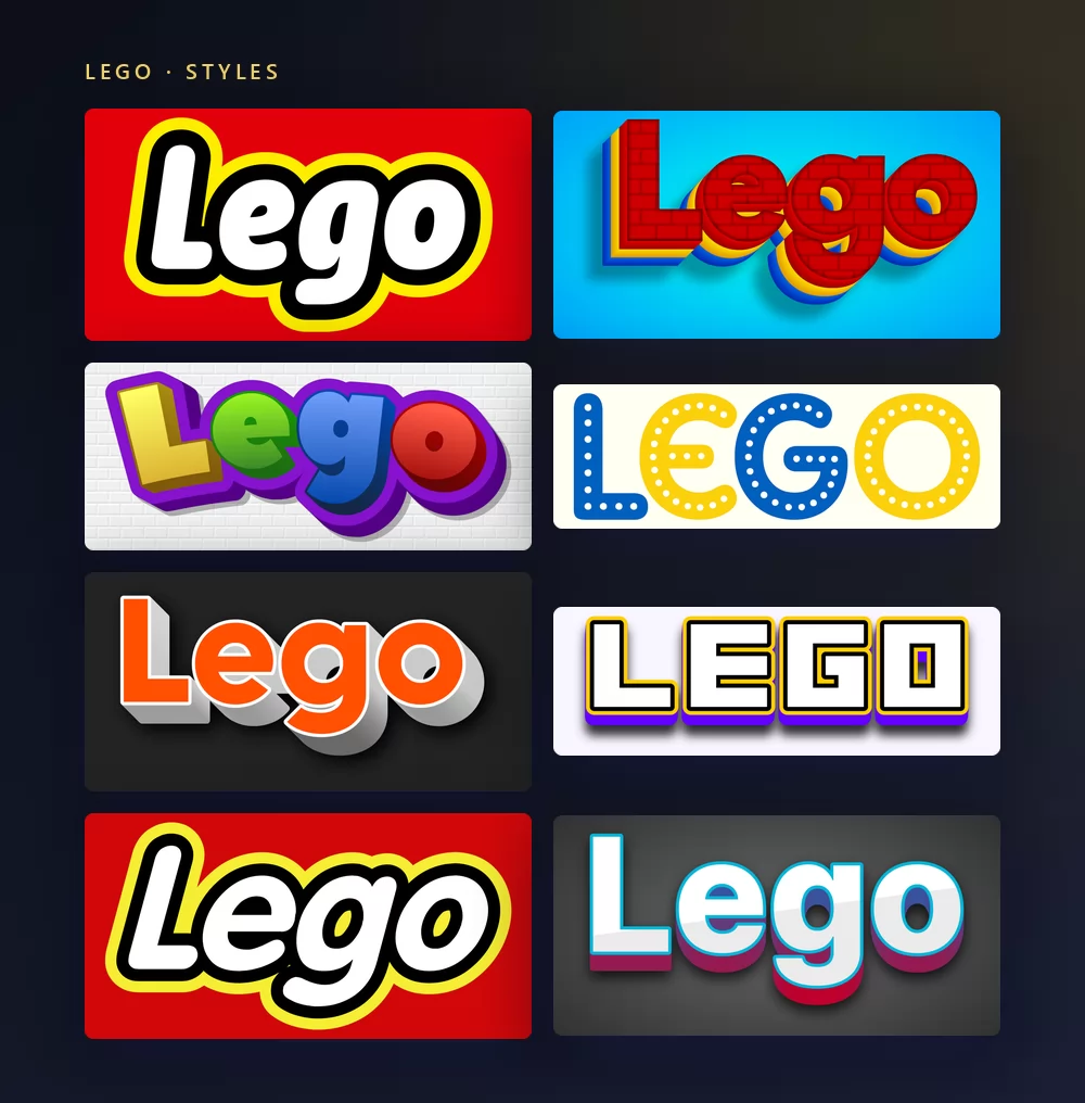
They all come from the same Lego font generator, with a different style picked from the list. Nothing to install, no account, and every style above is free.
About the Lego font
LEGO started in 1932 in Billund, Denmark, in the workshop of a carpenter named Ole Kirk Christiansen, who made ladders, ironing boards and wooden toys. The name comes from leg godt, Danish for "play well". The brick everyone knows, the one with studs on top and tubes underneath, was patented in 1958. The logo that made the brand recognisable everywhere arrived in 1973: white capitals, rounded and slightly tilted, a heavy black outline, a yellow border, all on a red square.
That logo is drawn lettering, not a typeface. There is no LEGO font to install, because the letters were never released as one. The closest free thing is LegoThick, a fan-made font built from the logo itself, and it comes with a catch worth knowing before you download it: it only contains capitals. Type in lower case and you get blocks instead of letters.
The fonts the LEGO Group actually uses are a different story, and they are public. Its own open source page lists Press Start 2P and Exo 2.0 under the SIL Open Font License, plus Open Sans, Roboto and the Noto families, for what it calls its digital experiences. All of them are free and open licensed. None of them is the logo.
How to make Lego text
Step 1. Type the word
Open the generator and replace the sample text with yours: a first name, a party title, a video title, a class name. The letters redraw as you type.
Step 2. Pick a style
The style on the target page is the logo one: white rounded capitals, black outline, yellow border, red background. The list also holds the brick versions, with plastic texture and studs. The Style tab lets you change the fill, the outline and the shadow in either.
Step 3. Pick the shape
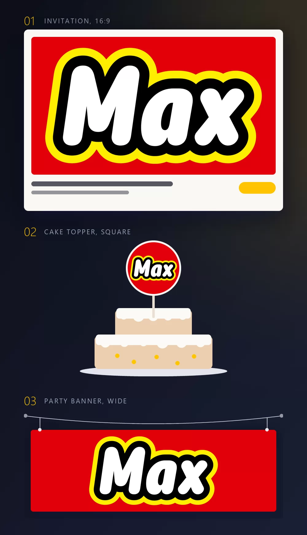
Set the shape before you export and nothing gets cropped afterwards. A 16:9 for an invitation, a square for a cake topper or a profile picture, a wide strip for a banner over the table. The three mock-ups above are what those shapes become once they are in place.
Step 4. Download
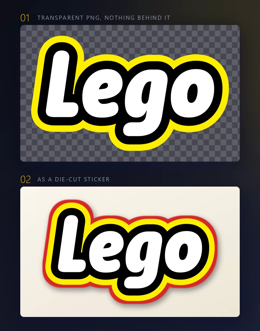
In the Download tab, take the transparent PNG if the name is going onto something else: your own photo, a coloured card, a slide, a cutting machine. This is the option most people miss, and it is the one that matters for a party: the name sits on your background instead of dragging a red rectangle along with it.
Long names fill the width fast
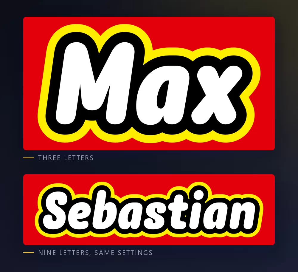
The more letters there are, the tighter they sit. Character spacing is a slider in the Text tab: open it up a little and a long name stops looking cramped. The same tab holds zoom, line height, curve and rotation.
The logo look, or the brick look
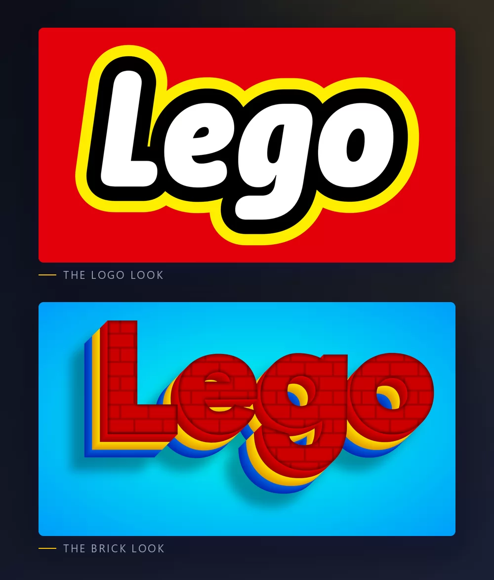
The logo look is the one on the box: rounded white capitals with a black outline, a yellow border and a red field. It reads at any size, which is why it is the one to use for a name on an invitation.
The brick look is the other half of what people search for, and it is a different idea: the letters themselves are built out of plastic, with the texture, the depth and sometimes the studs on top. It says "bricks" rather than "brand", and it works better big than small.
Both are in the same list, so you can try a name in one, then in the other, without leaving the page.
Which font to install, if you want one
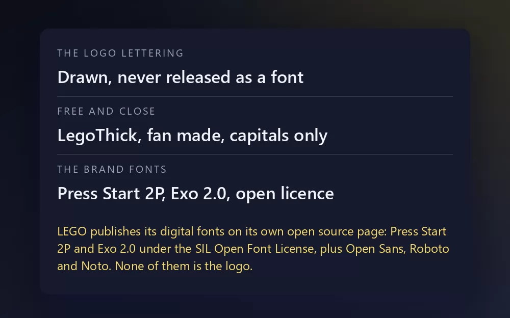
LegoThick is the fan-made font built from the logo. It is the one every "download the Lego font" page points to, it is free, and it is capitals only. Font sites label its licence differently from one to the next, so the safe reading is personal use. It lives on the usual free font aggregators, FFonts, Fonts2u and FontPalace among them, rather than on one official page, which is exactly why the label changes depending on where you land.
Press Start 2P and Exo 2.0 are the real brand fonts for digital work, both under the SIL Open Font License, both on Google Fonts. Press Start 2P is a pixel face and looks nothing like the logo, which surprises people; it is what LEGO uses on screens, not on boxes.
If you want the shape of the logo with a clean licence, the honest picks are the fat rounded faces on Google Fonts: Fredoka, the closest in weight and roundness, Baloo 2, a little softer, and Luckiest Guy, heavier and more cartoon. None of them is the LEGO logo. They give you the silhouette, and at party-sign size the silhouette is most of what the eye reads.
What people actually make with it
Birthday parties, first and by a distance: the invitation, the banner over the table, the cake topper, the name on the door. Then classroom door signs and reading corners, YouTube thumbnails for brick-building videos, Instagram highlight covers, and the odd T-shirt printed for a family party. Almost all of that goes better with a transparent PNG than with an installed font, because the look is made of the outline and the border as much as the letters, and a font file gives you the letter shapes and nothing else.
How to make Lego text in Canva
Canva does not have LegoThick and it does not have the logo lettering. It does have Fredoka, Baloo 2 and Luckiest Guy, so you can get the chunky rounded shape without leaving Canva, then add a thick outline and a shadow from the effects panel. For the real logo look, make it here as a transparent PNG and upload it: it drops straight into a Canva invitation and stays sharp.
If you live in Canva, you can also use TextStudio effects inside Canva and skip the upload.
How to make Lego text in Photoshop
Install LegoThick for the logo shape, or Fredoka if you want lower case too, type in capitals, then build the look with layer styles:
- Colour overlay in white for the letters.
- Stroke, position outside, black, thick. Then a second stroke in yellow, wider, on a copy of the layer underneath: two strokes are what makes it read as the logo.
- A red rectangle behind, with rounded corners, and a little breathing room around the word.
Keep the corners generous. The logo has no sharp angles anywhere, and that is most of its character.
How to make Lego text in Word
Install the font, type your text, then use text effects for the outline and the shadow. Word can do a thick outline, which is the bulk of the look. For an invitation you are still better off dropping an exported PNG onto your page.
On a phone
On iOS and Android, most apps cannot install and use a font. The generator runs in a mobile browser, which is where most party invitations get made anyway: make the PNG on the phone, save it to the photos, and add it in whatever app you were using.
Is the Lego font free
LegoThick is free to download, capitals only, and its licence is labelled inconsistently across font sites, so treat it as personal use. Press Start 2P, Exo 2.0, Open Sans, Roboto and Noto are the brand's own digital fonts and are all open licensed. Fredoka, Baloo 2 and Luckiest Guy are open licensed lookalikes for the shape.
There is a second question underneath, and it gets mixed up with the first one constantly: a font licence is not a trademark licence. LEGO is a trademark of the LEGO Group, the logo is protected, and its Fair Play policy asks people not to use it as their own. A name on your kid's birthday banner is the kind of use nobody has ever objected to. Selling merchandise that trades on the brand is another matter, and no font licence covers that for you.
Open TextStudio, type a name, and see the style straight away.
More fonts and styles to try
If you came for a toy or a game font, these cover the same ground:
- Minecraft font generator : blocky letters, and the same transparent PNG workflow
- Geometry Dash font generator : pixel logo letters or level-style letters, and the same thumbnail workflow
- Fortnite font generator : heavy condensed capitals, and the same thumbnail workflow
- Toy Story font generator : yellow fill with a thick outline, on a slanted band
- Bluey font generator : chunky rounded capitals on sky blue, and the same invitation and cake topper workflow
- Hello Kitty font generator : the red script under Kitty's face, and the same invitation and wallpaper workflow
- Pokemon font generator : the same solid and hollow lettering, in another colour scheme
- SpongeBob font generator : the same thick cartoon capitals, softer
- Spiderman font generator : jagged capitals with a heavy outline, plus a web texture
- Disney font generator : the signature script and the Mickey lettering
- Death Note font generator : scratchy title lettering and the blackletter L
- logo fonts : why a film or game logo is almost never a font you can install
Questions people ask
What font does Lego use? None, for the logo: it is drawn lettering from 1973, never released as a typeface. For screens the LEGO Group uses Press Start 2P, Exo 2.0, Open Sans, Roboto and Noto, all open licensed, and it says so on its own open source page.
Is there a free Lego font? LegoThick, a fan-made font built from the logo. It is free to download and contains capitals only.
Why does my Lego font show blocks? Because you typed in lower case. LegoThick has no lower-case letters, so anything you type unshifted comes out as empty boxes. Type in capitals.
What is the Lego brick font? The other style people mean: letters built out of plastic bricks, with texture, depth and studs, rather than the logo lettering. Both are in the generator's list.
How do I make a Lego name banner? Type the name, choose the wide shape, download the transparent PNG, and print it on the coloured paper you are using. The transparent background is what lets it sit on your own colour.
Can I use the Lego style on something I sell? Font licences and trademarks are two different things. LEGO belongs to the LEGO Group, so even a permissive font licence does not cover merchandise that trades on the brand.
Which Google font looks most like Lego? Fredoka, for the weight and the roundness. Baloo 2 is softer, Luckiest Guy is heavier. All three are open licensed, and none of them is the logo.