
 Mia Hartley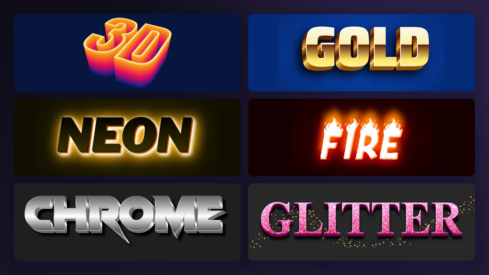
A text effect is everything that happens to a word after the font has been chosen: the fill, the outline, the shadow behind it, the depth under it, the light on its surface. The font gives you letter shapes. The effect is what makes those shapes look like gold, like a neon sign, like something on fire.
There are three ways to get one. You type your word into a generator and download a picture, you open a layered PSD in Photoshop, or you write CSS and it only ever lives in a browser. This page is about the first, with the PSD route further down for anyone who wants the layers.
Twelve families follow, in the order people actually look for them. Every sample was rendered for real by the cool text generator at TextStudio, with the name of the effect as the word, so nothing here is a mock-up. Click any image to open that exact style and put your own words in it. None of the twelve is a premium style.
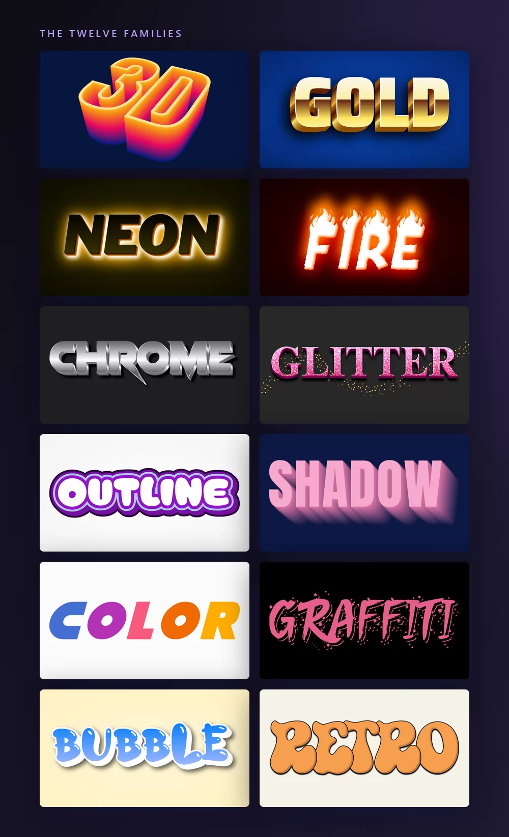
1. 3D text effect
Depth is the oldest trick in the set and still the most useful: the letters get an extruded side, a light source and a ground, so they stop being ink and start being an object.
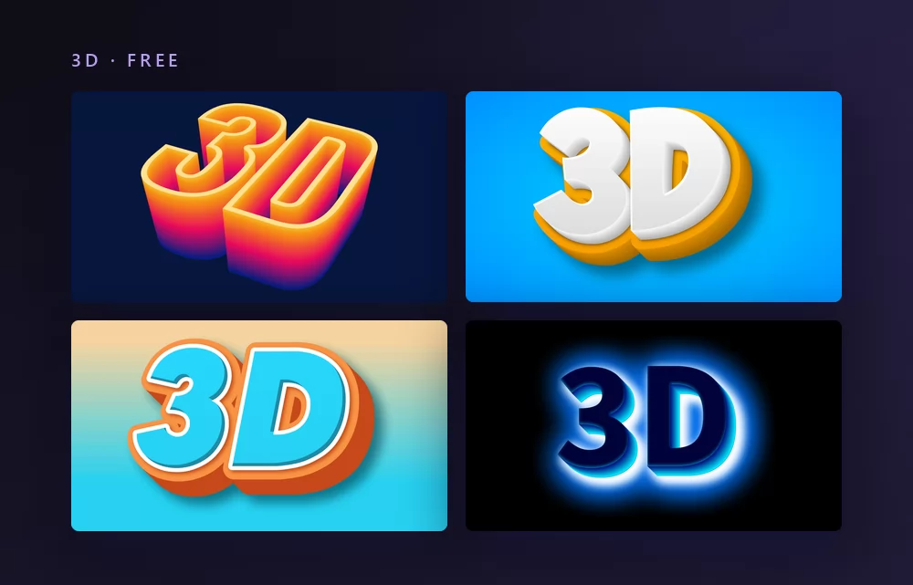
Isometric depth like this reads at any size, which is why logos and thumbnails keep coming back to it. The alternative is a soft perspective extrusion, which looks better big and turns to mush small. If you want the older, blockier version of the same idea, the Word Art styles collect it.
Good for: logos, video thumbnails, posters, anything that has to survive being scaled down.
2. Gold text effect
Gold is not a colour, it is a recipe: a warm gradient that runs dark at the top and light in the middle, a hard bevel on the edge, and a highlight where the light hits. Fill a letter with flat yellow and you get a banana.
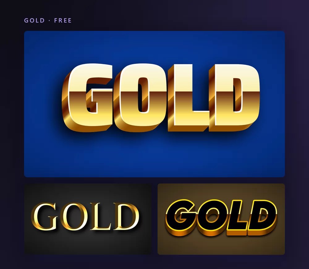
The blue behind it is not decoration either. Gold needs a cool, dark ground to look like metal, which is why award posters, new year greetings and luxury labels all end up on navy or black. More of them are in the gold text effects guide.
Good for: invitations, new year posts, certificates, logos that want to look expensive.
3. Neon text effect
A neon effect is a stroke that emits light: a bright core, a coloured halo bleeding outwards, and a dark surface for the light to fall on. On a white background it disappears, and no amount of tuning fixes that.
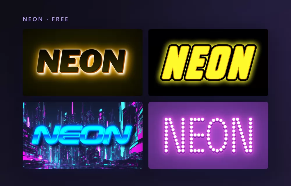
Tube neon, the kind above a bar, keeps a visible outline and a thin unlit gap inside the letter. LED sign styles drop the tube and use dots of light instead. More glowing styles are in the neon fonts collection.
Good for: party invitations, stream overlays, dark website headers, anything that wants to look like a sign.
4. Fire text effect
There are two ways to set a word on fire and they do not look alike. Either flames are drawn rising off the top of the letters, or the letters themselves are made of ember and glow from the inside.
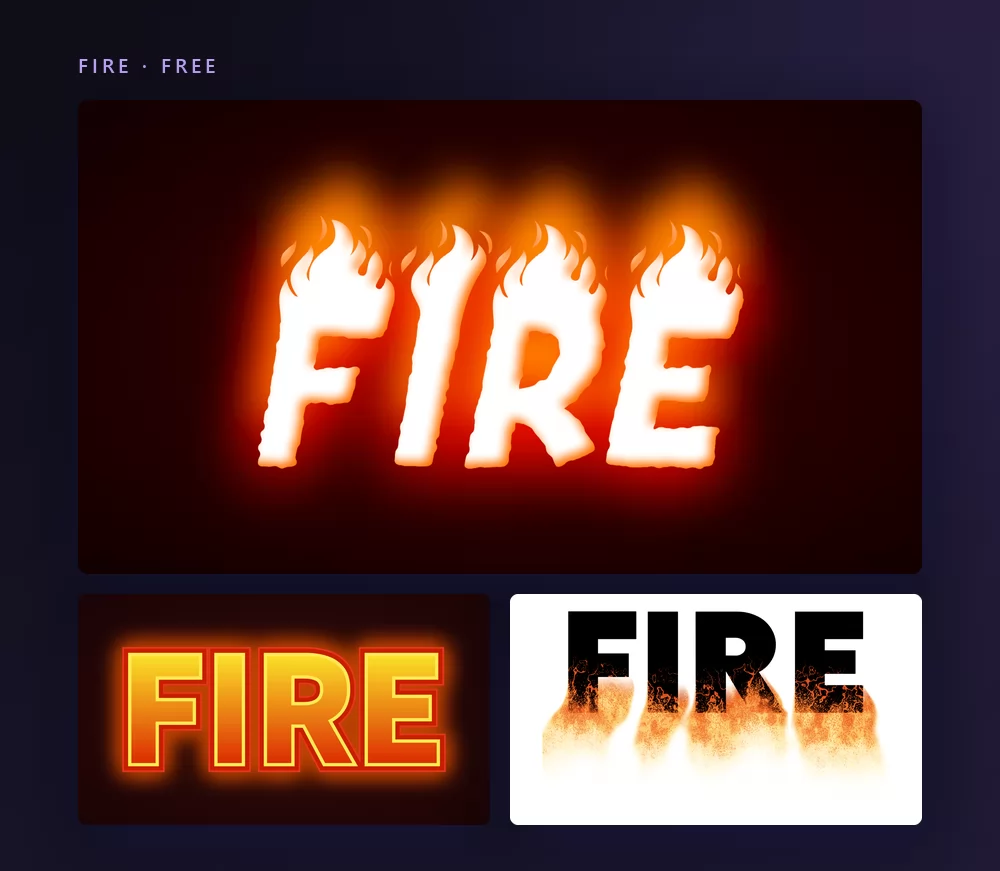
Flames above the letters keep the word readable, which matters if it is a name. Ember-filled letters look hotter and read worse. The eight variations, including lava and cartoon fire, are laid out in the fire fonts guide.
Good for: gaming thumbnails, sports and band posters, anything that should look loud.
5. Chrome text effect
Chrome is a gradient with a horizon in it. The trick is the hard line across the middle of each letter where the reflected sky meets the reflected ground: remove it and you get grey plastic.
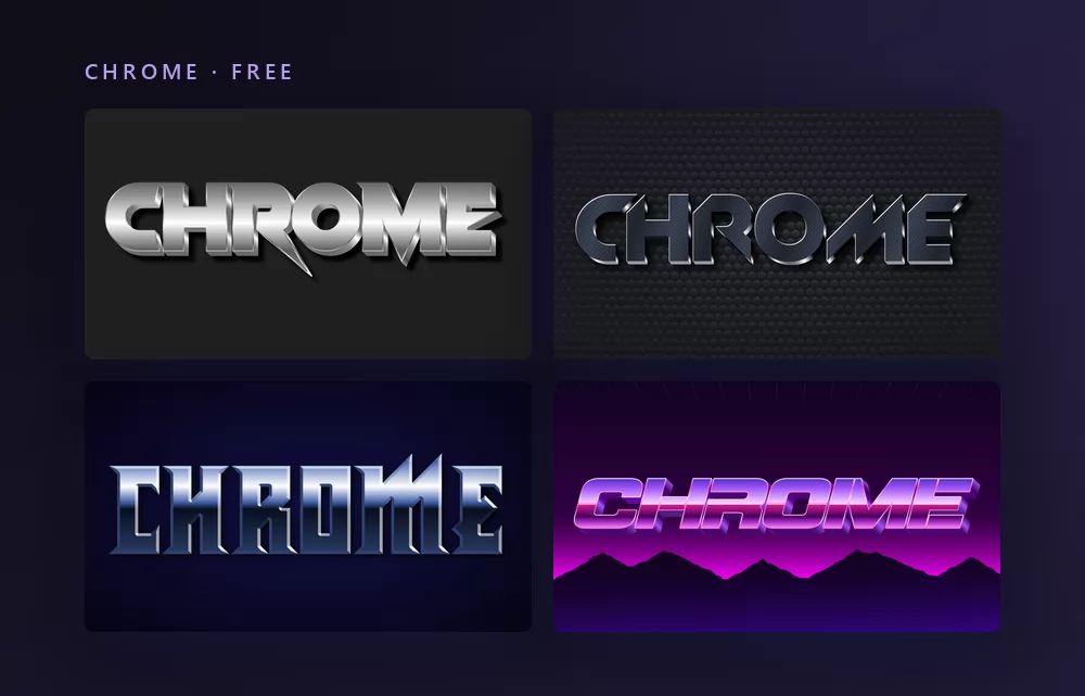
Silver, steel and chrome are the same family with different amounts of contrast. The Y2K revival brought all of them back at once, and more of them are in metal and chrome fonts.
Good for: certificates, car and sport logos, Y2K designs, anything metallic.
6. Glitter text effect
Real glitter is a texture inside the letters plus loose dust falling around them. The fake version is a smooth gold gradient with a sparkle drawn on top, and once you have seen the difference you cannot unsee it.
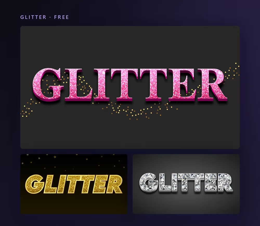
Glitter is the one effect that loses most of its point when printed, because the sparkle is made of tiny bright pixels that a printer averages away. It is made for screens. The glitter fonts guide has the test for telling real sparkle from a painted-on shine.
Good for: birthday posts, party invitations, profile headers, anything aimed at a phone screen.
7. Outline text effect
One stroke around a word separates it from whatever is behind it. That is the whole reason memes and thumbnails use it: the caption stays readable on a photograph nobody controls.
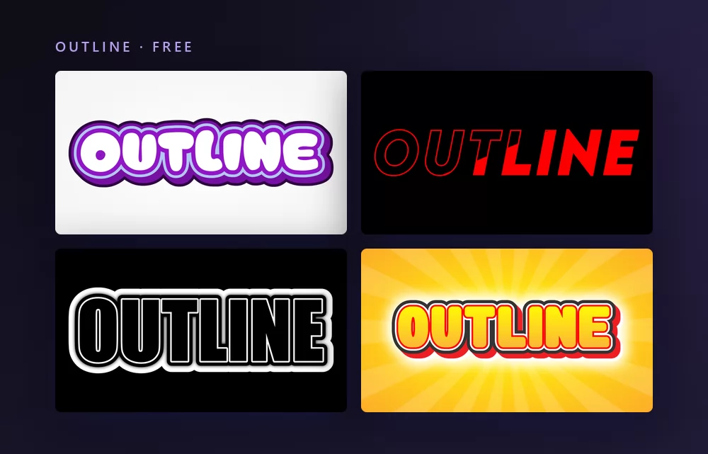
Stack several strokes in different colours and the word gains a halo thick enough to sit on anything, which is the sticker look. Each extra outline costs you letter shape, so it works on a poster and fails at thumbnail size. The mechanics are in the guide to adding a stroke to text.
Good for: memes, stickers, captions over photos and video.
8. Shadow text effect
A shadow does two jobs at once: it lifts the word off the background, and it tells you where the light is. A soft shadow is a contrast tool. A hard offset shadow is a style.
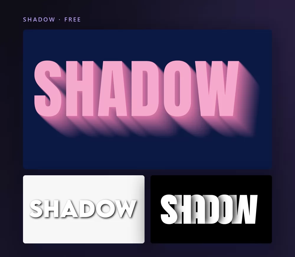
The long shadow above is the flat design version, a single solid shape at forty-five degrees, no blur. The soft drop shadow is the everyday one, and it should be subtle enough that nobody notices it: that is the one text shadow explains.
Good for: flat design posters, app screens, slide titles, captions that need contrast without an outline.
9. Colour text effect
Colour is an effect in its own right once it stops being uniform: one colour per letter, or a gradient running across the whole word.
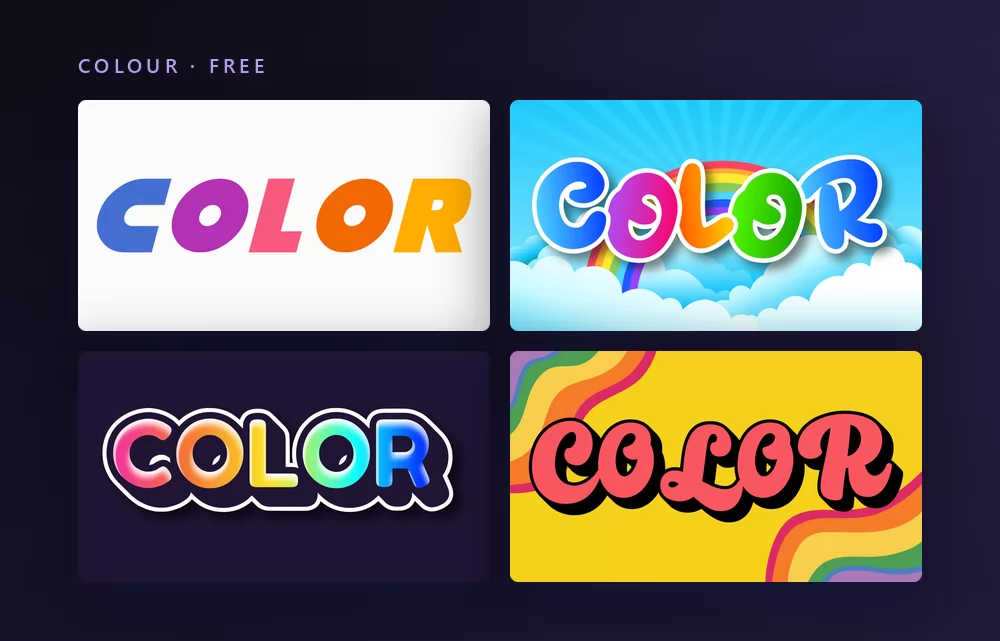
Per-letter colour is what children's parties, classrooms and pride posts are actually asking for when they search for colourful text. A gradient across the word is the current default on short-form video. The eight colours and where each one lands are in colour text effects.
Good for: birthday and classroom material, playlist covers, anything that should look friendly.
10. Graffiti text effect
Graffiti is not one style, it is a family of them: the quick tag, the fat throw-up, the blockbuster, the wildstyle that you are not supposed to be able to read.
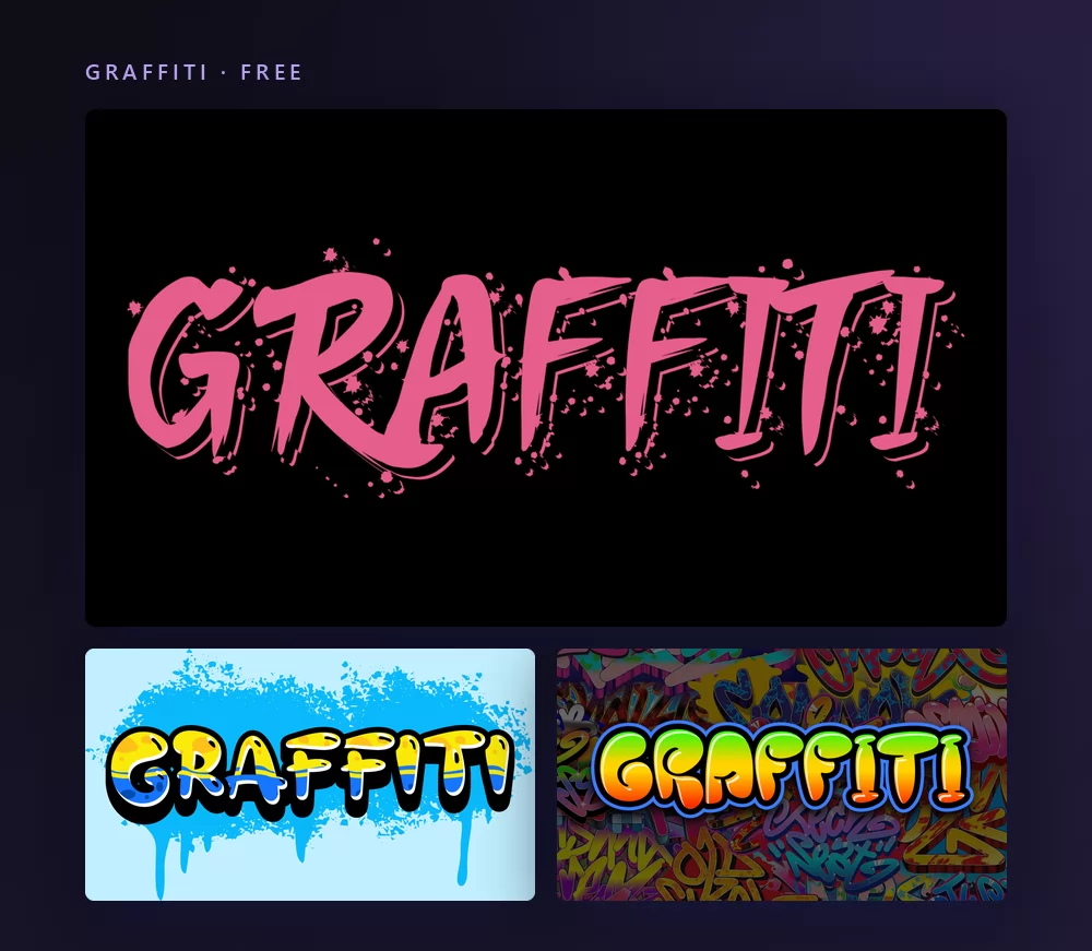
A tag like this one is a signature, so it wants to be a name. Nine lettering styles, with what each one is called on a wall and what it is for, are shown on the same word in graffiti fonts.
Good for: music covers, streetwear, gaming names, skate and youth club material.
11. Bubble text effect
Bubble letters are inflated: round shoulders, a thick outline, and a highlight where a soft light hits the top. They read as young and friendly before a single word is read.
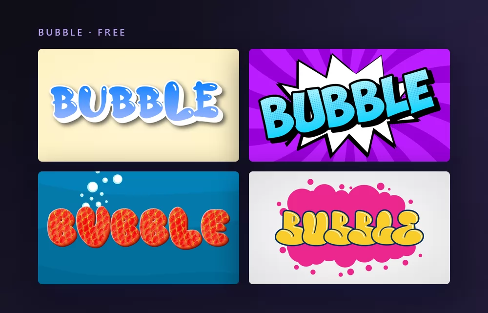
There is an important fork here. Bubble letters as a picture, like this one, are drawn shapes you download. Bubble letters as copy-and-paste characters are Unicode symbols that travel into a bio but can never be coloured. The bubble letters guide covers both, and how to draw them by hand.
Good for: birthday cards, classroom displays, sticker packs, anything for children.
12. Retro text effect
Retro is a decade, not a look, and picking the wrong one is the most common mistake on this page. Groovy seventies is round and warm. Eighties arcade is chrome and grids. Y2K is bubble metal on a blue desktop.
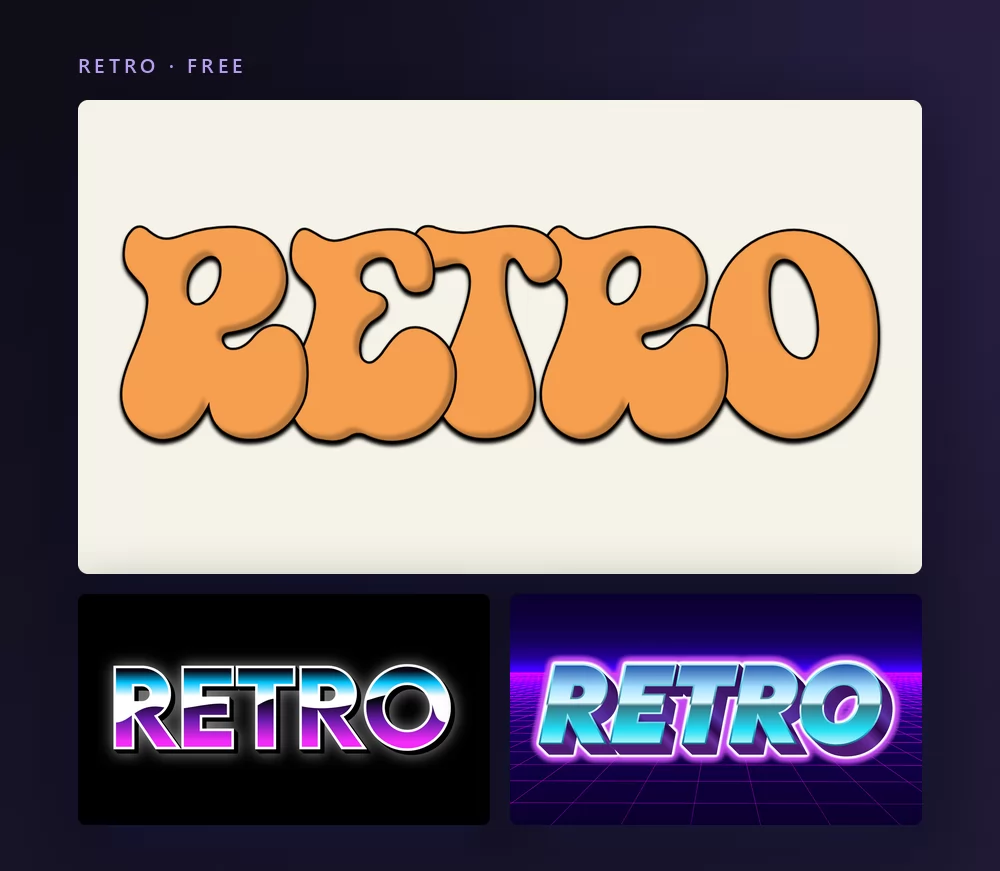
The seventies version above is the one that came back hardest, on coffee packaging and festival posters alike. More of the revival styles are in retro fonts.
Good for: festival posters, packaging, band merchandise, anything nostalgic.
Sixteen more styles, one word
The twelve families above cover what people search for. The catalogue does not stop there, and the rest is easier to judge on one word than on twelve.
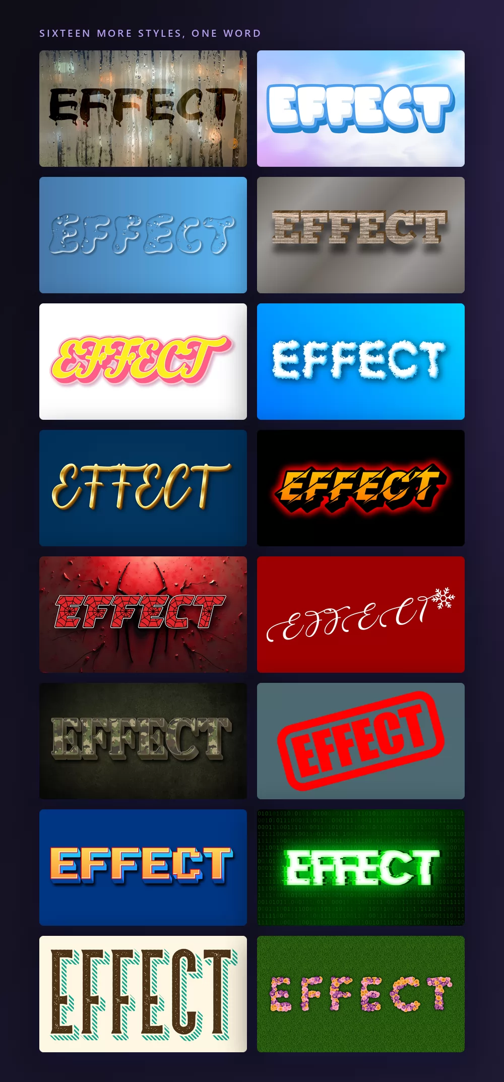
This is where to look when the effect has to match a subject rather than a mood: a Christmas card, a sports poster, a garden centre flyer, a party invitation with the word spelled out in flowers.
What a text effect is actually made of
Every style above is a stack of the same four layers, applied in the same order. Once you can see them separately, you can build any of them, and you can say what is wrong with one that is not working.
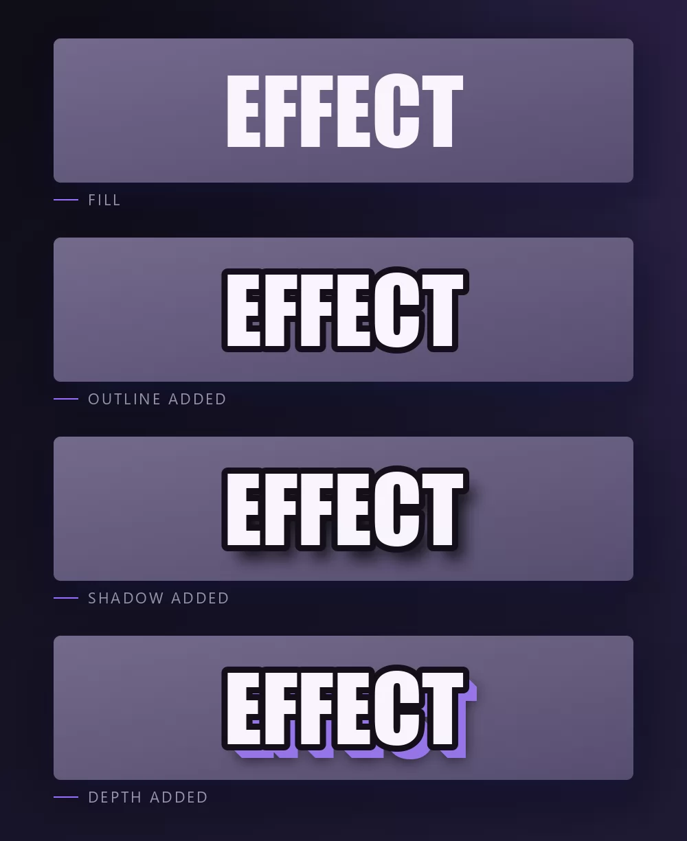
Fill is the colour, gradient or texture inside the letters. Outline is the stroke around them, and it is what makes a word survive a busy background. Shadow separates the word from the surface and sets the light direction. Depth extrudes the letters into a solid.
Gold is a fill plus a bevel. Neon is a glowing outline with no fill. A meme caption is a plain fill and a heavy outline. Nothing else is going on.
How to make one, in five steps
Step 1. Type your word first
The effect is fitted to the word, not the other way round. A style that looks perfect on three letters can break on eleven, and you want to find that out before you have chosen colours.
Step 2. Pick the style closest to what you want
Do not start from a blank editor. Every style on this page opens as a working effect with your text in it, and adjusting one is faster than building one.
Step 3. Change the colours before anything else
Colour carries most of the character. The same bevel that reads as gold reads as chrome in grey and as candy in pink, without touching another setting.
Step 4. Set the size for where it will be seen
A thumbnail is read at about three hundred pixels wide on a phone. Fine outlines and small extrusions disappear at that size, so check the effect small before you decide it works.
Step 5. Download the right file
PNG for the web. Transparent PNG if the word is going onto your own image, and that is the option most people miss.
Every style on this page is free and needs no account. Open TextStudio and put your own word into any of them.
The whole alphabet, in one effect
Some jobs need letters, not words: a name spelled out on a wall, a cake topper cut one letter at a time, a classroom display. Any style renders the full alphabet in one go.
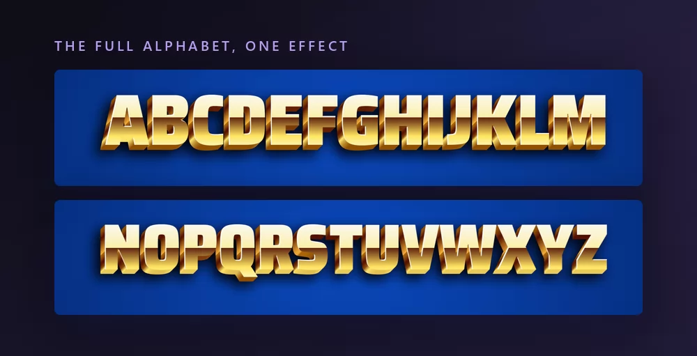
Watch for pairs that touch when a style has a wide outline. If two letters collide, add letter spacing rather than shrinking the text.
The transparent PNG
A downloaded effect usually arrives with a rectangle of background attached. On its own that is fine. On top of your own photograph it is a grey box in the middle of your picture.
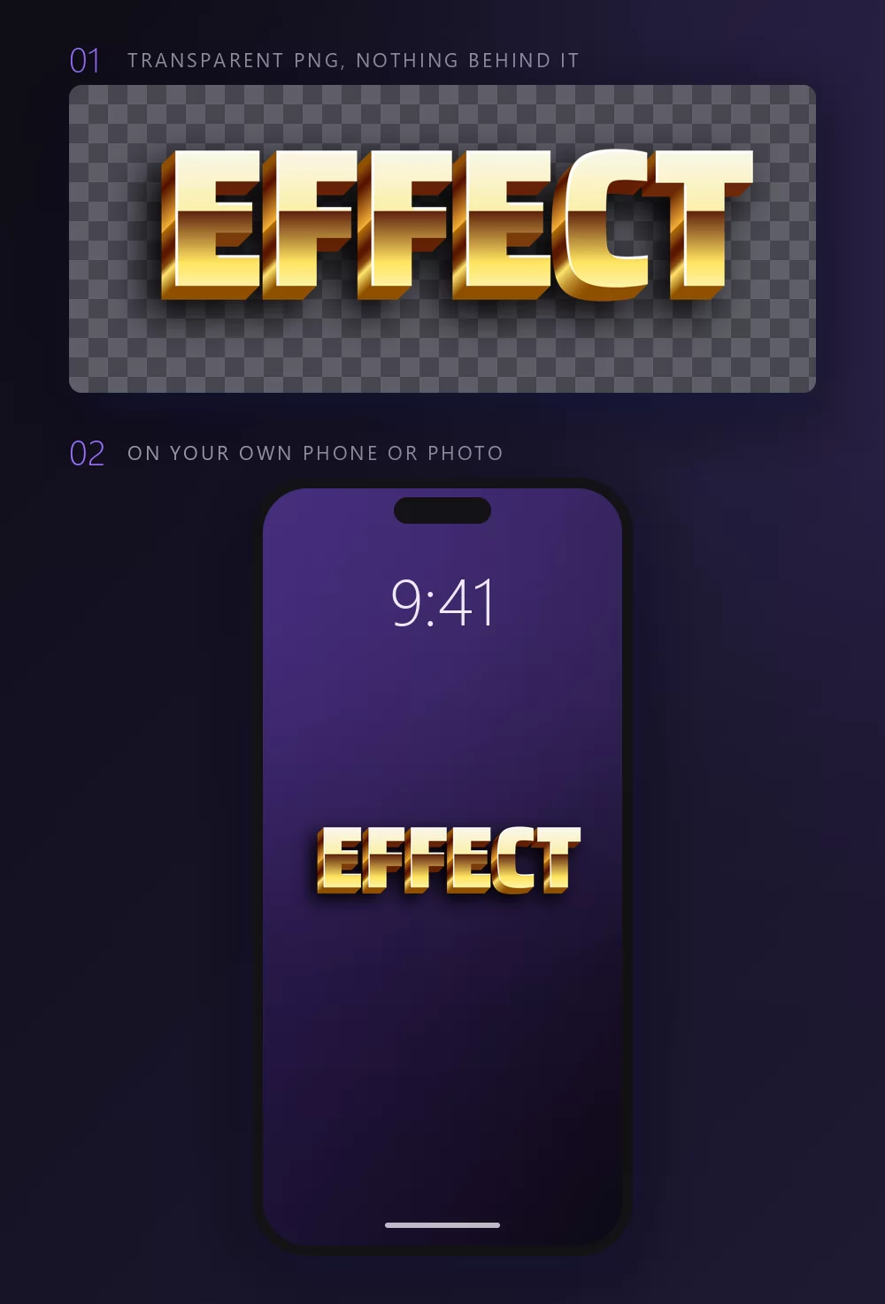
In the download panel, the background can be set to transparent before you export. The file then carries the letters and their glow, shadow and depth, and nothing else. It drops onto a photo, a video, a slide or a Canva design and keeps the effect intact.
Where these words end up
The same effect behaves differently depending on what it lands on, and it is worth seeing before you commit to a style.
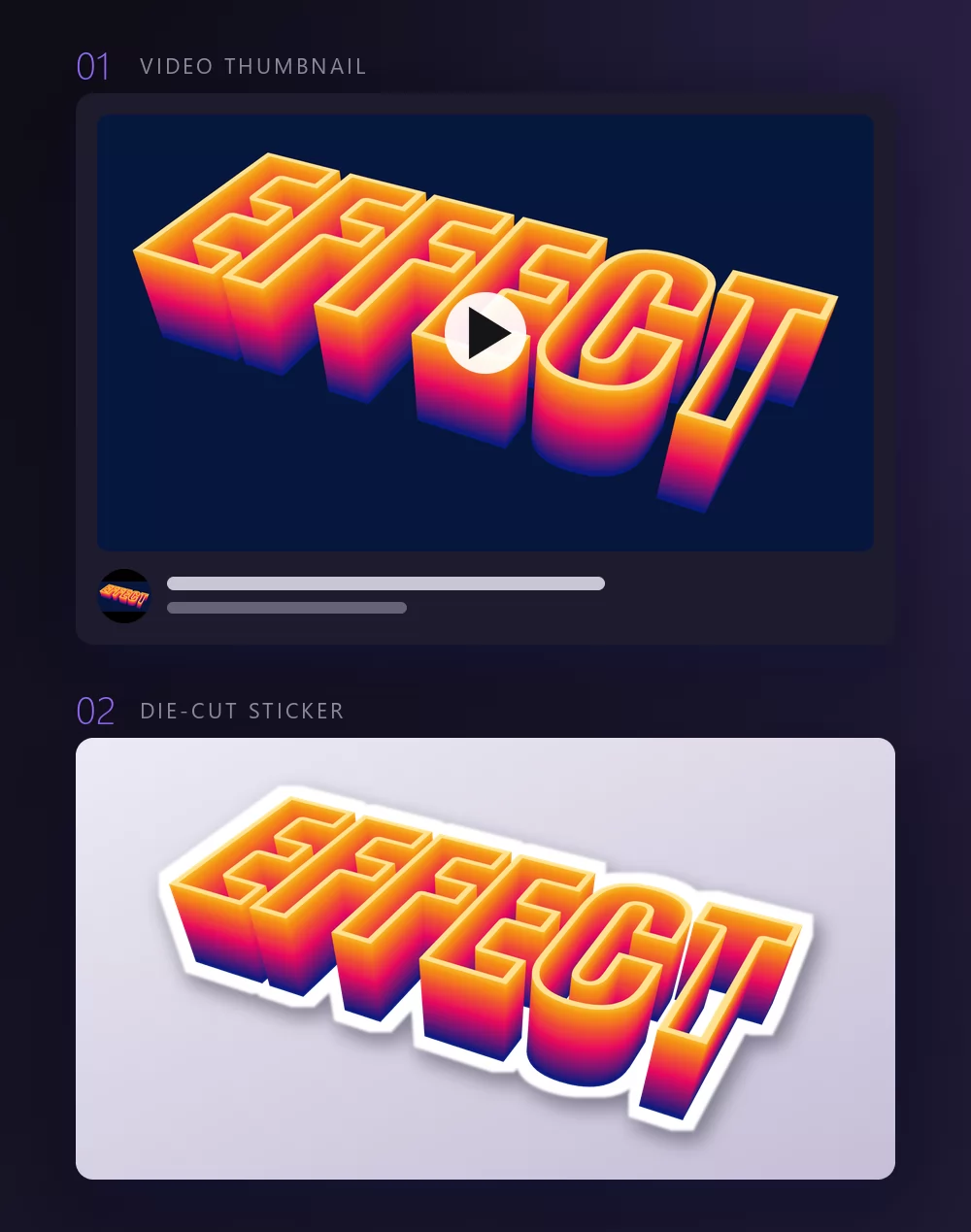
On a video thumbnail the enemy is size: the word is read small, next to other thumbnails, so contrast beats detail. On a sticker or a print the enemy is the edge: the word needs a border to separate it from whatever it is stuck to. A transparent PNG covers both.
Photoshop PSD files
If you want the layers rather than a finished picture, TextStudio also gives away the source files. The free PSD text effects page describes them as high-resolution PSD text effect images for personal and professional use.
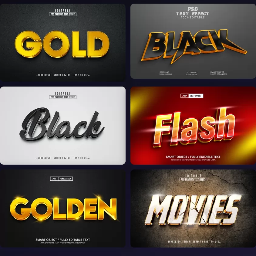
You need something that opens a PSD: Photoshop, or Photopea in a browser, which is free and reads the layers. We have a step-by-step for that route in editing a text effect with Photopea.
Layers are worth the extra step when the effect has to sit inside a bigger composition, or when a client will ask for the colour to change next week.
Inside Canva
All twelve styles on this page are also served by the text effects app for Canva, which puts the same engine inside the Canva editor. You type the word there and the effect comes back into your design, with no upload step in between.
Brand and logo styles are the exception: Canva does not accept third-party logos inside its apps, so those stay on the website and travel as a transparent PNG.
What it costs
The twelve styles above are free styles, and rendering one costs nothing. Premium exists and it buys other things: Ultra HD quality, every download format including vector and PSD, the exclusive effects and fonts, no advertising and no attribution requirement. It is priced at 9.99 EUR a month, 49.99 EUR for a year or 129.99 EUR once, checked on the day this was written.
That is worth saying plainly because most comparable tools work the other way round: the effect itself is behind the wall.
The twelve at a glance
| Effect | What makes it | Background it needs | Best for |
|---|---|---|---|
| 3D | extrusion and a light source | any | logos, thumbnails |
| Gold | warm gradient plus a bevel | dark and cool | invitations, awards |
| Neon | glowing stroke, no fill | dark | signs, party posts |
| Fire | flames above or ember inside | dark | gaming, sport |
| Chrome | gradient with a horizon line | dark or plain | certificates, Y2K |
| Glitter | grain inside plus dust around | dark, screens only | birthdays, profiles |
| Outline | one or more strokes | busy photos | memes, stickers |
| Shadow | offset shape, hard or soft | flat colour | slides, posters |
| Colour | one hue per letter, or a gradient | light | classrooms, parties |
| Graffiti | spray edge, drips, overspray | walls, dark | music, streetwear |
| Bubble | inflated shape, thick outline | light | children, cards |
| Retro | the details of one decade | warm, muted | packaging, posters |
Pick the family that matches where the word will be seen, then spend your time on the colours. Open the cool text generator and start from the closest style rather than from an empty canvas.
Questions people ask
Is any of this free? The twelve styles here are, and so is rendering them. Premium covers Ultra HD, extra formats, the exclusive effects and the removal of the attribution requirement.
Can I use a text effect commercially? Read the licence of the style you picked before you sell anything with it. A brand logo style is never yours to license, whatever tool made the picture.
Can text effects be animated? Yes, some of them. The animated styles export as video or GIF instead of a still, and they are a separate family from the ones on this page.
What file do I get? A PNG by default, with a transparent version available in the download panel, and vector or PSD formats on the premium plan.
Do I need Photoshop? No, not for anything on this page. Photoshop only matters if you want the layered PSD files, and even then Photopea opens them in a browser.
Which effect should I use? Start from where it will be seen. Small and busy means outline or shadow. Dark and large means neon, gold or fire. Print means anything except glitter.