
 Mia Hartley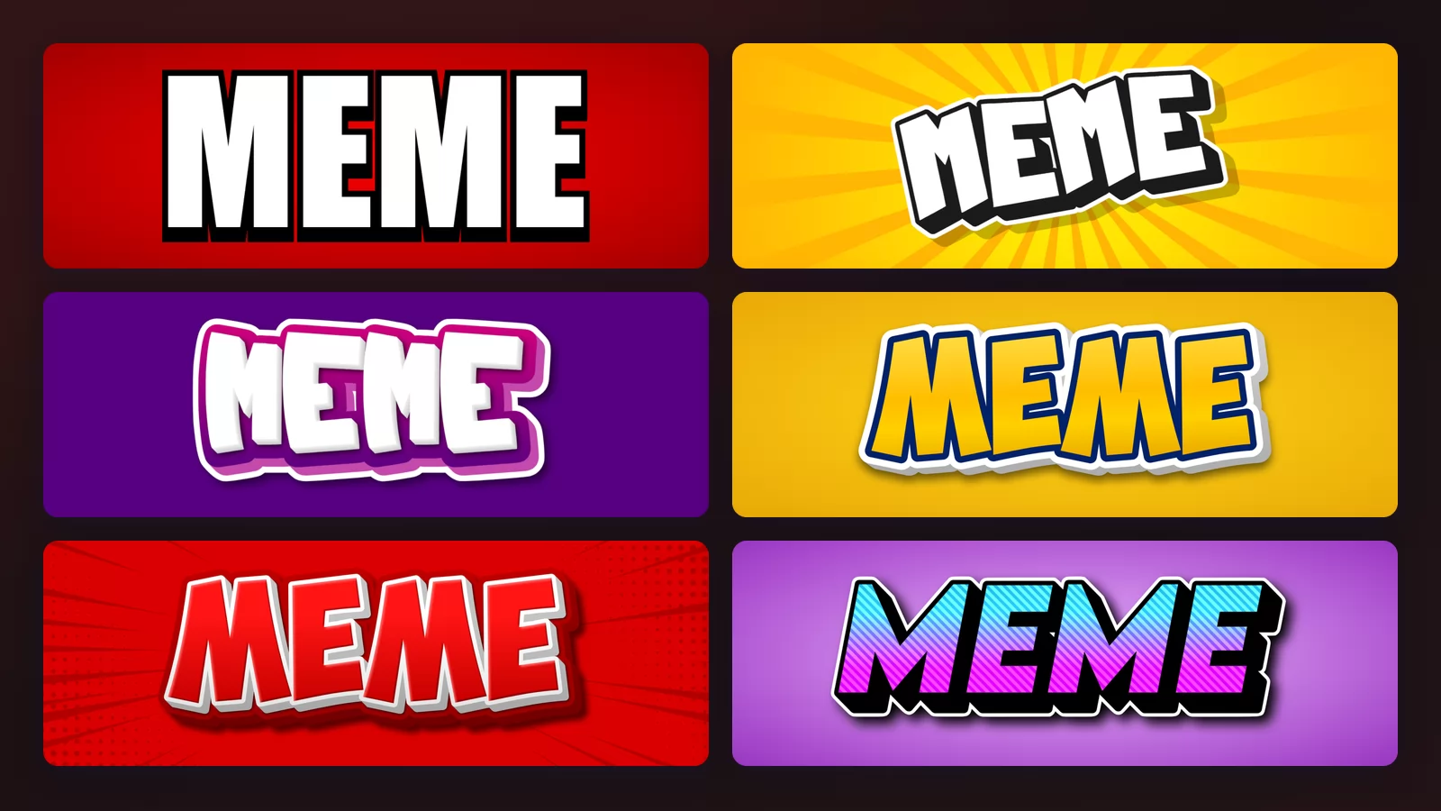
Ask what font memes use and you will be told: Impact. That is correct, and it is almost useless, because typing your caption in Impact gets you something that looks like a 1998 newspaper headline and not like a meme at all.
The thing nobody names is the outline. Below, the same typeface at the same size, twice, with one difference. Every sample further down was rendered with the meme font generator of TextStudio, so you can click any image to open that style and put your own words in it.
It is not the font. It is the outline.
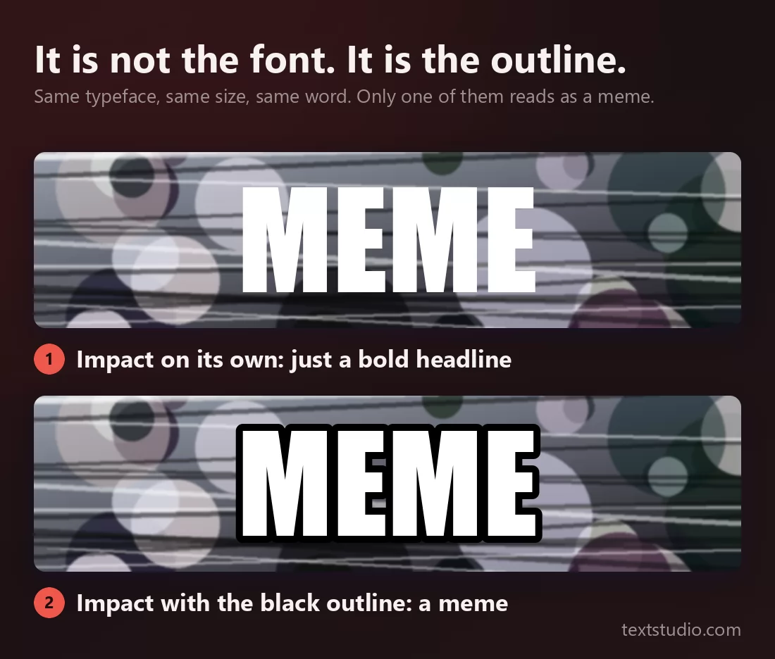
Same face. Same size. Same word. The top one is a bold headline sitting on a photo. The bottom one is a meme, instantly, to anyone who has used the internet since 2008.
That is worth saying plainly because it changes what you go looking for. You do not need to hunt down a special font. You need a fill and an outline, and everything else on this page is a variation on those two.
Where it came from
Impact was drawn by Geoffrey Lee in 1965, for advertising. His brief to himself was to get as much ink on paper as possible in a given size, which is why the letters are so tall in the body and so tightly packed. It was made for poster headlines, decades before anyone had a computer to type it on.
It became the meme font for a boring reason: it was already installed. Impact shipped in Microsoft's Core fonts for the Web and landed on essentially every machine with Windows 98. When image macros took off on Something Awful and then with I Can Has Cheezburger around 2007, Impact was the boldest face that everyone already had, so everyone used it, and after a few million pictures the association became permanent.
Nobody chose it for its beauty. It won on availability, and then it won on habit. That is worth knowing, because it means you are free to use any of the eight styles below: there is no rule being broken.
1. The classic
White capitals, a heavy black outline, nothing else. This is the recipe in its pure form and the only one on this page that reads as the meme font rather than as a lettering style.
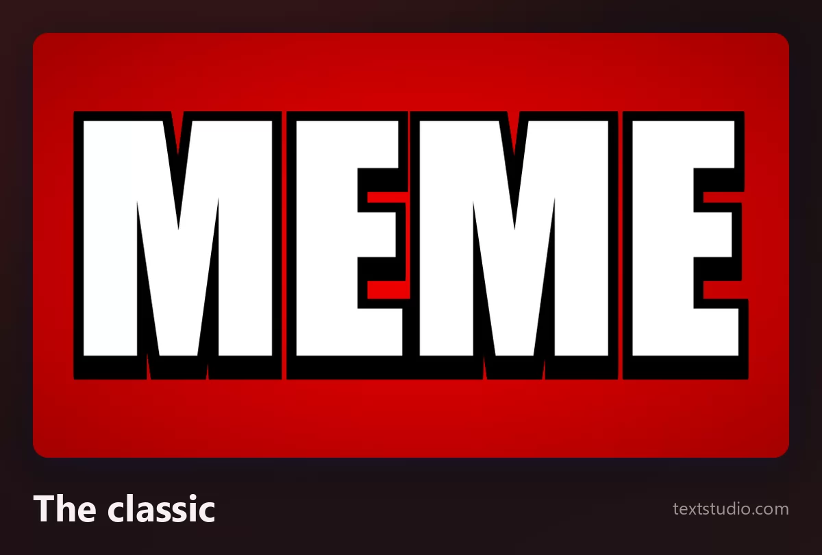
Use it when the joke depends on the format being recognised. Top line, bottom line, all caps. Anything else you do to it makes it less of a meme, which is sometimes the point and sometimes a mistake.
2. Comic book
The same white-and-black idea with an energy behind it: a yellow sunburst, a slight tilt, letters that look drawn rather than set. It carries humour without carrying the meme format itself.
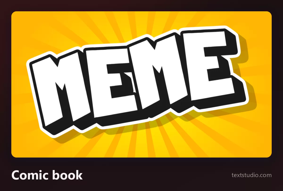
Good for: reaction images, comic panels, anything that should read as funny before it is read at all.
3. Video thumbnail
White letters, a white cut around the whole word, and a flat block of colour behind it. This is what a thumbnail caption looks like once you stop fighting the photograph and give the words their own field instead.
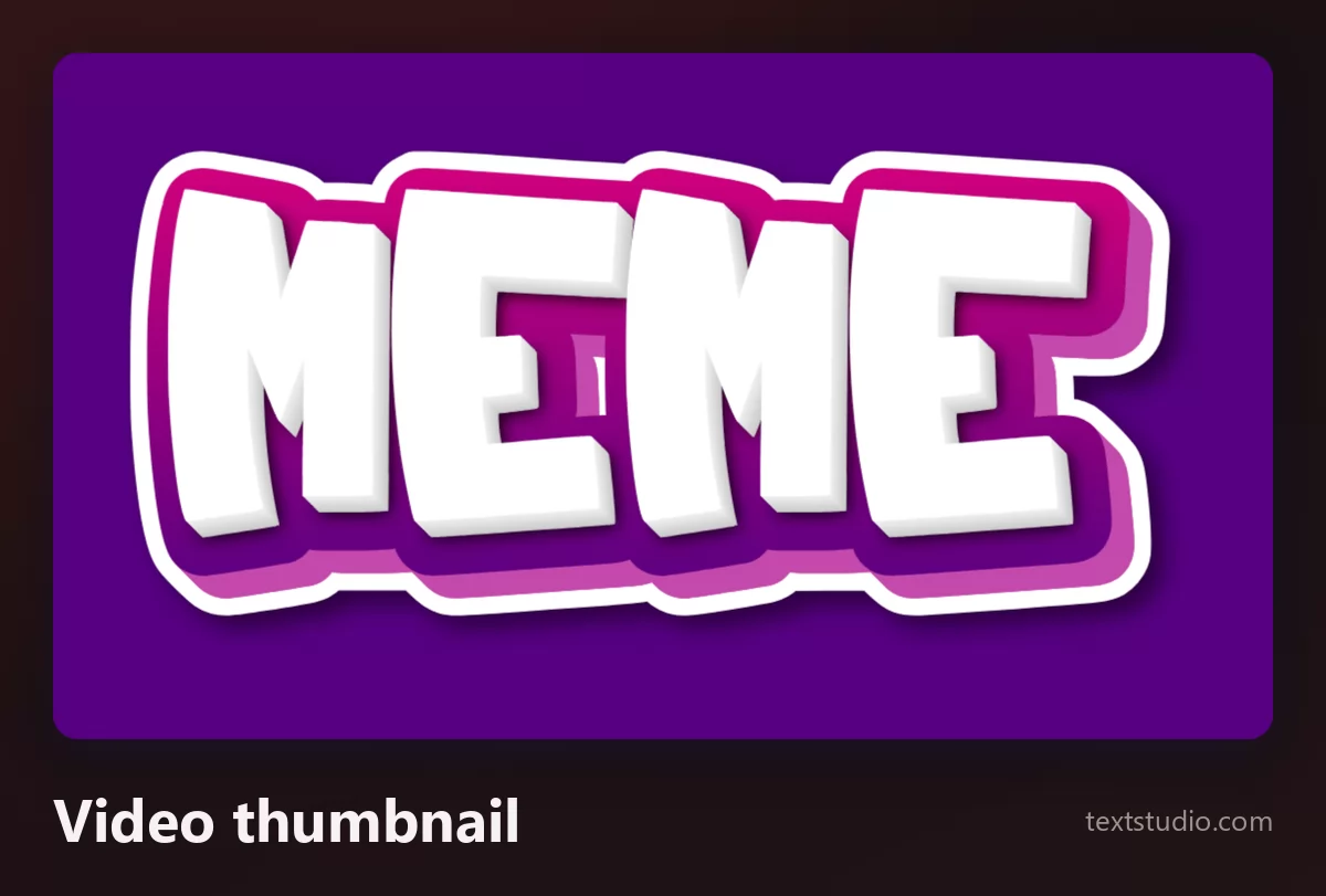
Good for: thumbnails, playlist covers, anything that has to be read 200 pixels wide on a phone. The flat field is the whole trick, because it guarantees the contrast that a photograph never does.
4. Die-cut sticker
Yellow letters with a white border around the whole word, as if it had been cut out of vinyl. The outline is still there, it has just changed colour and moved outward.
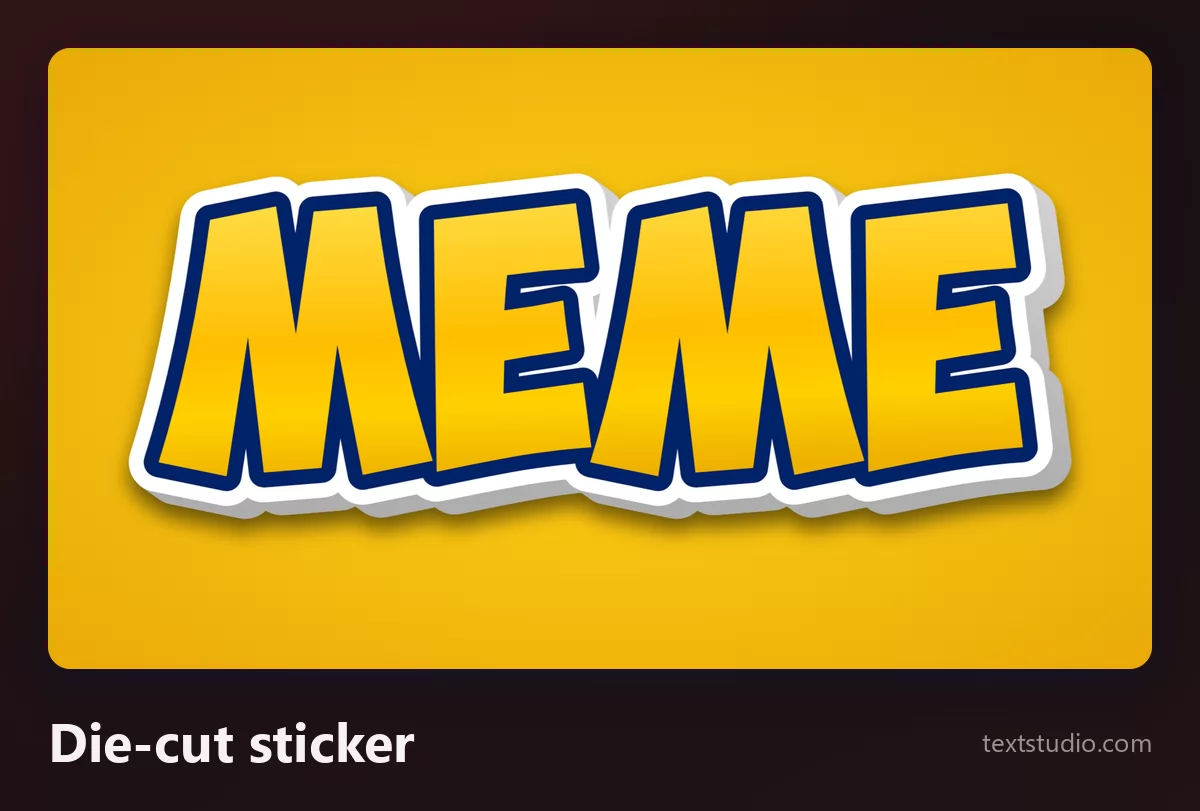
Good for: chat stickers, print, anything that should look like an object rather than like text. This is also the friendliest style here, because the rounded cut softens everything.
5. Halftone pop art
Red letters with a white edge over a field of printed dots. Comic-book printing from before comic books were printed well, and the closest thing on this page to a deliberate design choice.
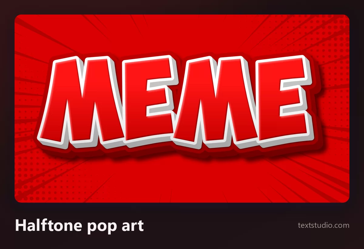
Good for: posters, merch, anything that wants the joke to look designed. It is also the style that survives being printed, which none of the glowing ones do.
6. Layered outlines
One outline is the meme recipe. Three outlines, in different colours, is the sticker-pack look: the word gains a thick halo that separates it from absolutely anything.
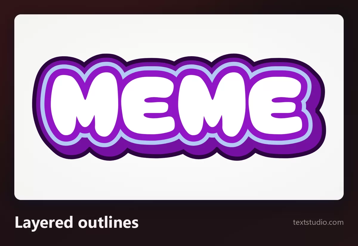
Each extra outline costs you letter shape, which is fine at poster size and fatal at thumbnail size. If you want to understand what outlines do on their own, the guide to adding a stroke to text covers the mechanics.
7. Gradient fill
The outline stays black and heavy; the fill becomes a gradient. This is the current default on short-form video: the shape is 2008, the colour is now.
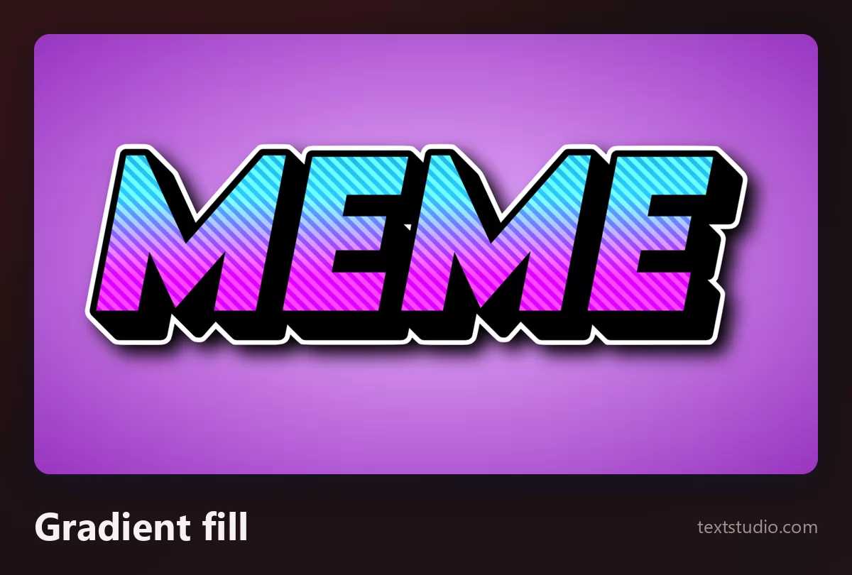
Good for: captions on video, playlist covers, anything aimed at people who were not alive for the first wave of image macros.
8. Soft pastel
Pale letters with a coloured outline instead of a black one. The recipe is unchanged, the volume is turned down, and it belongs to the cute end of reaction images rather than to the shouting end.
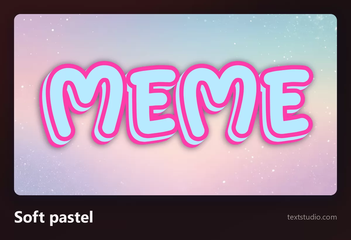
Watch the contrast: a pastel outline on a pastel background gives up the one thing the outline was there for. Use this on a busy photo and it disappears.
All eight, on the same word
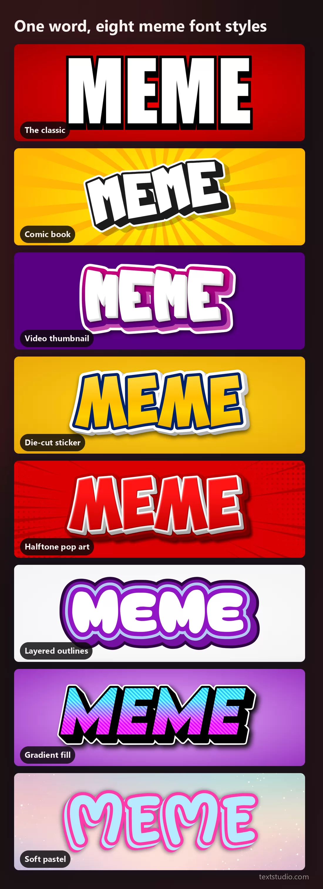
Seen together the pattern is obvious: not one of them is a bare typeface. Every single one is a fill wrapped in an edge. That is the whole trick, and the next two sections are the only two decisions it leaves you.
How thick should the outline be?
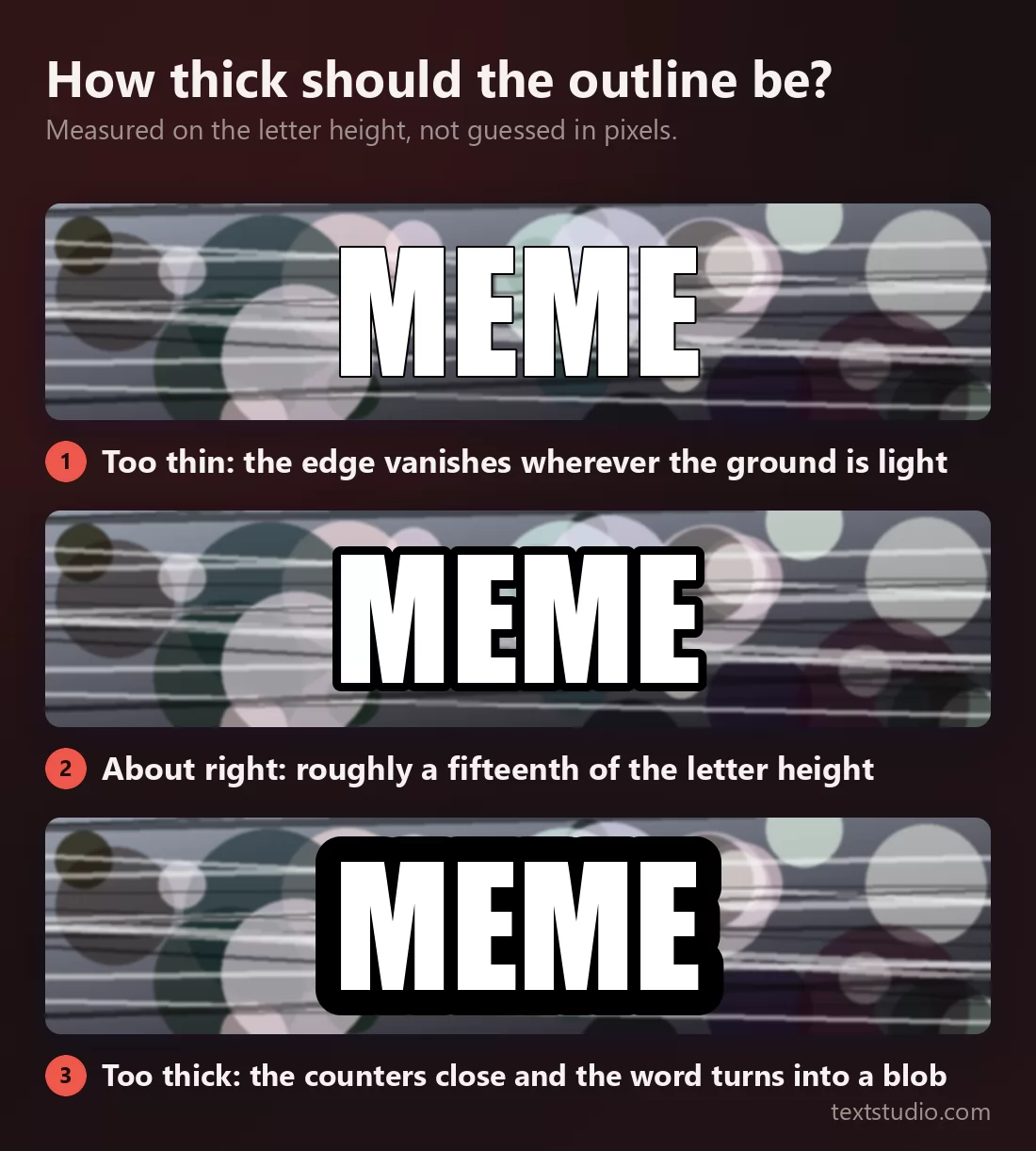
Measure it on the letter height, never in pixels, because a value tuned on a big image is wrong on a small one. Roughly a fifteenth of the cap height is the classic weight, and it holds from a phone screen to a poster.
Below that, the edge stops separating the letters from the picture and only shows up as a grey fringe. Above roughly a sixth, the outline starts eating the holes in the letters: the A closes, the E fills in, and the word becomes a shape you decode rather than read.
The outline is what survives any background
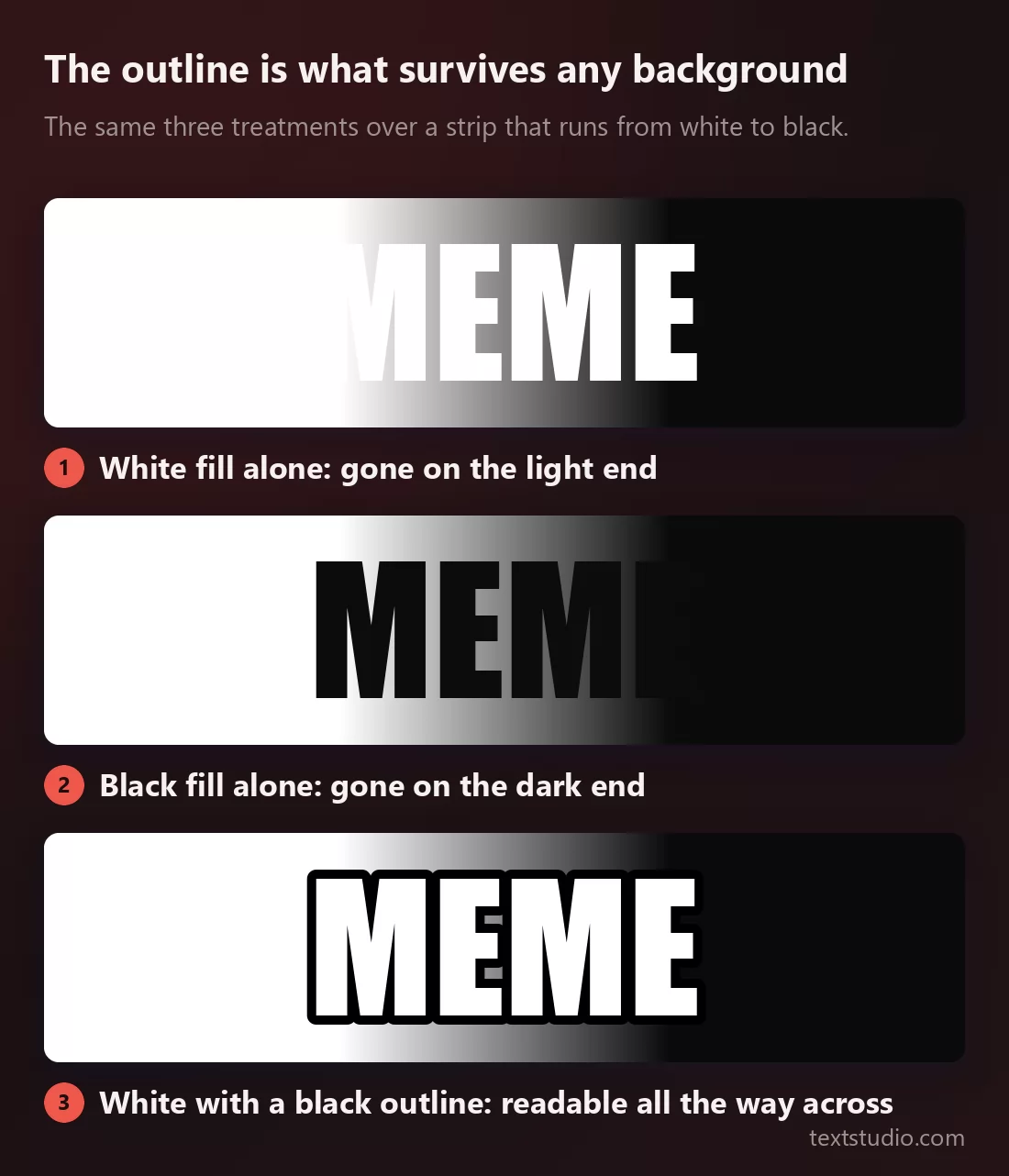
This is the practical reason the convention exists, and it has nothing to do with humour. A meme is text dropped onto a photograph nobody controls. Plain white text dies on a bright sky. Plain black text dies in a shadow. White with a black outline is the only one of the three that cannot be killed by the picture underneath.
Everything else on this page is taste. This part is engineering, and it is why the format has outlived every trend it has passed through.
Making one, in three steps
- Write it short and write it in capitals. Impact was drawn narrow and tall, so its lowercase is cramped and its capitals are not. Two lines of four or five words is the format, and it is a format because it works.
- Pick the fill for the picture, not for the mood. Look at the photo first. A bright image wants a dark fill or a dark outline; a dark image wants the classic white. Choosing the colour before you have seen the background is how captions end up invisible.
- Check it at the size it will be seen. On a phone, in a feed, at thumbnail width. If the outline has closed up the letters, thin it; if the word has floated away from the picture, thicken it.
Every style here is free and needs no account. Open TextStudio to put your own words into any of them.
Questions people ask
What font do memes actually use? Impact, almost always, with a heavy black outline and all capitals. The outline is not optional: without it the same font reads as a headline, not as a meme.
Is the meme font free? Impact ships with Windows and macOS, so most people already have it. Every style on this page is free to use here as well, with no account.
Why is meme text always in capitals? Impact has a very large lowercase relative to its capitals and very tight spacing, so lowercase text closes up and gets hard to read at small sizes. Capitals keep the word legible in a feed, which is where it will be seen.
Can I use a different font? Yes, and plenty of memes do. Keep the recipe rather than the typeface: a heavy face, a fill, and an outline of about a fifteenth of the letter height. Any bold condensed sans will pass.
Why does my meme text disappear on some photos? Because it has no outline, or the outline is too thin. Text with a fill alone is only readable on backgrounds that happen to contrast with it, and you do not control the background.