
 Mia Hartley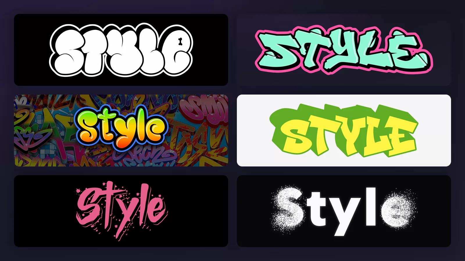
Search for graffiti fonts and you get walls of samples, each on a different word, at a different size, in a different colour. You cannot compare anything that way. So this guide does the opposite: one word, Style, rendered in nine graffiti lettering styles with the graffiti font generator of TextStudio, so the only thing that changes from one image to the next is the style itself.
These are not mockups. Every sample below is a real render, and you can open any of them, replace the word with your own name and download it. What they are not is a substitute for a can of paint: this is lettering for screens, sketchbooks and canvases, and for planning a piece before you ever stand in front of a legal wall.
1. Tag (handstyle)
The tag is where everything starts: a name written in one continuous, fast gesture, in a single colour. There is no fill and no outline, only the stroke itself. Writers call it a handstyle because it is closer to a signature than to a drawing, and it is the part of graffiti that takes the longest to make personal, because there is nothing to hide behind.
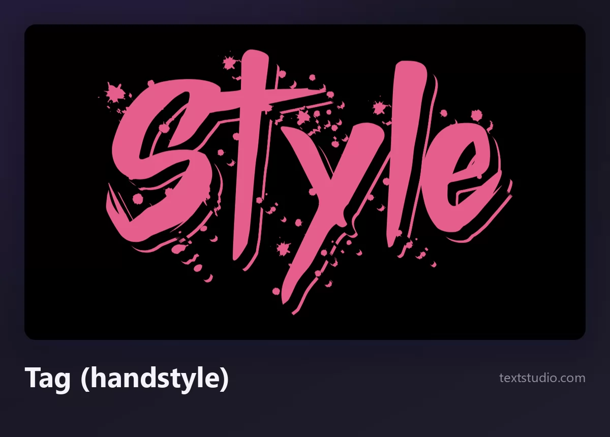
Good for: signatures on artwork, stickers, social handles, anything that should look written rather than designed. Watch out for legibility, because a handstyle is meant to be recognised, not read by strangers.
2. Throw-up
A throw-up is the next rung up, and it is defined by economy: two colours, one for the outline and one for the fill, rounded letters, painted in about a minute. The classic version is white fill with a black outline, and it exists because it covers a lot of surface for very little time.
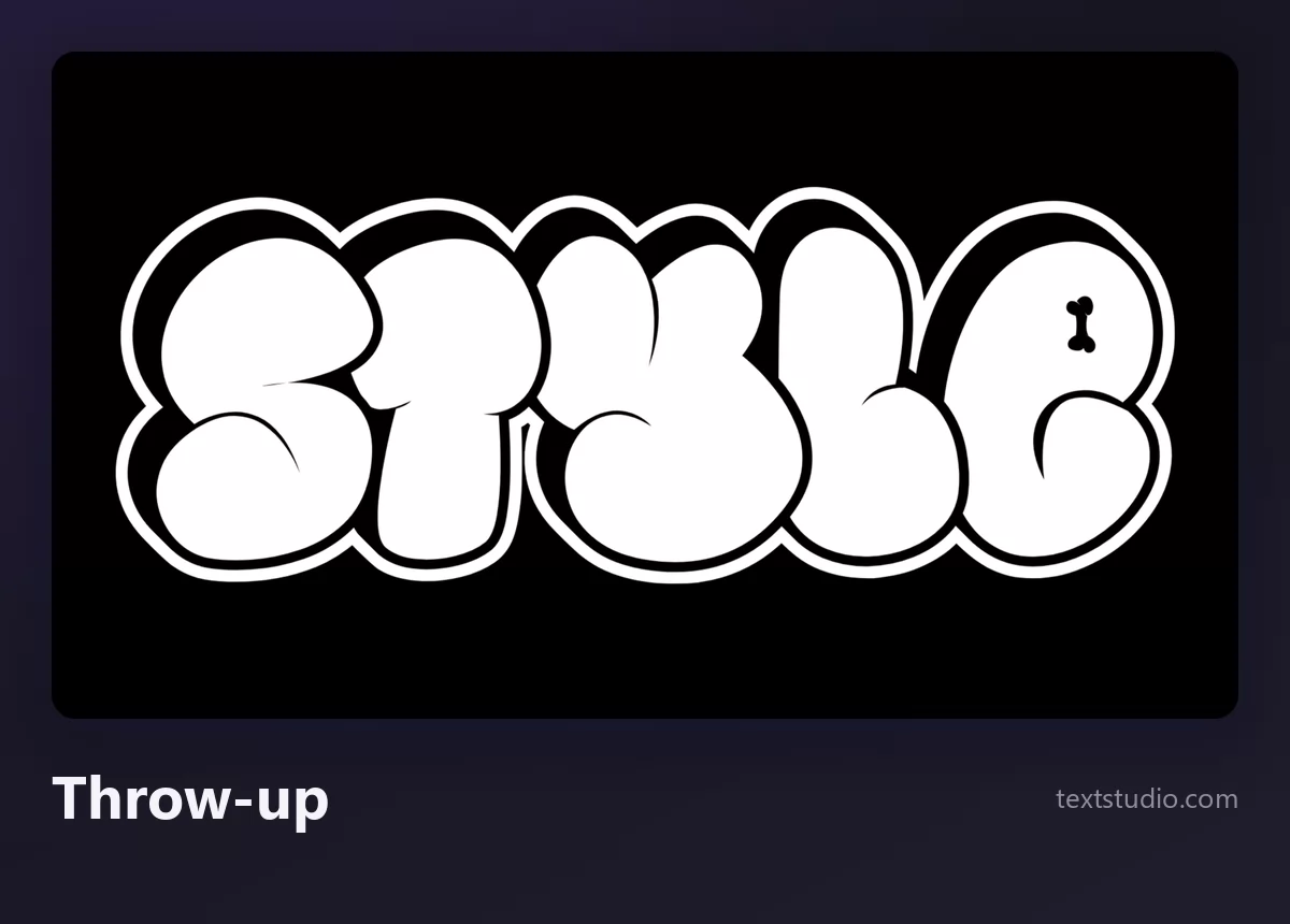
Good for: bold titles, T-shirt prints, thumbnails. The two-colour rule is what makes it read from far away, so resist adding a third and a fourth colour; it stops being a throw-up and starts being a mess.
3. Bubble letters
Bubble letters take the throw-up shape and make it friendly: inflated, glossy, usually colourful, often with a highlight that makes the letters look like they were blown up rather than painted. This is the style people mean when they say graffiti looks fun, and it is the easiest one for a non-writer to use without getting it wrong.
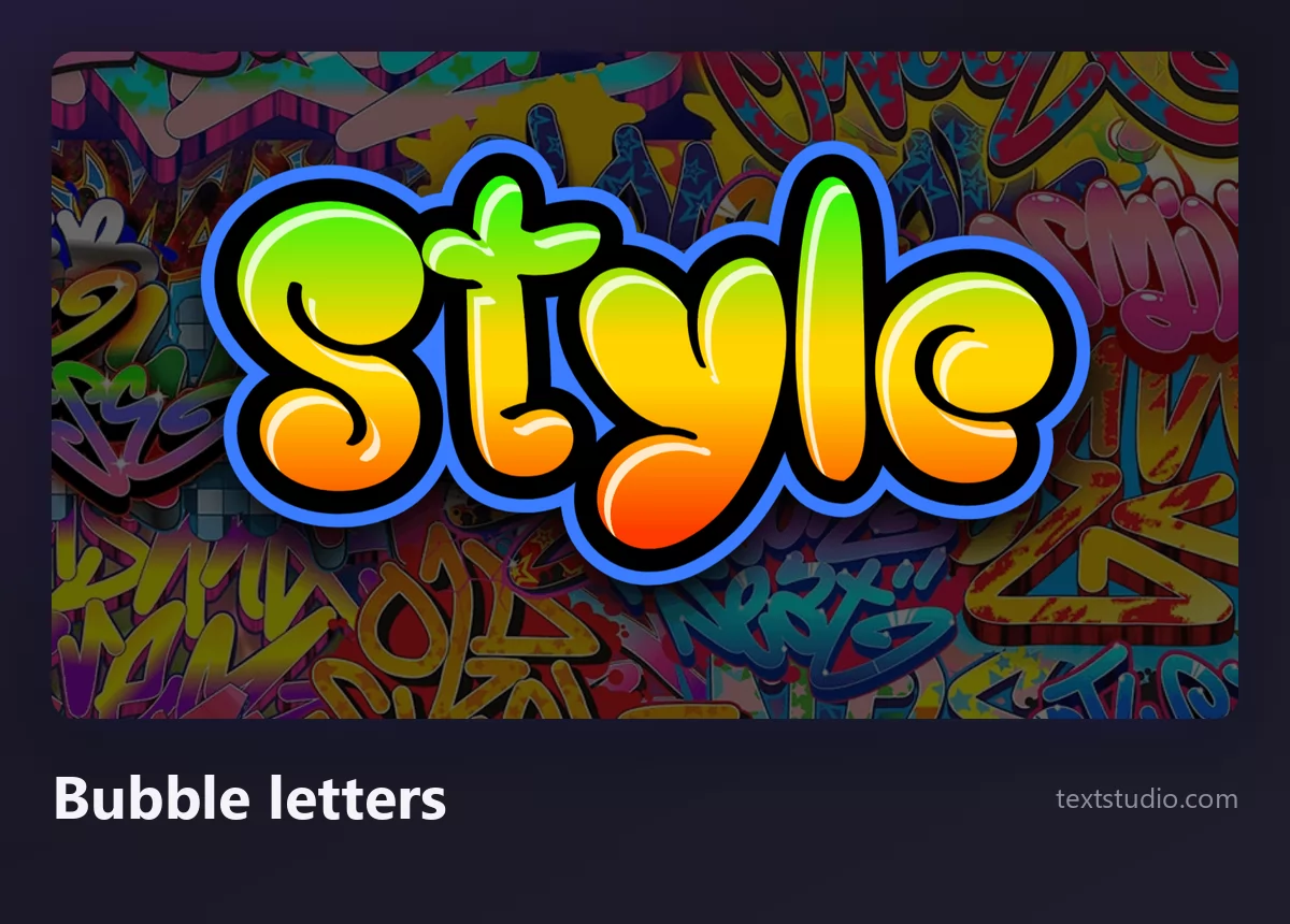
Good for: birthday cards, kids content, playful branding, anything aimed at a wide audience. Bubble letters stay readable when they are small, which is rare in this list.
4. Straight letters
Straight letters, sometimes called simple style, are graffiti letters that anyone can read: upright, even, with a clean outline and often a flat 3D edge. Writers use them when the name matters more than the flex, and they are the backbone of most crew logos and shop fronts.
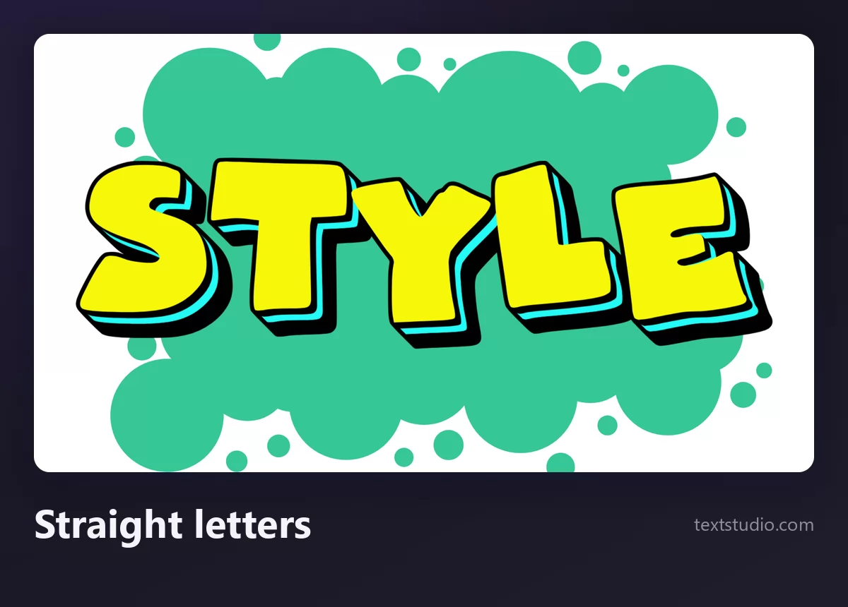
Good for: logos, headers, posters, anything a stranger has to read in one second. If you are torn between styles and the text has to be understood, this is the safe answer.
5. Blockbuster
A blockbuster is built to dominate space: huge, square, thick letters, usually rolled rather than sprayed, with a heavy 3D extrusion that turns the word into architecture. Two colours, no decoration, all mass.
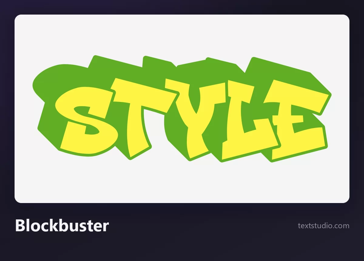
Good for: banners, album covers, anything wide that needs weight. Give it room: a blockbuster squeezed into a narrow space loses the only thing it has going for it.
6. Wildstyle
Wildstyle is the deep end. Letters interlock, arrows grow out of them, bars and connectors link one letter into the next until the word is almost unreadable to anyone outside the culture, which is partly the point. It appeared in the late 1970s and it is still the yardstick writers measure each other by.
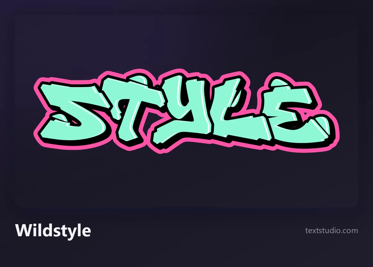
Be honest about what a tool can do here. A wildstyle graffiti generator gives you the angular, interlocking look in a second, and that is genuinely useful for a poster or a thumbnail. A real wildstyle is drawn letter by letter for one specific word, and that part is still done by hand, on paper, over years. Use the render as a starting sketch, not as the finished piece.
7. Chrome (silvers)
Chrome, or a silver, is a throw-up painted in metallic silver with a black outline. It is the cheapest paint on the shelf and the fastest thing to cover a wall with, which is exactly why it became a style of its own rather than a compromise. The gradient fill catches light like real metal.
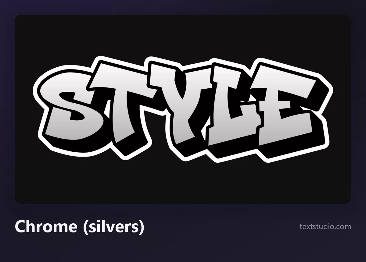
Good for: anything that needs to look expensive without colour, music covers, sportswear. Chrome sits well on dark backgrounds and badly on light ones, because the fill and the page turn into the same grey.
8. Drips
Drips are not a letterform, they are a finish, and they can be added to almost any of the styles above. Real drips happen when the can is held too long in one place; drawn drips are a deliberate signal that says spray paint. Used well they add movement, used everywhere they look like a filter.
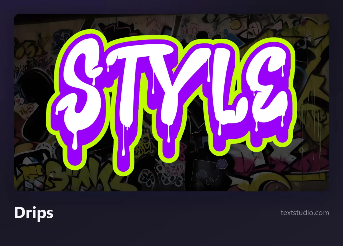
Good for: music artwork, streetwear, Halloween. One rule: let the drips fall from the bottom edges only. Drips coming off the top of a letter read as a mistake, because gravity does not work that way.
9. Stencil and spray
The stencil is the other half of street art: a cut shape, sprayed through, with the grain and overspray that a nozzle leaves behind. The letters are usually plain, because the texture is doing the work. It is the most graphic style in this list and the least tied to graffiti writing culture.
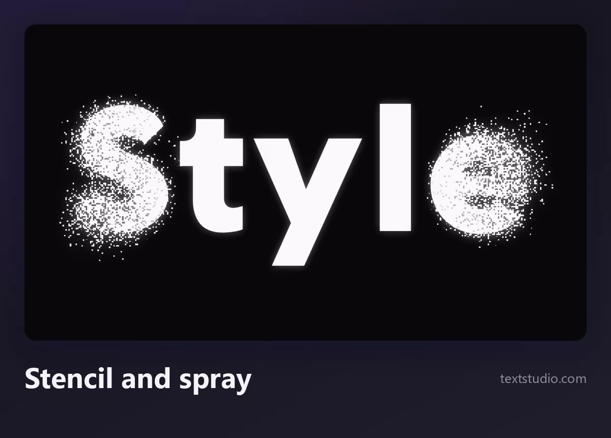
Good for: protest posters, zines, anything that should look printed by hand. Keep the letterforms simple; a stencil with complicated letters loses its edges.
From tag to wildstyle
These styles are not a menu, they are a ladder, and every writer climbs it in the same order. The tag comes first because it costs nothing but time. The throw-up adds a second colour and takes a minute. A piece adds a full palette, a background and hours of work. Wildstyle sits at the top, where the letters stop describing a name and start describing skill.
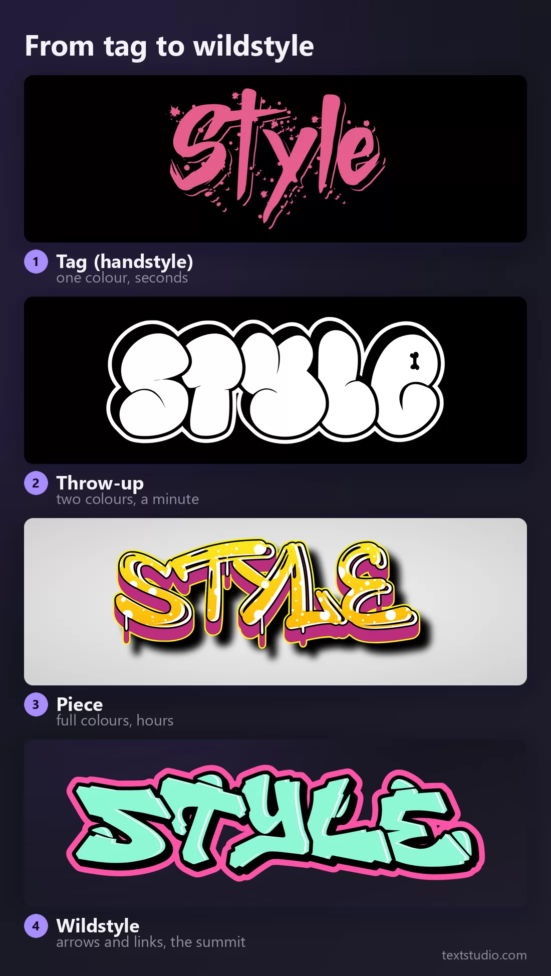
Knowing where a style sits on that ladder tells you how much visual weight it carries. A graffiti tag generator output next to a full piece will always look thinner, and that is not a flaw in the tag; it is the whole difference between a signature and a mural.
The parts of a graffiti letter
Once you start customising rather than picking, the vocabulary matters, because every one of these parts is a separate control in an editor.
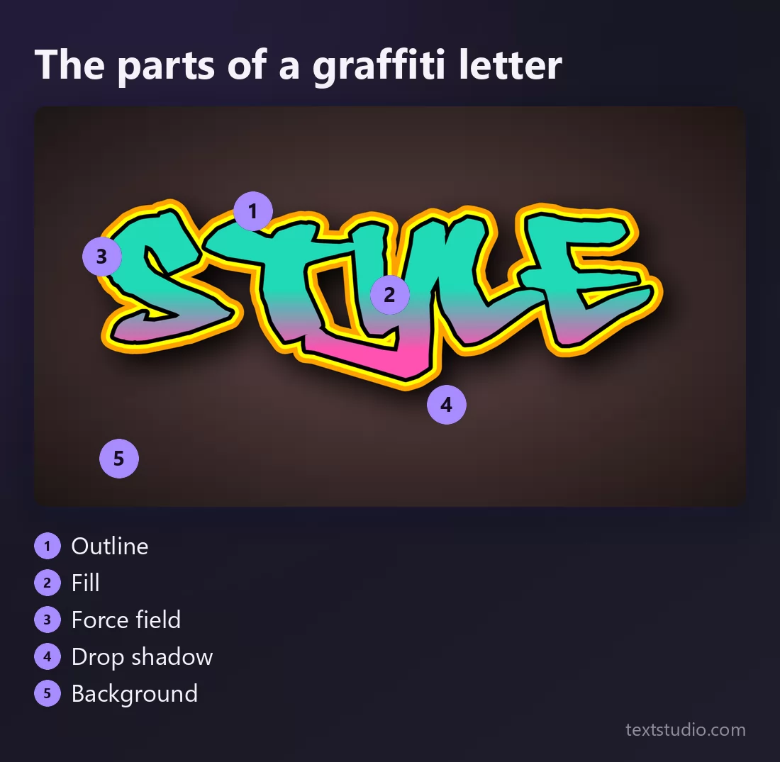
- Outline. The keyline that defines the letter shape. It is drawn last on a wall and it is what makes the piece read.
- Fill. What sits inside: flat colour, a gradient, a pattern. Change the fill and you change the mood without touching the letters.
- Force field. The second outline traced around the whole word, offset outward. It separates the piece from the wall, and it is the single fastest way to make a flat render look painted.
- Drop shadow. A dark copy offset behind the letters, which does the same job as the force field from the other side.
- Background. Wall, brick, paper or nothing. On a screen, a transparent background is often the most useful, because it lets you drop the word onto your own image.
One word, six styles side by side
Put them next to each other and the differences stop being theoretical. The tag takes the least ink and the most confidence. The throw-up and the bubble letters read from across a room. The blockbuster is the widest. The wildstyle is the only one you have to work to read.
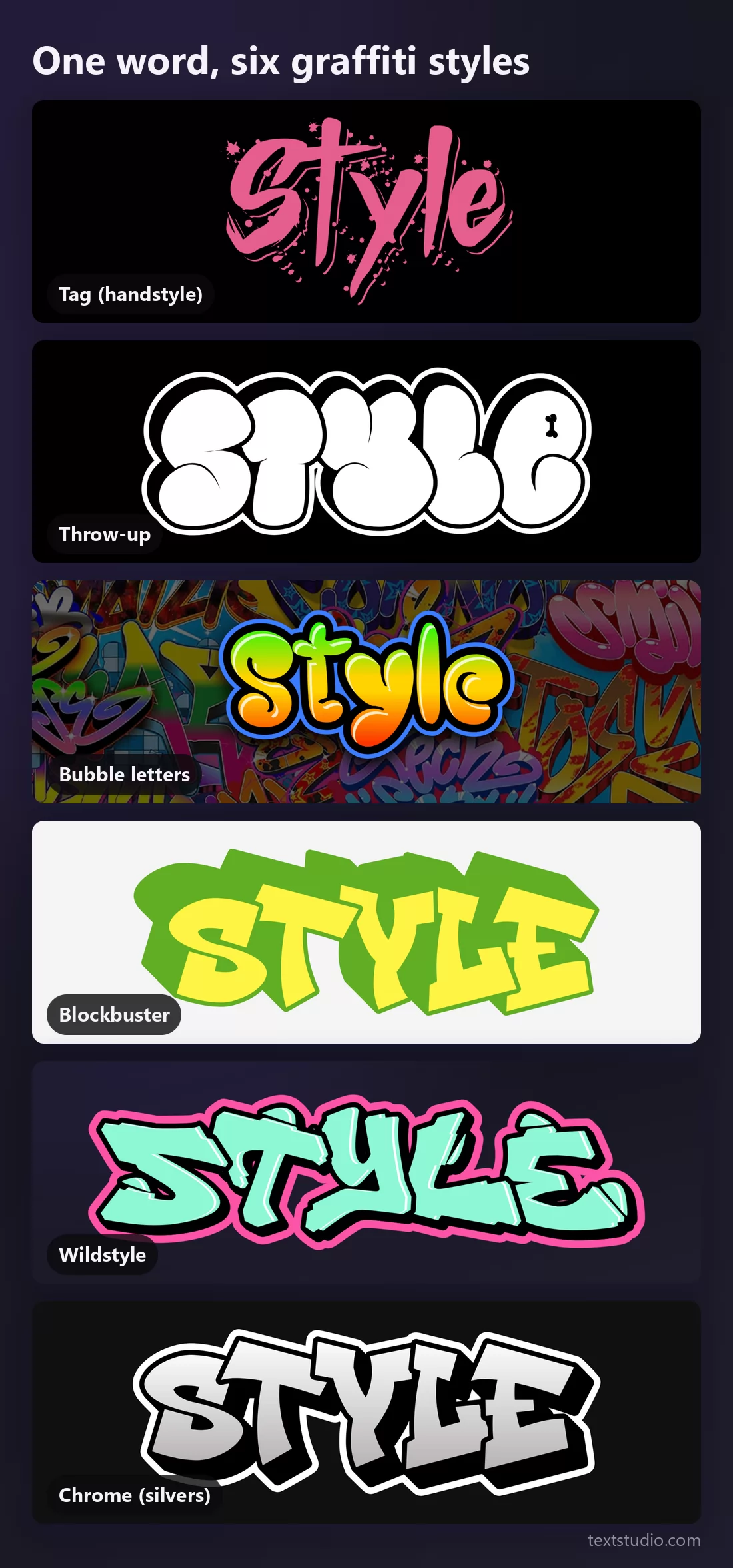
How to pick a graffiti style
- Start from the reader, not the style. If a stranger has to read the word, use straight letters or bubble letters. If the audience already knows the name, wildstyle and handstyles are open to you.
- Match the style to the surface. Wide formats suit blockbusters, square formats suit throw-ups, tall ones suit tags.
- Two colours beat five. Almost every style in this list was invented under a time limit, and the limit is what gives them their shape. Adding colours usually removes the style.
- Check it small. Shrink the render to thumbnail size. Bubble letters and blockbusters survive. Wildstyle and drips turn to soup, which is fine for a poster and fatal for an app icon.
- Use it where it belongs. Digital art, prints, clothing, sketches, legal walls and commissioned murals. Painting someone else's property is vandalism in most countries, whatever the lettering looks like.
- Steal the technique, not the name. Copying another writer's tag is the one thing the culture does not forgive. Take the style, write your own word.
FAQ
What is the difference between a tag, a throw-up and a piece?
Time and colours. A tag is one colour and takes seconds. A throw-up is two colours, rounded letters, about a minute. A piece is a full production with a palette, a background and often hours of work.
Which graffiti font is the most readable?
Straight letters, then bubble letters. Both keep even spacing and closed letter shapes. Wildstyle is the least readable by design.
Can I use these graffiti fonts commercially?
Check the licence of the specific style you download, exactly as you would for any font. The renders themselves are yours to use, but a logo that will carry a brand deserves a licence you have read.
What is a force field in graffiti?
The extra outline traced around the outside of a whole piece, usually in a contrasting colour. It lifts the letters off the wall and it is one of the quickest ways to finish a design.
Why does my graffiti text look flat?
Almost always because it has an outline and a fill but nothing behind it. Add a drop shadow or a force field, and if the style allows it, a 3D extrusion. Depth is what separates a graffiti font from a bubbly typeface.
Write your own word
Pick a style, type your name, change the fill, and compare two versions side by side before you commit. If you like this way of comparing lettering, the same approach applies to tattoo lettering styles, where readability at small sizes matters even more. Open the TextStudio graffiti generator and see what your name looks like on a wall.