
 Mia Hartley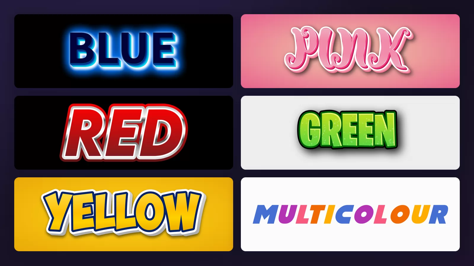
Almost nobody types "coloured text". They type blue text, or pink, or red. The colour is not a setting they will adjust later; it is the thing they came for, and it usually carries a reason they could not quite put into words.
So this guide is arranged by colour. Each one below is shown writing its own name, so you can see the colour rather than read about it, and every sample was made with the colour text generator of TextStudio. Before the eight, one thing decides everything else.
A colour is not readable. A colour on a background is.
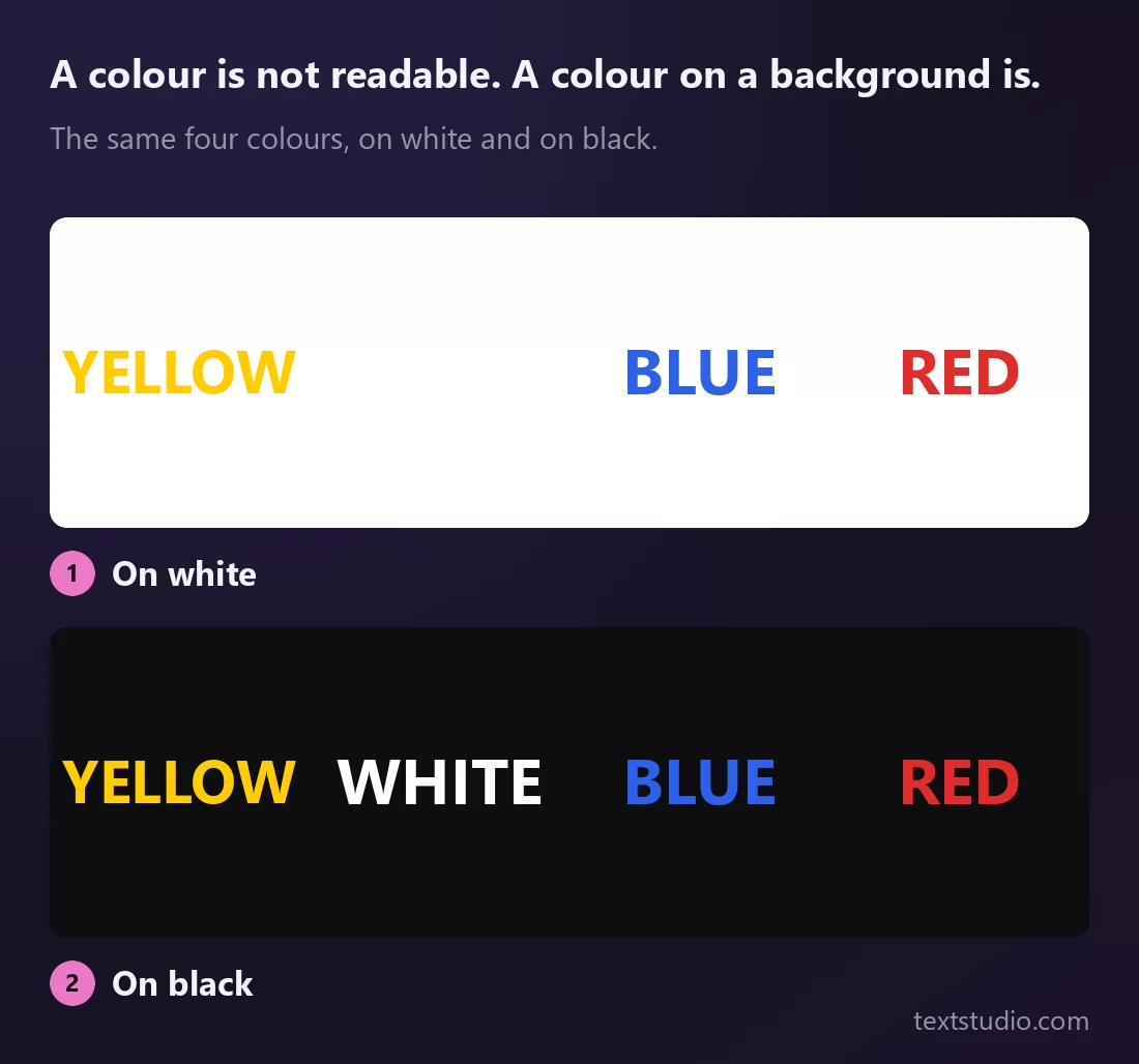
Look at the top panel. The word WHITE is there. It is written in exactly the same size and weight as the others, and it is invisible, because white on white is nothing. Yellow is only slightly better off.
This is the mistake behind almost every unreadable design: choosing a colour on its own, in a picker, against whatever background the picker happens to show. A colour has no legibility of its own. It only has a relationship with what sits behind it, and that relationship is the whole game.
The practical rule that follows: decide the background first. Then pick a colour that has somewhere to go against it. Yellow is superb on black and hopeless on white; white is the reverse. Nothing about the colour changed, only what was underneath.
1. Blue
The most searched colour of all, and the calmest. Blue reads as trust, distance and cold, which is why banks, software and hospitals are drowning in it. It also recedes: a blue word sits back rather than jumping forward.
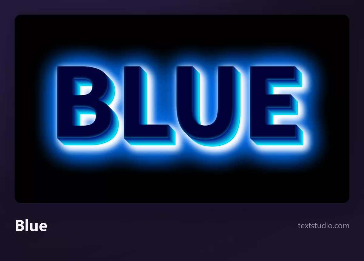
Its weakness is darkness. Pure blue is the darkest-looking of the saturated colours, so on a black background it needs a glow or a light outline to survive, exactly as above.
2. Pink
Pink is not simply "for girls" any more, and has not been for a decade. It reads as warmth, play and confidence, and it has become the default of beauty, music and anything aimed at a young audience.
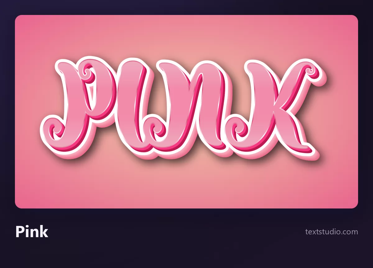
It is one of the easiest colours to use because it holds on both light and dark grounds. The trap is the opposite one: pink on pink, which is what happens when the background comes from the same mood board as the text.
3. Red
The loudest colour there is. Red means stop, sale, alert, love and appetite, all at once, and the reader picks whichever meaning the context suggests. It advances more than any other colour: a red word looks physically closer than a blue one of the same size.
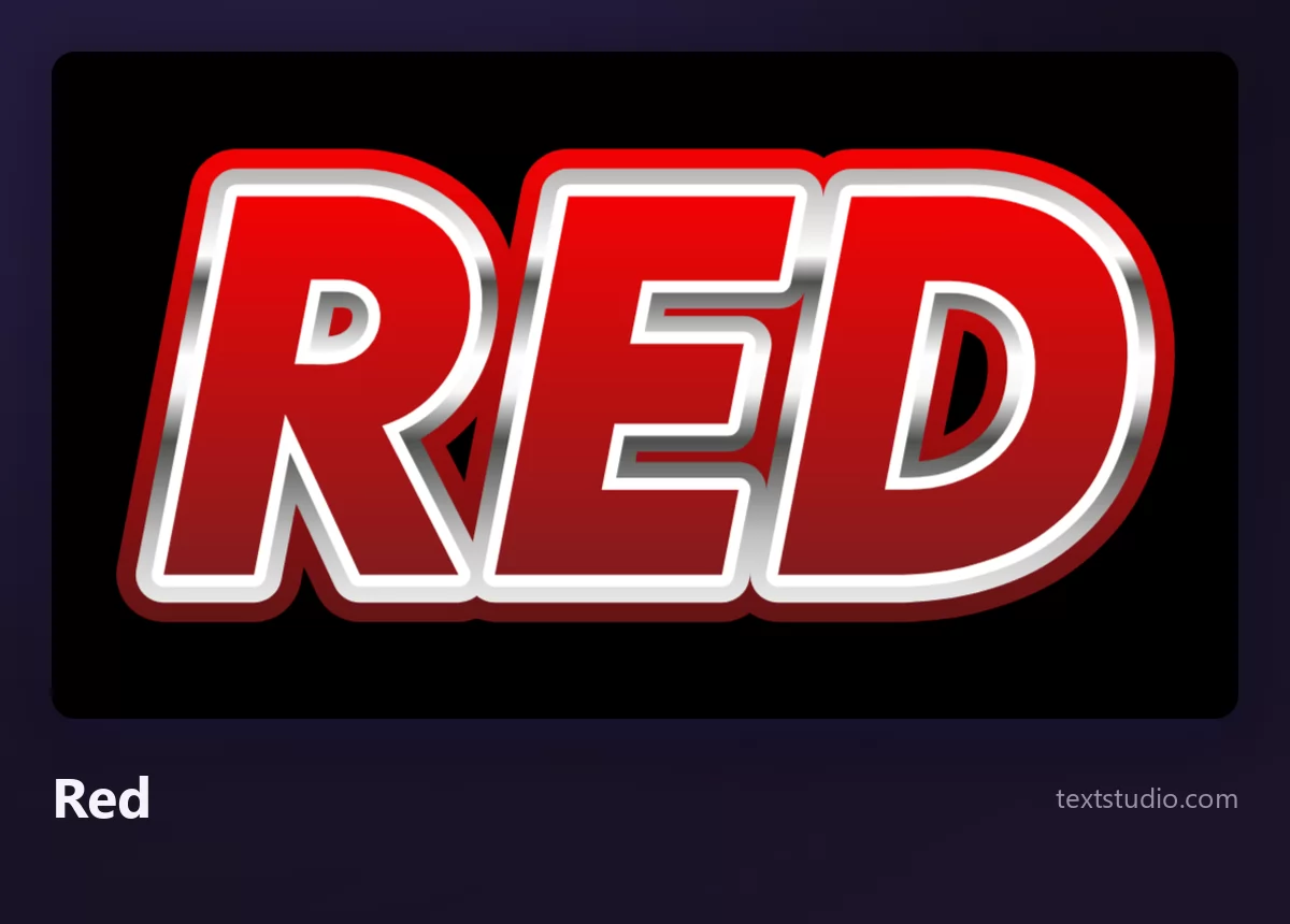
Use it for one thing at a time. Two red elements on the same design cancel each other out, because both were claiming to be the most urgent.
4. Green
Nature, money, health and go. Green is the only colour that carries a strong "yes", which is why every confirm button in the world is green, and it sits comfortably in the middle of the light and dark range.
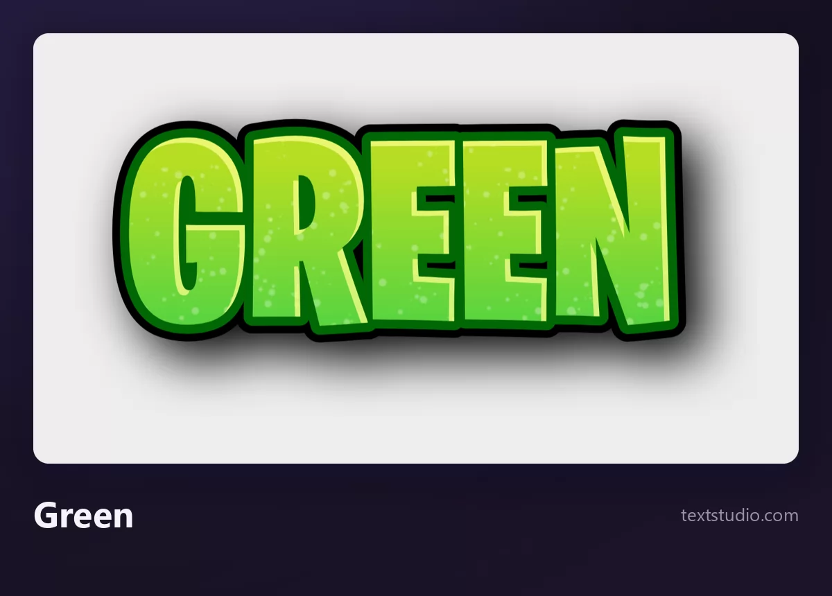
Watch the shade. A yellow-green reads as fresh and playful; a blue-green reads as clinical and expensive. They are the same colour name and two different messages.
5. Yellow
The brightest colour the eye can process, and the one with the widest gap between its best and worst case. On black it is unbeatable. On white it is nearly gone, as the first picture showed.
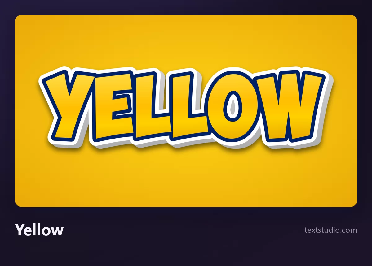
Because of that gap, yellow almost always needs an edge: a white cut, a dark outline, something that gives it a boundary. The guide to adding a stroke to text covers exactly that, and yellow is the colour that needs it most.
6. Orange
Warmth without red's aggression. Orange reads as friendly, energetic and slightly cheap, in the way a sale sign is cheap, and it is the colour of autumn, sport and food.
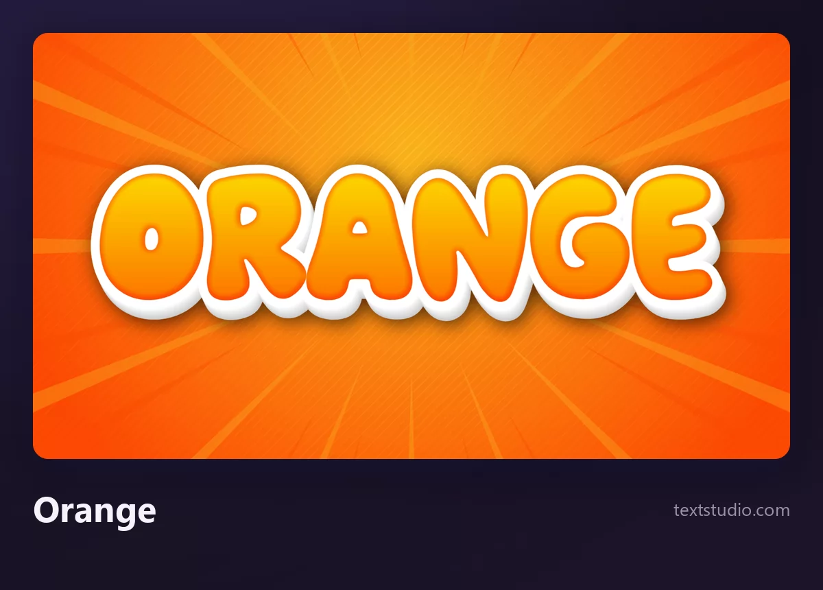
It is the hardest colour to place next to another. Orange fights with red, muddies with brown, and vibrates against blue. Give it space or give it a neutral.
7. White
Not an absence but a choice. White reads as clean, premium and calm, and on a photograph it is the only colour that works on almost any subject, which is why it dominates fashion and film titles.
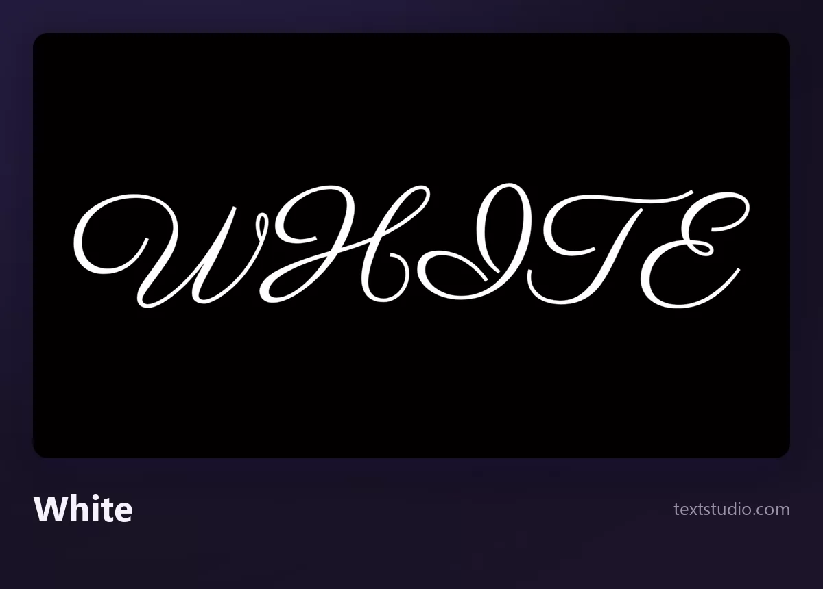
Its rule is simple and absolute: white needs something dark behind it. On a light photo it disappears completely, and no amount of shadow rescues it. Move the text, darken the photo, or change colour.
8. Many colours at once
One colour per letter, the rainbow treatment. It reads as fun, childlike and celebratory, and it is what most people mean when they type "coloured text".
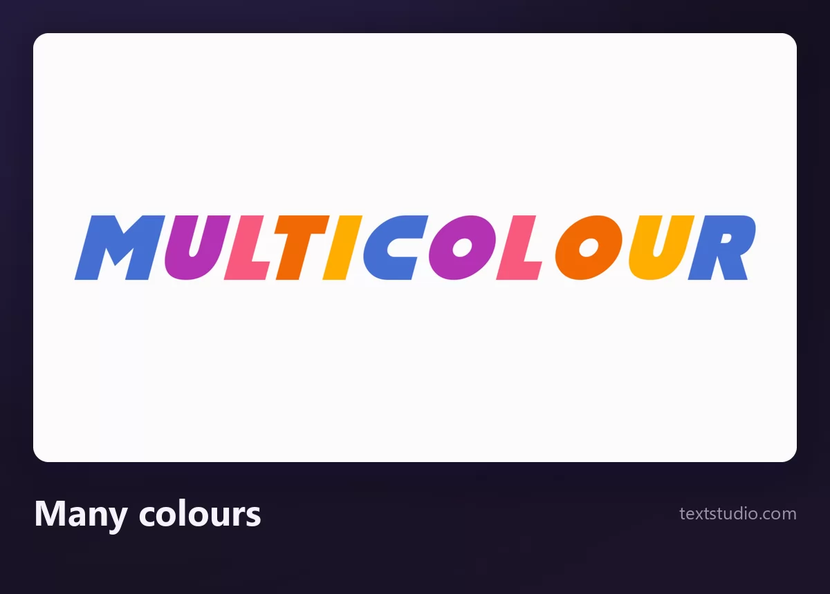
It also costs you legibility, and it costs more than people expect. That is worth its own demonstration, further down.
All eight, each written in its own colour
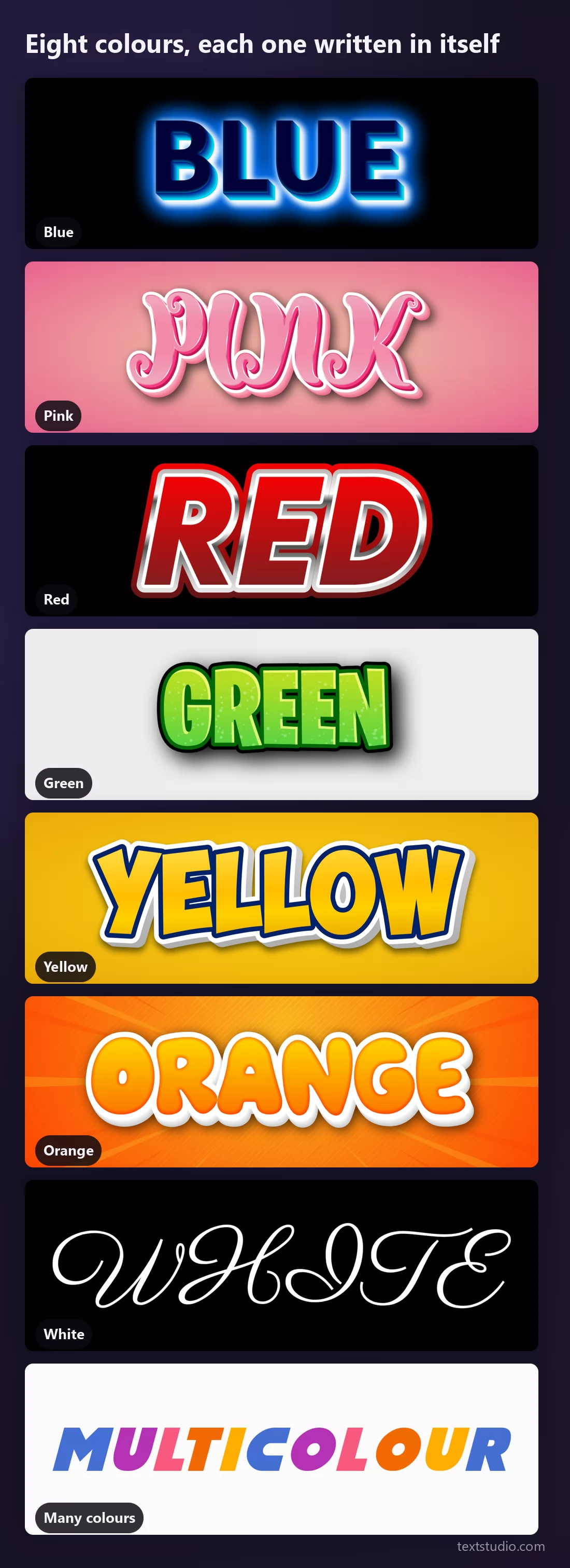
Three colours are missing from this list because they already have their own guide: gold text effects, purple text effects and neon fonts. For silver and chrome, see metal fonts.
What each colour says before anyone reads it
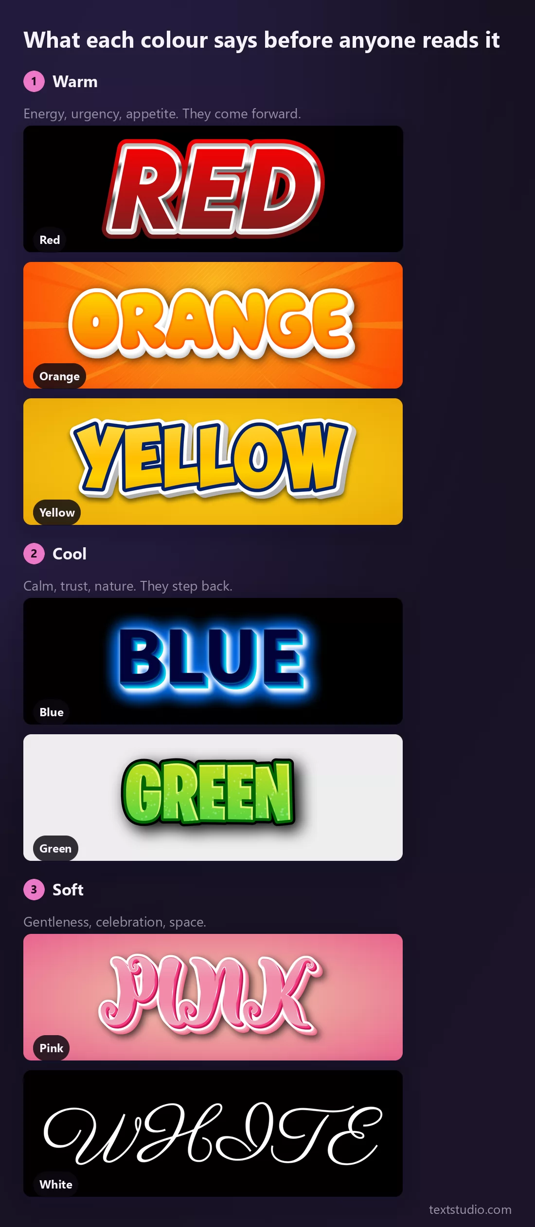
Colour is read before the word is. By the time someone has decoded your letters, they have already been told whether this is urgent or calm, cheap or expensive, for children or for adults. You do not get to opt out of that, so it is worth choosing on purpose.
The warm ones come forward and demand attention. The cool ones step back and let the reader breathe. The soft ones say gentleness and celebration. None of that is a rule you must obey, but if you break it, break it knowingly.
How many colours before it stops reading
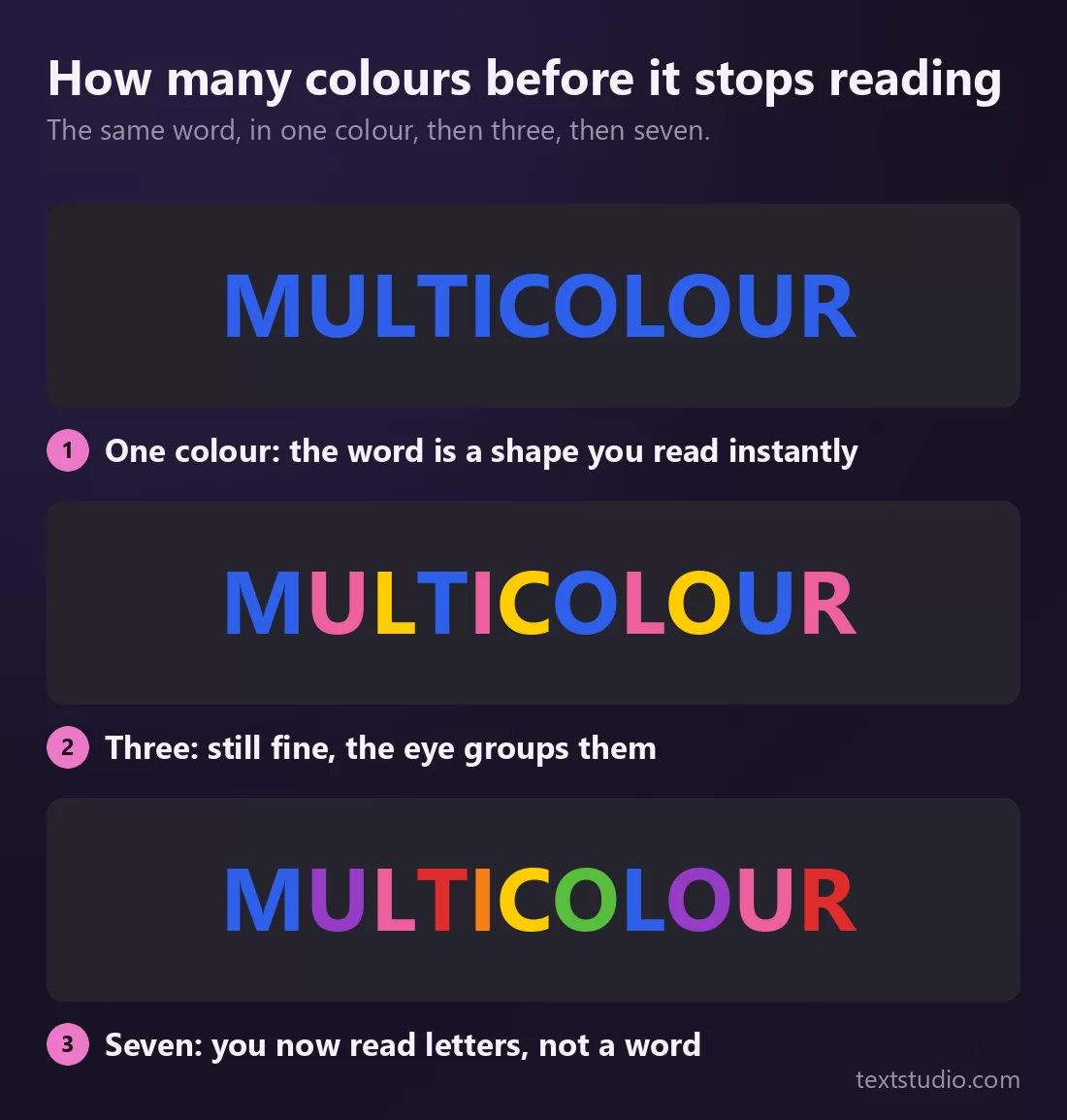
We read words as shapes, not as letters. One colour keeps the shape intact and the word arrives whole. Three still works, because the eye groups them into a pattern. At seven, the shape has been broken into pieces and you find yourself reading letter by letter.
That is fine on a birthday banner, where nobody is in a hurry, and it is fatal on a thumbnail, where you have less than a second. The rainbow is a decoration, not a way of writing.
Choosing, in three steps
- Look at the background before you look at the colour. Light or dark decides half your options immediately. Yellow and white live on opposite sides of that line.
- Pick for the message, not for the mood board. Red says urgent, blue says calm, green says go. If your colour and your message disagree, the colour wins, because it arrives first.
- Give it an edge if it is a bright colour on a busy ground. Yellow, orange and white all need a boundary once the background is a photograph rather than a flat panel.
Every effect here is free and needs no account. Open TextStudio to write your own words in any of these colours.
Questions people ask
What is the most readable colour for text? There is no answer without a background. Black on white and white on black are the two most readable pairs; yellow on black is close behind; yellow on white is among the worst.
Which colour should I use for a title? One that contrasts with what is behind it, then one that matches your message. In that order. A title that suits the mood but cannot be read has failed at the only job it had.
Can I put several colours in one word? Yes, and up to about three it stays readable. Beyond that you are decorating rather than writing, which is the right choice for a party banner and the wrong one for anything people must read quickly.
Why does my coloured text look dull? Usually because the colour and the background are too close in lightness. Two colours can look very different and still have almost the same brightness, and it is brightness, not hue, that makes letters stand out.
Do I need to know the hex code? No. Every effect here already carries a colour that has been chosen and balanced with its own outline and shadow. Picking a ready-made effect is faster than tuning a value, and usually better.